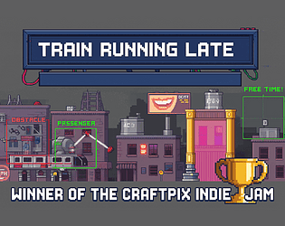
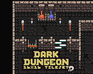
Thanks for checking back. I planning to make something very similar in the not too far future. I'll let you know once it's available.
Zoltan Kosina
Creator of
Recent community posts
As promised, the Post jam version is now available with a significant amount of brand new features:
- 4 types of enemies: rats, spiders, bats, cyclopses
- 26 different sound effects: steps, hits, chirps, squeaks, grunts, and victorious fanfares
- Music
- Updated map layout
- A flickering torch, flashy visual effects, updated switch and door animations
- Minimap
Post jam version is now available with a significant amount of brand new features:
- 4 types of enemies: rats, spiders, bats, cyclopses
- 26 different sound effects: steps, hits, chirps, squeaks, grunts, and victorious fanfares
- Music
- Updated map layout
- A flickering torch, flashy visual effects, updated switch and door animations
- Minimap
Hey, thanks! I'm a big fan of the 90's classics, so I guess it shows. I was planning to add enemies too, since the asset pack had some fun ones, but didn't have the time for it.
Initially I have added torchlight, but the second viewport started to glitch because of it, so I had to remove it.
I wanted to add a minimap too.
I also played with the idea to add some Sokoban mechanics. The crates in the storage room would have been suitable for it.
But in the end, I had only 48 hours, and and in reality even less, so instead I focused on creating something stable.
Good news: I'm actively working on the post-jam version. I have already added the following:
- music
- footsteps, flying, door opening, gate opening, and potion pick up sound effects
- a potion pick up visual effect, a flying animation and a switch activation animation
- fixed some asset import issues, and hopefully the texture glitch on mobile
And not only these, I'm also planning to add all that we mentioned above, so stay tuned. ;)
Review
- First impressions
- The title screen is flawless.
- The intro could be a little bit shorter and the parallax background feels like it’s slightly off.
- The typewriter effect is a bit slow.
- There is no button to skip complete dialogues.
- After a few seconds the message should progress without space to save time.
- The interact with F tutorial should be displayed when it needs to be first used.
- First level
- Jumping vertically is too fast compared to running horizontally.
- The jump height should depend on for how long the jump button is held.
- The first enemy started to slowly fly through the air once I killed him.
- Requiring the player to transform back from a bird to a dog, just so it can interact with the world is counterintuitive. Why would a dog be better at operating heavy machinery than a bird? Keeping the dog as the box pusher, while every form could interact with buttons would feel better.
- Requiring the player to transform from bird to dog to talk to a bird is just silly.
- Second level
- The rain is just awesome.
- Showing the dog’s head on the side of the box is a very clever trick.
- The bird should also collide with the box to emphasize that it’s not part of the background, but only the dog could push it.
- Same with the button. Both the bird and the rat should be able to stand on the top, but only the dog/box would have enough weight to push it down.
- If the only purpose of the box is to be pushed on the button, then making it a full-fledged physics object that rotates randomly is risky. It’s easy to push it so the dog is blocked from jumping without backing away from it. Making it so that it only moves horizontally, without rotating is better in this case. Free movement for physics objects is best when you can freely grab them and move them around, and even in that case it’s hard to ensure it won’t do game breaking things. If you keep it non-physical you can even add some custom animation for the dog to really show its connection with the object.
- The rat being able to jump the same height as the dog is a slight design flaw.
- Giving the ability for the dog and rat to jump when in bird form they can fly is questionable. Maybe instead of the 1-3 buttons, transformations could be activated by the dedicated movement keys and deactivated by context. So an up or space button would auto-transform the dog into a bird and touching the ground would transform it back to a dog. Pressing down on the ground would transform the dog into a rat, and releasing it would transform it back to dog. The whole game experience would become more fluent, and the puzzles are spatial anyway, there are no real decisions to make about the current form.
- The chompers part is old. So old, that even in 1999’s Galaxy Quest parodied it. And just like there, it makes no sense here as well. I wonder if any players today would find it exciting. Especially with the insta-death and without the tightly fitting collision boxes. Nice thing that there is a checkpoint right before it, but it’s bad that afterwards you are thrown into the next insta-death challenge immediately, without noticing the hidden checkpoint at the rat. So, I would just remove this part completely.
- The issue with the box puzzle was mentioned by others too. The problem is that it’s not enough to transform in-between the boxes, because one box is stuck next to the wall. And the fact that it doesn’t reset when you die is downright sadistic.I see why you decided to add physics to them here, but I still think, making them only pushable horizontally, and then just make them fall straight down would have been good enough, and less errorprone. And it would make the boxes feel more heavy, compared to the rubbery, paper-boxy feel they have now.
- The final maze issue was also mentioned already. Building a game on top of 3 unique forms with specific movements patterns and abilities, just so you can ignore everything learned before and blindly force the player into a maze game against all odds is a huge let down. It feels like you ran out of ideas already, and rely on mechanics that has nothing to do with your originally teased ideas.
- Summary
- It’s a nice little game. As I mentioned, with a focus on the core mechanics that are supposed to make this game unique instead of forcing old platformer tropes on the player is what will make this game exceptional.
- The description, the title screen, and even the intro promises the destruction of nature, but that part lasts exactly 30 seconds. Then it’s just an industrial platformer.
- It promises ruined landscapes (10 seconds) and puzzles (put the boxes on the buttons).
- Mentions that the rat can avoid detection, but it can’t in the maze.
- Still, I’m looking forward to the next version, hopefully with more careful design, as everything else, the maps, the gameplay, the music is solid, and I couldn’t find any bugs.
I have decided to try to tackle all challenges. Mixing 2d and 3d with a single asset pack is not the most difficult combo, as you can grab a 2d asset pack containing a tileset, and use the tiles as textures for your 3d world, while using the objects as 2d sprites like in the old boomer shooters.
However, making a coop game that can be controlled with a single mouse is kinda impossible for me. Local coop could only work if one player uses the left button, and the other the right, which is ridiculous. A multiplayer coop is a bit hard to pull off in 48 hours, especially since I never made one. :D And the no text would make it even harder to allow players to join the same session. :D
Hey phaelax, thanks for playing! Yes, all these issues has the same root cause, namely the lack of refinement, which is expected in a game made for a pretty short game jam like this. All your feedback would definitely make the game more understandable and enjoyable, but for now, we are not planning to continue the development, as we don't see enough potential in it to make it a successful full fledged game.
Instead, we are focusing on new ideas built on the newly acquired Craftpix asset packs, so stay tuned.
This is a very addictive game, for awhile. Then the lack of variability in upgrades degrades the engagement significantly. In the end, I reached 9th place on the leaderboard not because I couldn't survive more, but because I started to get really bored of cycling through the upgrades until I reach the nuke, then use it when the enemies get to close. Still, I played more with this game than most of the other entries, because it's well refined, classic formula, and the time element gave it a fresh perspective. Not a lot of focus on jokes or creative control though. Would have been nice to see what the team can come up to spice things up a little bit more.
Anyway, well done, good work!
Collected 1560 points, and had some fun, but also noticed some less than pleasant issues.
The arrow movement prevents two hand typing, and you need to rarely use anyway. Maybe moving left with F and right with J would have been better, as those are the typewriter starting positions, and using those would have reduced the break in the flow.
The random characters appearing under the enemies, even if there were 4 or 5 of them, wasn't to much fun. Typing games usually use actual words, because people read them faster and can type them faster. And with some silly words, you could have nailed the humor factor too.
The background image is your enemy. Drawing light letters on a background that has light spots is just unfair, especially with this font family. I typed "I" three times when I realized that it must be a "J" even though I didn't actually see it.
The repeating letters are less of an actual issue, more of a balance problem. Once again with actual words, and a set order of the characters, this would have been avoided.
All in all, I enjoyed this game, I love this genre anyway, it just needs more refinement.
Wow, this one was tight. I had to win it, no matter how much my hand hurt. The boss had a very unique way to annoy me. Always distracted me from catching free time or killing enemies or reloading. And the game itself is surprisingly well balanced. When I saw the screenshots I thought you built a legit FPS for a one week jam, so it was kind of a bummer, when I realized you didn't, but still, the good old arcade vibe and the unique reloading got me. Realizing that for the first minute I need to kill everyone as soon as they spawn and reload the missing bullets after each kill was a game changer.
Well done! A solid entry with exceptional controls and engagement factor.
A very nice game, and a nice idea about impacting future levels. But I'm simply baffled by the fact that there are so many beautiful Craftpix assets suitable for tower defense games, even some freebies, but you still only used the most basic one.
Anyway, good job, a little more balancing on the tower costs, and some visual improvement, and this can easily become a pretty addictive game.
Wow, man, this was a short one. I kinda hoped, there is more. Maybe next time instead of focusing on the difficulty levels, you could spend the time on refining the map gen logic, and adding a few more, more and more complicated levels, new monsters, and traps.
Anyway, hit me up, if you want some mentoring. We have a few dev groups in Hungary where a bunch of people could directly help you improve. I'm not a Unity guy, but there are plenty of others in our community who are.
Nice concept, but the physics was kinda flawed. With 0 air control, it's just aim and pray. And the fact that the player is sliding around like everything was covered with ice doesn't help either. But yes, the biggest issue is the lack of checkpoints. Reaching the 3rd torch, then falling back to the bottom worked for Getting Over It, because there at least you can partially block your fall, and physic is a lot friendlier, allowing huge jumps if you get the hang of it. Here, not that much.
And the charging of the fireball wasn't useful either. I'm not sure if any of the gaps would have been easier to overcome with a half charged fireball for example.
Anyway, nice start, with a few more refinements it could be a pretty decent game.
The most solid entry I played so far. Nothing extraordinary, but what it is commited to it delivers practically flawlessly. This genre, like the cooking or bar server games, usually works with on demand ingredients, while in your game those are piling up endlessly, leaving a chaotic and funny mess in the end. Maybe some creative ways to control the ingredient generators would have helped.
Anyway, good job! Now you have the foundation, next time it's time to get a little bit more adventureous on the design before you run out of time! ;)
A very funny game, but I didn't really like the challenges. The movement of the the player would suggest a more action focused gameplay but in reality it was a puzzle game, with way too much inbetween time, and it also didn't help that I could barely see what am I doing. Still beaten a handful of challenges.
But you spent your time on it and designed a lot of levels and a system to support it, so great job, I bet there will be players who beat all the levels. There are always some.
Nice idea, but the execution didn't really cut it. The proc gen maps are good to have, but if the algo is not designed to be always solvable then it's just a roll of a die how many level you can beat. Or maybe I was not good enough. Either way, even if the levels would be always beatable the original idea becomes stale pretty quickly. You mentioned in the description the extra features that would have made this game more engaging. Also, the controls are standard, and not even in the good sense. In a totally grid based map, where time is the key, using a pixel-based instead of tile-based movement is just simply annoying.
I would really love to see how this game would look like with a little more time and effort put into it.
Still, you made a playable, original game, that can be played from beginning to the end, so you already achieved even in this limited time what some couldn't. So well done, I'm sure in the next jam your game will be even better.
Well, running out of time is one thing. But you are free to update the game page even after the deadline. Not telling the player what to do, not explaining the controls, when they are clearly not self-explanatory is a huge miss. I pressed all the buttons on my keyboard and ended up with what I assume a full inventory, still couldn't serve any customers. Tried to interact with the plant with E, then with the fruit with F, nothing happened. Tried mouse, drag and drop. Nothing.
So, sorry, but for me, this game is unplayable.
Better luck next time!
Sorry, this game was not for me. I see what the unusual controls were meant to do, but the execution made me extremely frustrated. In general, it's not a good design if the player feels like he is not in control, however creative that is. I think, a better way would have been a grid-base puzzle, and a better communication of how many times I changed directions which makes me slower. Floating through the map, missing some gems with just a few pixels didn't feel fun.
Still, it's a nice idea, just needs more refinement next time.
This is a cool entry. Even though I had seen plenty of similar games before, this one was still able to suck me in and keep me engaged until I beat all three levels. Which was just enough though. The level design was more and more creative, but due to the basic concept, I don't know how many more levels I would have played doing the same things over and over again. However, intentionally or not, the humor got me. Breaking my leg due to a huge fall, screaming in pain was too funny to me. And ending the levels by falling into the void made me smile too.
The controls weren't the best though, even though it was the standard platformer controls, the lack of acceleration and decceleration and coyote time made this feel less responsive and therefore less enjoyable to play than it should.
However I liked the non-linearity of the maps, and the fact that there were multiple platforms you could you to reach you destination, you didn't had to rely on a very strictly designed route.
Well done!
Phew, this was a tough one. I beat 6 out of 8 levels most likely due to pure luck instead of skill. I either overshoot or fall under the ending platforms. But that's on me. The infinite retries and the ability to skip maps should be a must have for all jam games, I'm gald that you added that. The controls were unusual, but kind of hard to master, and felt like they are more of a hassle than a challenge. But once again, originality, humor, and freedom to improvise were all top notch, so well done!
Completed in 42 secs. Chill little game. Nice jump mechanics. It took me some time to realize what standard controls can I use, and I was surprised that I could jump higher in sprint mode then without it, even if I didn't move left or right. Overall, nothing exceptional, but what this game has aimed for, it has successfully achieved it I think.
I really liked this game! Well, I think I like this genre in general, if we can call it that. Managing your days while you solve minigames to complete subtasks always draws me in, especially if I like the theme, which I really did here.
I think at least two more types of minigames would been nice, even if something simple, unoriginal, just to increase variations. I quickly decided that I don't like welding, so I only did the circuits, which I really enjoyed all the way through, but I wonder what else could you come up with.
Also, 4 days is just not enough! :)
A solid entry. Very smooth gamemplay and nice implementation of the assets. The idea of incorporating battle into an infinite runner is pretty good, and you have implemented it flawlessly.
Enemies could always ready their weapons. That way it would be easier to differentiate between archers and close combat enemies. Also, my first instinct was to duck against arrows, not trying to jump over them. Learned the correct reaction the hard way.
I had a strong start, but then the game became pretty repetitive surprisingly quickly. I wonder what other obstacles could be added to keep the gameplay fresh over time. Maybe one that requires jumping and attacking at the same time, or jumping and sliding mid-air. Also, I really missed a health power up. Would have been nice a few were scattered between the obstacles. Maybe some of the villagers like a priest could heal you for not killing them.
The controls' layout was also not the best for me. I was wondering if there would be a way to control the whole game via mouse. Or even better, to control it only via drag movements, like the infinite runners on mobile. Up, left and down gestures would cover everything. And maybe you could come up with something for the right gesture too, like a parry, or a backward dash to avoid a falling rock or a huge demon's axe.
The genre itself, even with the battle mechanics added to it is still pretty limiting if we look at it from the perspective of improvisation. So, I can't even come up with an advice related to that.
But in the end, it's a cool game, so well done.
I found a recent reference that I really wanted to share with you, right from the CraftPix jam. It uses the same assets and correctly implements a few points I mentioned above:
1. Single screen intro with iconified controls throwing you right into the action afterwards. It could still be better if the controls would appear during the gameplay too, because I needed to start over to check back on the controls, but still it's a great start.
2. Jumping and attacking animations are combined, so no odd looking standing in air situation. This is most likely done by bone-based animation, which is a bit harder to implement, but it's worth it.
---MY REVIEW---
1. MAIN MENU
1.1. Arrow Glitch on Reload
Right away, in the main menu, adding the arrow mechanics is a very cool idea. However, the arrow itself glitches before every reload.
Basically starting at the default position for a single frame, then repositioning to the position of the bow. Not a big deal, but it's easy to fix, and getting rid of it makes the game look more professional.
1.2. Settings Button Logic
The Settings button works as a toggle, but it's only one way. If there won't be more settings, there is no real need to have them hidden behind this button. In general, if there are only a few settings, it’s better to scatter a few related buttons around the edges of the screen. See the Craftpix GUI asset mockups like the Jungle, the Wooden, the Fantasy, or the Space Shooter.
1.3. Button Feedback and Visual State
Overall, if the button's response is tied to the arrow reaching its target, then it would feel more responsive if the button used an in-between state while that happens, instead of acting like a usual button.
Adding a little red target point until the arrow arrives would communicate to the player to anticipate something unusual, then when the arrow hits, that is the time when the button should animate into the pressed state to match it with the exact moment when the user action is resulting in the expected event.
1.4. Missing Main Menu Audio
The lack of sound effects and music in the main menu felt odd when I finally started the game and the music burst at me.
Sound volume settings directly in the game would be a nice addition in the final game.
2. INGAME UI
2.1 Overwhelming UI at Game Start
Once the game starts, the player is immediately overwhelmed by a huge number of unusable UI elements.
It's good practice to only start showing parts of those when they actually become useful or are used at all in the game.
Later on, I realized that this is basically just a stat block and an inventory combined together. This is definitely not the best way to do it.
2.2. Inventory
The inventory should go at the bottom, either in the middle or to the right. That is the usual place where players look for something like this. And it should only show the items the player already has. Showing empty icons is just wasting space.
Money should go here.
2.3. Damage and HP
Showing the damage is useless. There are no weapons or other ways in the game to change it, and the health of the enemy is not displayed as a number either. So even if the player knows this number, there’s no way to figure out how many hits each enemy will need. And knowing that would be pointless anyway, because there are no health-related tactics in the game — you need to kill everyone, no matter how much damage you do or how much health the enemy has.
The same applies to displaying the player's health as a number, when you already have a health bar over the character. There is no need for it.
If you really want to display all these numbers, they should be at least toggleable, and hidden by default. Or displayed only via tooltip. The player definitely won’t need to see them all the time. Some games even hide the health bar if it’s full, just to make sure the player never has to look at anything that won’t serve as useful information at any given time.
2.4. Level and XP
These are fine here. But to make the experience of leveling up more engaging, little XP numbers flying out of enemies when they die would be a nice improvement.
2.5. Unnecessary Signpost Explanations
The three signposts explaining the basic controls — which is common knowledge for every player who reaches the point to actually start the game — is waaay too much text.
Even those who know right from the beginning how to control the game have to spend some time to scan through these with the assumption that there might be some unusual controls in this game worth explaining in detail.
But since there aren't, this is just noise, which once again impacts the overall experience of the game.
2.6. On-Screen Icon Prompts as a Better Approach
Adding an always-visible overlay of icons that suggest what the player needs to do is a lot better approach.
Especially if you don't frontload the players with the jumping and attacking controls, but show them on screen only when they first need it.
3. STORYTELLING
3.1. Action Platformers Should Show, Not Tell
In general, players don't like to read unless it's the very point of what they expect from the game.
An action platformer is not that genre.
Even the intro dialogue from the elder could be made more impactful as a slideshow or a flashback of demons actually crawling out of the well rather than just writing it down.
3.2. Unhelpful or Redundant Elements
The hell signpost is completely useless — once again, just noise.
If the goal here is to make the player visit the magician, all 8 points of interest up until reaching the magician are practically make no sense, especially the arrow that points to the only direction that the player already followed through the whole game.
Adding extra props to the background is a good idea, but not without meaning and purpose. The story is that the demons crawled out of the well, but the environment sure doesn’t look like it. Once again, show, don’t tell. Add broken fences, burning ruins, anything that shows that something indeed happened here, instead of just filling the whole area with boring signposts.
3.3. Broken Parallax Effect
The parallax background is moving incorrectly.
The middle layer should move in the same direction as the front and with half the speed.
3.4. Streamlining the Intro Sequence
The main takeaway of the intro sequence is that it has to be as short as possible.
You should only keep those parts that are crucial to understand what the player needs to do in the game, because players have a very short attention span and can't wait to start to play instead of just warming up.
4. EARLY GAME FLOW
4.1. Premature Shop Interaction
Asking the players to visit the shop with just enough money to buy the first item when they don't even know what to anticipate yet is an unfair move.
Half a minute in the game already and the first meaningful decision is to buy an extra potion or not while we have no idea how often we'll need to use it.
Skip the shop for now. Only send the players there when they already faced the challenges that can be overcome via these items.
4.2. A Better Starting Point
Instead, I would suggest starting the game in medias res — a few extra slides on the intro slideshow, and then jump into the well, directly.
A little animation of the player falling from the top, landing, then the movement keys showing up on screen, without the enemy even in sight at first.
Then the first enemy, waiting patiently to get attacked, with the attack keys displayed under him — this is the ideal user-friendly flow: non-intrusive, minimalistic, to the point.
5. COMBAT
5.1. Combat Collision Issues and Lack of Impact
Not colliding with the enemy is frustrating.
Trying to hit him while overlapping, flailing aimlessly is painful, and an underwhelming battle mechanic.
Enemies should not only collide, but also be knocked back.
Hits should have a higher cooldown, but way bigger damage to make it more satisfying even on the first level.
If the first battle the player experiences is not fun enough, they will never reach the later stages of the game.
5.2. Weak Combat Animations
Attacking while moving only shows the standing attack animation, which simply doesn't look good enough.
The legs of the character should be animated separately from the upper body.
That way, the player can start or stop moving mid-attack and it will still look fluent enough.
5.3. Directional Control
If mouse is meant to be supported, maybe it would be a good idea to add mouse look.
Relying on just attacking towards the movement direction once again can be frustrating.
Preventing the player to do the simplest tactics properly, like backing away from an attack, then hitting the attacker.
Obviously this won't really work with just keyboard controls, but even in that case, if the attack key is held down, then maybe the player shouldn't change direction.
6. PLATFORMING
6.1. Lack of Jumping Animation and Features
Similarly, there is no jump animation.
The player either stands or walks in the air, which is once again a bummer.
The most successful platformers have a lot of industry-standard mechanics around jumping.
Jump height controlled by how long you press a button, and coyote time are just the two most important ones of those.
6.2. Harsh First Jump
Asking the player to make his first jump over a deathtrap is a bit harsh.
Even the classics weren't so mean.
It's nice to allow the player to experiment with less risky jumps first.
7. ENEMIES
7.1. Enemies Are Too Dumb
It's way too easy to just run past the enemies.
They either need more damage, or some other ways of blocking the player.
Otherwise, they are just pushovers.
Forcing me to kill them even though half of them don't even follow me, just so I can free the villager, doesn't make a lot of sense.
7.2. Flawed XP System
Getting XP for landing hits instead of kills feels odd.
Leveling up before even killing the very first enemy is not just confusing and unsatisfying, but undermines the whole value of a leveling system.
Keeping all XP, items and money after death is just a broken, exploitable system. Without punishment, without slowing down player progress, players will not care at all. And I don’t think you want that.
7.3. Boring Combat Loop
The battle in general is just boring.
Spamming attack until the enemy dies.
Not even moving around, because that would slow down the process.
The fact that the player is forced to die and then come back to farm XP multiple times, and there is no optimal way of playing other than just dying and farming and dying until you are tough enough to win, is just a huge disappointment.
8. SECOND LEVEL
8.1. Hits and Misses
On the second level, the addition of new gameplay elements like the tree and the traps are nice. If you want to be extra friendly, you could teach the controls using them in the village. Just a barricade to break through to reach the village, and a pile of rocks to show how to jump. But it has to be implemented carefully, otherwise the player will crave for the actual action and will be annoyed by the dumbed down tutorial.
The underground area bleeding into the screen was surprising. At first I thought it's a glitch. And since in the end the player teleports anyway and there is only a single vertical movement in the whole game, once again, it’s an issue that could have been easily avoided with more thoughtful map design.
8.2. Unforgiving Traps and Slippery Movement
The fact that the traps insta-kill you, but the player movement is kinda floaty — like sliding on ice in the depth of hell — is not a good point either.
Especially because they kill you if you touch them from the side, which is not even intuitive. Even on level 18, with a 1000 health, when I almost one-hit-kill every enemy, I get insta killed by these nasty traps. That’s just bad design.
8.3. Frustration with Repetition
Checkpoints would be nice too. Especially before the fireball trap. I spent a good 45 minutes always dying at this point, then trying to slide and jump through the first part of the map all over again.
There is a reason why saving or at least checkpoints became common in games like these.
Players easily abandon the game if they need to repeat the same things over and over, especially if they weren't really having fun anyway.
8.4. Misleading Progression and Forced Grinding
Finally, looking at the other comments was the key for me to finally finish the game.
Facing the fact that the only surefire way to beat the so-called platforming part of the game is to buy an invulnerability potion from the infinite amount of money you can grind through repeated dying, then skip through the part like it isn't there, is just a huge misleading design.
If the game is meant to be a platformer, then it should be beatable via actual platforming, instead of just mindless grinding.
9. SUMMARY
Overall, the game has potential. I see what it is meant to be.
The first thing coming to my mind was that it's a side-scroller version of Diablo with platformer elements.
Which is a nice idea, but needs way more refinement.
Diablo is played on a 2D top-down plane, which gives room to a lot of tactical elements even in close combat.
Your game at this point is basically 1D. There is very little utilization of the height.
Dare to use the space! Make it an essential part of the gameplay — this is what will make it interesting.
Look at, for example, Shovel Knight or Rogue Legacy.
Find out what is the main concept of your game, the key element, then build the whole game around it. If you chose it to be a side scroller because that is the right perspective to achieve your goals then be a sidescroller, use the space, figure out unique movement or combat patterns.
Don’t end up being one dimensional.
Unless you really want to. But in that case, accept that this is not a platformer game, and really focus on how to make sideways movement exciting.
And most importantly, don’t give up. You might have failed to nail the things I listed on the first try, but that’s exactly what will help you learn and improve upon in the future.
Good luck! And try to have fun in the meantime! You are making a game after all! ;)
Spent hours on this one, couldn't win though. Any hints on the optimal combo? I saw the leaderboard that plenty of people figured it out. Not me. :D
Anyway, pretty nice game. The inflation is painful, but a very good idea. And overall, the combo of the survivorslike and idle game genres is a clever choice. Sadly, not a lot room for creative controls in it.
Will give it a few more tries later on for sure.
This is a pretty solid entry, and the most addictive of all, which is almost a given in the world of Flappy Bird clones, especially if done well, and improved upon the original game, like in this game.
I dipped my toes into this genre before, and faced the ultimate truth that finding the perfect gravity and jump power is everything. In this game, I felt like this was missing. A much higher gravity and power would result in a lot more satisfying controls. In the current state I often feel like a flying brick rather than a nimble bird. It feels bad when you push the key to the bottom and still has to stare at the screen for almost too seconds while my little birdie heads beak first into a huge mace.
Also, when you realize, that the only way to score high is to stay on the single lane that is provided for you, no matter what, and you can only pray that the random generated traps won't make your life miserable, that's a bit demotivating I think, but maybe that's the message here. Maybe you can come up with a little more variation in the gameplay, given a little more time.
Still, you'll see a lot of ZOLs on the leaderboard, so you can guess how much I enjoyed your game.
Well done!
I like the concept, the music is on point, and the whole look of the game has a pretty cool vibe. But the gameplay itself is unfortunately pretty basic so far, not a lot of innovation or variety. A bigger map, maybe crawling into tight tunnels to escape from the monsters, jumping and crawling enemies would improve this game a lot. A good start nevertheless, I'm pretty sure your next game will be better now that you learned the basics.


