

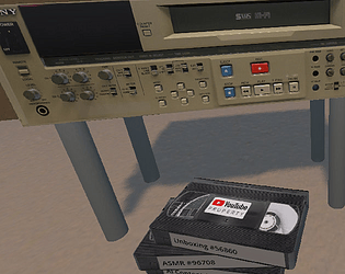
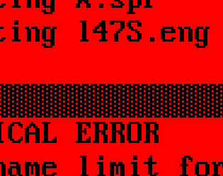
Hi, nope, no progress! I planned to implement gameplay, but sort of ran out of time. I ended up intentially making it extremely pointless, hoping users would try experimenting and try eating a tape, which results in different (very unpleasant) effect, one for each type of tape.
A member registered Aug 14, 2016 · View creator page →
Creator of
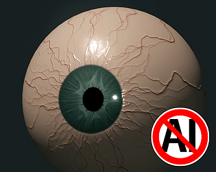
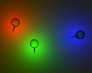
Free Godot eyeball textures made in Photoshop and Krita

Bold and aggressive sign to flaunt your human-made artwork!
Free guide to ChatGPT erotica

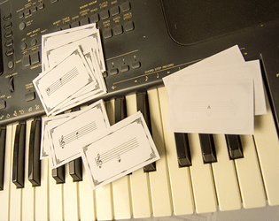
Freebie melody recorded from my Stylophone Beat

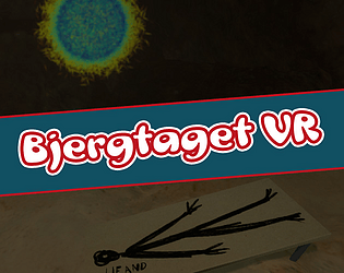
And Other Halloween Flash Fiction Tales
A somewhat saucy Noita mod!
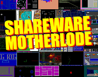
43 ready-to-play vintage games!
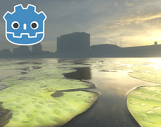
Earth is a lovely planet. Let's make it habitable.
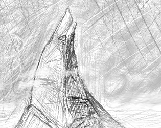
Think Conan the Barbarian, but on Mars!
Grotesque fantasy short story about food!
1912 booklet about the horrors of fleshfood
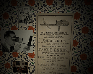
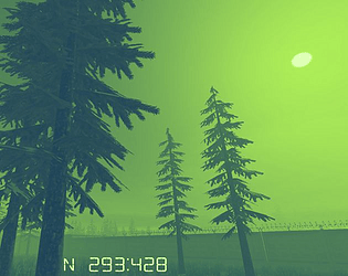
First VR image viewer coded in BASIC!
Recent community posts
itch.io Community » Game Development » General Development · Created a new topic My HTML5 game refuse to be embedded in the itch.io page (2)
itch.io Community » Game Development » General Development · Created a new topic My HTML5 game refuse to be embedded in the itch.io page
itch.io Community » General » General Discussion · Replied to methodia in Has Itch.io Started Healing?
itch.io Community » General » General Discussion · Replied to Hugues Ross in About the censorship situation, and AI
itch.io Community » General » General Discussion · Created a new topic About the censorship situation, and AI
itch.io Community » General » General Discussion · Created a new topic As much as I like sleeze, the BIG one is wether LGBTQ+ is targeted
itch.io Community » General » General Discussion · Replied to Tanith81 in The Censorship of NSFW Titles is Disgusting
itch.io Community » General » General Discussion · Created a new topic Article on the current shadowban
itch.io Community » General » General Discussion · Created a new topic Any must-have games at the Autumn Sale?