Indie game storeFree gamesFun gamesHorror games
Game developmentAssetsComics
SalesBundles
Jobs
TagsGame Engines

Screen estate versus aestetics

A topic by Kasper Hviid created Jul 25, 2020 Views: 279 Replies: 2
Viewing posts 1 to 2
(+2)

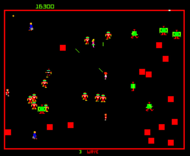
Here's a screenshot from the very old game Robotron 2084. Notice how where is a sort of arena (the red line) encapsulated the action:

The same design was seen in Smash TV, which made the arena design a part of the story:
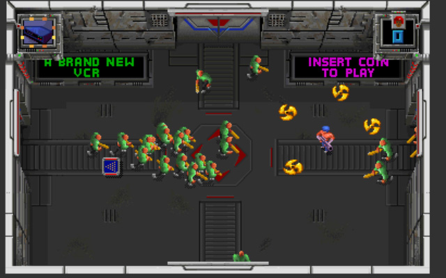


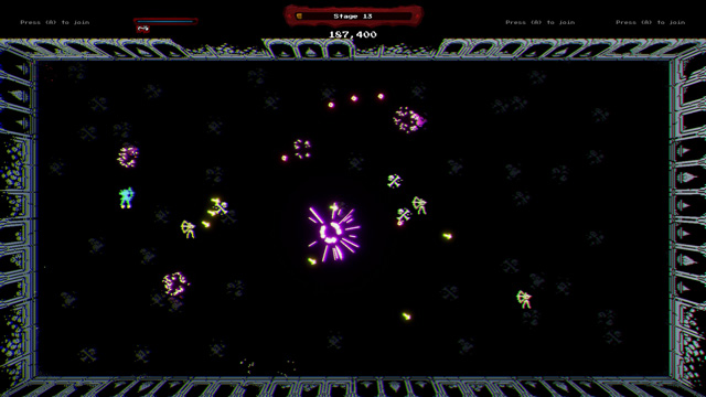
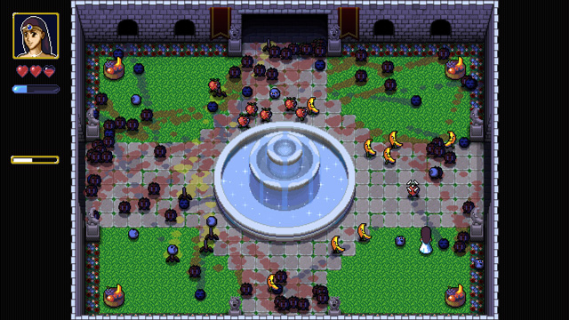
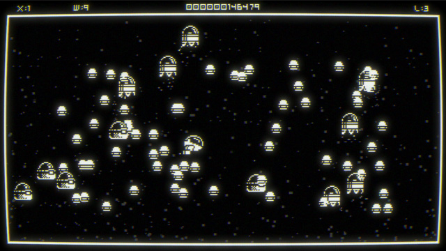
And here is a couple of modern Robotron-like games, Cecconoid, Retromancer and Resistance is Fruitile which sticks to the arena design:

(All three games are way fun! I got them with the Bundle for Racial Justice and Equality)


In older games in general, the interface often took up a lot of the screen estate. Just take a look at Dream Web, Wolfenstein and Wing Commander. Of course, this was a practical decision to keeping the requred computing demands to a minimum.

Today, the trend is to have a discrete HUD giving some basic information. Some games even try to clear the screen of any GUI element altogether.

I'm currently toying with a Robotron clone of my own. This has made me wonder what value it has to the experience that there is this visible arena around playfield, as opposite to just let the screen edges makes up the border?

One advantage I see to the border edges being visible is that it can inform the player where the spawn points are (if any). In the Smash TV screenshot, it shows the doors where the enemies come from. But without the borders, the player doesn't know if they should be anticipating attacks from just one direction or all directions.

Good point. I didn't even think of the practical implications. Also, you can place GUI elements outside of the arena, so it don't obscures the action.

If the borders were a part of the gameplay, something physical you can bumb into, then it makes sense to let it be a visible in-game element rather than just the monitor edge.

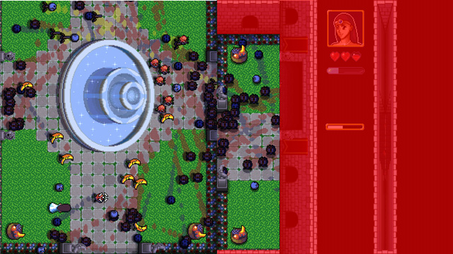
I tried splitting Resistance is Fruitile up, so that the play area is to the left, with the non-playarea stuff marked with red. It really take up alot of screen area! Might be worth it, but it's really a bold design decision.