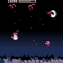
Indie game storeFree gamesFun gamesHorror games
Game developmentAssetsComics
SalesBundles
Jobs
Tags

EmptyStudios

67
Posts
79
Followers
8
Following
A member registered Jul 25, 2016 · View creator page →

Creator of

Recent community posts

I've thought about it but unfortunately i don't really have any ideas on what to add from here. i had some thoughts about other power generation,  but i think renewable energy would be boring and fossil fuels would end up too similar to factorio...

the fluid sim also needs a redesign since if you know what you're doing its pretty easy to make insane amounts of power.

it means a lot hearing someone wants more, I'm sorry i can't deliver... maybe one day I'll get back into it

Really nicely made, good animations, cool use of environmental stuff instead of UI, great work!

Cool movement mechanic! I wish some of the challenges were a bit easier, turning circles can be tight and finicky and managing velocity is hard when the controls are a little inconsistent at times. Neat game though, nice vibes and fun concept, very bold to have such an unusual movement system.

I can't update the game due to it being in a game jam rating period, post jam i plan to patch with a fix for this, apologies :(


For now you can try the command line argument  --resolution 1920x1080 to customise your resolution, but the UI doesn't scale so the game may become unplayable at resolutioms significantly smaller than 1080p. Up to you if you want to try it.

https://itch.io/jam/acerola-jam-0/rate/2581585

everything but the music is made by me, sfx are a grey area cause sampling existing sfx and modifying them to fit your needs is pretty much the only way to do okay sound

Nice pixel art, needs a bit of feedback on the weapon, tracers or projectiles of some kind go a long way to getting more juice in. Nice use of vision cones for tension but the movement being relative to the camera is pretty weird and non standard, most top down games use global directions for each movement key which is a lot less disorientating most of the time.

Funny that our two projects have a lot in common but are totally different genres!

Really nice art and cool visuals, but I feel like the cool visuals are so detached from the gameplay they are a little wasted, there's not really an interesting transition when you hit stuff, and the enemies and spikes feel a bit unimaginative compared to the wild background art.

Platformer controls had a few issues, the player moves in weird ways, especially when falling off ledges there is some weird hyper acceleration going on, the hitboxes are also quite unforgiving, pickups are small but enemies are large compared to their visuals (at least it feels that way) and the player moves almost uncontrollably fast given the tiny screen size.

It feels like the player movement and power up design is designed around a fast paced flow state game where you're moving through the levels smoothly, but the reality is quite the opposite, you need to be slow, methodical and careful. Potentially this is an issue on my end for putting my own expectations on how the game should work, but it felt like there was a disconnect.

Tweaking level designs to be more flow statey, where you can maintain high speed, rapidly dodge or hit specific targets etc. I think would have made this actually very very fun, and a few early levels feel this way to me, so potentially there was just not enough time to iterate on the levels in testing.

Great work again with the visuals, I feel like this criticism is a bit negative but this game is one of the most eye catching I've seen which is impressive and shows clear capability, the tricky part now is building gameplay that's just as solid and exciting as the visuals, when you can nail both you'll have something truly amazing on your hands and I look forward to seeing it!

Really cool concept, it is definitely hard to predict the voronoi cells. I think one thing that would have been nice to kind of animate the regions changing as the turn progresses, it's much harder to build intuition when you only see the before and after.

It's really interesting and I wonder how balanced it is, it could be cool as an online pvp thing like chess or advance wars by mail, you would probably have to rework it so it's more playable in 1v1 though. Also no guarantees anyone would be interested, it's a very complex and interesting game but might be too hard to understand for the average player, still really cool and I'd love to know what high level play looks like. Definitely one of the most mechanically interesting and original ideas this jam.

Also! I appreciate the tutorial, the icons are a bit unintuitive so some work could be done to make the UI a bit more clear, but the tutorial really helped me quickly understand what to expect which was great!

Really neat idea but brutally micro intensive and way too punishing, pretty classic jam vibes to make the hardest video game known to man.

I think some key things to improve experiences like this is to allow some failure, as it stands if you lose even one party member you're pretty much completely dead, and the clunky movement and controls and spotty AI mean you're pretty likely to lose someone to bad luck unless you're extremely fast at RTS controls. Most games in this genre avoid that by letting you pause and queue commands.

The vision cone + movement buffs for movement were cool, and theres a boatload of writing here which is really impressive, most of it is pretty well written though the olde english is a little over the top at times, I think clarity is more important than the flavor of the dialect. Loads of cutscenes and encounters which is cool, but replaying them gets tedious fast and cause of the aforementioned difficulty you're replaying the same encounters a lot.

Great vibes and awesome art all around, there's so much dungeon and character design variety which is super cool, the black and white aesthetic is bold but you've made it work really well, I had no difficulties identifying enemies etc. which speaks to good level design and character design.

Really cool game, great vibes.

Xcom does a flat percentage roll every time a unit sees another unit do an action, based on your current TUs, enemy TUs, and the reaction stats of each party. I like the uncertainty of this but It can be a bit silly or unrealistic at times, it also encouraged moving very slowly and keeping a large bank of TUs at the end of your turn to maximise reaction fire, at higher level play this gets tedious as optimal play is to inch forward and punish enemies who stray into your field of view, it also made reactions one of the most powerful stats since it protected you on both turns. I like the mechanic a lot and it functions well to make both turns exciting, but I didn't like the choice structure it presented (take huge risks and face dire consequences if you want to finish missions in reasonable amounts of time, or play boring and slow). I also didn't like how maxed out units would be basically untouchable since they would mow down anything they saw.

My system makes some changes to address these issues, not perfect but I think it has more interesting decision making. Reaction fire is no longer a roll, during the enemy turn as long as your unit has direct line of sight on an enemy, they start filling a 'reaction meter' (3rd bar below hp and TUs), when the meter fills they either snap fire or burst, chosen at random. The speed the bar fills is proportional to your reaction stat, and a bonus depending on weapon (SMGs and shotguns react quicker than ARs, the LMG cannot react at all). 

Once a unit has reacted once the reaction meter takes half as long to refill, to represent your guy actively enterring combat, the initial slow reaction lets enemies get a bit of a drop on the squad, it's always better to shoot on your turn than to wait for reactions (unlike original xcom). At the start of the enemy turn, units also gain or lose TUs proportional to their reflex bonus, this means low reflex units sometimes cannot react at all, and high reflex units will have a pool of TUs even if you exhaust them entirely. 

This lets you be a bit more aggressive with both types of units, mitigating the x-com crawl somewhat. Units with middling reflexes fit somewhere in between and behave more like x-com units, where preserving TUs for reactions is more optimal, I don't think the play pattern in x-com is entirely bad, I just wanted to softly disencourage the pathologically unfun case of inching forward 1 tile per turn.

I think there's still lots of room for iteration but I was relatively happy with how it felt.

P.S. Nothing wrong with ignoring the manual, I expect some people to do that no matter what, ideally I would have some better tutorialisation and ingame resources to understand the mechanics rather than using the crutch of a readme :)

Thanks for your input!!

Thanks for the feedback, I took a risk making a game aimed at more advanced players in the genre, and I'm glad to see those people enjoy it, even if it's quite hard for newbies (even despite n erfing the game HARD. friendly fire used to do full damage and the basic creatures could 3 shot an average marine)

I'm really glad you got the vibes of the enemies, I was going for an event horizon/doom/E.Y.E feeling with psychic or demonic entities in space, it's a bit tricky to convey that with such simple flat sprite art but I'm glad it clicked for you! There are actually 2 big guys on the ship, but only the one in the reactor fight is truly mandatory.

It always bothered me that the genre has moved towards more percentage based dice rolls when I prefered the simulation elements (I'm a big original xcom fan) which is where the aiming system comes from, it's up to the player to make the call rather than guesstimating a percentage. For snap shots though there is a secret mechanic where you have a bonus chance to make a 'clean shot' where the bullet is guaranteed to go perfectly straight, based on your characters accuracy. As for bonus weapons, there are two, you can find PDWs (an smg alternative) or the revolver on the bridge. I wanted to do more but scope...

Messaging is a very important factor I missed for sure, I really wanted a damage log but it slipped out of my fingers. I also wanted a UI element that would let you cycle through enemy units that were visible to you. A common factor I've seen is people being unable to identify enemies among corpses etc, so that needs a rehaul. There are also some issues with fog of war, many players don't seem to understand the view cones which made them miss obvious enemies.

One question for you since you seem invested in this type of game, what did you think of the reaction fire mechanic? Did you understand it? It's similar to original x-com but I tweaked it based on some things I don't like about their system. I'm happy to explain the mechanic fully but I think it would be valuable to get your thoughts without a technical explanation first :)

I went to gym one time and this is what happened to me immediately afterwards.

Remind me not to join your pirate crew if you're going to give orders like that haha.

Thanks for playing!

Super impressive visual presentation on everything, really cool and loads of juice, wish the game loop had a bit more to it though.

The music is crazy good and really sets the mood, gives me darker hotline miami feelings, fun little game. I also like the store page which is very on theme and in characters, committing fully to the edginess is definitely the way to go.

While everything is really well presented it is a bit too dark, potentially an issue on my monitor? A gamma slider or slightly more contrast on the text + civilians would help make it just a little more readable.

Really cool stuff, I'm jealous of your ability to make such a stylised game with a really consistent visual feel!

Couldn't try the multiplayer but some interesting concepts I haven't seen before, the flipping mechanic is pretty cool but I don't know why you snap the camera 180 degrees on a flip, makes it much more disorientating than it would ordinarily be. There's some major stuttering issues in the web build that I think happen each time an enemy spawns? Seems like it could be avoided with object pooling potentially if it's an object instantiating related hitch. Made it pretty brutal to play.

I solved 3/4 rooms but couldn't figure out the button room, I pressed all of them but nothing seemed to happen? I'm a little lost still.

Really cool central mechanic though, definitely a puzzle game you could make around this, pretty sweet to have a full 3d environment made for this as well with a variety of props too. Although it was a teeny bit too grey, a bit more color would be sweet, maybe each room has a signature color to help differentiate them a bit more or something.

Awesome work!

Spent four hours and unfortunately couldn't beat it. The bone drop RNG is just too brutal for me to ever get past the purple enemies unfortunately, I either lost because I spent too much making a grinder or because I spent too much on ammo. Oh well.

Very fun idea to do a choose your own adventure. A creepy strange tale, love the illustrations that set the mood perfectly. I hope locket-chan is doing well.

PDF gaming can only become stronger.

Pretty cool concept, I would guess you've realised that making first person controllers is really hard after this jam!

Building a game out of rocket jumps and grappling hooks (the second ability is more or less this) is something I'm surprised nobody has ever done, really cool concept with depth to work with there, and your implementation was mostly solid aside from the player feeling a bit slow to move.

I liked the humor in the starting section too ;)

Interesting, that was the second option I thought of way back when, but figured dealing with hardcoded positions would be finicky and annoying. I guess part of it is how much time and effort you're willing to put into replaying the level over and over to hand tweak it to what you like, maybe I just don't have the patience for that lol.

For sounds I normally use a variety of CC0 sources, freesound + sound packs + personally recorded foley and VO, and then I edit them in audacity. It's not as high quality as professional sound designers who can make some truly amazing stuff (idk how they do it frankly), but mixing and matching existing sounds, tweaking their levels and editing them (and building up a personal folio of sound effects over time) is a great way to get more passable sounds. I still have a long way to go though and I don't think my sound design is top notch, just middling to decent... It's definitely a weird grey area for a jam like this where you are 'supposed to make everything yourself', but imo an important part of sound design is repurposing a variety of sfx and it's not really reasonable to do that only with personal recordings made midjam??? Idk I'm rambling now.

Loved your game, thanks for the insight on your process!

I really like this concept but as someone with zero knowledge of flying whatsoever (don't even play flight sims) this was really hard to penetrate. Definitely partially my fault. I eventually got through it and completed it however!

If anything the scariest part was figuring out how to fly a plane after being in it for 10 seconds. I did my best to avoid the ending but I guess you can't? I'm curious if there is only one ending.

I think this is a super cool concept, mixing horror with hard simulation is an awesome combo that I wish people explored more.

Also visually the game is gorgeous, cool cockpit and level, I really love how the houses look in the darkness, the moodiness of the dark night flying is really well done and I loved the vibe.

One major thing that would improve it is subtitles! I'm sure to aviation fans the radio transmission is more understandable, but to most normal people the tower is virtually indecipherable, which made following their instructions even harder.


Also the first time I played I rolled back through the hangar, jacked up the accelerator and took off vertically from a stand still, but I did safely bring the plane back around and land despite saying nothing to ATC. I'm sure there would be a small fine for such behaviour.

My favourite game so far, cool idea, cute art, decently complex and I really like how interactive everything is, sandboxy gameplay is super fun.

It's incredibly hard, or I'm playing wrong, not sure which, but it does feel like the requirements for getting your first structure are quite complex, an early game stepping stone to get started would be nice, the crafting is an interesting mechanic but a little clunky to use, especially when the menu goes off screen.

I really want to beat it so I'll be coming back to this one, but I genuinely mean it when I say this is my favourite so far, it really gets my brain ticking which is awesome.

I love shmups even though I'm bad at them, this one has great feel, good controls and popcorn enemies are fun to kill, I kinda wish there were continues because I died right before the boss died and had to fully replay it...

At first I didn't understand the point of the glitch enemies, they can't really hurt you as far as I can tell, but when I reached the boss it made more sense since it uses a variety of projectiles, I understood how to beat the boss instantly which was great, good telegraphing.

I wish the sound effects were a bit nicer, most seem to be very short quiet synthesised sounds, but they aren't super appealing and made blowing up popcorn feel a lot less satisfying than it could be.

I've made a shmup for a game jam before and I really struggled to generate interesting enemy patterns and test the levels, in my shmup I had a unity scene that had all the enemies laid out vertically, and as the camera scrolled up enemies would activate. This helped me visualise the level but still was clunky to work with and far from ideal. How did you do it? I felt like your enemy and bullet patterns were way better than the ones I've made in the past.

Simple really cool concept, big fan, I got on a good run and got to about 950 and then I ran into a glitch block and had to press combo keys to move and it made me genuinely want to cry so great job there, emotional response achieved.

Nice game, runs well even with what looks like thousands of enemies on screen which is nice, the spiral mechanic is neat but I think could be fleshed out more, there's some depth to that system (Reminds me of noita wands) but in this demo its not really that important the order you do stuff. I like it in theory though.


Fun game, I never played vampire survivors but seems like you've implemented their winning formula pretty well, nice work!

Cool concept and I like the physicality of it and how it's built into a real space, the main menu lighthouses are very cute also.

A little bit too trial and errory, I'm sure there are some ways to do it better and maybe my brain is just bad at rotating stuff mentally but I found it really hard to visualise what was going wrong so most of the time I was randomly nudging things back and forth a millimetre to try and get progress, it was pretty rough towards the later level.

Good call making level selection to avoid getting stuck.

Also! I somehow found a soft lock on the main menu by hitting escape or something while viewing the credits! It doesn't really matter but I thought I'd mention it because I'm proud of finding such a weirdly specific softlock.

I'll make an update post-jam with dynamic res.

For now you can try the command line argument  --resolution 1920x1080 to customise your resolution, but the UI doesn't scale so the game may become unplayable. Up to you if you want to try it.

Sorry for the inconvenience, thank you for letting me know.

awesome work finishing it, thanks for playing! i've beaten it about 3x myself and it's definitely an effort to make it all the way through, really appreciate it!

got it in 22 clicks and 5 buttons, really really hard to figure out, cute idea and the button slicing is super satisfying, a great little joke game I like it.

would be nice if it was slightly easier... and i think more importantly it needs a reset button, or some way to join buttons, if you have too many random buttons it feels nearly impossible to finish, maybe it is but I think you'd need PHD maths to prove it either way.

Nice job!

20.54 is my PB, wish there was a quick reset button to try and push it down lower.

I really like the commitment to the artstyle, it's not the most beautiful game but it knows exactly what it's trying to be and that's it's own kind of appeal. Like a painting of a space ship made by a little kid brought to life, I think it's super cute. I also really like that you show the next checkpoint so you can plot a better maneuvre for speed, it's a small feature but it makes the game much more enjoyable to try and optimise.

The aesthetic reminds me strangely of Oddworld, really cool art and lots of unique set pieces which is so cool, every screen is unique. I liked the ending a lot, not what I expected to happen. Great work here.

(1 edit)

Very nice art and pretty nice level design, memorable rooms and layouts as evidenced by the final objective. Cool art style, stability and framerate were pretty jank all around though.

Armacham are really getting into all sorts of trouble nowadays.

Oh yeah and I really liked the police car asset, I see why it's on the front menu. Nice work on the IK on the hands too, saves so much time when you only have to keyframe hand positions lol.

Chill game but gets a bit tedious. I cleared the whole map and it took me over an hour cause I had to leave it in the background to charge.

Performance got quite bad towards the end, too many trees maybe...

Really cool changing minesweeper, a game that's normally tense, into a relaxed version where you can take your time and there's no lose condition, it's a very different vibe. It was cool learning new patterns I'd never considered in minesweeper because you lose instantly on hitting a mine in the original game.

I liked the ideas for modifiers, the circle one that sums nearby die seemed really good, some cute shader work, I like the subtle voronoi stuff going on under the dice. Felt a little flat without any sound effects but was overall pretty sweet, nice work :)

you should mark your download as apple only, it doesn't contain any windows executable so can only be played on osx.

https://emptystudios.itch.io/breach-protocol really boosted my game's vibes, thanks so much for this awesome collection.

Really nice art across the board, sad theres no sound yet, looking forward to that.

VFX looks great and animations are good too, very solid presentation. UI is a little boring but it functions and doesn't stand out as bad or anything.

Player movement and enemy movement could be a little faster overall, early game it was nice to have the slow pace but as I got better it became a little tedious. Maybe as you get deeper into the dungeon the player + the enemies can naturally speed up? Making the countdown before each room starts visible might be nice too (a simple circle wiped ui element is probably enough? just so I know when the action starts)

I like what I see but it feels a bit basic for now. With more items + spells and maybe initial character select I can see this being a really good concept, especially if the art remains at this quality.

Oh yeah and I think the walk cycle has foot sliding.

Character art is cute and the writing is mostly decent, but i think the dialogue itself needs another pass, I'm not good at dialogue myself so I'm not sure what's wrong, but to me it feels slightly unnatural, hard to put my finger on what's wrong but that's just my gut feeling.

Combat is snappy and fun, some more enemy variety would be sweet and I like the telegraphing of enemy behaviour, but it didn't really click for me for a while. Maybe tooltips on enemies could help give a bit more info on what they are doing, at least until you learn what each icon means. I love the crabbos.

Levels are mostly passable but a bit repetitive, falls into the common pitfall where theres loads of map but most of it is using the same 3-5 assets so it's easy to get lost or confused. A bit more variety in overworld art would really help there.

It's a bit weird that enemies don't respawn and are optional. Feels like a way the player can screw themselves by not fighting enough enemies to get enough xp to stay relevant later on. This is a cursed JRPG problem in general, but I think it's worth keeping in mind.

The UI isn't ugly but it also isn't pretty either. It feels a bit off. I think the completely flat UI might be what's wrong here, and the large dead zones on different screens made it feel unpolished. The actual art used seems mostly fine, theres just something off about the composition of UI elements that makes them feel slightly jank. Maybe animation could help here?

Fun demo, would like to see more.

The music is great btw, the menu theme sounds really familiar, I think it has a similar melody to a lovely planet track? I like it, feels very anime bop.

i plan to keep colliders on to avoid physics issues, but it definitely needs tweaking cause it makes movement annoying. The dialogue thing is just a placeholder cause I had an update timing thing where when I bound it to E you got softlocked in convo and I just did the hack fix of swapping input until I have time to fix it.

Thanks for the feedback. The ute controls are fine that's just a skill issue ;)

I don't really like this genre as a whole, so I won't give much feedback cause I'm just not into it and that's not your games fault.

The writing is mostly decent, I think some references are a bit too on the nose but also the target audience will probably like this. Jojo is ok, but I think you should change her design to be less like you know who because it feels less like a homage and more like a ripoff.

The art is nice and the sound is good. I think your audience will like it.

Combat plays horribly from the top down perspective, enemy windups are insanely fast and stunlock the player instantly sending you back 5 screens. Which wouldn't be so bad but the player movement is slow and painful, and a lot of design choices rub salt in the wound of the unpleasant combat. Animations all around are bad and it doesn't seem like any thought was put into enemy encounter design, just spam enemies in rooms. Enemies also have visible stamina and mana bars, but basically can't deplete the former and the latter doesn't seem to do anything, so that information is just useless.

Starting the player with no simple access to a weapon is quite annoying. None of them are locked behind particularly difficult challenges, you just have to walk past most enemies, but it means combat is basically pointless until you find one of the weapons. I played for over 45 minutes before I found a weapon. It wasn't enjoyable.

Putting gameplay critical information like how to use consumables or perform alternative attacks inside pamphlets is a bizarre choice. Particularly when you can just check the control binding screen for that information. I'm not really sure what the goal of the pamphlets is, either the player checks the control scheme and they are useless, or the player will be frustrated by important mechanics being taught to them by random missable objects on the ground.

The campsite UI is confusingly designed and annoying to navigate, and the level up screen being separated feels arbitrary since camp fires always feature both. The UI also has a hard to read font and black on grey text is doubly annoying to read. It's also annoying that consumables are so readily available but not explained in the tutorial and not equipped at all by default. This feels totally nonsensical to me.

It's clear to me a huge amount of effort has been put into building the complicated combat system, but the combat itself isn't actually enjoyable at all. Attacks are overly punishing, stunlocks are common for AI and players alike, healing is slow and irrelevant in most combat, AI are highly aggressive and often lack punish windows and it feels to me like ranged weapons are simply overpowered as they let you ignore the AI.

I feel like this game falls for the common pitfall of a designer building content, playing it one time to ensure it's beatable (likely with full equipment, and with the omniscience of the game designer), then moving on to the next piece of content. Even if your game is intentionally difficult this is not a good way to design, you have major blind spots for the users first time experience, the pacing of the game and the ways in which it's frustrating.