
Hello creators! Automatic GIFs and gamedev clips thanks to AI – how I created a tool that does my marketing for me (Promo Cutter)

As a tech enthusiast, I've been testing how artificial intelligence can make our daily lives easier. I create graphics and game assets myself, which meant I used to spend way too much time on the tedious editing of promotional videos. Recording your work in a program takes just a moment, but cutting out the interesting parts or making GIFs for social media could take a whole evening.
I decided to check if I could write a program with the help of AI that would do it entirely on its own. That's how Promo Cutter was born. The result exceeded my expectations, so I'm happy to share what this automatic tool can do:
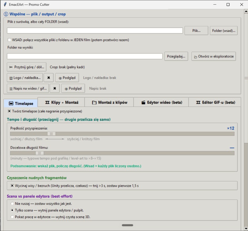
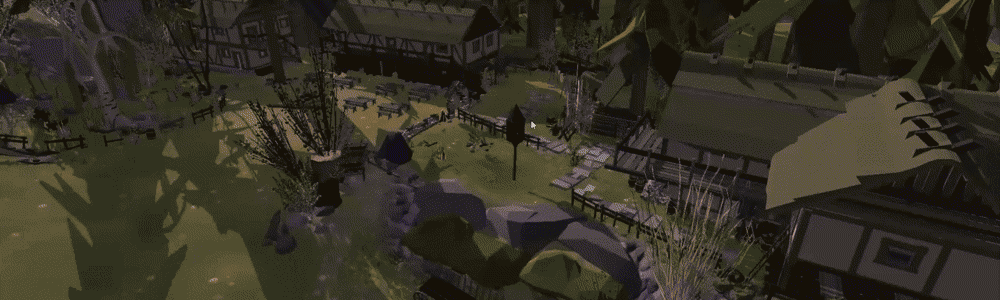
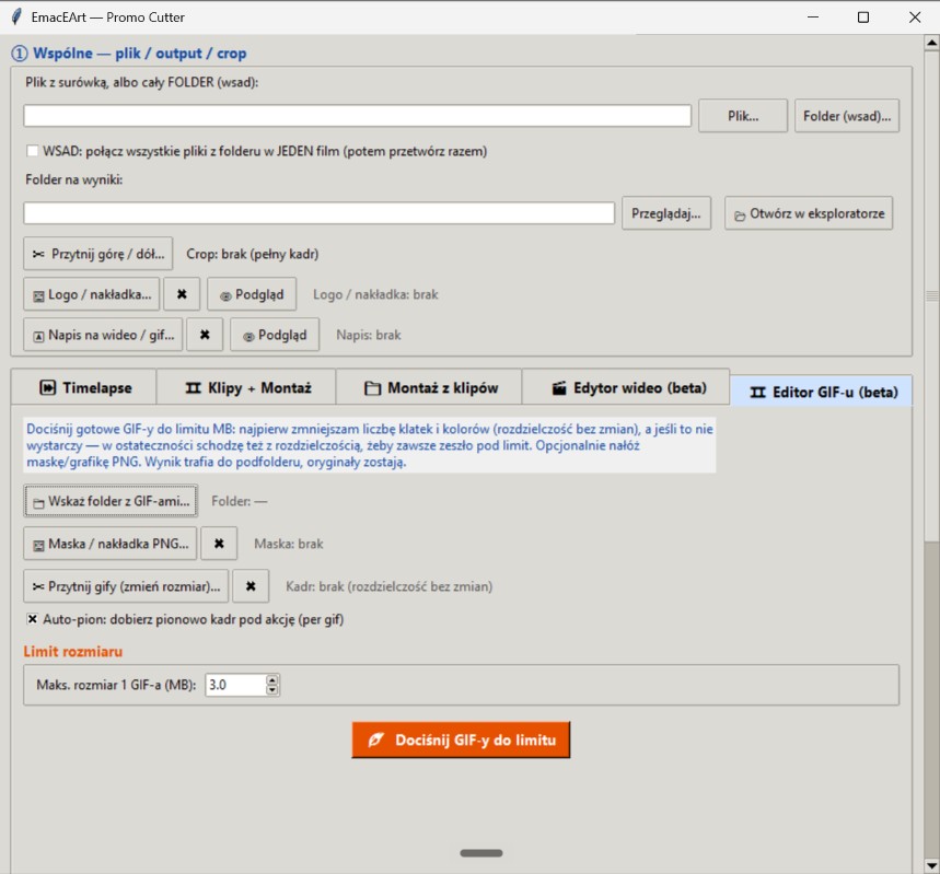
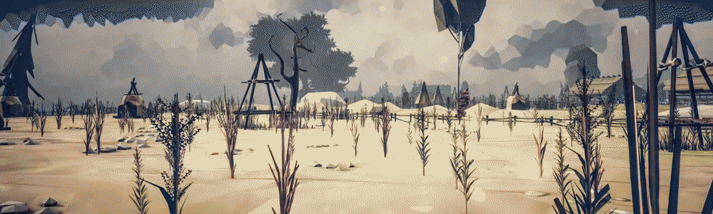
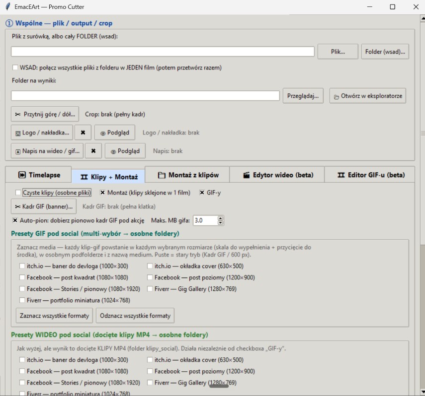
Optimized GIFs tailored to platform limits: Anyone who has uploaded materials to itch.io knows the pain of tight file size limits. The program automatically compresses the GIF size (e.g., perfectly under a 3 MB limit) by smartly reducing the number of frames and the color palette, while maintaining a nice, clear resolution. Additionally, it has a feature that detects motion and can automatically crop a wide image into a vertical format for phones.
Lightning-fast Timelapse: The program takes a multi-hour recording and creates a smooth, accelerated video. Best of all – it automatically detects and cuts out boring moments when nothing was happening on screen (e.g., when the system was baking something or compiling, and I was just waiting).
Automatic clip cutting: The app can "review" the recording, evaluate the aesthetics of the frames, and choose the fragments where the most action happened. It can save them as separate, short videos or immediately stitch them into one dynamic montage film.
Recent improvements from battle tests
The program is already working in practice, and thanks to great feedback from my tester Filip, we managed to introduce some fantastic improvements:
- Formats for social media and Fiverr: In addition to GIFs, the program can now generate cropped video clips tailored directly for social media, as well as demanding gallery templates for Fiverr.
- Massive speedup: Instead of analyzing the video multiple times for each format separately, the application now does it all in one go. This shared analysis means that ready-made promotional packs pop out of the program instantly.
- Lighter files and order: We fixed an issue where the finished videos were too heavy. Now they are perfectly compressed and lightweight for publication. The program also started naming files better (adding a clear "original" tag to the source file), so nothing gets lost in the folders.
One quick note – the tool's interface is currently in Polish, as it is still undergoing final development tweaks. However, I am strongly considering hosting the project on GitHub. I would love to develop this app out in the open alongside the community, shaping its future features directly around your feedback and suggestions. What do you think about this idea?
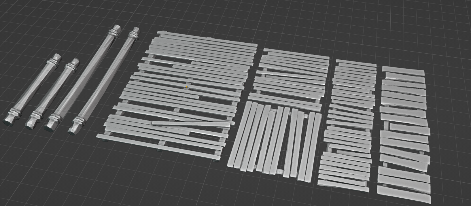
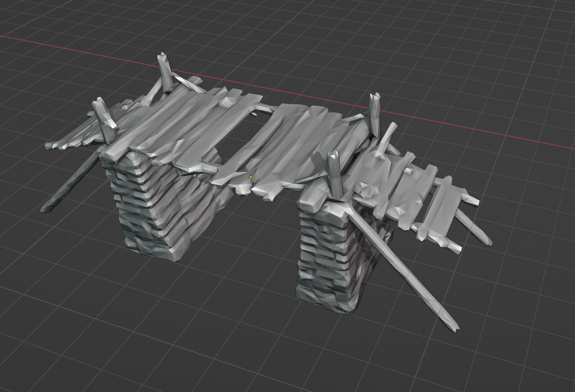
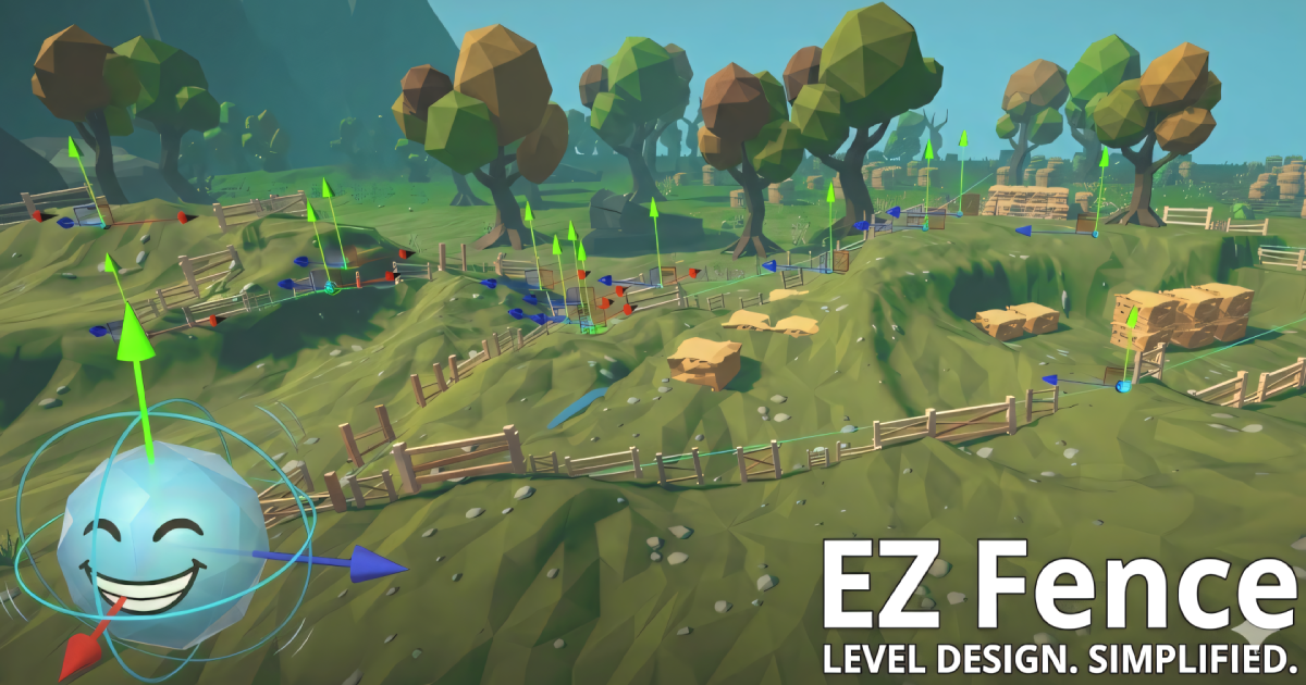
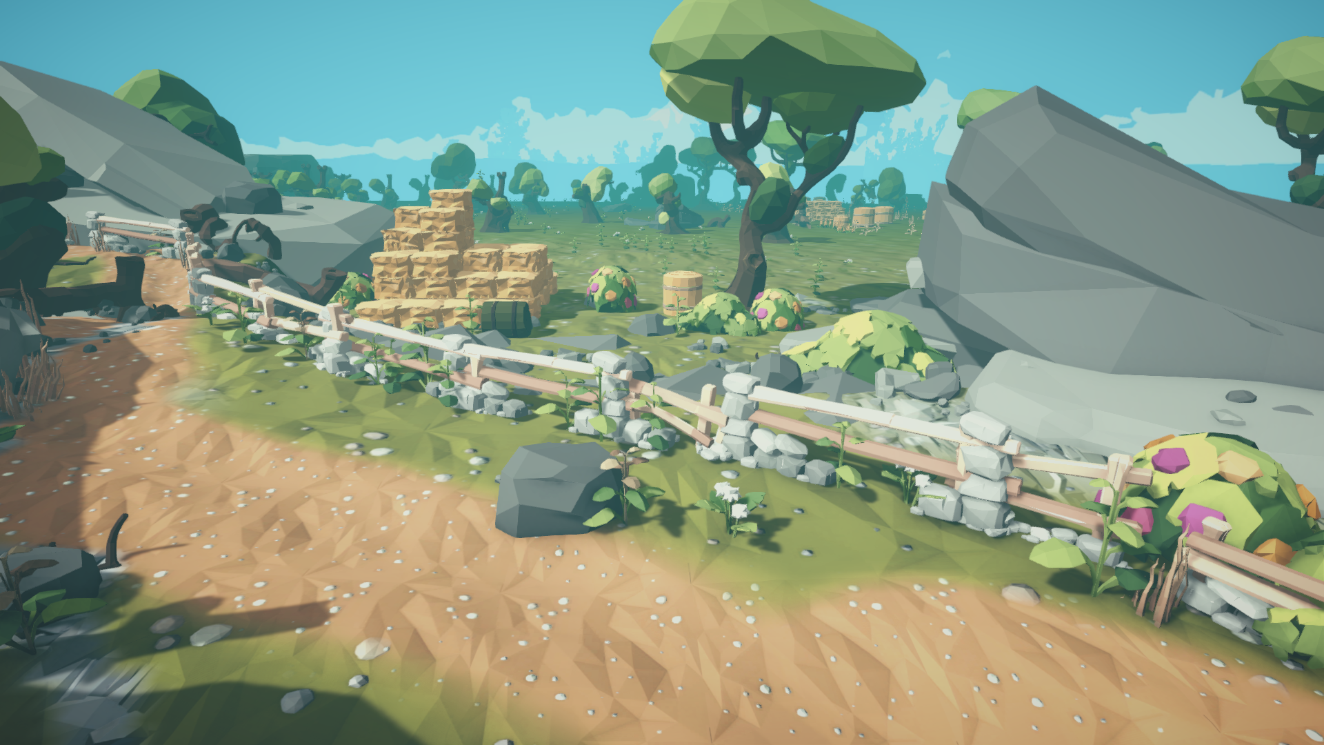
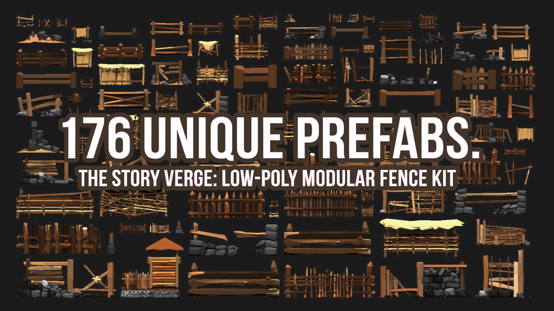
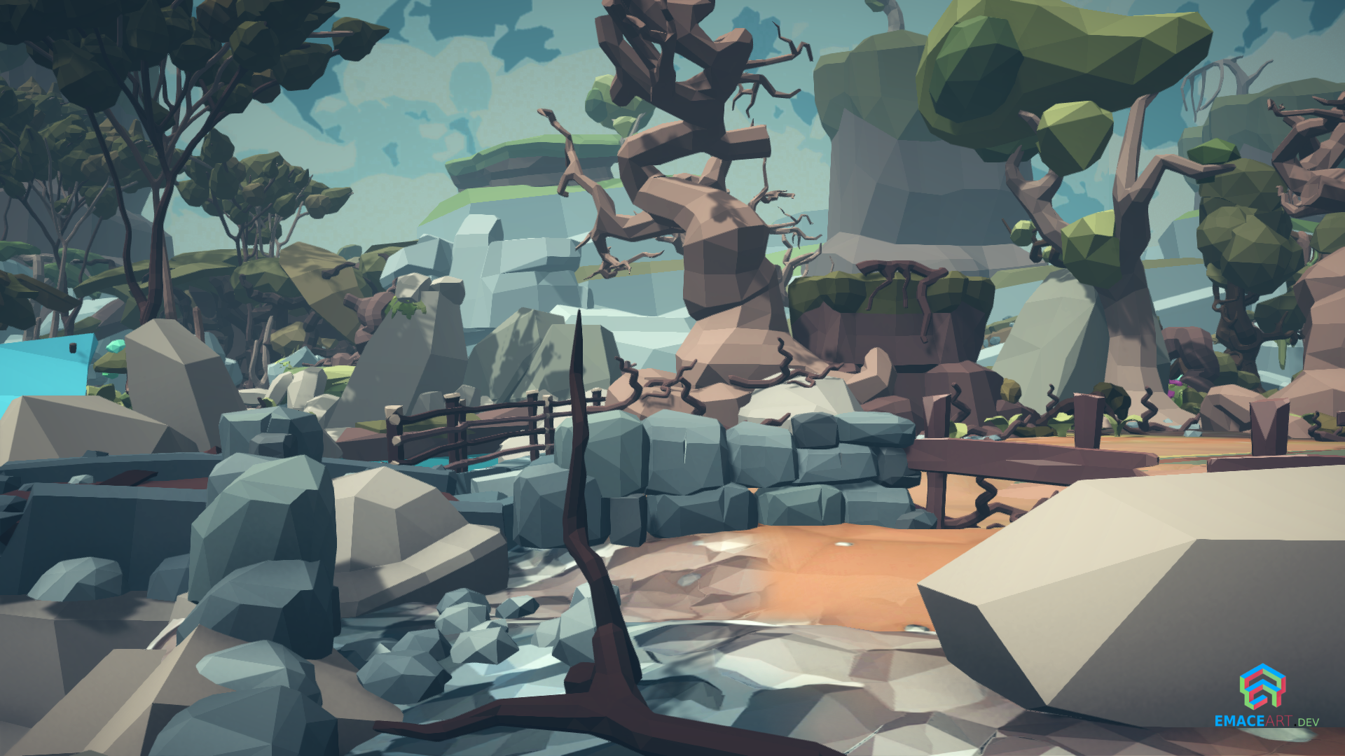
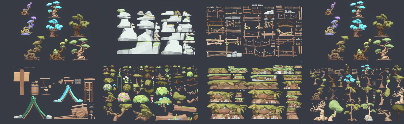
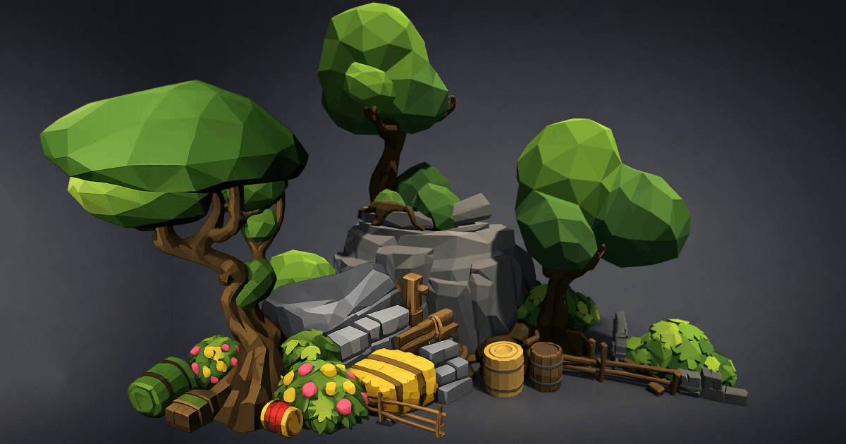
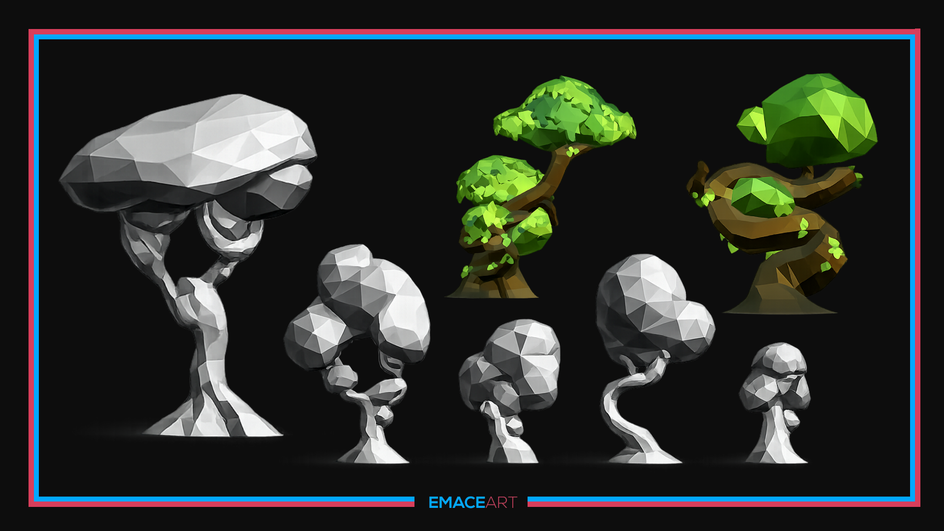
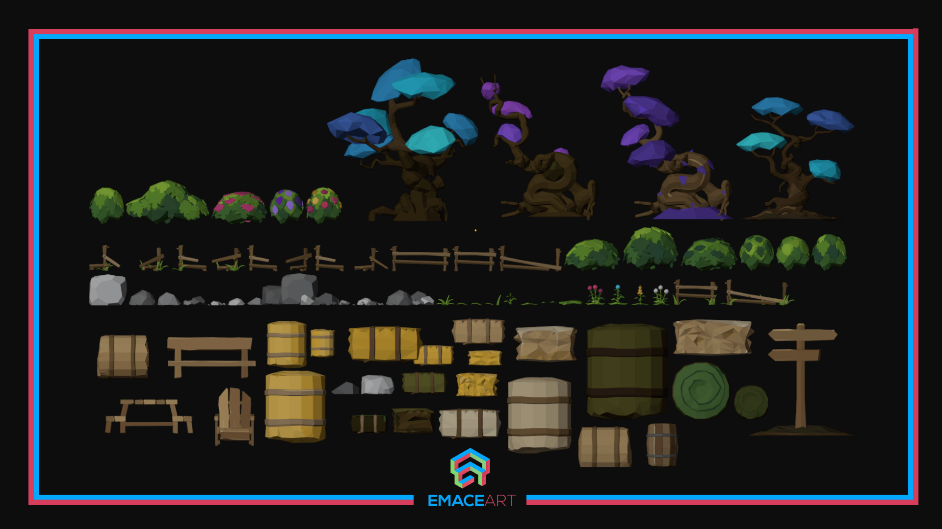
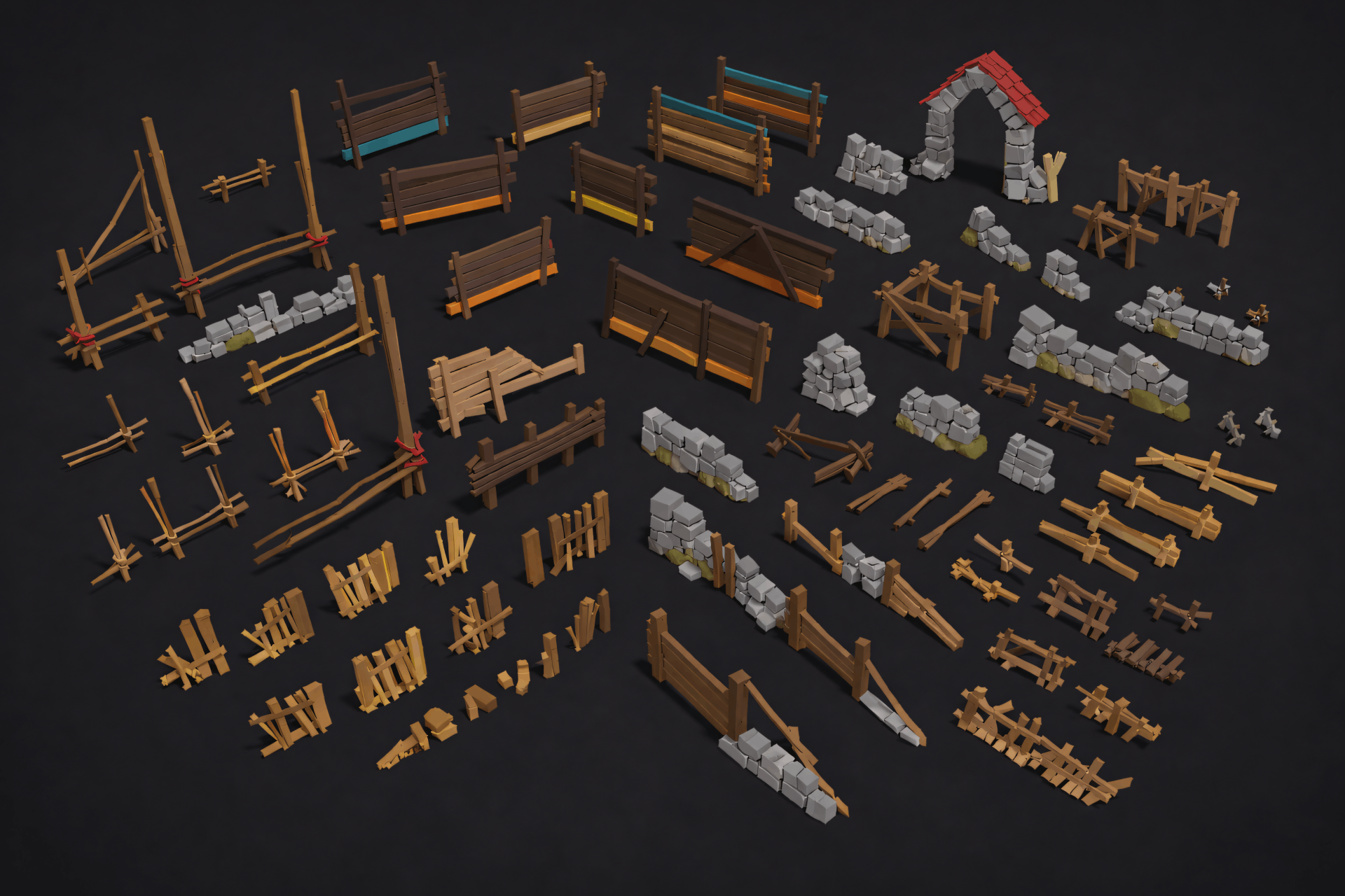
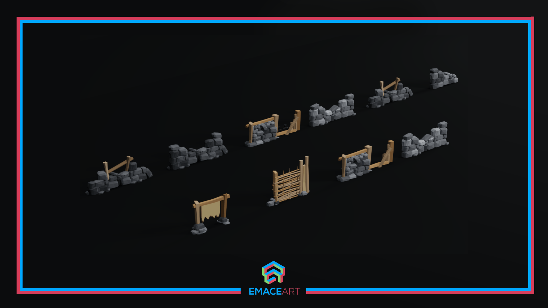
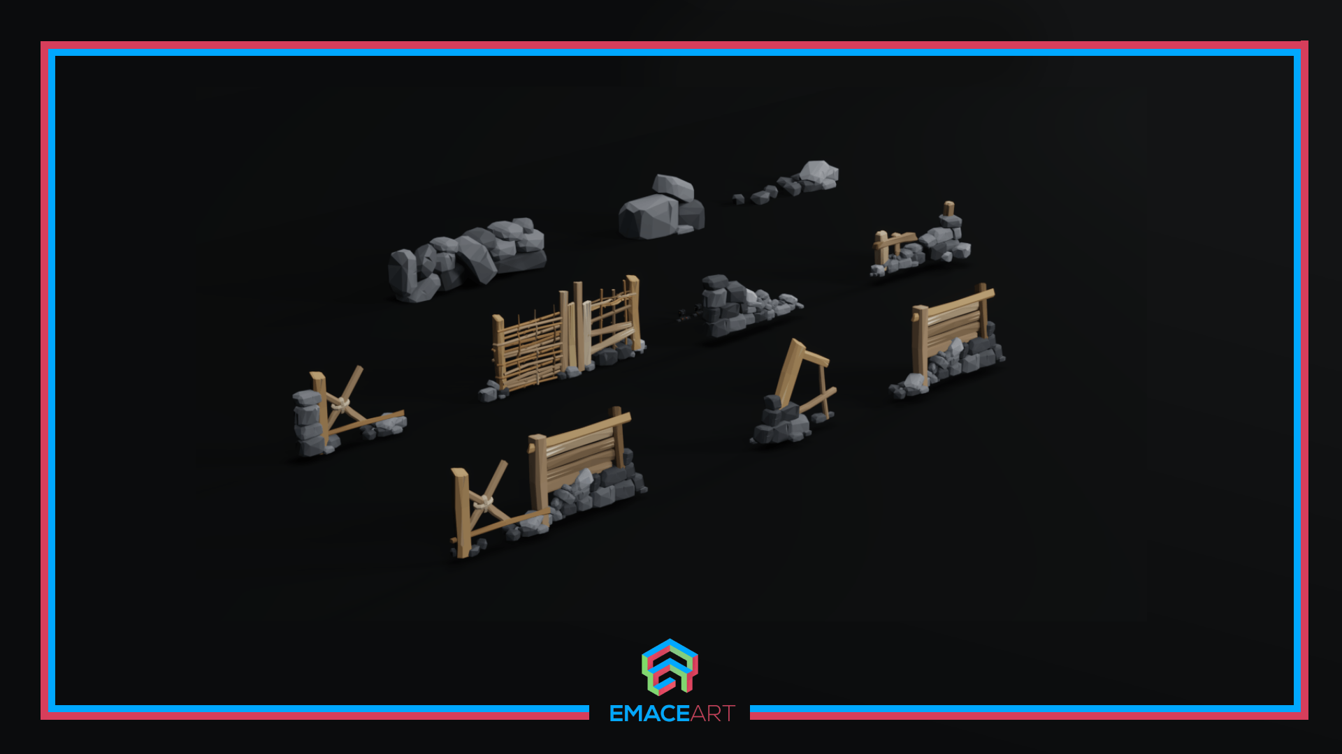
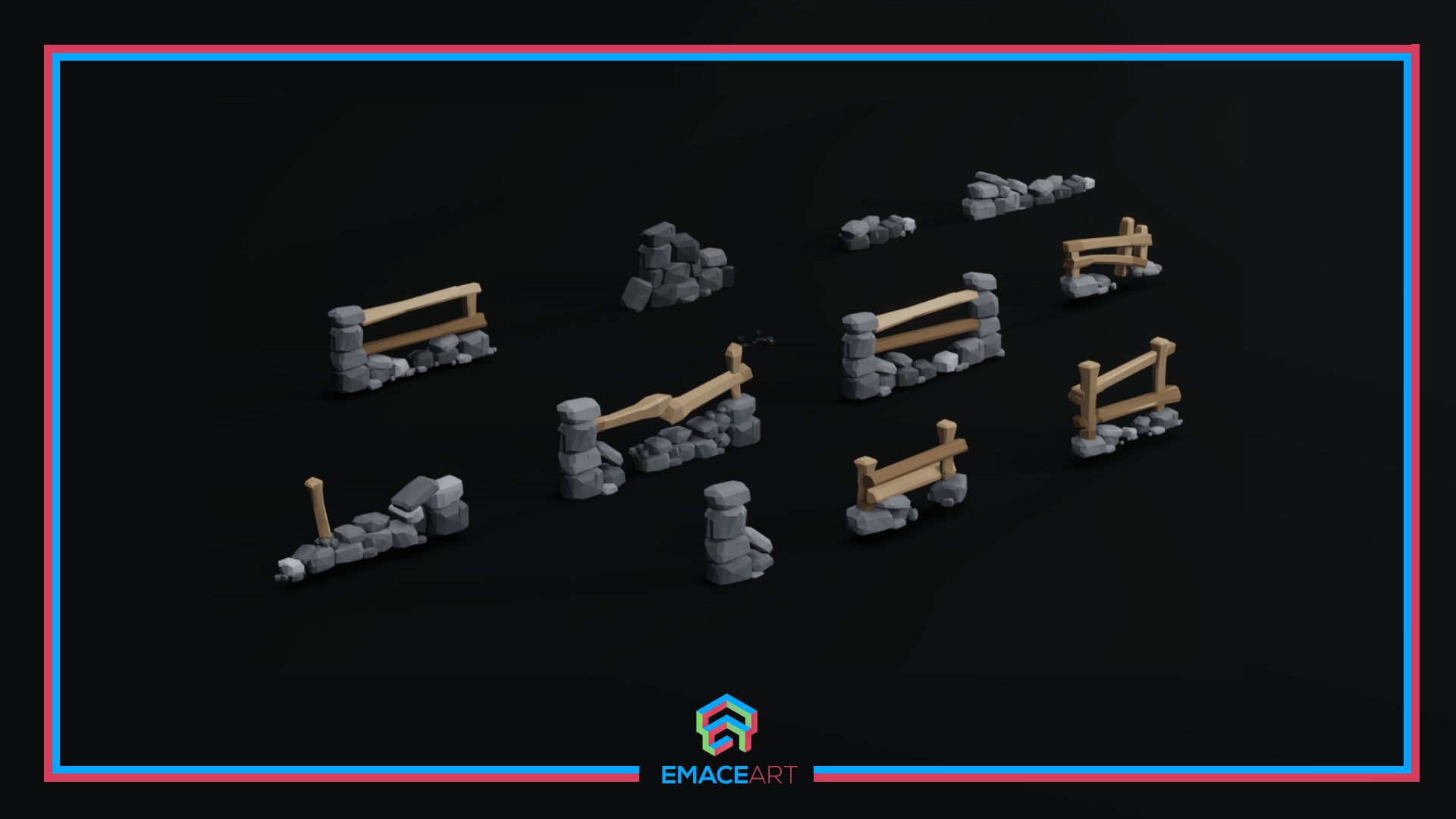
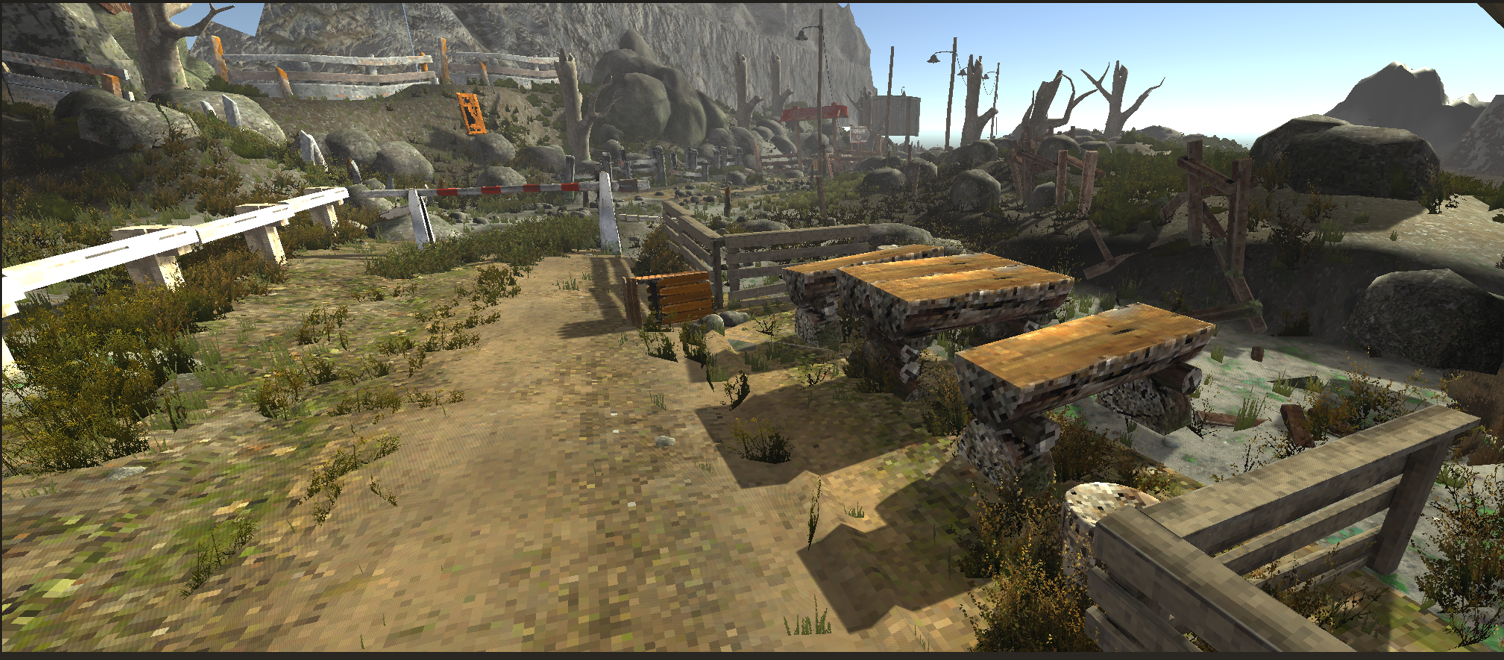
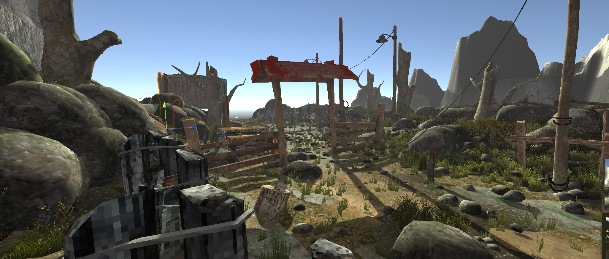
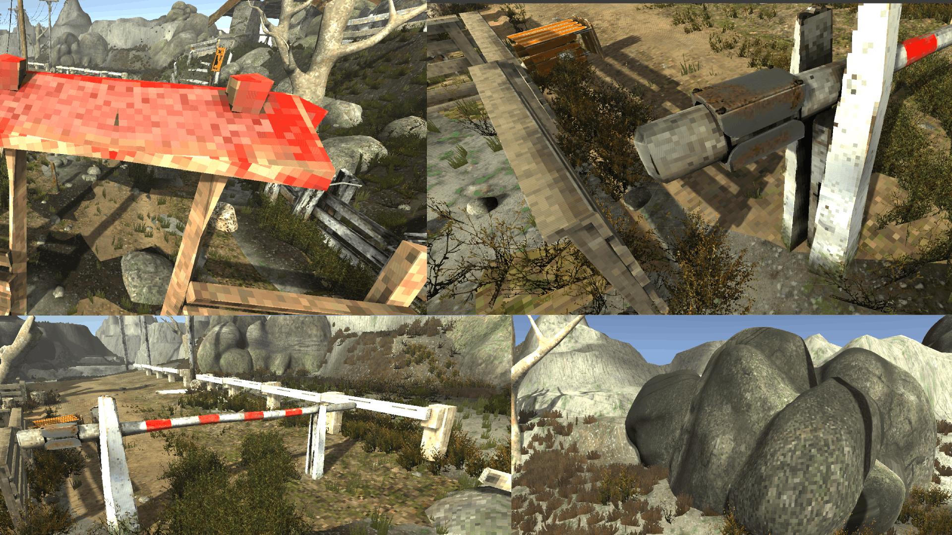
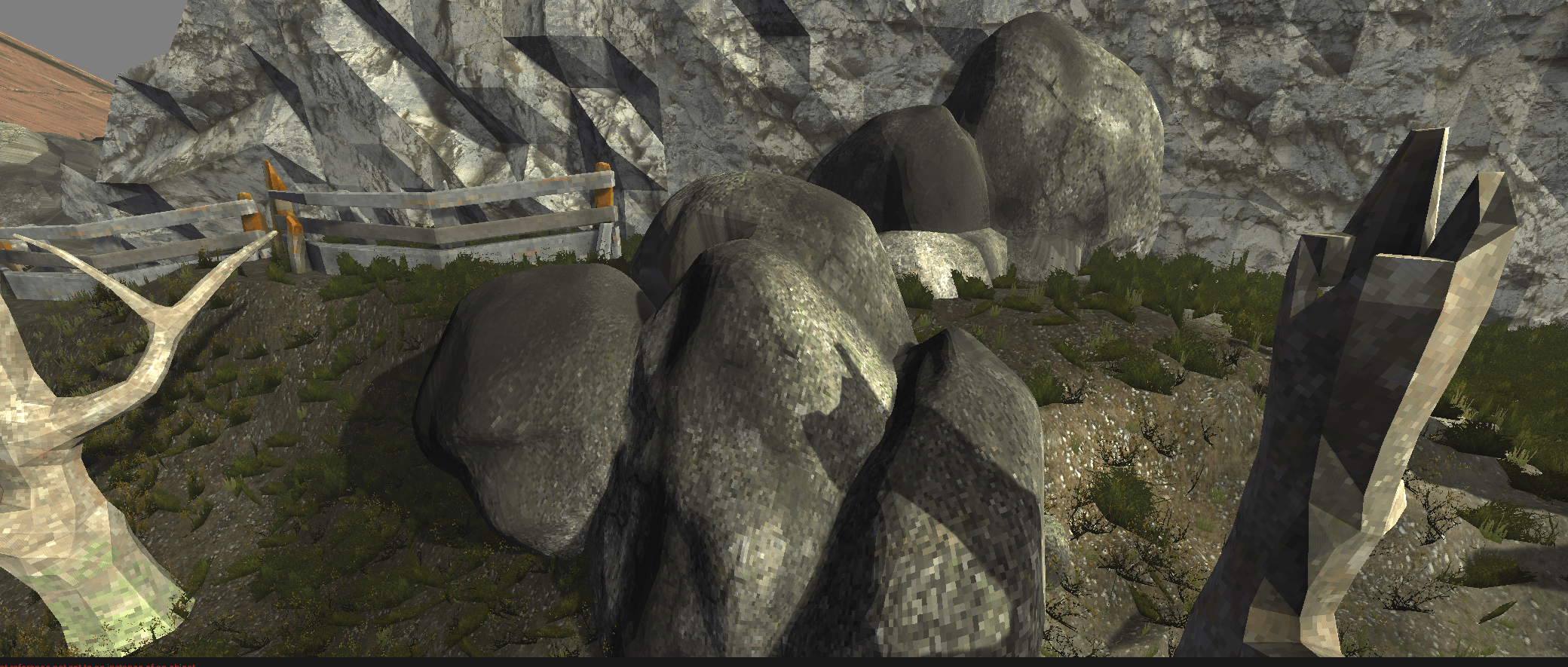
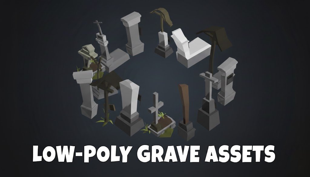
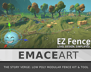
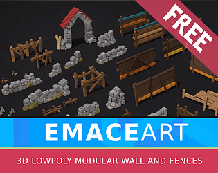
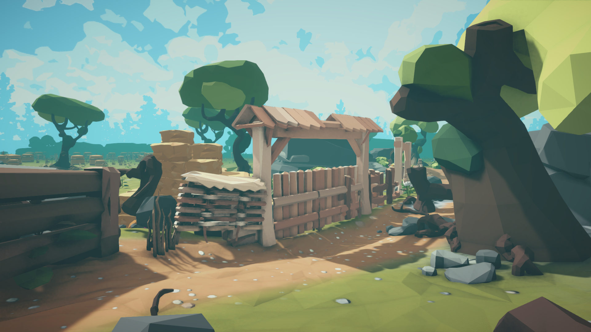 Fence systems are often overlooked but essential for believable level design. In this devlog, I break down the creation of a modular spline-based tool, focusing on low-poly optimization and workflow efficiency.