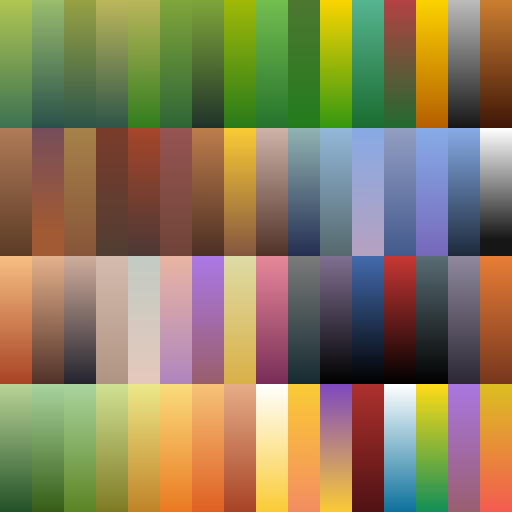
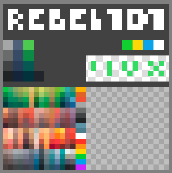
Thanks a lot for the message and for taking the time to go through my stuff on itch and elsewhere, I really appreciate it. About the palette: your timing is perfect, because I’ve just refreshed my texture pipeline with „future-proof universality” in mind. I used to work with very small atlases, a few dozen colours on a tiny texture, and that was fine for a long time, but as the packs grew it started to block me: no UV space left, no room for new materials or variants. Now I treat a 2048 texture as my base atlas, intentionally leave some empty areas for future extensions, and from that base I can comfortably generate 1k/512 versions if someone needs lighter assets. In that free space I can not only keep adding new colour/material samples, but also pack in bits of text - signs, labels, markings - without having to create separate dedicated text textures.
Instead of one palette that should cover everything, I prefer a few palettes that are universal within a given mood. One base for neutral/daylight sets, another for darker / dungeon / swamp stuff, and another for neon where contrast and saturation behave differently. Inside each mood I keep one main texture and slowly fill the empty areas as the pack grows, so new updates still feel like the same world, just richer.
When it comes to colour choices, I try to mix intuition with some classic schemes from the colour wheel. For more futuristic moods I lean into complementary, high-contrast pairs - opposite hues give that punch and energy. For natural daylight landscapes I prefer analogous harmonies: ground, rocks, soil stay in related tones, different forest layers (undergrowth, bushes, canopy) are still neighbouring colours, but pushed apart in value and temperature. Accents - flowers, small props, gameplay elements - often come from the opposite side of the wheel so they pop immediately in the frame. For nature I generally avoid very synthetic hues, so I usually end up with earthy mixes: greens nudged slightly towards browns and yellows, and so on. My personal “colour flow” gravitates towards a pastel-like feel - an almost idyllic, candy softness, but slightly roughed up so it doesn’t become sterile. It’s a lot of gentle, light tones with a hint of juiciness and a bit of “dirt” in the colour, which keeps the scene pleasant but not plastic. All of that comes straight from colour theory, it’s just that after years of practice it feels like intuition in day-to-day work.
While browsing your profile I found Praise the Storm and Pixel Renderer - really cool combo. The game nails that “storm cult” vibe, and the pixelator looks like a great custom idea/tool, congrats if that script is yours. I’ve been dreaming for a while about making a very raw, ascetic game with a heavily limited palette, focused on mood and exploration rather than detail density, so tools like that are extra tempting. I’m really curious how you define your own “universal” palette for projects like these - is it mostly a set of colours, or more of a full bundle of materials and shaders? If you ever share a breakdown, I’d be happy to compare approaches.