
Indie game storeFree gamesFun gamesHorror games
Game developmentAssetsComics
SalesBundles
Jobs
TagsGame Engines

Thank you so much for the detailed reply. and for taking time to explore my work. If you are interested, my portfolio has some artwork i did using either flat or gradient textures: https://bukkbeek.github.io/

Similar to you, I used colors/ gradients to match the aesthetics I'm going for. But then I wanted to make a universal palette:

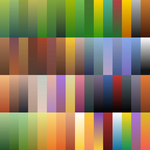
This is one of my gradient palettes: 

But this did not live up to my expectations as I had to tone it depending on the project. For example this following airship used a less saturated one: https://sketchfab.com/3d-models/nomads-barge-wandering-airship-of-elysium-7192f9...


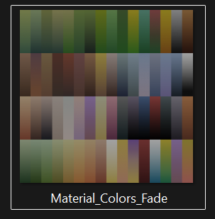
This also has a flat version as well:

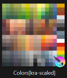
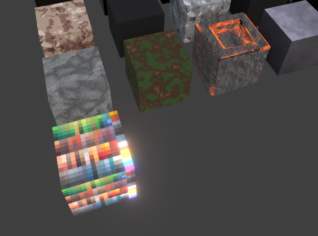
In all, I maintain a material library to use from if these are not enough (specially for grounds/ camo), then I bake it:


But I think this final palette still needs a lot of refinement as I ended up using some colors many times and some never used at all. 

On the other hand, I was thinking an approach similar to your idea as well, having a bigger single atlas and build colors as I go. 

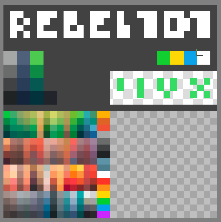
That's how I approached making my portfolio game: REBEL.101 by Bukkbeek using following texture:

Hi!

So, coming back to the idea of a universal palette: in my packs I’m leaning more and more toward a single shared 2048 texture atlas, roughly divided into four working zones. One of them is a grid color used for picking materials: a full spectrum of base colors plus their shades, which I treat as the foundation. The remaining space I intentionally leave empty so I can keep adding new colors over time as different projects need them.

That free space is also a workspace for artists using my packs. They can paint in their own colors there or drop in textures for signs, billboards or labels. Obviously, if someone edits the original atlas that ships with the pack, there’s always a risk that a future update will overwrite it. In practice though, I assume studios hook up their own extra textures and keep things clean in their pipeline, instead of modifying the “factory” file. For me, mixing grid colors and utility textures like signage on a single atlas is completely fine.

About your point on having to tone colors down depending on the project: my solution is to prepare variants of the same texture. From one base set of colors and shades I create a brighter and a darker copy, because users asked for those options. They then build their own materials on top of that - for example, they plug in the “brighter” atlas and get new variants of their prefabs without touching the original.

The fact that there are colors on the atlas that you’re not using right now isn’t really an issue in my view. As the project evolves, you can gradually replace them with new hues, or just keep them in reserve until they’re needed. With a 2048 atlas where a single cell in my grid color is about 62 pixels, it’s very hard to actually run out of space - you can always add, shift or replace something.

That’s why I think your final decision on REBEL 101, to move toward a bigger atlas, is a solid one. A texture of that size not only makes your own work more comfortable, it also leaves plenty of room for future users who might want to add their own content. That’s exactly why I build large atlases myself, designed from the start with future expansion in mind.