Hey, thanks to those who reached out but I joined a team and I think we're full up at this point. Best of luck!
BreakfastAvenger
Creator of
Recent community posts
EDIT: I joined a team, thanks to those who reached out
Hi folks!
I'm an experienced C# programmer looking to join a team to build something in Unity or Godot. I have a few jam games posted on itch that you can check out, but I have quite a bit of solo development experience beyond that as well. I'd like to branch out into working with a team, so reach out and maybe I can help you make something cool!
Thanks! I am a little embarrassed to admit that I had not even thought of the spherical gameplay as an embodiment of the jam's theme until you said that. Part of me wants to defend the resource system and point out that it is deeply embedded in the core game balance, with different strategies producing fairly different experiences depending on when it's used. However, it's clear from your feedback and others' that it's not coming across with a strong thematic feel, which is fair enough.
Anyway, I'm glad you liked it! I'm kind of blown away to be getting positive feedback on this one, because when I started it was sort of a random, off-the-wall idea that I didn't really expect to work at a pretty basic level.
Thanks for all the feedback!
I try to avoid putting in health bars unless I need to, but I agree that the purple, spinning turrets don't give enough feedback about how much damage they've taken in particular. With 15 hp, they require nearly two seconds of direct hits to destroy, even if you don't miss. I wanted to do some sort of "damage stage" system where they'd get more beat up after taking hits, but since I didn't have time for that, yeah, I prolly shoulda just done floating hp bars.
Really good game! It's fun to play, and it feels like it has a lot of content. I like that each gun feels a little different and requires a slightly different playstyle.
I think the camera should be MUCH further zoomed out, like maybe even twice as far out as it is now. Ideally, if an enemy can shoot me and I can shoot them, I'd like it if they were either visible or at least pretty close to the screen's edge most of the time.
I also thought it might be nice if the character moved just a tiny bit faster, because I felt that too much difficulty just came from not being able to get out of the way of bullets fast enough. Rolling helps, but I think it would have been less frustrating with even just 10% faster movement or something. Idk.
Nice work. I thought this was a lot of fun, and the boss was a good challenge!
Yeah, I should add a special hit sound for the boss and probably some form of vfx, like sparks when it gets hit. Pretty sure that was actually on my to-do list at some point, but it got lost in the rush.
It's interesting to hear your thoughts about the Overcharge ability. I think you may be underestimating its actual impact, as the game's overall difficulty is quite sensitive to player damage output due to the fact that all enemy spawns are time-based. Adding even one extra use of Overcharge would actually be a fairly large balance change, especially since it does quite a lot of damage when used against the boss (about half of its health!). I'll probably revisit some things I thought of but never got to try out in order to make Overcharge feel more appropriately game-changing, like adding even more bullets in a wider arc (which would miss the boss anyway), or having it wipe out all enemy bullets when used.
In any case, I'm glad you liked the game. Thanks for playing!
This was pretty fun! The movement system works, and I like that the upgrade system is simple but effective, with each upgrade choice having a clear purpose. A few brief notes:
- I wish the ammo recharged a bit faster, as I spent a lot of time just sitting there waiting to be able to shoot again.
- The bosses seem to have a high degree of variation in difficulty, with some feeling right and others . . . sort of just shooting away from me and letting me sit there with no reason to move.
- I wish the difficulty scaled up a bit faster. I did finally die on wave 20, but it took a long time before the game felt challenging.
I liked this game. It's simple, with some cool arcade-style action.
Great game! I think this is my favorite implementation of "limited ammo" that I've seen so far. The graphics are charming and cohesive, and the sound design is really on point. I felt that the difficulty was well-tuned, with enough challenge to be interesting but not overwhelming. I might have liked for it to be a bit harder, but I tend to like my games more challenging than most people do.
The only thing I can think of to suggest for improvement is that the dash felt a little jerky and sudden. It worked fine for getting through walls of bullets, but it was just a little disorienting to me.
Despite the warnings I played in WebGL with a gamepad, and had no noticeable issues (I prefer bumpers over triggers for binary "button"-type actions, since I've had triggers break from repeated use).
Really impressive-looking game with a lot of juice, making it very satisfying to blow stuff up.
On the gameplay side this one seemed competently-made, but with a playstyle that was not really to my taste, honestly. I tend to like games that are pretty hard and focus on skill-based challenges, and that didn't come through for me much here. The character's hitbox is so hard to make out and everything on the screen is so chaotic that I was almost never able to figure out where to put the character relative to the bullets in order to actually dodge anything. I could survive by circle-strafing, or by just dashing into everything and killing things so fast that occasionally getting hit didn't really matter, which . . . seemed to be the best strategy? In any case, facerolling with dashes was enough to reach the end on both difficulties, after which point I wasn't motivated to keep playing for a higher score.
Nevertheless, the game looks very polished and professional, and it seems to do what it set out to do quite well. Kudos on making a game with visuals that would be at home next to any major title on the market today. I think I may just not be the target demographic for this particular style of gameplay.
I loved this! It's so creative and cute, and the reload mechanic turned out to be surprisingly fun.
My only complaint is that after a few waves, I thought the gameplay was a little repetitive. I like games to be quite hard, so the difficulty may have just been a bit undertuned for my taste. I quit after completing wave 20, so I could see what the twist was.
Any of the ideas you've mentioned in other comments would help mix things up, especially if something new happens every 5 waves or so. There's so much potential to add creative things onto a simple idea, which I think is really cool!
A great entry that brought me a lot of joy; well done!
An intriguing entry. I liked the weapon customization system. The UI took me a little while to figure out, but once I did it was fun to try out some different options.
My biggest complaint was that the enemy bullets moved too fast, resulting in a lot of constant circle-strafing. This type of gameplay is okay in small doses, but it's less interesting than the dodging-and-weaving around slower bullets at the heart of most bullet hells. Remember that slow-moving bullets stay on the screen longer, and as a result can actually present a greater challenge than bullets that move quickly. This also gives the player more agency to select a path of motion--a win/win most of the time.
I also wish the sounds and music were not so noisy and repetitive. Sounds that play often, like an enemy's shooting sound, need to be quieter and more subtle than this.
Good job on completing your game, and making so much content in a short period. Nine bosses is a lot!
This game is very cool! It's a clever idea with pleasant geometric visuals, and the music and sound set the mood perfectly. I don't think I'd call it a bullet hell game, but it's neat so I don't really care ¯\_(ツ)_/¯
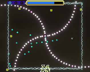
I think the level design could use a bit more work to ensure that gameplay is always fair, because I encountered points where damage felt unavoidable or very nearly so. The spinning cross on the top-left of level 1 was a particular offender: it splits space into four sections with no indication of which one the player should head to. Choose correctly (the left) and there's a decent chance you'll avoid damage just by luck, but choose wrong and it feels/maybe is impossible to avoid the sweeps that move across the stage while the cross is turning.
That said, I liked this game enough to capture video and review it frame-by-frame to try and give precise and accurate feedback. This is a great prototype and I'd love to play an expanded version with more levels, designed with more fairness in mind.
The main purpose of Casual is to allow anyone playtesting the game to get all the way to the end, regardless of skill level. Outside of a jam context, I would consider removing or redesigning it, and in hindsight it probably should not be the first setting selected when starting the game.
It's nice to hear from someone who likes games to be hard. Thanks for playing!
A well-executed, classic shmup with great art and cool vibes. I thought the light mechanic was cool, although it might benefit from a bit of tutorialization/on-ramping (make the circle bigger at first so the player can get used to it?)
Would love to try this on a gamepad, as the player moves quite fast and it would be easier to move precisely with a joystick.
Hey cool, another 3D game! It looks really nice, and I appreciate that you made the models yourselves. I also really liked the dialogue boxes. They made the gameplay feel like it had a context, creating a much more exciting and immersive experience with just a few portraits and lines of text.
Like a few others said, I felt like the aiming seemed a little off at first, although I eventually got the hang of it. I think it has something to do with the perspective, and the fact that where you're aiming in 3D space is ambiguous and depends on the depth. Putting the cursor over things that need to die worked well enough, though.
Cool game. The mechanic fits the theme very well and creates a unique, compelling experience.
I felt like the gameplay became repetitive after a while, with no clear feedback that I was advancing in the game. It would be nice to have a timer or some other clear objective to work toward--the only change I noticed over time was that different enemies started spawning.
Shotguns ftw
Did you play on Casual? On Casual, damage is disabled on purpose to make sure people can see the whole game if they want to. I hope the hit sound wasn't too annoying; you're only supposed to hear it a few times per game!
Thanks for the feedback on the difficulty. I might reconsider the boss attack patterns a bit; I really wanted to make sure you saw the bullets coming back and the patterns overlapping, but I think I can get that effect without making it so hard (and maybe make it look cooler in the process).
The mechanics seemed cool, but it was quite hard to get a handle on. It seemed like my bullet exploded when colliding with enemy bullets, which felt unfair? I was able to land hits by jumping over the enemy and shooting real quick, but with everything else going on I think it would be better to be able to just shoot like normal.
Nice music :)
What a cool concept! And the art and sound are quite good. It took a few tries, but I managed to take that kaiju down >:)
I think it would be more fun if the character moved just a smidge faster. I mostly ended up hiding behind buildings to avoid attacks, which was interesting and thematic, but being able to dodge more would be more exciting.
Nice work.
This is really cool! I like the paper art style, and spamming bullets everywhere is fun. I was skeptical of the movement mechanic at first, but it turned out to be a fun challenge.
One small improvement I would suggest would be to have the UI buttons light up based on which attack is currently selected, so that it's easier to be sure you have the right one equipped.
Great job! If this is your first completed game, that's very impressive.
There is a (hopefully) rare bug where the game fails to end sometimes. I wasn't able to replicate it after finding it, so unfortunately it didn't get fixed.
A dash is not really in keeping with my design concept for the game, but I appreciate the feedback about the projectile spam. I think it would be less overwhelming if I'd had time to add more structure to the bullet patterns, but time limits are what they are.
Thanks for playing!
An intriguing idea.
I had a pretty tough time understanding the game, both in terms of UI and mechanics. I think I mostly got the hang of it after a while, but since I still wasn't 100% sure what the results of each action/turn would be, it was very hard to come up with a strategy to try to win. This might also just be because the game is hard in general, as your comment on the game page suggests.
I think this could be a lot of fun to play, if the rules were clearer!
Neat game!
The graphics and sound come together nicely for a simple, retro feel. The gameplay is not too complicated, with some fun arcade action. I thought the controls were generally fine, especially after I figured out that I could hit down to fall faster. It would be nice if you moved a little faster than the cakes though, so there's a chance of catching up with them if they get past you.
It looks like your spikes have artifacts from texture wrapping, so that a line of pixels appears on the side with the tip. Not sure what this was made in, but if there's a "wrap mode" setting of some kind that could be changed to "clamp", maybe that would help?
Hey, can you elaborate on this a little bit? I tend to err VERY far on the side of caution when deciding what to use during game jams, which results in a ton of pointless rewriting of code. I'm planning to do Trijam every week for a while, so any extra guidance you can give would be a big help.
Specifically:
1) Are there any rules of thumb I should follow when deciding what's fair game and what isn't?
2) Yes/No answers to any of the following would be nice. Can I use a . . .
-Small utility library with things generic math functions, code for shuffling an array, custom generically-typed collections, and an enum for cardinal directions
-Generic object pooling system
-Custom SoundManager class that pools audio clip instances and can limit simultaneous instances globally or per-clip
-Shader for a generic visual effect, like making a sprite flash a certain color or dissolve pixel-by-pixel
-Noise texture for use in a shader (eg, an image file containing raw Perlin noise) that can be generated procedurally, with no direct interaction from a human via image-editing software. Some of my shaders depend on these, and it's annoying to re-generate them.
-Title screen script that implements "Start Game" and "Exit" buttons
-Stub script containing a class declaration and empty method declarations, but no fields and the methods are all empty, as part of a project template
I don't really use .rar files for anything these days, so I had to download a program just to extract it. Please consider .zip instead for Windows builds.
The visuals look amazing for a three-hour project! The style is warm and pleasant to look at, and it's impressive to make a 3D game so quickly. I couldn't really understand what the enemies were supposed to be, but everything else looked so good I didn't mind.
On the gameplay side, I found the mouse movement disorienting. The sensitivity was way too high for my taste (though different people have different preferences) and both the vertical and horizontal axes felt inverted from what I expected. The Y-axis can go either way in 3D for different games, but the X-axis definitely felt weird.
It would be nice if instead of hitting a button to view the inventory, that information could be listed on the Missions tab along with the amount needed.
After a few tries, I was able to gather some resources and build a boat. Hooray!
Neat little management sim.
I like that there are random events to respond to.
Very minor point about the UI: there's no reason to have the option to send 0 mana, as the minimum value that has any effect is 10.
Did you consider just letting the player click a hex to send 10 mana at a time, rather than using a menu? It would save clicks, but I guess it would also be more prone to player error.
Grats on your game :)


