Play grob
CemeterierThings's itch.io pageResults
| Criteria | Rank | Score* | Raw Score |
| Authenticity (Use of resolution restriction) | #176 | 4.195 | 4.400 |
| Gameplay | #205 | 2.860 | 3.000 |
| Overall | #216 | 3.123 | 3.275 |
| Graphics | #237 | 2.860 | 3.000 |
| Audio | #243 | 2.574 | 2.700 |
Ranked from 10 ratings. Score is adjusted from raw score by the median number of ratings per game in the jam.
Did you work in a team?
We were a team of three school-boys trying our skills of fast game making. Here we are:
StarikTenger - by far the biggest part of the code, initial idea
MaximusTG - all the art things, solid part of the code, polishing
RadiantPhoenix - some nice code
Was the resolution a challenge?
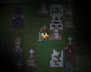
The hardest part was to draw 6*6 lamp, all other things were done by 8*16 sprites and this was just enough for our pixel-art skills. Resolution cap was more of a positive thing that gave us a chance not to think about screen usage - we just had to use it to its maximum.
What did you learn?
The best thing to learn on this jam was definitely screen space usage. Every pixel has to be on it's position, and that's something everyone has to master (in our team's opinion)
Also, we finally reached GitHub for teamwork and it helped us A LOT.
Leave a comment
Log in with itch.io to leave a comment.


Comments
Pretty impressed with the UI, it's legible but still fits in with the spooky art theme. You did a great job of using the tiny space to its fullest.
Great music in this! The UI & controls were a bit overwhelming, especially at the small resolution, but it played nice! I like the vibes of the artwork! Well done!
Awesome job! I loved the music, it wasn't clear how to reload the gun though, after I ran out of bullets I just had to hope there were no monsters nearby. I loved the music and I had fun!
You can find ammunition for gun on the map just like matches, oil and whiskey
Glad to hear about fun!
Nice little game with a good "old school" feeling ! The gameplay is working, and I didn't encountered any game-breaking bug. Figuring out what to do and what were those things in the UI was a hard time, but it finally went pretty good after a few minutes (I still needed to recheck the keys 2 times).
I couldn't finish the game, but with a little more playtime I think it would be less a problem. Maybe I will give it another try later on :) !
Really liked the music btw, really fitted the theme. And the pixel art assets were nice, even more for a first released game !
Here is some things from my playthrough that could be useful to you :
• I'm european, and I have an AZERTY keyboard. It is often underestimated, but it could be an instant stop for someone that don't have a QWERTY key configuration installed. Luckily I had one. On your main menu, making a click/space bar switching between the two key configurations won't take too much time and could be useful for accessibility.
• I think you already know it, but a few sound design could be a cool addition in your game. If you want to create your own, BFXR is quite common for a lot of pixel-art jam games.
• Like I said, I had a hard time figuring what is what in the UI. A little sound effect when picking pick-ups will lead to a way better understanding of the UI, for example. Joined with a temporary white outline around the UI square where the item is stored, I think it will be really efficient.
Of course, this is my own opinion, and I think you would figure out other things while letting the others play.
Sorry if it's obvious for you, but don't hesitate to make your relatives play the game : casual players will have a really different approach than an experienced gamer/developper, and it could help pointing the flaws in your GD/LD/UI designs.
Well overall be proud of you, that's some nice work for a first released game !
Whoa, thanks a lot for such a review! It will definitely help us increasing quality of our games in the future!
Also I personally have never thought, how warming it feels to read a comment from someone who really tries to give a good piece of advice :)
Ok start to what could become an interesting roguelike. Graphics could use some work (especially the still screens after you die), and the procedural generation didn't really make different play-throughs feel different. Nice job fitting everything (map + icons below) in 64x64 pixels, though!