Play game
Do What I Say - GoedWare Jam #11 Isolation's itch.io pageResults
| Criteria | Rank | Score* | Raw Score |
| Innovation | #54 | 1.761 | 1.833 |
| Audio/Sound Design | #57 | 1.681 | 1.750 |
| Theme | #57 | 1.841 | 1.917 |
| Gameplay/Fun | #58 | 1.681 | 1.750 |
| Overall | #62 | 1.745 | 1.817 |
| Art Style/Visuals | #63 | 1.761 | 1.833 |
Ranked from 12 ratings. Score is adjusted from raw score by the median number of ratings per game in the jam.
Game Engine / Tools
GameMaker
How does your game fit the theme?
Trapped in the depths of his mind our hero faces endless waves of enemies who seek to overwhelm him. His only hope is a mysterious friend who promises salvation if only he can have something to eat. But the more our hero feeds the beast the deeper into the depths of his mind he sinks and the enemies pile up. He soon realizes that the beast is the very thing cutting him off from the world and is hardly a protector at all, and that the only way to starve the beast of isolation is to stop feeding it at all, as perilous as that may be.
Self-made stuff
Leave a comment
Log in with itch.io to leave a comment.


Comments
Nice job!
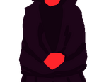
As feedback on the graphics, the big character in the middle seems to be scaled differently than all other characters, which makes it look a little out of place. Try to be consistent with the pixel sizes of your sprites; it helps with the overall look of the game.
The "food" seems to be scaled too, but it seems to be using some kind of linear interpolation, which makes pixel art blurry. You may want to use "nearest neighbor" scaling for pixel art (or preferably redraw the sprite at the correct size, otherwise you get the same situation as with the big character).
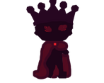
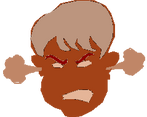
I would also recommend being consistent with enemy colors. Either let all enemies use the same colors or have all of them use different ones. As it is, Wrath is the only enemy using a different color palette, which looks a little off.
Remember, consistency is key. Keep it up!
thank you for playing and the detailed feedback, I appreciate it!! you're right about the pixel inconsistencies, I have a ton to learn there. Any intro tutorials or resources you would recommend? I'm very new to this stuff, "nearest neighbor" and "linerar interpolation" went right over my head lol. The enemies were meant to be the same color scheme, I'm not sure why Wrath ended up that way, but I waited until the last 2 days to start cause I'm lazy and ran out of time to fix it. Is the basic idea to have a starting pixel size of 16x16, 32x32, etc and then scale up to a viewport at a ratio of 16:9? If I were to make all the art for a game in a 16x16 template and then scale up to a 256 by 188 window would I avoid those scaling issues? Thank you again for the detailed comment! Gonna go check out your game now :)
When it comes to upscaling an image (making it bigger), your image editing software will try to calculate the color of each new pixel that gets added to the resulting image to make it bigger. These new pixels are calculated using one of many techniques, most of which add new colors or blurry pixels close to the edges of your sprites. This is normally not the desired outcome when it comes to pixel art. With pixel art, you usually want clean edges and to keep consistency with your color palette.
"Nearest neighbor" is the name of one technique that only copies the color of the closest pixel to create a new pixel when upscaling. This results in the desired effect of clean edges (not blurry) and an "unbroken" color palette.
You can read more about scaling algorithms here.
Now, I believe that for your game you may have used the scale property of your enemy objects to make them seem bigger. If this is true, this means that your game engine is scaling your sprites with one of the other techniques. To fix this, I believe GameMaker Studio 1.4 used to have a global setting to turn texture interpolation off, so there should be something similar for GameMaker Studio 2 if that's what you are using. On the other hand, if you are scaling your sprites before importing them to GameMaker, your image editing software should have a dropdown menu when using the scaling tool that lets you select what kind of interpolation to use. Simply select "nearest neighbor" when scaling pixel art.
Now, here is the thing, to keep consistency with pixel art you want to have the same scale on all sprites/images regardless of interpolation algorithm used. So, either scale everything the same amount, or keep the scale at 1.0 on every single sprite.
For example, for my game, I chose a game resolution of 480x270 and I drew all sprites according to that size; the cow sprite is 36x24 for example. All sprites are 36x24 but the entire game viewport is then scaled to the right window size keeping the aspect ratio during gameplay.
I recommend you watch this video about Inconsistencies with game art.
Also, there is this series of Pixel art classes by AdamCYounis that you can watch too.
I recommend both of those channels btw.
Hope this helped a little.
First of all, thank you so much for taking the time and effort to write such a detailed and thought out response! Much appreciated!
So, for this game, I made the sprites at (basically random) larger sizes in GIMP and then scaled the image down to 64x64 or whatever to then be imported to GM2. So basically if I had "nearest neighbor" selected before scaling down in GIMP the blurriness/etc. would not have appeared?
Following your example, how did you decide on a resolution of 480x270? And how did you know to draw the sprites at 36x24? In my head, I would think that to apply the 16:9 aspect ratio to a 36x24 sprite would mean you want a resolution of 576x216 for the game (as that is the result of 16*36 and 9*24), but I must be missing some key part (more likely parts) of this. I'm also confused by game resolution vs. viewport vs game window, are those terms interchangable? Sorry for all the questions, I am very new to this stuff.
I will be checking out both of the links you sent me, thank you again.
No worries, if you don't get a chance to answer all those questions, you have already set me down the right path :)
Correct, you would not get blurriness, but I would still advice trying to draw your sprites at their final resolution and avoid scaling them altogether.
So, 16:9 is the most common aspect ratio with 1080p (1920x1080) being the most common monitor resolution used according to steam. Your game's resolution is gonna depend on various things, mainly the kind of game you are making and your art style. For pixel art games you normally pick a low resolution that scales cleanly to as many resolutions that use 16:9 aspect ratio, especially to 1080p. Most common game resolutions for pixel art games are 320x180 and 640x360. I picked 480x270 because I felt 320x180 was too low resolution for my game as I wanted higher detail on some aspects of the game that I couldn't get with that resolution. I could've tried with 640x360 (might still try later), but I felt 480x270 was good enough for what I wanted to make.
480x270 scales cleanly (as in you multiply both numbers by integers) to: 960x540, 1920x1080, 3840x2160. So I got the most popular resolutions covered.
This video by AdamCYounis may help you on choosing a resolution.
I usually start by creating an image the size of the game's resolution filled with a single color that would represent the background of the game (green in this case). I then draw a sprite on a different layer of that image trying to keep it at a size that makes sense. For this game, I knew I would need to place many sprites of around the same size on the scene, so I drew the cow's sprite small-ish compared to the game's resolution. I populated the full image with copies of the sprite to make a mockup of how the game would end up looking. When I was happy with the size of the characters, I then just copied the cow sprite to a separate image of the resulting size (which was 36x24) and exported that image. I later made all other sprites using the cow sprite as reference for size.
You don't really need to confine your sprites to 8x8, 16x16, 64x64, etc. as modern game engines don't have problems with sprites of resolutions that are not powers of 2. There is a benefit to using sprites of sizes that are powers of 2 when it comes to texture page sizes, but I wouldn't worry about that.
The game window is the final size that your game is rendered to. A game window with a different size than your game's resolution will scale or not scale your game's resolution to match it. Whether it scales your game or not depends on how you set it up. I don't remember for gamemaker, but in Godot there is a stretch mode and aspect settings that you use for this. On itch, the embed size is basically your game window size. For example, I chose 960x540, so my game is scaled to that resolution for the embedded version and, because of the settings I used in Godot, the game is scaled evenly without adding artifacts to the image. Note that the version of Godot that I am using currently has a problem with some web browsers (Firefox at least) and itch web embed, so it might pop-up a new window instead of playing embedded in the page.
A viewport is an area of the game window where your game will be rendered. Generally, there is a main viewport that you draw your game to, and this main viewport can be composed of one or more viewports. For example when making splitscreen games, you can use one viewport for each player's camera view to be displayed.
Game resolution is the resolution of your main viewport, this will get stretched (or not, depending on settings) to the player's game window.
I know it seems complicated, but you really get used to it with practice. Just keep making games, following tutorials. and trying different things and you will get the hang of it.
I hope this helps!
Re-reading this now and just wanted to say thanks again for being a big homie and dropping knowledge, you da man!!
It is a good concept, i dont really like the art and i would like a bigger map, but its a good submition. Very good!
thanks for playing bro!! map is too small i agree. and i'm not at all happy with the art either lol, its probably my biggest weak point (one of many) but I had a lot of fun making this game and I'm going to keep at it. thanks again for playing and the feedback!
edit: oh and your dog rocks
Played and rated!
It's a fun concept for a small game and I found the story interesting. I would have prefered playing in a bigger map so it would be easier to avoid the enemies, especially as their number increases.
Congrats on making a game :)
thanks homie :) appreciate you taking the time to play and leave some feed back!! agreed about the map size its more than a bit cramped...
GAMEPLAY
Fun game with a twist! The small playing field did led to frequent accidental contacts with objects. Twist was a nice one.
ART STYLE / VISUALS
Creating your own visuals is always impressive.
AUDIO / SOUND DESIGN
The audio is satisfactory.
INNOVATION
Innovation was not applicable
THEME
The theme was adequately addressed.
Solid game jam entry. Keep on this good work :-)!!
thanks for playing my game and for hosting!!! appreciate the feedback, i'm still new to game dev and hope to improve a lot on my next game. this jam was a lot of fun thanks again!
Nice little twist for the win condition. The gameplay was very simple, and you can even win by doing absolutely nothing! You can just let the character die and wait for the boss to die anyway. It still triggers the ending
lol i didn't even realize that nice find. thanks for playing!!! glad you enjoyed the twist, and you're right it was a very very simple game, my next one i hope to make more in depth. thanks again for the feedback, cheers
edit: just started playing your game, holy shit dude!! its so cool
I enjoyed the twist on how you win. That was pretty fun.
I think the more you Obey the more obvious it could become that it is the source of your problem "For being so loyal to me, here, have another special friend"
Neat idea, I like your take on the theme.
thank you for playing it, and glad you appreciated the twist :) thats a really good idea for another dialogue pathway, that way you have kind of a carrot/stick motivation to clue the player to whats really going on. it would have helped make the ethos of the game a lot more clear that way and added to the player-boss relationship a lot too.
Hitboxes don’t feel particularly fair, ie this killed me:
I think the story is really a great idea for something, even if the gameplay wasn’t super polished. I like doing what evil Jabba tells me to :)
thank you for taking the time to play it!! agreed about the complete lack of polish hahah, i have a whole lot to learn still. and sorry about that hitbox sheesh lol. glad you liked the premise too. thanks for the feedback!
Not really sure what each of the gauges at the top are supposed to represent, and the twist to beat the game was an interesting idea, though the area is so small that I would occasionally have to run into the collectibles just to avoid enemies.
the gauges are supposed to be 3 different "health" bars for the boss. they go decrease at different rates and spawn in enemies at certain thresholds. if you get the food it resets the lowest bar back to 100%, which will then spawn enemies again when the threshold is reached. so you are punished for listening to the boss and rewarded for not collecting the food. i dont think i made that very clear at all in the game tho lmao. thanks for playing and the feedback, i appreciate it!
Such a funny game, good casual game, please try our game :)
Preface
The rating is based on my personal preferences alone. Generally, I'm pretty open to new experiences, but I prefer games where lots of things happen. I tend to be a harsh critic.
I have finished the game.
Gameplay/Fun
It's short and shallow. All you do is run around and avoid everything. Movement doesn't feel fun and the dash just teleports you. Also, are you really going to spoil the solution to the game in the descriptions?
Art Style/Visuals
The art direction here is questionable. Why is The Beast pixel when everything else is hand-drawn? Speaking of hand-drawn, I appreciate the hand-drawn assets, even if they look somewhat weird. Also, the sprites' colors clash with the background.
Audio/Sound Design
Unfitting. Neither of the songs fit the game.
Innovation
No innovation to be seen.
Theme
The game only loosely fits the theme.
Verdict: Eh, I don't like it.
RATING IS SUBJECT TO CHANGE.
valid lol i'm very new to this still, thanks for the honest feedback I appreciate it