


This happens to me every time I go golfing, but I never thought to give the ball to the ethereal being standing hauntingly in front of me and I never have a fun time. Perhaps, next time I will try returning the Titleist and I will have more fun time.
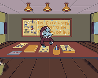
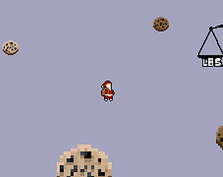
Sound design and general atmosphere are super sick. The build up and sudden stopping of all sound when the ball dropped in was a really nice spooky moment. The jibberish sfx when the shadow being spoke was super neat too. Idk what you did to miss mess with the perspective and shape of things in the outside scene at the end but it came out looking awesome. Ending was surprisingly heartwarming lol. Sharing is caring. Game was weird as hell and i very much enjoyed it, ggs