Play game
Mobius's itch.io pageResults
| Criteria | Rank | Score* | Raw Score |
| Overall | #4 | 3.986 | 3.986 |
| Theme | #5 | 4.348 | 4.348 |
| Geometricness | #5 | 4.522 | 4.522 |
| Creativity | #7 | 4.000 | 4.000 |
| Music | #10 | 3.696 | 3.696 |
| Graphics | #15 | 3.783 | 3.783 |
| Gameplay | #16 | 3.565 | 3.565 |
Ranked from 23 ratings. Score is adjusted from raw score by the median number of ratings per game in the jam.
YouTube Channel
https://youtu.be/nGSMHI-z9OI
Epicness
seY
Leave a comment
Log in with itch.io to leave a comment.


Comments
Impeccable job Myline and team!!! :33 <33
This was remarkably polished for only being made in a week!!
This is really good game!
But it will be much better if there are more different enemies.
The game has 13 types of enemies, just new ones are found throughout the game
Ok, than it`s fine!
I was very confused and had no idea I could move at first. Then I learned that you can empty the health of one guy then slowly kill the enemies to easily progress through the levels. Good concept, but hard to play and definitely needs some polish. Nice game nonetheless!
I had to read comments to understand what I needed to do lol. Even after I figured it out, the difficulty level seemed a bit out of my control at times. The gameplay was nice and smooth, the music was awesome, and the idea was really cool! Good job everyone!!
Ooo bro i understood the concept black cant die, but white got health and the enemies which die on the left side comes to the right. I really like it such a polished game its very good bro 10/10 , music gameplay everything is awesome, there is nothing much to say about your game because its perfect but one thing i would like to mention that, don't display heath on back player because it confuses at start, it tells us that we have to protect both but in reality we only have to protect the white one.
Thats it very polished game , good experience.
I also request you to check my First Game Jam game also and give you honest opinion on that.
Thanks
Really good game, the only thing I found a little bit confusing was the movement on the right side, but after some runs I managed to do both!
Great game, fun idea.
Really polished game, with nice transitions. It starts very quickly, I got hit without understanding what was the game. I felt overwhelmed very quickly so focused on only one side, but I don't think it's what you intended for. Music and FX are good. Well done.
I agree with all the other comments, I can't add much
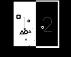
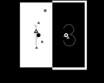
This is a pretty neat game. I like the strictly black and white color scheme and the geometricness, and showing health loss by filling the shapes is a really nice touch. A few notes that I think would improve the overall experience.
1. Right now, the cursor position seems to be the top left corner of the cursor image, which seems very counterintuitive to me. I would prefer if it was in the center of the image.
2. As others have mentioned, I think I would prefer a shared health bar. Which would maybe make the game impossibly difficult and you'd need to rebalance it, but right now, the most efficient strategy seems to be to completely focus on the white side first and once you've got rid of all the enemies there, there's literally no way you can lose anymore and killing the enemies on the black side just feels like a mindless chore.
3. I think a small "ceasefire" period at the beginning of each level would feel more fair. Right now, sometimes you just get bodied by triangles when you start a new level and there's not much you can do about it.
4. I would prefer if the music wouldn't restart every time you restarted the level / entered a new one.
Still, all in all, a pretty cool idea and not a bad game.
Thank you for your detailed comment! We will take these suggestions into account in the future.
First 20 seconds and i already notice two things about your game:
1) It's basically impossible (at least for me) to watch two sides at the same time and switch eyesight to the other side it's really difficult to do too, so i often focus first on the black side and then on the white side, resulting me to being surrounded by enemy on the white side
2) When a level is loaded enemies have already moved quite a bit, and often they can even deal you damage, so it's a bit frustrating and/or unfair to the player :P
Other than that it's a really fun game, that would do great for a mobile game imo (even tho i have no idea on how the controls would adapt on a mobile device xD) I especially loved the simplicity of the art style!! Good Job!!
Thank you for your detailed comment! We will take these suggestions into account in the future.
Nice game, very creative. It took me a while to figure out that the enemies I kill show up at the other side, after figuring that out it became easier to strategize around it. Some of my notes:
- Area is a bit too small I think, maybe make the characters a bit smaller so we can have more room to maneuver around?
- It does get a bit repetitive, especially for a hundred levels, would be great to have some sort of system that allows for change, upgrades, pickups, or even boss fights, anything that would make it stay fun and interesting the whole 100 levels (Note: I only managed to play till level 24, which is how far I got)
- Numbers might be helpful feedback when hitting enemies (When hitting an enemy, or as a score system, or anything that gives a sense of accomplishment)
But overall great game, I really liked the idea of enemies going to the other side when you shoot them which adds a lot of depth and strategy to the game.
Thank you for your detailed comment! We will take these suggestions into account in the future.
Just watched your video about the game after I played it. It was fun, really fun, A little bit too contrasty. You should've used two colors but not black and white. I think it would've looked better. Otherwise, the controls and gameplay are smooth. The music is nice. Well done.
Thank you for your comment!
The game looks pretty slick in black and white and it’s pretty fun. Good game :)
A small thing: it took me a while to figure out the health, I think it’s just a bit too small/hidden in the character to be quickly noticeable.
Thank you for your comment!
Gameplay, geometry, scene transition are very nice, good look overall, easy to play. nice job.
Thanks!!!