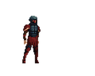
Play Sorrow
Sorrow's itch.io pageTheme inspiration
I interpreted passage as a one way path that the player has to go through, and also as death, because both are pretty similar
Sensory info
N/A
Content info
N/A
Extra Credit Challenges
Extra Delicious
Extra CGA
Extra Voice
Extra Diegetic UI
Extra CC0 and CC-BY
Extra Zoey
Leave a comment
Log in with itch.io to leave a comment.


Comments
The way the story is told here is quite interesting, there's just enough to be intriguing while still remaining vague. A lot of the more purely technical points have already been brought up by other people, but I did find that were was a bit of a lack of instruction. What exactly the flashing box around the character meant was never obvious to me.
Tutorials are hard to fit in with jam constraints, but even just having some instructions on the itch page or as a .txt file along with the game goes a long way.
Other than that, it was a solid experience, great job!
Thank you, also thanks for bringing up that I can add the instructions on itch, I already changed it so as to let everyone know of the drawback of the controls in advance.
Interesting! Very visually pleasing.
I found I was able to kill the monsters from quite a distance. Like, I'd stand there clicking and they'd just 'take it' and die without even attempting to kill me.
Also the story snippets are just enough to spark some curiosity.
Thank you, also I am surprised someone managed to get through the monsters. I made your rolling invulnerability too great, but it is not very intuitive, so I am glad someone found another way.
No problem!
I don't think I would have been able to kill them if it wasn't for the weird hitbox, and being able to strike them while being outside their range . I don't know if you'd want to fix that or somehow make that a feature (like, if you get the right distance for that effect some sort of visual effect happens to make it look like the player is hitting the monster rather than awkwardly swinging the air).
That would be cool to do, once I can post a better version of the game.
I liked the plot and I feel that the game play could be improved. For example, the sprite of the player and the hitbox seems to be the same object and I think it could be great if they where separeted things. When you change direcctions it feels like the sprite is fliped by the x axis and teleports. BUT as TaiPrev said, I had the same problem with many of my games and I learned how to avoid those things, I hope to see you in the next jam! (or in the discord channel) :D
Thank you, also I had fixed it, but it broke again at the last moment. See you later.
Very aesthetically pleasing and with very nice artistic assets! However, I couldn't get past the third monster, be it for lack of blocking, knowing how much health I had left or other management things.
Attacking feels a bit delayed and sometimes there are attacks that happen with no apparent reason (though I suspect that the inputs are stored and used after the animation stops playing), which makes it feel a bit awkward. Also, another little thing, not having the monsters make sounds but the main character doing so feels a bit jarring.
However, don't be discouraged! I point these things out so that you can focus on polishing and getting this into a better state! Good job!
thank you, those were problems I noticed but could not fix because of lack of time
Very nice aesthetic! Combat system feels a bit bulky, but im sure you can improve it. Good job!
thank you and I might after they allow me to edit it again