Play game
Cosmic Caveman's itch.io pageResults
| Criteria | Rank | Score* | Raw Score |
| Overall fun and playability | #70 | 2.943 | 3.133 |
Ranked from 15 ratings. Score is adjusted from raw score by the median number of ratings per game in the jam.
Theme incorporation
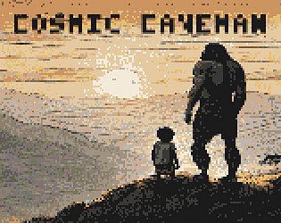
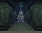
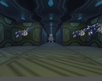
The player is a lone caveman in an alien spaceship; the enemies are the aliens onboard, which the player fights. The theme incorporated is cosmic horror.
Leave a comment
Log in with itch.io to leave a comment.


Comments
Sweet. Couldn't beat the final boss, but really like the caveman fighting alien setting, after so much dark chtulu tentacles. Gameplay is basic, but it's alright in a game like this. I wasn't sure if the game was turn based or time based ahah, the ennemies felt like hitting me a bit randomly (I was mashing). I'm not sure why I was falling in the floor as the level progress ? Was it tied to your life ?
Not a bad entry. The graphics were good, I liked the enemies especially. The movement was well done. The combat was pretty basic but it seems like you could just click spam your way through it, except the final boss. I couldn't quite beat him and I didn't know what scrap or time ravager did, outside of scrap doing some extra damage even if I was only hitting for like 1. I eventually ran out of scrap on the final one and then couldn't get him.
Also, someone mentioned it isn't a bug and if it isn't, the camera lowering to the ground could be explained a little bit better in-game.
Overall good job!
This was pretty cute. Would've loved if I could consume meat outside of combat to heal. Got to the end. Not sure if there were any subtleties to combat outside of me spamming the attack button really fast and winning, hah. I think you did a really good job for your first game, honestly
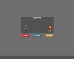
Movement is nice and dungeon looks great. The combat screen looks a bit different than the rest of tha game and could be made more coherent. Had an issue where I after a while moved further and further down, until I was at the ground when moving.
Game was a bit hard, but I had some fun playing it.
Hey! This is a really nice one! I like it :)
Theme
It definitely has horrible aliens so cosmic horror fits well here :)
What I liked:
What I would wish for:
The more fights I played, the smaller my character got. I mean the camera moved down with every fight until I was crawling over the floor, almost diving into it. Might be a bug to look after.(edit: I just read in the comments, that this was aging! Okay ^^. Maybe make this explanation more prominent somewhere. I saw a good entry that used signs on walls to explain important things. I think that would be a good idea.)Thank you so much for creating the game and submitting it and maybe you can tell me what is the story behind this one wall, where there seems to be meet on a plate together with some gold coins or fries displayed ^^. I could not click it or interact with it, but I think I saw it only once :)
Nice entry. For the first playable game? Awesome start!
There are couple things to keep in mind - first of, all UI is resolution sensitive in Unity. You can fix that by scalling it, not sure how exactly its done, but it is possible so it won't be tiny combat window on higher resolutions. You can see how much better it looked in JD Nation's video! Really nice when its all so close together and kind of cute too! Mine was even smaller window that your screenshots showed.
I wish there would be strafe button too! But movement felt good! So there is that :)
I guessed what scrap does in combat, but I had no idea what time ravager does and was confused at how to use it. So I lost to final boss, because I was tiny-human, I guess :D Some explanation can do wonders! Its a jam. so a lot to ask for sometimes. but you can write down hints in description on the page to help people who couldn't figure out things. Under spoiler maybe! I think you can do it even now, editing of the page is not against jam rules, but you can ask zooperdan just to be safer, of course, if you would want to do that.
Keep up good work! :)
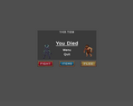
Haha, nice with the "You Win" pic at the end, you only have so much time in a jam. Game was solid, could be a bit smoother maybe and I was quickliy spamming "Fight" most of the time, which seemed to not let the enemies attack as often. But maybe I got that wrong. Graphics are nice and the game has fitting music. Simple, but very playable.
Nice entry. I learned things reading the previous reviews; I didn't even understood crawling was not a bug but aging.
It was fun but a little confusing.
The overworld could use more sound design. The battles had nice music and a decent interface.
But because of the speed clicking glitch I got the idea that's how I was supposed to be playing it.
And I had no idea the item just before the Boss was the Time Reaver.
I thought maybe that was the name of the enemies and I was collecting their corpses.
But after I read Crypt Rat's review, it became clear what I was doing wrong.
Very impressive first swing at a game.
---
Here's my playthrough: Cosmic Caveman Pt1 by Kenny
As a side note, I liked how you picked things up by looking at them from an adjacent square. It felt weird at first, but I got into the habit of spinning around to suck everything up,! XD
"YOU
WIN"
Overall the game was super fun, after being humiliated a couple of times I had to understand how everything works (the first time I reached the boss I realised I could use the Time Ravager during the fight but I had not noticed that I picked the item just before the fight), use my scraps properly, and also to map the dungeon and plan the right route to get the time ravager as soon as possible. The difficulty is right on point which is a very big plus to me, I like that the game offers some challenge.
The character crawling as he ages is a super cool effect (at first I thought that was a bug, when I realised it was nott hen I thought "Oh, that's in fact super cool", movement is right too especially as you can walk as fast as you click.
Only thing I did not like is that I think that during fights if you mash the button very fast you can prevent the enemies from performing all their attacks (sorry if I'm wrong about that) and then I had to press the buttons slowly while the sequences become obvious once you got it, I managed to keep my nerves and win without ever using this though'.
Very cool entry, thanks for sharing.
You are right. I feel that the placement of the time ravager was not great, and perhaps even unnoticeable. Thanks for playing and for your review.