Play Epicness
Arc 'n' Fly's itch.io pageResults
| Criteria | Rank | Score* | Raw Score |
| Gameplay | #31 | 3.500 | 3.500 |
| Audio | #52 | 3.286 | 3.286 |
| Overall | #52 | 3.300 | 3.300 |
| Visuals | #55 | 3.643 | 3.643 |
| Technical | #72 | 3.000 | 3.000 |
| Creativity | #103 | 3.071 | 3.071 |
Ranked from 14 ratings. Score is adjusted from raw score by the median number of ratings per game in the jam.
Message from the creator(s):
Fonts were not made by me.
Rule
Rule A
Only used the colors black (#000000) and white (#FFFFFF)
Theme
No
This game does not follow the optional theme
Original Art
Yes
Created own art
Original Audio
Yes
Created own audio
Leave a comment
Log in with itch.io to leave a comment.


Comments
It is for Rule B indeed due to the alpha effects. In contrast I really loved the simple mouse playability plus the arcade audio feedbacks.
Thanks!
I love games where you're basically part of the instrumental of the music, I would definetly suggest to add a sort of rhythm game mechanic to it! That was the funniest part in my opinion.
I enjoyed this game, I thought the gameplay was nice and it had a cool core loop. I think this would have good potential as a mobile game with the simple control scheme. If you choose to go this route, I advise adding in more types of obstacles and some sort of progression system.
If you wanted to improve, I suggest having the obstacles despawn after a period of time, the game appeared to have problems finding new places for obstacles to spawn after enough were on screen. I noticed they would try to spawn in then would despawn as soon as an error was found. I recommend having the old one despawn and keeping in the new one or repopulating the old one so there is always more points to be gained.
Overall you have a solid foundation and I hope you keep working on it.
Thanks! Yes, I am working on making this a full mobile game. I will be adding lots of new obstacles. I was encountering that problem but you gave me the solution! Thanks for the amazing feedback!
Of course! If you want me to play test again, feel free to let me know!
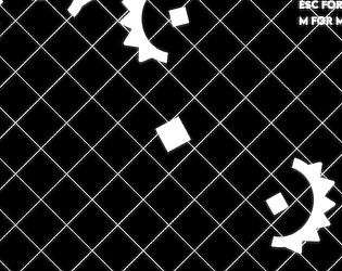
nice game, the movement was great, it took me a sec to realize that the coins were the square shaps,
it could use some invisible walls to prevent the player from going far from the enemies.
geat work.
Thanks! I totally agree that there could be invisible walls. Thanks for the feedback!
Pretty simple and nice, Its just a bit repetitive, more obstiacles and borders at the sides could make it a cute endless highscore game.
Super satisfying move mechanic. I love the big explosion every time I had to move. I'm personally not into button mashers, but this game made for a great adjustment to the mechanic. I'm not just clicking over and over for no reason, I'm actually moving my character around the map. So I totally loved it. If you decide to build this out into a bigger game, I think it would be cool to see the square sprite designed to look like a tron bike or something of that nature.
Anyway, great submission! Well done.
Thanks! This was the first time making these types of games. I am working on turning this into a mobile game!
Yeaaahhh! This would be perfect as a mobile game.
Nice game. For a second there the background of the webpage looked like it matched the games background. Tried to exit the game area with little luck. Aside from that I liked it.
Thanks for the feedback!
Cool. Too bad the score disappears when you lose. And maybe we should block the edges of the field? In any case cool well done!
Thanks! I was debating on whether to reset the score on dying or not. I decided resetting it would be better. I had put a small easter egg, that's why I had opened the edges!
Nice retro style and i love the crunchy sound effects
Thanks!
This game is pretty nice and a fun short game to play. I like the particles the cube emits when blasting off and the glow effect in the game. It really gives off that feel for the game. Even the patterned background was awesome! Great job on this game entry!
I also found the easter egg heh.
Thanks a lot! Appreciate it!
Nice little game , I liked the itch page design too. I wish i could rate but i am not even part of the jam
It looks pretty nice and simple
but also noticed that you can go out of bounds
not sure if that's intentional
Thanks! Yes, it is intentional. Maybe there's a reason 😏