Play game
ALWAYS HAS BEEN's itch.io pageResults
| Criteria | Rank | Score* | Raw Score |
| Game Design | #100 | 3.692 | 3.692 |
| Audio | #113 | 3.538 | 3.538 |
| Graphics | #188 | 3.692 | 3.692 |
| Overall | #188 | 3.410 | 3.410 |
| Fun | #207 | 3.346 | 3.346 |
| Innovation | #338 | 3.038 | 3.038 |
| Theme | #384 | 3.154 | 3.154 |
Ranked from 26 ratings. Score is adjusted from raw score by the median number of ratings per game in the jam.
How does you game fit the theme?
Sometimes it is not all about you.
Did you write all the code and made all the assets from scratch?
All the codes and art were written and made by me during the jam **except for the music**
Leave a comment
Log in with itch.io to leave a comment.


Comments
Great game, as simple as it is, it is beautiful. Good job!
Thanks for the words. I appreciate it!
Nice game bro. Enjoyed it.
Thanks, Wika!
Nice game! it could be better with more levels, but overall good job!
Thanks for playing! I will definitely add more stuff If I make a post-jam update
The game is really addictive, Nice design
Thank you!
Fun game with simplistic art! Would recommend! Do you mind rating mine when you get a chance?
Thanks for playing!
Nice art and graphics it looks really cool! was a blind jump where i landed on a spike which was one of those traps u dont see coming and makes it frustrating but its all good had fun!
I think little arrow to direct players will help. Thanks for playing!
Really nice atmospheric game. More checkpoints would be nice, particularly around some of the leaps of faiths. Great work!
Yes, a checkpoint would have been beneficial. Thanks for playing, Matt!
I'm very impressed with this game, great job ! learned a thing or two from you
Thanks for playing, that's awesome! I think it's the beauty of game jams, not only do we learn new things while making our own, but we can also get some inspiration from playing other devs games too.
I thought this was a fun game! I liked the controls, overall moving around felt good. I felt like I was super-smart when I discovered the climbing mechanic without seeing the instructions.
I didn't like that I had to use trial and error to progress - checkpoints and making it possible to see what's coming by using the climbing ability would have made me feel like I was "mastering" the game (e.g. I kept trying to slide down and climb to look at what was further down, but still couldn't see the next obstacle.
Overall I think you did a great job with this game, I had fun playing it and that's what matters!
Thanks for playing. It's just a small little game, and I'm glad that you liked it. Yes, that's one of the pointed out concerns. Since you really cant see what's happening/obstacles down below, I think having maybe some arrows pointing in the directions where the player needs to move would certainly help.
*(Revisiting for some more in-depth feedback)
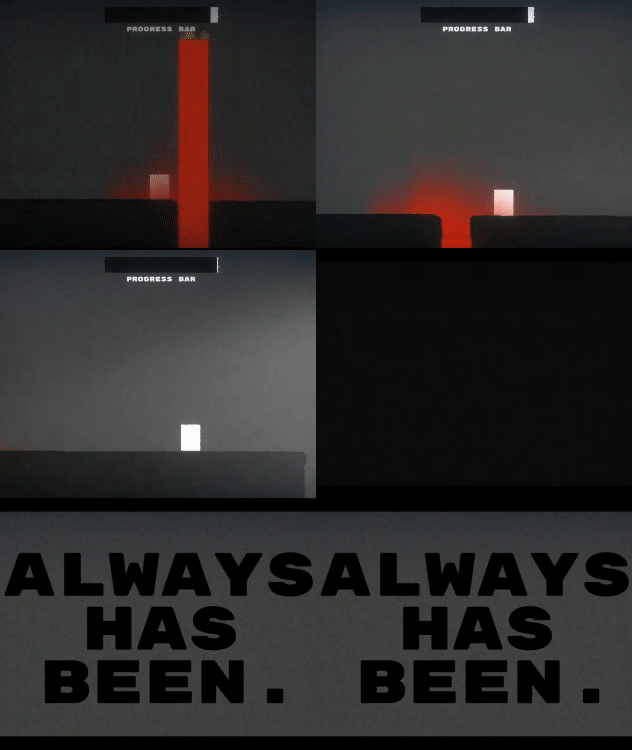
First off, it's such a simple looking game but sometimes that's all you really need. This game felt so Brackey's inspired to me in the gameplay & visuals, which was nice. I loved the ability to wall climb & the little particle effects added to the lava made it feel less like a rectangle & more like something that could melt me if I touched it. It did take me a few runs to get through but the music made it feel scarier each time I tried to get through.
I also appreciated the inclusion of a Youtube preview of the game & how it didn't spoil the end. I could see what I was getting without compromising anything.
What I liked the most: The post-processing!! I love the effects you've used for this. It really helped to elevate the simplistic art you used & made it more exciting visually. Also even though you didn't make the music, your choice of what music to used matched the game very well.
What could be improved on: I would have liked some checkpoints for this, even though it was short, I feel it would have made it a little less frustrating to get through to the end. Also a big issue I had when playing was that the camera didn't pan down when you go to move platforms, so I'd die a lot which was quite frustrating. Having some sign before you go down, or a camera pan added would be a nice addition.
TLDR; A simple game made well. A subtle horror which leaves you on edge the whole time.
I'm not trying to sound like I'm covering up my bad drawing skills :D but yeah, the game kinda gets some inspiration from brackeys with the use of basic shapes and some lighting. I intentionally made the game as simple as I could and let the post-process effects do its thing, which I think turned out pretty well, I also believe adding player animation would have elevated the game even more, but I went too basic with this one and ditched them.
To be honest, I don't really have the chance to playtest for other players, to get some quick thoughts about the game. But I agree that camera panning and signs would have been beneficial to players. And for the checkpoint, I'm debating with myself whether to add it or not, as I feel like maybe the game is too short on having them, but you also pointed out some reasons why the game should have them. As the player's input would always be crucial in making a game a lot better.
Thanks for all the feedback, Steff. That's why I like joining game jams like this, we learn so many things in the process.
That was neat i guess. not much to it, not much to say. just neat
I made it as simple as I could, maybe a case of a little too simple on the art side of things, but yeah, thanks for playing!
It's an attractive game with abstract and clear graphics. I like it!
Thanks for playing, I'm glad you liked it!
I like it. Rate mine too.
Thanks for playing!
Nice aesthetic, simple palette and shapes but works well. Maybe a tad too much film grain but very often I'm guilty of the same thing.
Nice game, lava is hot.
Thanks for playing, Datux! I only use basic shapes with this one, so I think I can get away with having 'extra' post-process effects to spice up the game, and yeah it's getting hot in here :D
That was not bad, Quite Short but I really liked the twist at the end, I was playing thinking what does this have to do with the theme? but the twist at the end showed all the traps were being controlled by enemies at the bottom of the bit, nice meme reference, that twist ending was nice!
Couple things I gotta give feedback on,
- at the sections where the players have to jump down to a lower platform, the camera isn't zoomed out enough, we can't see what we are jumping into, so players usually have to commit suicide and gamble on where your lower platform is. which is quite unfair, a way to fix this is to either add arrows directing the player where you want them to go, so you can have arrows or even coins, coins work great for that, players follow coins in video games as its fun to pick up them but, but you can use them to direct them to the lower platform.
- I'd would 100% animate your player, even tho he's just a cube, a simple running animation where you move the cube sprite up and down would make your game so much more fun to play
Thanks for playing, Zyrex. I don't know, but my previous jam games were all meme-inspired. I didn't want to break the trend, so I went down that path again. I'm glad that you caught that one :D
Since the camera won't show the lower part of the platform, I agree a little sign would have been usefull, an arrow will be fine. tbh I wanted to add a small moving and jumping player animation, but I didn't know why I did not, I think I went too too simple on this one and that's on me.
Good Stuff, welp you learn that for next game, the coin / arrow thing is a good thing to note for Games Design for Future Projects, I placed arrows in every level in my game to direct people to where they should go
Thanks for all the feedbacks and tips, I appreciate it all!
Altrough i did not played trough entire game (i ragequited), i can say it's a realy good game. Art is simplistic, but apealing to the eye. The use of this noise effect in the background as well as good music make all the atmosphere for this game. THing i did not liked tho is that there is no checkpoints. That alone would be not much of a big deal if not paired with this specific platformer movement which feels very hevy. But i guess that's my only complain, and overally i like this game :)
Yeah, post-process is your friend when you have art like this :D and btw VOiD1 Gaming did the music. Checkpoints would be a good addition, but I feel like the game is too short to have them. Thanks for playing!
I love the effect you used for the visuals in this game, it added some depth to the simple graphics used. Did the music make me scared? You bet - was on edge the whole time. Very nice & simple game - I enjoyed it a lot!
Thanks, Steff! It's not the fanciest of graphics and animations, but I'm glad you still liked it. I did not make the music myself, but I agree that really made the game a lot better.