These controls are very unlike traditional RTS games. Also, the test level is quite mind numbing… I look forward to playing in a future update though.
Play game
Claws of Steel's itch.io pageComments
Played the tutorial, couldn't beat the test level.
Animations and models are FANTASTIC. Walk animation is a bit jank, dunno how I feel about it, but idle and shooting animations are so good. Grenadier seems to be using the machinegunner animations - I assume they just don't have their separate animations yet.
After the tutorial I was a bit confused about Rush/Hold modes, they didn't seem to do what the tutorial explained. Either that, or I was being stupid, but my units kept attacking even when standing still in rush mode.
Test level is a bit bs, enemies have more reinforcements than me which is... Unfair, especially on an almost flat plane map. But assigning units to squads works, giving them different commands works too.
So it works, I think, even though I couldn't beat it.
Also - first time I lost the test - the stats were not shown on the defeat screen, had to restart. Worked the second time.
I don't know where else to post this but honestly it makes me kinda sad that people didn't enjoy the control scheme.
I reckon spawning is terrible and spammy,and i need to change that ASAP. But i don't understand how people didn't really enjoy the waypoint and group system. To me, it felt like the most intuitive way possible to issue your orders. I figured it was the best way to avoid too much of the dragging madness present on most RTS games. And besides, this shouldn't really play like an usual RTS, you should just issue orders to your groups without getting too much in their way, that's why i made the individual units auto-engage targets and do other things without player input like grabbing grenades and throwing them back. The grenades are very coin-flip-ish because that's the entire purpose of the game, to be very unpredictable.
Anyway, i'll hopefully come up with a better game in the next update. I'm already working in many aspects of it.
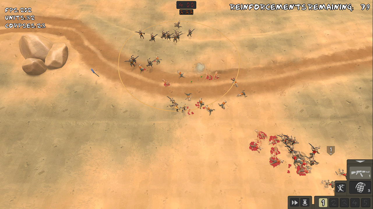
I played through the tutorial and lost the first match, it for sure is hard given that they had over 200 reinforcements. The controls were nice and the tutorial explained it well, although I would prefer the text have a continue button rather than auto scroll, or an option atleast. The match itself was fun, but I think the strategy of forming a group of a bunch of gunners and few grenadiers and sending them in probably wasn't the best but it's what I did. I think developing further the unit system will help the gameplay, and changing how you deploy them as well. I really liked the models and the shooting and grenades are great. I'd say keep going because it has a great premise so far!
Happy to see the game has a tutorial. Some of the tutorial dialogue was skipping far too quickly than I could read it. Would be good to make sure it's paced properly, and tied to gameplay more. Might have been that my troops were too far ahead. The test map doesn't have a whole lot of depth to it, which is fine, but the enemy team just seems to be playing by different rules as there's endless waves of them that can't be beaten. Grenades seem to be able to wipe squads, but it's just too random and unpredictable. I'd like there to be text that shows up when hovering over buttons. The characters and art are pretty good.
Hey, thanks for playing.
I think i made the demo mission a bit too difficult. The AI currently has twice your reinforcements number. I know you've already played it, but a little tip to make your things easier on that map is to just keep a few grenadiers behind the rock.
i'll make sure to make a couple of better missions next update. Might as well add different difficulty levels...
There's not a ton to comment on right now because it's clearly an early test demo, but please next time make the tutorial dialogue skippable and don't make it so esc just boots you to the main menu without a prompt or anything.
Controls are weird, if I understood it correctly you're basically placing a rally point for a particular control group and then units will move towards their corresponding waypoint and that's why unassigned units can't move?
I don't mind it but if you're going to keep it this way you may want to group units by squads like the MoW games do, but, regardless of how you set it up, only being able to issue orders to control groups instead of individuals units is weird: if you need one specific guy to scout ahead, dodge a grenade, hang back to wait for heals or kite the enemy, you need to assign him to a new control group before moving him, it's clunky and in my opinion you should allow for individual unit control.
It's doubly clunky because this system won't allow you to queue commands either.
Also in modern RTS games you usually control units with right click not left click.
For some positives, the game runs smoothly and the hyena model is cool, I love the idea of a goofy African warfare setting, I don't know what causes your troops to play the guitar but seeing several of my guys playing music until a grenade launched them in the air was funny.
I'll totally check this game out in future DDs if you keep working on it, RTS games are cool.
Well yes, i wanted to make a RTS game where you're more focused on controlling groups but without needing to tell them what to do frequently, instead just moving them to a position and letting the units figure out what to do by themselves. It's a bit of a different take i'm going for, and i figured that system would be better for that purpose instead of the usual drag and click approach of normal RTS games. It's all a experimental and im testing what works and what doesn't.
Anyway, the guitar guys are spawned randomly, it's like a 5% chance for every unit you spawn. They don't cost any reinforcement points but they don't do anything too, besides throwing back grenades like all the other units do...
Too many /agdg/ are plateformer or retro console slop zelda like. It is good to see someone doing something a little niche Here my fanart, kept on trucking.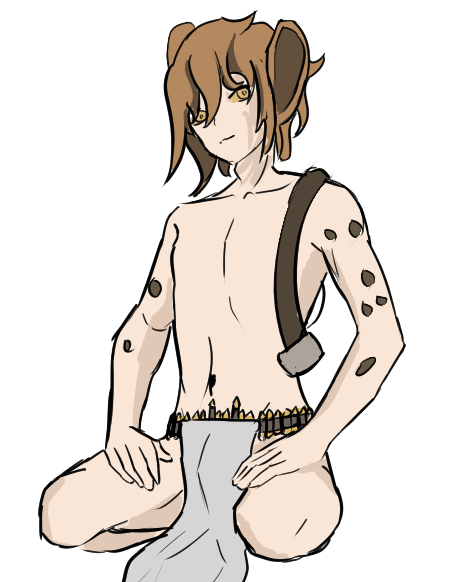
https://www.twitch.tv/videos/2290727465?t=0h18m3s
Not a huge fan of these kinda controls, but I guess they work well on console and so on. It would be nice to be able to remove a waypoint without directly clicking on it.
The graphics are obviously kinda cool, we all let you know in the thread already. The desert style with the tires and all has great vibes.
i like the genre, two minor nitpicks i noticed:
the beginning of the tutorial felt pretty slow. you should tell the player quicker how to assign units to a group to move them around
also, the aim of the units felt extremely inaccurate, which is not very satisfying imho, especially when shooting with multiple units against a stationary targets a few meters away and most hits keep on missing the target again and again
I thought this would be more of an auto-battler, but right now it feels more like an RTS but with annoying controls. I like the graphics. I tried playing right away without the tutorial at first, the only thing that was unintuitive was having to assign battlegroups before moving units and what certain buttons do. Played the tutorial after, but still don't know what this button does (go to waypoint on spawn?).
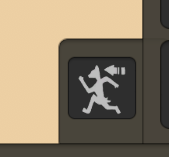
The guard icon is odd, I'd prefer a shield or something I think.
Add tooltips to the buttons when hovering!
Dragging the camera with right-click would be nice.
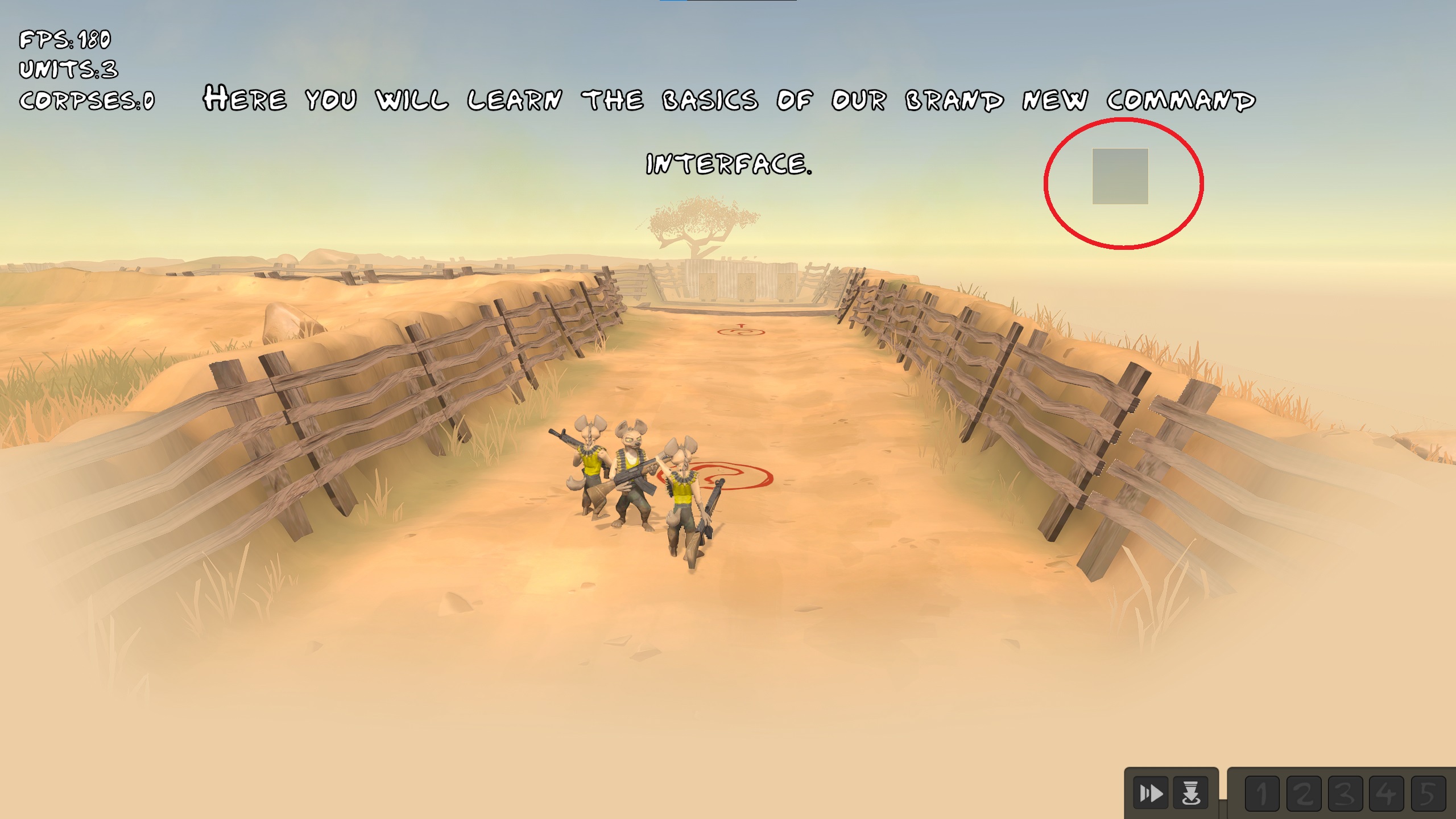
This square keeps showing up for some reason:
Clicking on the boards on the ground in the tutorial, trying to move on them doesn't work.
Its nice that they're enthusiastic but units playing a shooting animation on spawn looks odd.
Being able to enable both sprint- and guard-mode is odd.
Spawning units is way too spammy to be fun, I'd prefer it if you spawn in squads for most types of units instead so you don't have to click it like a maniac. Probably a global cooldown on calling in one tooso you don't get this weird minigame of trying to keep them all on cooldown all the time.
The feels like its some weird middleground right now between types of games and I'd think it would be good to lean into a specific type more. I didn't get that much macro type strategy feeling from it - more micro but your units are a pain in the ass to control. Constantly switching to sprint mode to have your units actually listen and then switching to guard mode for extra range to try and kite theirs, all the while spamming reinforcements; for example.
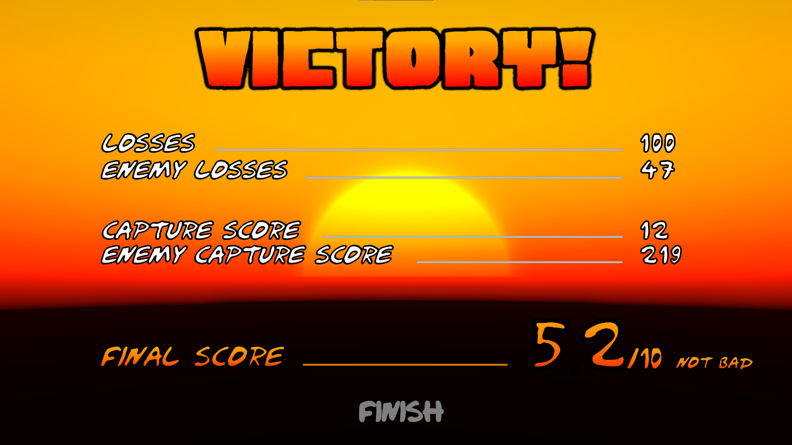
Also, 52 / 10 ? Alright...
Hey, thank you for the feedback. It's very crude and rushed but i'm trying to see what works and what doesn't, so all feedback is more than welcome...
Yes, that's indeed a waypoint button. I'll add tooltips to explain what the buttons do.
I have no idea what's up with that little square on the screen, i never had that before. Will check it out.
I do think being able to rush and maintain positions is a bit odd, but i wasn't completely sure about making both modes mutually exclusive unless if someone brought it up.
I plan to mitigate the spawn button spam with spawn queues like in the old c&c games.
And finally, for the score screen,there's a little dot there but it's not visible due to the font outline.
Hey, thank you for the review. Looks like i'll need to let it cook for a little longer, it's currently all very rushed... The enemy AI player is very stupid at the moment and all it does is throw units at the capture point. I'm working to make it smarter along with better map demos.
I saw the selection bug at the end, that's odd. I'll need to check what's going on.
Also, a little tip: It's much easier to win if you place a bunch of grenadiers behind that rock.
-Menu background graphic doesn't stretch/zoom to fill on my 16:10 monitor.
-Playing tutorial, I found it very unusual that I couldn't order my units until I set them to a group. Every RTS I've played lets you order things without groups, you instead batch select the units you want to use. Maybe just make group 1 automatically if one doesn't exist?
-Also, I couldn't tell if the tutorial was being sped along or if there was just a visual glitch, because I move along to the first encounter and sometimes a bunch of text would show up then immediately dissapear between two sets of tutorial sentences. On another note, I wish there was tooltips for the action commands, at that point most of the tutorial isn't necessary to read.
-Took me a minute to understand guard mode, doesn't help that for some reason my guys aren't shooting the moving enemy? I go on to beat the tutorial, and they never shot again.
-Game mode is kinda sucky, it's just a king of the hill with only 1 point of interest, and the enemy gets to cheat with way more(infinite?) reinforcements compared to me. Strategy didn't feels present, outside of making several groups to surround the enemy. Also, the physics based grenades are funny, but they bounce so much that it feels kind of luck of the draw for how effective they are.
-A tool tip to know that the button, which makes the units go to the waypoint automatically or not, would be nice.
-Graphical art is pretty darn cool, especially the characters. Animations are erratic though, most so the walk/run, which makes it less appealing while zoomed out and playing the game.
-Pop in, like grass, is way too aggressive and obvious to the eye.
Still early on, but has some promise. Keep it up.
Sorry if it's jank, everything's really really rushed...
The tutorial is very verbose, i really need to change it. It's odd that the units didn't target the moving target, i'll have to check that out later. The other thing you pointed out is probably a bug i haven't catched yet.
I plan to add more gamemodes. There's not much strategy per se since the enemy player AI is very stupid and it just sends their troops to the capture zone at the moment. Im working to make it a little smarter.
As for the art assets, thank you. Animations are placeholders at the moment but they'll look better in the next updates. I plan to add more unit model variations as well. As for the grass, i guess i gotta make the LODs fade a little more smoothly...
Anyway, thanks for the feedback!


Leave a comment
Log in with itch.io to leave a comment.