Indie game storeFree gamesFun gamesHorror games
Game developmentAssetsComics
SalesBundles
Jobs
TagsGame Engines
A jam submission

Project Nortubel (Still WIP)View game page

A 2D "escort mission" based game in Godot
Submitted by EyeBall Tank — 2 days, 23 hours before the deadline
Add to collection

Play game

Project Nortubel (Still WIP)'s itch.io page

Leave a comment

Log in with itch.io to leave a comment.

Comments

Submitted

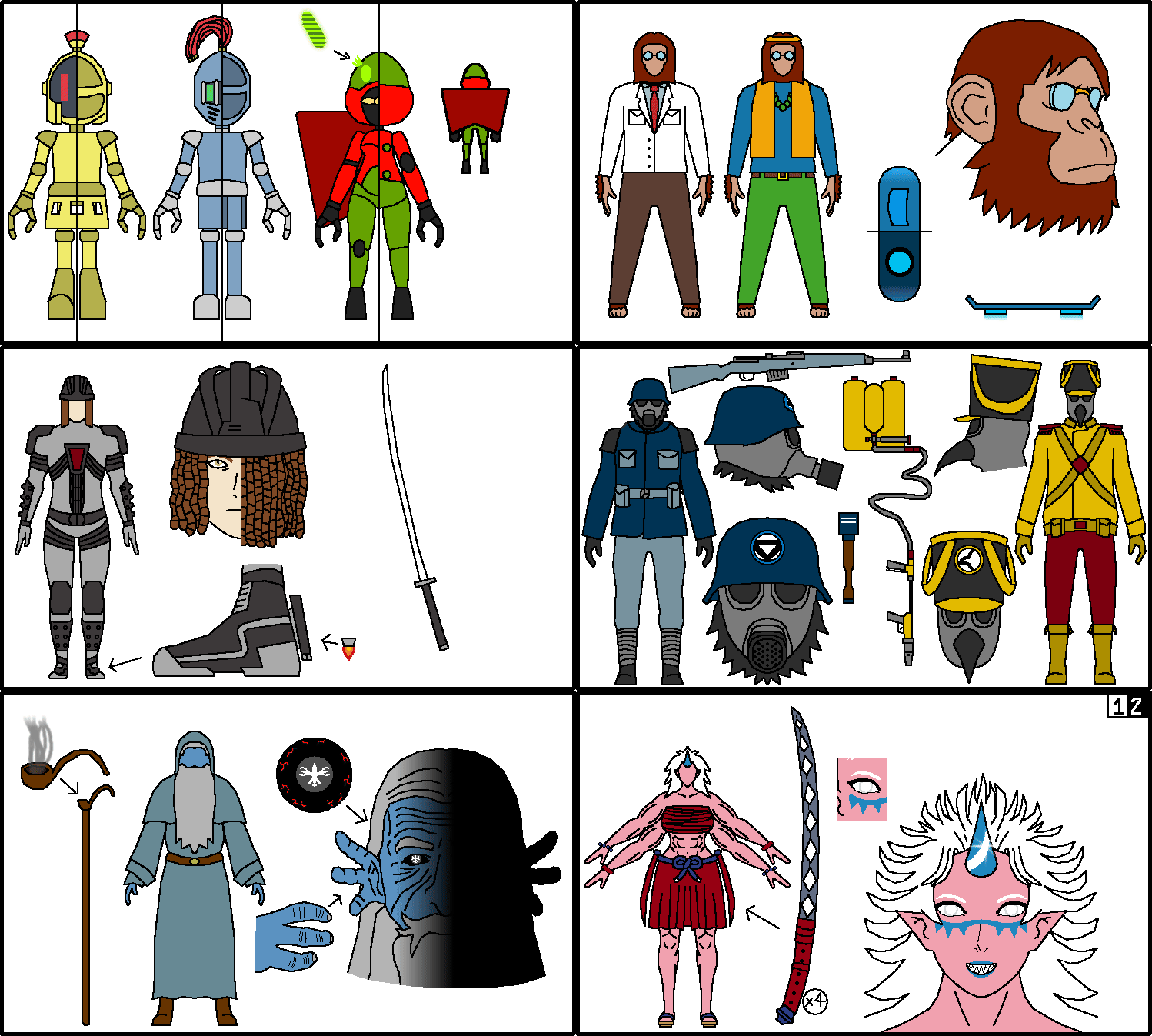
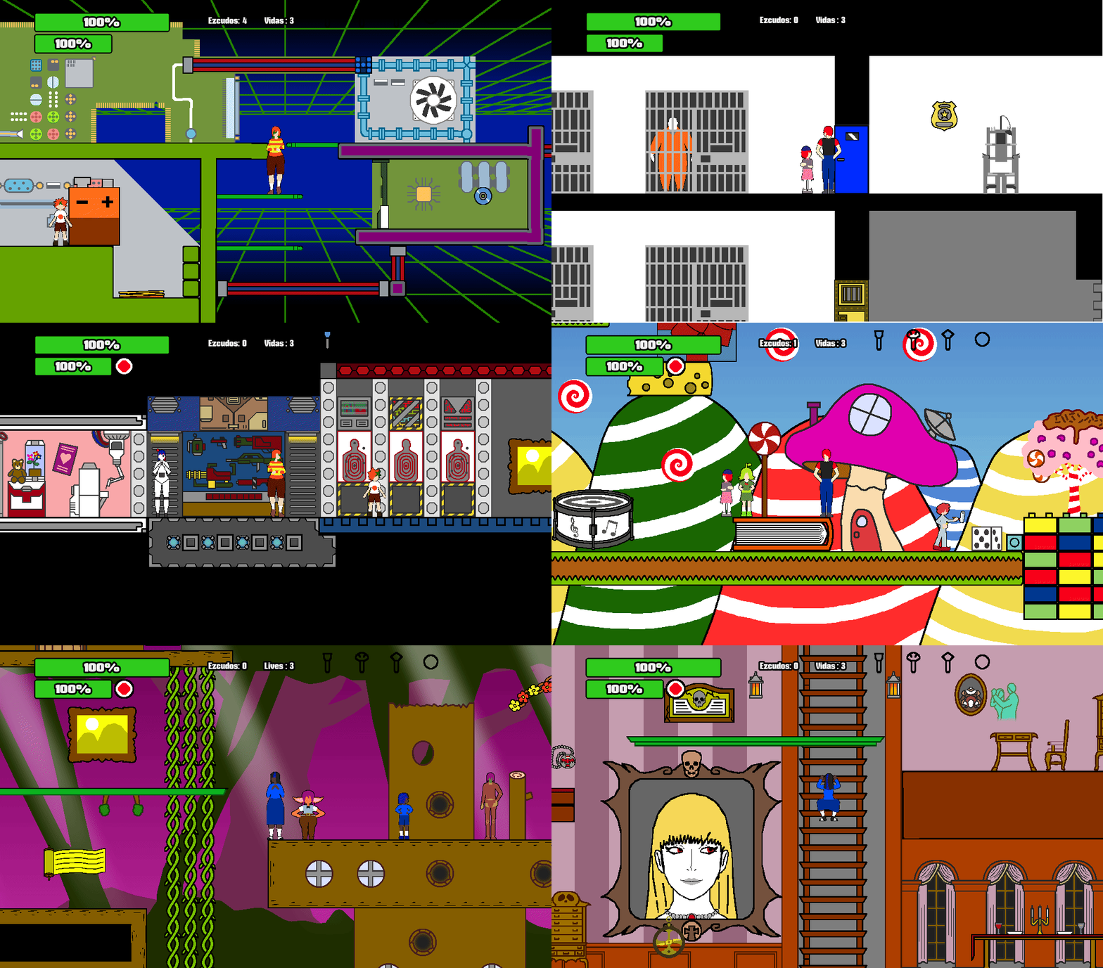
I think this is an interesting idea and there seems to be a lot of information already fleshed out in terms of characters and worldbuilding which is great! but I have to be sincere with you and say that both the UI and the sprites ingame are a bit lacking to the point where it might hurt the game and it's playability. 

Regarding the game mechanics, I found it to be a bit tedious to get the companion to behave like I wanted and often I felt like I was battling against the controls to get the desired outcome. Companion games are usually a hit or miss and I think that there's still some room for improvement in the companion behavior. 

Keep up deving!

Submitted

Played it for a 20 minutes? Got to a level, where I managed to push a giant vase on top of myself and got stuck, and apparently I'd misremembered the password as "osc4ro" but that didn't work. (you were playing as blue girl)

The intro goes kinda fast. You gotta remember that for first-time players, they're not just reading the dialogue, they're also trying to memorize the names and faces of the characters and see what's happening in the images.

The follower mechanics are interesting, but they sure take some getting used to. WASD doesn't seem to work with all the commands? Seems like an oversight.

I like most of the character designs, but clown girl's so clashing that she kinda hurts to look at.

For the tutorial, it might make sense to play as the clown girl to start with until you've got basic movement and mechanics like keys explained; you'd be able to keep things a little more simple since she doesn't have a kid companion to wrangle at the same time.

Graphics are generally passable, but the running animations stand out as really bad compared to everything else. I'd bump them up to 4 frames personally, but if you wanna stick with just 3, try looking at 8-bit Mega Man's run cycle for inspiration.

Developer

* I wonder if it's the 8th level where you got your brother to push the vase for you, since that's the one level with both the vase and where you play as Katrin (That's her name).

* (Pass on that level is "p33tt3").

* I'm trying to adjust timing of the intro, even if it makes the cutscene long becaues I could only do an animation as opposed to a proper slideshow with back and forth text change inputs.

* I'm thinking of getting rid of WASD movement because the combos with Q work better with arrows and WASD is a leftover from earlier versions.

* Characters clash because I thought of this game as an excuse to show off characters. You'll soon see her world but you'll also see other worlds that clash even more. Like a fake crossover.

* Well, being a huge ideas guy. I thought she could be playable in a potential game of her own. This one is about the 6 friends from Nortubel.

* I'll see how I can adjust sprites in the future.

Submitted

Yeah, it was p33tt3. I was jumping on top of the vase as my companion pushed it and accidentally fell down in the hole with the button. (You should probably make vases falling on you an instant kill so players don't get stuck)


I don't mean that the clown girl clashes in the sense that she looks weird next to the other characters - that's fine - but that the super bright yellow and purple right next to each other makes my eyes strain.

Developer

I made it to the vase can kill both characters like it can kill enemies.

I'll also see how i can handle colors later on, so maybe she could have a less annoying shade of yellow.

Submitted

I’m completely lost on what the theme of this game is.

  • The Companion controls are interesting, although I wish characters knew how to automatically jump off ladders
  • Where did the knife come from?
  • I’m not quite sure the proper ratio of font size to text box, but the font should probably be a bit bigger and is already high contrast so you don’t need black font outlines
  • The character sprites are nice looking.
Developer(+1)

* The game mainly exists to be an excuse for me to show off different characters, so even if the main world is Nortubel, I got plans for characters and worlds that are very different.

* I had to make their jumps/ladder use/quitting input related because their AI is very simple and I worked within my limitations and current skills. Least I can do is make sure later levels make better use of the core gameplay.

* The knife is just a basic idea for a melee. Maybe later in the game, there will be an explanation story-wise.

* Resolution in general is a mess and I thought it was because of the camera. 

* Originally, the character sprites were more detailed but it'd look off with the flawed resolution so I tried something more simple in comparison to before.

Submitted

Really weird setting and I'll be frank the visuals are a little off-putting.

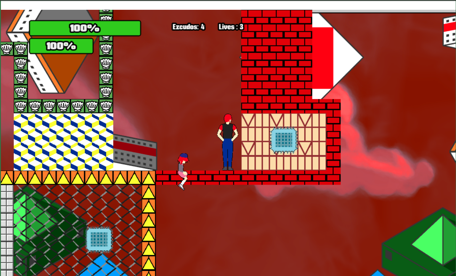
gameplay-wise, getting your follower to correctly get off ladders is really clunky and the levels are hard to read.
Like the wooden platforms you can stand on are very thin and hard to spot, while there's some walls you can go through and they don't really look much different than the ones that block you.
Similarly, the one retracting brick you have in I think the second level doesn't make it clear what it's going for, at least I didn't realize it was a timed platform until I missed the jump.

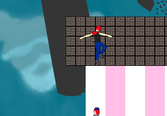
Towards the end I found this bug:

You can exit a swing and end up inside a wall, I suppose you could use the lack of collision while you're swinging as a puzzle mechanic.

Also the man o' war has some leftover black pixels at the bottom of the sprite.

Developer

An intention of mine was to use pure black on "solid" tiles and a lighter black/gray-ish tone on passable tiles but i guess i'll try to tweak that a bit more.

The idea of the kid climing is that first Z is pressed to attach them to the ladders (Usually, they'll enter a "CLIMBIDLE" state) and then the player uses the typical commands on follow/run/idle states and can press Z again to get the kids off the ladders.

It's a weird system that came from my current limitations but I want to make sure the level design supports the gameplay better.

Submitted

Hey, I have played until the part where the Bell shows up. I'm not sure it's the end, but I can't enter the door next to it, so that's where I quit.
Suggestions of things I think you can improve:
- Dialogue during the intro scene is way too fast. It should pause after each character's line and wait for player input, like visual novels and RPG games do.
- When a companion is off-screen, you could show an icon that looks like their head (maybe inside a white speech bubble, since your backgrounds are very colorful). I'm not sure the astrolabe will be intuitive to most players.
- Making the companion follow you in that part with the swimming pool and ladder was really difficult to me. Having to care about their oxygen made me even more nervous. Are you sure you want this system with your companions? It seems like your game would benefit from a system like "The Lost Vikings" had, where you control multiple characters, only one at a time. Check it out in case you don't know the game.
Things I really enjoyed: (!)
- Swimming. The part with the soccer ball. The part with the fishing rod. Those were all fun, but you didn't use them much. Killing the lizard with the knife also felt good, despite the crazy low range.
- The surreal visuals and strange characters is something I dig, makes the experience more unique.

Developer

The green door requires both characters, as stated in a yellow book from the first level.

* I still can't into proper "slideshow" cutscene/dialogue stuff so slowing down the animation of the cutscene is the least I can do.

* Maybe I could use an icon of their heads. I'd say the bigger issue is how it's not actually leaning to the border of the green but again, too ambitious for my first game.

* I've heard of Lost Vikings. Least I can do is make later levels handle the core gameplay better. The idea here was to press Z to attach the kid to the ladder after he swims high enough to reach it.

* The "surreal" visuals may or may not be intentional because my art skills are weak and when I imagine my characters/settings, they don't look like how they actually do in my stuff. After all, i still haven't added shaded to the characters in the cutscene.

But thanks for your and the others' comments.

I may still need to figure out things before adding new levels and content.

Submitted

>Introduced to 7 characters at once with barely anything defining them

>No way to pause r select when to show text, it just moves really quickly where it's hard to read

>WASD works, but it doesn't work with the commands

>The AI cannot handle ladders, I haven't been able to get them to use a portal unless the game teleports them automatically or them to leave the ladder to jump to the platform or they just stay at the top of the ladder

Needs a lot of work.

Developer(+1)

* I plan to make sure they get more interesting in later levels, be it cutscenes or side stuff like NPC interactions. Even if the "introduction" is very weak.

* Cutscenes are basic animations because I still haven't figured out a proper "slideshow" style presentation, but other people told me to slow it down at least.

* Arrows also work with movement, so I may have to ditch WASD in general.

* The kids' jump/ladder use/quit functions are bound to Z because I thought giving the player control over that was safer than figuring it out with the limited "AI". Maybe actual level design or tutorial info could still be tweaked.

* The portal mechanic is taken from a tutorial where its collision vanishes for 0.5 seconds, which might be another reason for them to not always work.

Submitted (1 edit)

Played through all levels, controls were clunky the whole time and moving along ladders is sometimes annoying but the puzzles were pretty fun, controlling the little kid is challenging but I feel like the puzzle design lets you know what you need to do then it's just trying a bunch of times until the little kid does it right. Also there was a bug where the kid got stuck in the floor after falling from a portal in one level.

Developer

All 9 currentl levels were rushed and edited later, so I may have to edit them again.

But when I add new levels, I hope they're less of a chore and better supportive of the core gameplay.

I think why she got stuck there is because of the way how the falling plat works behind the scenes.

Submitted

Very interesting, and impressively ambitious for a first game (a bit too ambitious, perhaps). I got up to the soccer ball part and then got stuck (couldn't receive the ball, tried knifing, jumping, crouching, etc on the bag and the net).


  • The intro is so fast that it's unintentionally hilarious with the text speed and characters constantly showing up before you can read the previous dialogue
  • Q + wasd for the companion commands is a really bad control scheme IMO. Just make the modifier something on the other side of the keyboard so you don't have to awkwardly take your hand off WASD
  • The part with the ladder above the water filtered me for a while. I think having to command the follower to follow you to get them to climb the ladder is too unintuitive.  Once they're on it they should just follow you.
Developer

The soccer bag should give you the ball automatically if you go near it and if you run out of balls, you have to be outside the bag and touch it again (Yes, I know).

Unless there's some other collision issue i overlooked.

* I may have to play with speed values in the intro.

* Movement also works with arrow keys. Q+Arrows in general exists because originally the game had S/F/R but someone thought it was too complicated. Maybe i should drop the WADS inputs from movement and keep it on arrows?

* I tried to make the kids' jump and climbing attachement optional because making it "automatic" could've lead to other issues. Even if it's still off, i wanted to make sure it'd be less bad if there was some "control" behind it.

Submitted

This is completely insane and I do not understand anything, but I am interested in trying more. The companion-system is extremely busted though, sfx should be replaced and you need to slow down the intro-scene or make it so that you can control when it goes from one textbox to the next. 

Developer

Being my first game (Too ambitious for that to begin with), there will be weird stuff about it that I should address in the future ("Addressing" not the same as "fixing").

* The kids' AI simply follow's the Player's position in the level and their jump being an input is an alternative to decide when they should jump automatically.

* Least I could do is make sure later levels are fun and handle the current state of the gameplay (Since most levels currently were rushed).

* Or rewrite those yellow book texts to be more explicit.

* As for sounds, I get them from FreeSound so it depends on whether or not I find better sounds from still free-for-use places and figure out how sound can work in general.

* The cutscene could be a matter of just messing with numbers in the animation at least (Because I still don't know how to make players "control" it like a video).

Because I had some other people play my game and some managed to go beyond the first level (Since this one seems to be difficult to other of the few players).

In a way, it's all a matter of my current skills, which is why I think "if I finish this game, the next one should be more simple" and even think that maybe in the future, this game could use a remake.

In other ways: If I can't fix some current issues, least I can do is "add more good that just coexists with the bad", even if there'd still be "more bad".

Submitted

I certainly think you should continue working on this, the level of craziness has a lot of value I think and may turn into something good in the future.