
Thanks for playing, and don't worry about being too critical! I actually just replayed super mario world and have become blackpilled about making a good full-length 2d platformer--it's way too hard for the amount of demand (essentially zero).
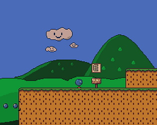
Good point about level design, it's not supposed to be a rage platformer, but it definitely plays like one. That's another problem with platformers, you can spend hours making a level that the player blasts through in 20 seconds. And I feel I've run out of ideas for levels that aren't just sadistically precise jumps.