Play game
Op Attack's itch.io pageResults
| Criteria | Rank | Score* | Raw Score |
| Arts | #33 | 3.266 | 4.000 |
| Audio | #35 | 2.552 | 3.125 |
| Mood | #46 | 2.552 | 3.125 |
| Gameplay | #46 | 2.449 | 3.000 |
| Theme | #49 | 3.062 | 3.750 |
| 2 Colors | #65 | 3.572 | 4.375 |
Ranked from 8 ratings. Score is adjusted from raw score by the median number of ratings per game in the jam.
Team1
Xin Jin Meng
Leave a comment
Log in with itch.io to leave a comment.


Comments
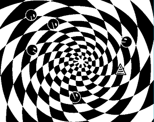
The gameplay itself is good, nothing too revolutionary but still fun to play. I really liked the slow-moving trippy backgrounds (especially the swirly vortex one), but the ones where it rapidly flashed between two colours were extremely painful to look at.
Also, probably an error on my end, but I couldn't get the controller inputs to work properly on either version.
Thank you. 💙 I'm not sure how I feel about the flashing "false-colors" either, but it's something I wanted to try.
If someone else reports a controller problem, I'll look into it. I wish I could make the keyboard easier to use.
I think the false colours are a good idea in theory, but I'm fairly sure you need a really high refresh rate to pull it off seamlessly. Otherwise, I've found that it's only really acceptable on small sections of the screen (IE player sprites)
And btw, I found the keyboard controls easy enough to use as they are.
Very nice, but please, for the love of Chin-Chin, don't save those as installers.
How did you achieve the backgrounds in GM? A vertex shader on a texture?
Thank you for your kind words. 💙
Where is the option to make a stand-alone app in GameMaker 2? I couldn't find it, it isn't where it was in GM1.4.
The background layers are currently stored as large files -- at 640x640, a 36-frame animation fits on a 4096x4096 texture, and most of these are 12 frame or fewer. I would have liked to have used shaders and palette rotation tricks, but 48 hours wasn't enough time to plan. I'd like to revisit this using the animated tile system.
I don't know where it is, I'm still using the superrior 1.4 :D
Oh, so that's why the game is this big :D
Yes, I fear "stand-alone application" is deprecated in GM2.0, probably because of all the security warnings.
GM 1.4 is still alive!!!
Ah my head and eyes hurt, but I'm impressed by the graphics. The backgrounds, font and explosion look very polished.
Thank you. 💙 When I first heard about the two-color jam, I wanted to experiment with "false color", a technique used in film where the frames alternate so fast that the persistence-of-vision effect creates a third color. In a computer game, such an effect requires a balancing act of refresh rates that is going to take more work.
The fonts are Helvetica (which you see everywhere) and Buxom (which you do not).
Simple game but very fun. I liked the visual style of the game, gives you some variation to not get bored during a game and the attack mechanic feels satisfying.
Thank you. 💙 I purposefully wanted the backgrounds to be distracting for an otherwise simple game. Some of these, I get so turned around!
Very trippy and fun!
Thank you. 💙