Thanks for noticing! We spent a bunch of time on these effects so it's nice when people recognize them.
Jacob Migneault
Creator of
Recent community posts
This is a great idea and I think you did it justice in your execution. It seems like the goal was for each puzzle to require both modes and I think that basically worked. The lockbox puzzle felt very escape room-like which was fun. I didn't enjoy wandering around in the dark but I can respect that it was a clever way to me to play entirely in text mode for a while and getting to walk back with light later was a cool payoff. Really good job overall!
I really liked this! The atmosphere is incredibly relaxing and the concept is so fresh and ambitious. At first I just rode around on the scooter which was super fun. My only concern there is that it's so fun that I didn't want to stop and take pictures. I eventually restarted the game because I couldn't remember what I'd taken pictures of while randomly scootering around.
On my second try I carefully followed the paths. Unfortunately, I am directionally challenged so I had a lot of trouble finding all the heads. I got 10 pictures of (I think) different heads, but the 11th head and one or two notes alluded me (I did find the totally destroyed head, which I feel like *should* have been the tricky one). I attempted to do some deduction from there but realized that the clue about there being a series of heads meant that just having pictures wasn't enough and I'd have to remember where each head I had pictures of was. That felt pretty impossible for me, so I realized I'd have to restart again and take notes to really do the puzzle correctly.
I hope this feedback isn't too detailed and/or honest. This really is one of the coolest games I've played so far in the jam and I thought you might find an account from someone really trying to solve the puzzle interesting. I'd check out a post-jam version if a few quality of life improvements were made!
I was honestly impressed with just the boat race and then the reveal that it's only part one of three was super impressive! I thought the pacing was really good and buying the upgrades felt satisfying just like in an old flash game. I also liked that you went for different movement schemes for each type of race, though I'll echo a commenter below and say that the air race was probably the least interesting (and I think I liked skateboarding the most!). The other little nitpick I'll give is that the upgrade UI was a bit confusing. Really nice work. Probably the most pure fun I've had with an entry so far!
The level of visual polish you all pulled off is really impressive given the time constraints! I think the core idea of mixing potions is a fun one. It reminds of the Magicka, which was always silly fun. I feel like there need to be more reasons to vary which potions I'm using. It also seemed like there were a few performance and technical issues, but that's very understandable when implementing a complicated idea like this in only two weeks. Great work!
This is super cute! And I love that you went for something original and ambitious. I found the experience alternated between silly chaos and somewhat frustrating interactions between the physics and controls. That's probably inevitable considering the time constraints and those moments of silly fun were really great!
This is a cool design. I like the idea of being able to split into multiple characters and that having both uses and drawbacks. I didn't love the secondary movement mode because it was a bit confusing and it wasn't obvious to me when it was useful. I also wish it was harder to fail levels by making the wrong moves. The solutions take a relatively long time and having to reset them multiple times because of mistakes was a little frustrating. I liked it overall though, nice job!
Nice effort! It sounds like you're not super happy with results based on your description so I won't provide too many detailed suggestions. I'll just say that I think the concept could be interesting (switching between vertical/horizontal only movement modes), but the final product was a bit confusing. In particular it took me a while to figure out how to kill the enemies.. Regardless, getting anything submitted is an accomplishment!
Nice work! I love the elegance of this idea and the art is super cute. I think there's some good puzzle ideas in here. The gravity switcher thing with the arrows is a cool idea. I wonder if the level order could use some tweaking. For example, the first real puzzle (level 4 I think?) introduces the gravity switcher, a cube, and a disappearing platform all for the first time, which was a little confusing. But overall I think the big picture design is nice. Good job!
Whelp, now DirectX is crashing right after the opening monologue. It seems the universe does not want me to try this game :( This probably is some sort of bad interaction with something in the game and my GPU/drivers. Probably non-trivial to debug so maybe not worth it, considering other people have been able to play fine.
Regardless, here's the error in case you're curious:
Fatal error: [File:D:\build\++UE5\Sync\Engine\Source\Runtime\D3D12RHI\Private\D3D12Util.cpp] [Line: 873]
PresentInternal(SyncInterval) failed
 at D:\build\++UE5\Sync\Engine\Source\Runtime\D3D12RHI\Private\D3D12Viewport.cpp:633
 with error DXGI_ERROR_DEVICE_REMOVED
I really enjoyed this! I thought the bill-boarded characters and objects were really cute and the premise kept things interesting. I fear the main cultural reference went right over my head (I had to google what the pioneers were!), but I still found the whole vibe really intriguing. For example, I was amused by the posters in the second story. Nice work!
Unfortunately, I'm getting an error while trying to run the game. Actually, I first get errors while trying to extract the zip ('Unexpected end of data'). Then, when I try to run I get:
Game files required to initialize the global shader library are missing from:
<install-path>/ThroughTheCatacombs_V1_4/ThroughTheCatacombs_V1_4/ThroughTheCatacombs/Content/
Please make sure the game is installed correctly.
Might be on my end if no one else is having problems. Or maybe only the most recent build got an incomplete/corrupted zip file?
Looks spooky and interesting from the screenshots so hopefully this can get resolved!
Appreciate you playing! Yes, in the end I'm decently happy with how the movement feels, but then you don't really get to do anything interesting with it. Time constraints led to game play not getting fleshed out more. If did it over again I would prioritize more interesting gameplay. Thanks for the feedback!
Thanks for playing! Yes, I'm not much of an artists, haha. If I ever expanded this to a full version I would definitely find an artist friend to help out in that area.
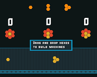
My guess is the duplicate bug you saw was a consequence of the fact that new hexes will generate even if you don't use the old ones (as long as you pull them off the generator and drop them *somewhere*). My guess is you clicked on a hex and so it didn't move, but it was technically removed from the red generator. Regardless, that whole behavior is weird and unexpected so it's definitely an area that would be fixed in a full version.
Sorry about that! You need to click on the red hexes at the top to choose a shape to produce. Then, press the start button and you should be able to drag and drop those hexes from the red grids down onto the assembly line below.
If that's still not working for you then maybe you've discovered a new bug :)
Wow, this is really well executed! The visual design is amazing and the feel of controlling the character is super solid.
I really liked the idea for the main mechanic and I think it fits well with the theme. Unfortunately I'm not very good with platformers so I spent a lot of time wait for 2.5 seconds and then totally failing my jump timing :)
Really good job overall!
Nice work! Unfortunately for Pingus, I am not good at building icebergs. I love the setting and the overall vibe of this one. The background art in particular is really nice and sets a great mood in combination with the music.
I found the gameplay mechanics pretty clear, but the strategy element wasn't as clear to me. Sometimes it felt like it was a bit arbitrary where I decided to put things. I also think the cloud mechanic could be tweaked a bit, because I kept missing the window and then would just kinda be sitting there waiting for the next one (though I understand this mechanic is partly to adhere to the theme).
Great work overall! Probably the silliest game I've played so far :)
Wow, this is great! Super polished and generally well executed. I like that you experimented with a variety of mechanics and then played them off one another.
I think there's a tension between the more puzzle-y side of the game and the dexterity platforming side which you did a good job balancing. The one mechanic that maybe leaned too far in the dexterity direction is the controls reversal. That mechanic felt more annoying than interesting to me. But maybe that's just because I have no dexterity, but like puzzles :)
Ignoring that one nitpick, your game was really fun! Great job overall!
This is fun! I'm impressed by how much you made out of a very simple mechanic.
I wish the rules of movement were slightly better communicated/defined. I figured out that getting a running start makes you go higher pretty early, but the movement sometimes felt a bit unintuitive.
Also, you might be aware, but the spike kill boxes are a bit too small in places. I saw the spike animation but didn't die a number of times.
I do love the little shadow visual effect on the player. It makes a visual style that's basically "oops all orange" look really slick!
Love the aesthetic and general flow of this game! The color palette, transitions, and sound design is all spot on.
I'll second the commenter below and say my biggest suggestion would be to make tweaks to the camera persepective. Because of the perspective it felt like objects weren't dropping where they "should". Much of the challenge was trying to compensate for this effect and that doesn't feel like the most interesting part of the game to be focused on.
Overall a cool experience, good work!
Wow, this game has immaculate vibes. It's polished in all the right places. All the growing animations are really impressive technically.
Not sure what plans you have for post jam, but I think this could be a great fit for a laid-back mobile game. I could imagine somebody working on their tree a few minutes at a time over the course of a day.


