
Super fun, felt like just the right length too. Long enough to get brain-twisty, but not so long as to get too overwhelming either
A member registered Apr 26, 2014 · View creator page →
Creator of
i wrote a very good and normal story just scroll down to read it! it is not a trap


Recent community posts
itch.io Community » General » General Discussion · Replied to Kador in Opinion on the offense of this ironic objectification joke
It’s not common, but it has happened. I recall a lot of older games by Cactus having that effect on me back in the day… with a lot of these games, the strangeness and confusion is a part of the game rather than something external though.
Having taken a longer read of the page and watched the gameplay trailer, I do think your game has that kind of energy but the page isn’t doing a good job of presenting it through the game. I think it comes back to the other commenter’s point about there being too much visual noise–the art’s cool, but makes it harder to focus on the content that would tell you more directly what the game is and make you want to try it.
I also think this bit “FREE GAME: An overly ambitious action platformer with a ton of features. Over 50 levels. 50 cutscenes. Around 750MB of oggs. Make of that what you will.” …being red-on-red ironically causes it to stand out much less than the rest of the text on the page, despite being a pretty solid hook.
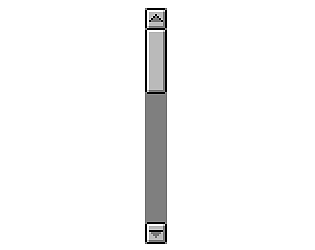
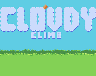
Like honestly the whole problem might just be page design / layout. Like look at this image I snagged off the bottom of the page:
This looks really cool, but I only just noticed it while writing up this comment because, as mentioned, it’s at the very bottom of the page.
itch.io Community » Game Development » Get Feedback · Replied to artpro25 in feedback on art requested
Alright, this might be a bit of a long post but I’ll see what I can do:
The Basics
I’m going to assume the aim here is pixel art, and (since it’s in your asset pack) it’s intended to be used as a game asset, something like an inventory icon or weapon sprite for a character to hold. A few starting notes on the game side of things:
- It helps a lot to give your assets a transparent background, or at least always use the same background color in them so that devs can easily remove it. Some types of assets like character portraits can have a custom background more easily, but with item sprites and the like you can’t really know in advance what background they’ll need to have.
- Another thing that helps is to use consistent sizes, I think most devs grabbing an asset pack expect to be able to use most of the included assets together and it’s gonna be a lot harder if they’re drawn at different scales. This is even more important with pixel art, since it scales quite badly. Ideally you want to make your item images all the exact same size (and maybe even look up some standard sizes for sprites and use those, since there’s a good chance the people using your asset pack will be using other people’s assets as well).
Now, on the pixel art side of things there are a few guidelines I’d recommend following. There are no absolute rules in art, but if you break the “rules” of a medium without understanding them it will usually make the result worse than if you’d followed them. You can find a much longer list over here, but I’ve pulled out the couple that are most relevant to the piece you posted above:
- Unless you’re very deliberate about it, you really want your pixels to all be the same size. I don’t know what your workflow looks like right now, but generally when making pixel art you want to be working with a very low-resolution image, zoomed in, and never scale the image while working (unless it’s to make a bigger copy that you can show people, or you know exactly what you’re doing). From the fact that the rectangles often line up exactly but are all different sizes, I get the impression that you might’ve scaled the image up a few times while working…but frankly I think it would’ve looked a lot nicer if you hadn’t (and it would’ve been a lot easier to put in a game, at that)
- Setting the scale aside, the image is also really heavily dithered (that is to say, you’ve used a checkerboard pattern all over). I would describe dithering as a spice: A little bit goes a long way, and too much of it can make the piece feel messy. While it was more heavily used in old media, this is because screens used to blend pixels together in a way that would make it more effective as a way to ‘mix colors’ like you would with paint. In modern times, that’s no longer possible so while you can still use it to mix colors you need to use much smaller amounts or the image will start look grainy.
The Sword
So, one thing you did well was giving the image the impression of a flaming sword. I didn’t check the name of the image at first, but I could tell what it was and that’s a good sign! I do think you could make it better though, by either giving it more form or less form. In other words, make a well-rendered sword with fire / flames as a part of it, or make a sword that’s more of a flame on a handle than a blade. Right now you’ve made something shaped like a pretty typical sword, but the pixels are just a bunch of messy red, orange, and yellow like a flame might have.
I did my own take, which I’ve broken down step-by step:
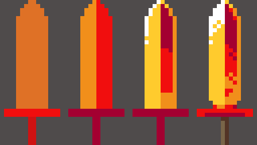
- The first thing I did was ‘block in’ the basic shape of the sword’s hilt and blade. You can freehand things with shading, but it usually helps to get the basic shapes in place first so I’d recommend trying that while starting out.
- Next, very basic shading. I noticed that your sword had one slightly lighter side, so I decided to go with a simple split down the middle. The light is coming from the left, so one side of the blade gets more, super simple, you probably don’t need to hear that bit :D
- The 3rd step is where it starts to be interesting, because you’ll see that the base of the right side has some orange to it now. There’s a reason! When looking up references for blades, I found this photo which I really liked. It showcases how metal, being reflective, will often get some reflected light on ‘dark’ side of the blade. While the main light source is coming from the left, and I detailed that slightly with the highlight on the edge of the blade, I gave it a little bit more light on the right to help create that feeling of a reflection.
- Lastly, we have the final details. I felt that the highlight along the edge felt too flat, so I expanded it to cover the full width of that side of the blade (but notice the hard contrast between the two sides–this is helps makes the blade look sharp). You can also see that I added some dithering back in…you could do more than I did, but hopefully this shows how just a little bit helps add interest without detracting from the overall piece. For the hilt, I tried to create some contrast in terms of both the lighting and the overall colors, to make it feel like this hot sword’s handle is made of some other, less flaming material. I also added a little bit of a notch at the bottom of the blade, because I think it looks cooler like that.
Aaaaand, that’s probably where you want to stop if the sword is supposed to be held by characters in a game. Your sword had a bunch of sparks / embers around it, which is nice on its’ own but would look really weird in the context of a guy holding the sprite while running around. Those kinds of effects tend to be handled by the programmers, adding in particles that appear around the weapon rather than being pre-drawn in a static position like you would for a normal piece of art.
Of course, if this is more like an item icon that you’d put in the character’s inventory then you could add some effects like that. So I sketched in some flame effects too:
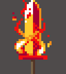
You can see that I’ve got a couple of embers around the sword, but even here I’m relying more on clusters of same-colored pixels to create the flames around the blade. It’s not perfect, but hopefully it gives you some ideas on how you could improve your sword (or make new ones!)
Resources
I wanted to leave this off with a source you might find useful on your journey: Right here
Lospec’s list is pretty comprehensive, and while the quality of the tutorials in there varies there are some very good ones to be found.
If I had one recommendation though, from my experience learning pixel art a while back: ‘How to draw X’ tutorials are not really worth your time in the long run. Instead, I would look more at the tutorials that cover more general skills such as lines & shading. Once you get your fundamentals to a certain point, you become able to draw literally anything without instructions so building those skills is more useful than following instructions on how to make something specific.
itch.io Community » Game Development » Get Feedback · Replied to artpro25 in feedback on art requested
itch.io Community » Game Development » Get Feedback · Replied to artpro25 in feedback on art requested
itch.io Community » General » General Discussion · Replied to Kasper Hviid in About the censorship situation, and AI
itch.io Community » General » General Discussion · Replied to Kasper Hviid in About the censorship situation, and AI
itch.io Community » General » General Discussion · Replied to kenjiyoi in About the censorship situation, and AI
itch.io Community » itch.io » Developer Updates · Replied to houdini-magazine in Generative AI Disclosure tagging
itch.io Community » itch.io » Developer Updates · Replied to IslandWind in Generative AI Disclosure tagging