my asset packid like feedback i have worked extremly hard on improving and making great art
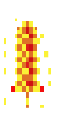
that icon above is one of my work
not here to sell just for feedback
my asset packid like feedbacki have worked extremly hard on improving and making great art
that icon above is one of my work
not here to sell just for feedback
please tell me what you thin kof this free asset pack https://artpro25.itch.io/potion-icons-pack-fantasy-rpg-item-assets 20 + free assets i made on my own time
there meant to be simple and forever improving in quality
This is kind of my point actually: If you’re asking for feedback on the whole set, but only a few of them reflect your current style / skill level, then there’s a good chance you’ll get useless feedback on because the people trying to help are looking at an old piece.
Alright, this might be a bit of a long post but I’ll see what I can do:
The Basics
I’m going to assume the aim here is pixel art, and (since it’s in your asset pack) it’s intended to be used as a game asset, something like an inventory icon or weapon sprite for a character to hold. A few starting notes on the game side of things:
Now, on the pixel art side of things there are a few guidelines I’d recommend following. There are no absolute rules in art, but if you break the “rules” of a medium without understanding them it will usually make the result worse than if you’d followed them. You can find a much longer list over here, but I’ve pulled out the couple that are most relevant to the piece you posted above:
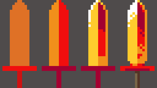
The Sword
So, one thing you did well was giving the image the impression of a flaming sword. I didn’t check the name of the image at first, but I could tell what it was and that’s a good sign! I do think you could make it better though, by either giving it more form or less form. In other words, make a well-rendered sword with fire / flames as a part of it, or make a sword that’s more of a flame on a handle than a blade. Right now you’ve made something shaped like a pretty typical sword, but the pixels are just a bunch of messy red, orange, and yellow like a flame might have.
I did my own take, which I’ve broken down step-by step:
Aaaaand, that’s probably where you want to stop if the sword is supposed to be held by characters in a game. Your sword had a bunch of sparks / embers around it, which is nice on its’ own but would look really weird in the context of a guy holding the sprite while running around. Those kinds of effects tend to be handled by the programmers, adding in particles that appear around the weapon rather than being pre-drawn in a static position like you would for a normal piece of art.
Of course, if this is more like an item icon that you’d put in the character’s inventory then you could add some effects like that. So I sketched in some flame effects too:
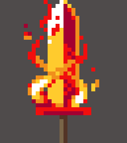
You can see that I’ve got a couple of embers around the sword, but even here I’m relying more on clusters of same-colored pixels to create the flames around the blade. It’s not perfect, but hopefully it gives you some ideas on how you could improve your sword (or make new ones!)
Resources
I wanted to leave this off with a source you might find useful on your journey: Right here
Lospec’s list is pretty comprehensive, and while the quality of the tutorials in there varies there are some very good ones to be found.
If I had one recommendation though, from my experience learning pixel art a while back: ‘How to draw X’ tutorials are not really worth your time in the long run. Instead, I would look more at the tutorials that cover more general skills such as lines & shading. Once you get your fundamentals to a certain point, you become able to draw literally anything without instructions so building those skills is more useful than following instructions on how to make something specific.