Indie game storeFree gamesFun gamesHorror games
Game developmentAssetsComics
SalesBundles
Jobs
Tags

Human NPC sprites - thoughts?

A topic by Nanoff created Jan 24, 2022 Views: 1,528 Replies: 25
Viewing posts 1 to 12
Developer

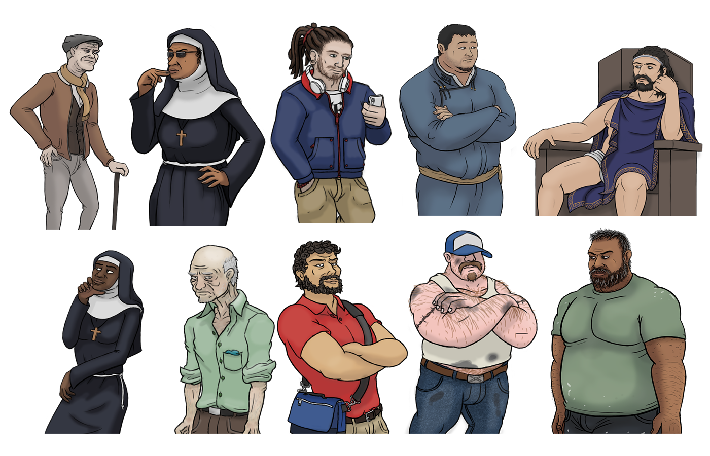
One of the biggest points of criticism we received for Minotaur Hotel is the human NPC sprites. We've been insisting for a while that making the characters look kind of ugly and naturalistic to contrast with divine beings is a conscious design decision, but it seems like that is not being conveyed properly, so this is something I'd like to improve going forward.

And... going backward. A while ago I made a post with the updated Greta sprite we'll be using starting in 0.6 (seen below for comparison)


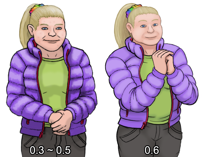
(also don't worry the old sprite is still there if you play with the speedrunner background)

So, I'd like to hear your opinions. Would you guys say this is a substantial improvement? Does it convey the idea that Greta is not exactly a looker, without coming across as an excuse for bad art? If so, what would you say needs to be fixed?

And besides Greta, I'm going to post all the human NPC sprites currently below (well, not all of these characters are human, but you know what I mean). Which ones would you guys say would really benefit from an updated sprite? What's the one sprite that makes you go "Minotaur Hotel's human characters look really bad"?

(+2)

I'd say the nuns look a bit out off, especially the one without the sunglasses

(+1)

Who is the old man in the top left? I don't think I've ever seen that sprite...

The other character that might need a bit of updating would be Greta's boyfriend, whose name escapes me.

(1 edit)

I believe he's in wolfs intro

Developer

Yup
I made the sprite on an earlier draft where i thought he'd have more screen time, but he ended up appearing for two or three lines of dialogue

Ah okay, I've never done wolf's intro

i would say the old man from the introduction might need an improvement. considering who he is.

Oh, yeah. Probably.

I think the nuns and Jean need it the most, though my main gripe with him is he looks a little too attractive, but in sort of an artificial way... Which may have been the goal but it's always kinda bothered me

I think that's the point with Jean, considering who we find out he is.

The flower shop mascot?

(1 edit)

Sure ;)

(+2)

Ishmael and Greta were the only ones who ever took me out of the narrative.

I guess Luke's trucker always kinda looked like he was wearing a fake moustache? But not enough that I didn't want to rewatch the scene.

I'm actually going to argue against updating Jean, there's a real subtle 'painted on the side of an urn' quality to him, and I feel like that'd be really easy to lose.

I definitely feel like he feels fake, not quite right.... a bit, artificial?

Which works! It fits beautifully when you figure everything out!

The top right sprite's always bothered me. Not because the art is bad, but mostly because it just looks like a guy wearing his underwear. Considering who he is, he really should have a more intriguing appearance. Like a more extravagant outfit.

Yeah, I always thought he should look more regal.

i wonder, because while the idea was to make human characters purposefully mundane, shouldn't divine beings have an unnatural feel to them?

Developer(+2)

That's a good point, and the design for that character is one that we debated a lot internally with the team.

Keep in mind that, in the scene we see him in, he's having a private conversation with Asterion. He's dressed a little more casually than you'd usually see him. He's also really fucking tired in that scene. Another important thing is that, out of the Gods, he's portrayed as the most human and approachable.

I 100% understand the disappointment, I fucking love more stylized portrayals of the character (Jen Zee's from Hades and Gerald Scarfe's from Hercules for example), but for Minotaur Hotel in particular we wanted to go in the opposite direction and humanize him, since (if the Homeric Hymns are anything to go by) he's the least of an asshole in the Greek pantheon. 

Also, look at how ancient Greeks portrayed their gods in statues and vases: they're just dudes. Really aesthetic dudes in striking poses, yes, but dudes nonetheless. And they're wearing simple togas and chlamyses.

Well shit there goes my attempt to not spoil who the character is for people reading the forum that haven't gotten to that point yet. Go play the game.

The unintentional consequence here is that the frumpiness makes Greta endearing. I get the feeling we should hate her but Greta said nothing wrong and she would have changed the world for the better if we went along with it. Queen shit!!! 

Anyways if you update her you might as well update Ishmael for the sake of noticeable disparity. Aside from Jean/Hermes who looks fine, Greta and Ishmael have the most time on screen. 

Developer(+2)

Well, the responses here have been incredibly mixed. Thank you guys for the feedback, you all raised good points. I'll try to address most of these eventually.

For the time being it seems the consensus is that Ismael's sprite sticks out the hardest now that Greta got upgraded, and I have a bit of time while the writers finish editing the last chunk of content for 0.6.0. So...


Here's a comparison between the old and new sprites.


It's also an opportunity to show off the gothic script uppercase "E" in Ismael's graphic tee a little better. Don't know if I've ever mentioned it but the sweater hides two more letters to the sides of the E (L and F), which spell "Liberté, Égalité, Fraternité". Between that and the color of his clothes Ismael is... French. He's very French.

(+4)

Just the addition of his head turning makes him feel a much more alive

(+2)

I agree, he looks much better! 


Thanks for listening to everyone's input :D

I will say though, the pose where he's looking at his phone his forehead looks massive, I'm not sure if it's just the angle making it look like that though

Developer

It might look a little too big, yeah. I still have time to fix it.

(1 edit)

Oh.  Have we seen all we'll see from Mr. Vase painting in pink?  If not he could use more expressions at least.


Well okay it's more of a red.

I'm going to go ahead and say it. The nuns, especially the one in the sunglasses, are perfect to me. Considering where you encounter them the fact that they look like they are entirely done with this shit and ready to throw down if need be just fits so well in the narrative. If you do any sort of rework of them definitely continue going for that vibe.