Indie game storeFree gamesFun gamesHorror games
Game developmentAssetsComics
SalesBundles
Jobs
Tags
A jam submission

ShootBoyView game page

An endless runner made for the ScoreSpaceJam17
Submitted by FonkinS — 21 minutes, 36 seconds before the deadline
Add to collection

Play Really Cool Game

ShootBoy's itch.io page

Results

CriteriaRankScore*Raw Score
Aesthetics#463.4833.483
Sound#542.9312.931
Gameplay#642.9312.931
Overall#792.7412.741
Theme#1321.6211.621

Ranked from 30 ratings. Score is adjusted from raw score by the median number of ratings per game in the jam.

Leave a comment

Log in with itch.io to leave a comment.

Comments

Submitted (1 edit)

Great visual and game, just didn't understand the 30s thing and can't get the leaderboard button working and don't see the link to the Protect theme. A good piece of work anyway

Submitted

I like the look and feel of the game and UI but for some reason kept dying like immediately. I was thinking maybe I was hitting the wrong buttons but I think theres some issues with that

Developer

You were dying after exactly 30 seconds, because if you look closely at the top left corner, there's a timer ticking down. Yeah I really should have made that more clear

Submitted

Really solid gameplay and aesthetics. I liked it!

Submitted

Doesn't really fit the theme, what are you protecting?

Developer

If you read the description, you will see that I have squeezed the very bad explanation of "you must protect the realm by running through it and killing the monsters that have invaded it". In other words I didn't really follow the theme

Submitted

Well, I didn't notice that part. Sorry.

Submitted

Nice game! I'm waiting for updates!

Submitted

my main critiques have been mentioned by other people all ready but the main one is that the spikes look like trees or part of the background. I had fun playing the game though ^^ the art style is cute ! just a good rule of thumb in my opinion is don't mix background colors with foreground colors. as much as possible. foreground colors should have more Value meaning more dark or saturated colors. than the background most of the time,,, 

Submitted

Your art style is great! I love it :)

Submitted

Beautiful artwork! Music and SFX are also good. The gameplay and the controls can be improved in my opinion.

Submitted

I really like the art and the palette you chose but I don't really see how this fits the theme.

Submitted

The art style of the game is very beautiful and the gameplay is also good!

Submitted

Crazy good. This was really fun! The graphics are just gorgeous. Really well done! I would love to see a post-jam version with improvements!

Submitted

I think the idea here is good but the game definitely needs some work. That being said it seems fairly ambitious for the given time and I offer you congratulations for getting it in on time!

Submitted

I really enjoy the color palette and the aesthetic, tho it doesn't really feel like it fits the theme. also the controls threw me off for a bit as I am used to using the arrow keys form movement and jumping

Submitted

I really enjoy the color palette and the aesthetic, tho it doesn't really feel like it fits the theme. also the controls threw me off for a bit as I am used to using the arrow keys form movement and jumping

Submitted

You did not follow the theme of the jam. The graphics are pretty good and the sound and music is the best part. The gameplay however was frustrating I'm really not sure how you were supposed to avoid the enemy's that shoot back.

Developer

yes, I really didn't follow the theme, I was going to add another element that did, but ran out of time. And also, to avoid the shootie enemies you spam back, (because then your bullets will collide with their bullets) or jump over their bullets.

Submitted

I love the graphics and sound effects. Scores is a little buggy and the movement can have some improvements

Submitted

I like the graphics and controls! Instead of going back to the main menu, it should just restart immediately. You'll keep players interest much more because every time they see the start screen is a chance for them to decide they are done playing. I died in mid air at one point and had no idea why. This could use some polish but it's nicely done for a jam!

Developer

As I mentioned in the description, it was probably because your timer ran out, and I never had time to make this clear.

Submitted

Hey! First of all -congratulations! The game is fun and I loved the colors. Troubles I found: the score gots crazy at the start of the game. I find some visual assets to have very different art styles and I missed a sprite of the character looking up, but these are minor issues. I don’t see the game follows the theme at all. Yes, you are ‘protecting’ the realm shooting at these crazy monsters, but I think the ‘protect’ part is fully given by the itch.io page. You could have tried with another gameplay, or an intro, to mark ‘what’ I am protecting or why I am not just killing monsters.

Developer

Out of interest, which assets did you find out of place?

Submitted

Hey! Sorry for the long time. I was away from PC and I couldn’t answer. I hope you’re taking this in an instructive way as I have no intention to offend you (English is my second language so I’m sorry if it’s poorly written):

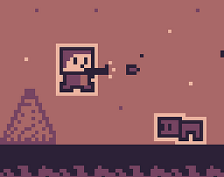
First of all, with the color palette you have chosen, the black and white colors should be forbidden! If you were going to use outlined letters, you should use these two colors (already part of the game) as in the picture.

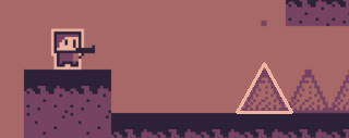
Another thing I found out of place is the fact that the game is not pixel-perfect. Everything is pixelated until you find these perfectly rounded corners in the buttons. The fact that the chosen button has the same color of the background doesn’t help.

I’d suggest outlining the spikes as, even if they’re not living beings (as it seems to be your rule), they’re close to the importance of the enemies.

I put the game in fullscreen for the pictures and it causes a few visual bugs:

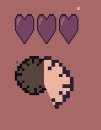
The clocks and the hearts ends up distorted and misplaced. You can deactivate the fullscreen option in the itch.io page.

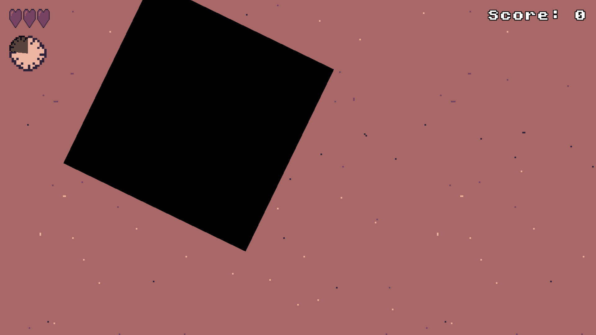
The transition is black and is not pixel-perfect by design. (I’d prefer if it scales without rotating)

The sound stuttering is a shit but I understand that’s not your fault as your game seems to be made in Godot and is a web build as ours so I’m not taking it into account.

If I am right and your game is made in Godot, I’d suggest setting your stretch mode to Viewport so the game can keep the pixel-perfect rule (thinking that probably you designed it from a lower resolution and some things are smoothened on error)

Nothing more! If you take any of these suggestions in a next version, please write me to check. Your game has a lot of potential! Sorry if I offended you, I am probably too nitpicking.

Developer

no worries, and now that I look at it, I 100% agree!