
Indie game storeFree gamesFun gamesHorror games
Game developmentAssetsComics
SalesBundles
Jobs
TagsGame Engines

GameTranslate

In-game translator at your disposal · By Godnoken

[Feature Proposal] Alternate Background Removal

A topic by IDLT created 97 days ago Views: 312 Replies: 21
Viewing posts 1 to 9
(9 edits)

Issue Description

What : The background removal algorithm that the Auto-Translate window tries to apply is too destructive. I believe it tries to repeat edge pixels.

When : This method breaks when the window is not perfectly aligned with the background or if the captured area is too large.

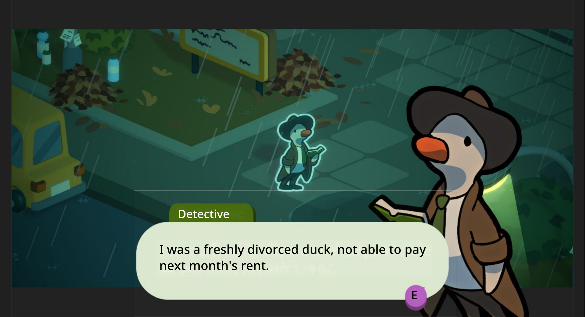
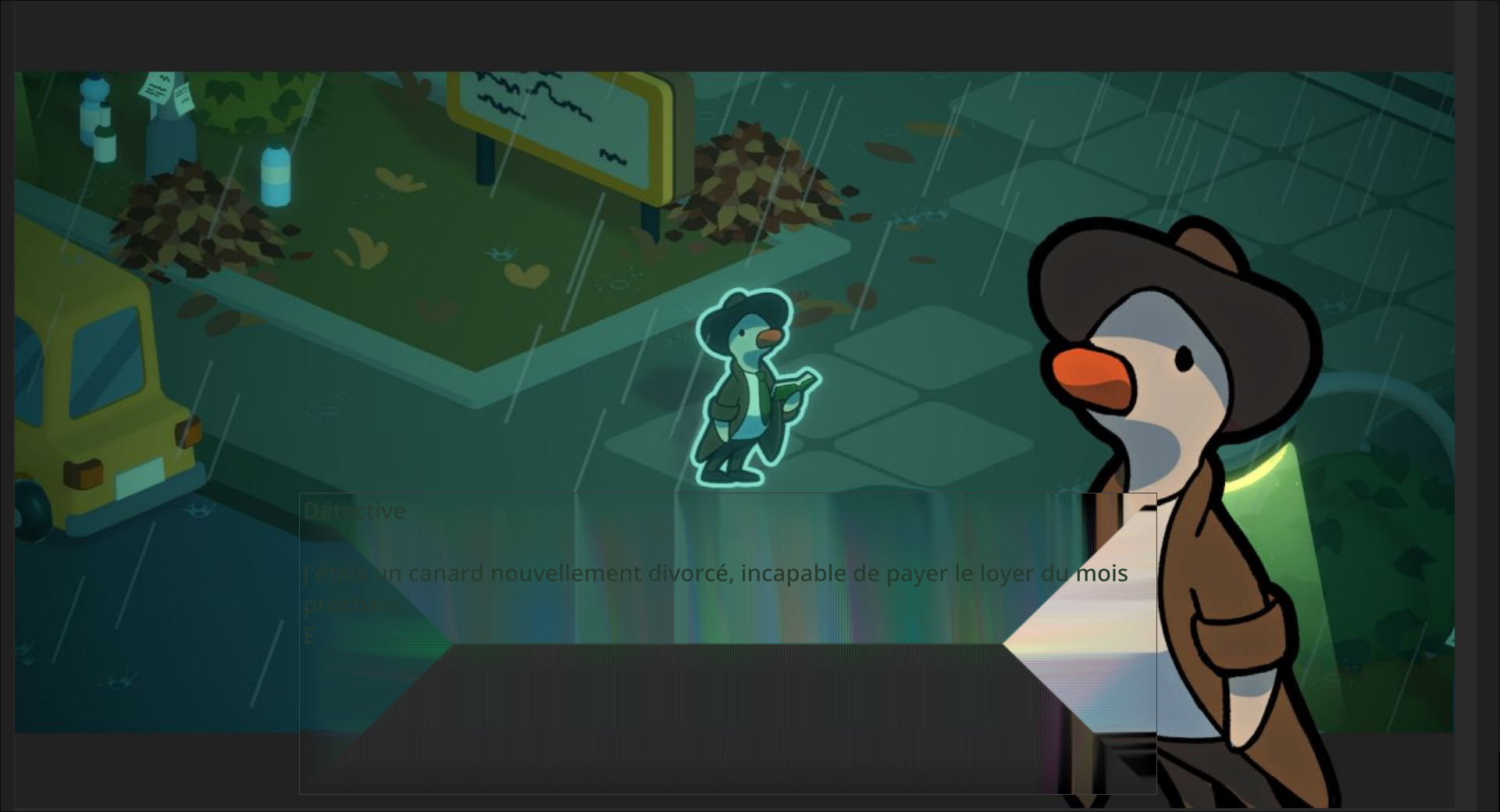
As we can see here, the background removal is so aggressive that it removes the UI on which the text is supposed to rest, making it difficult to read.


Proposed Solution

In an ideal world, we could do live AI processing for text removal. This being a little heavy for now, we will have to concede to a workaround. Implementation of a Gaussian/Box Blur + Feather Selection would be more robust while still being lightweight.

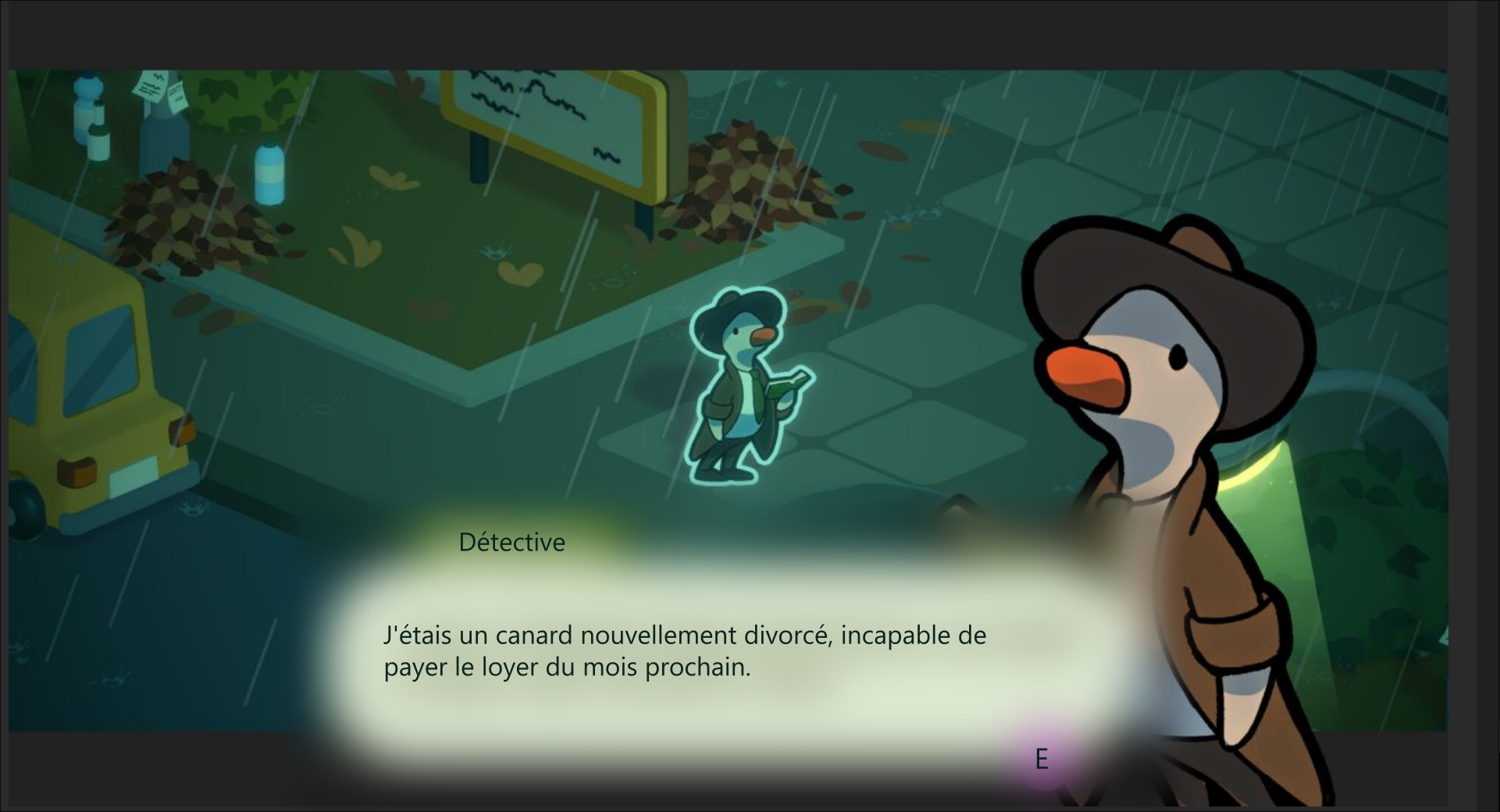
Here it is with an improved detection of text placement. It does not attempt to remove the background and blurs enough (100px radius) so that the source text is not readable while saving both the UI elements and the general feel of the game.

Thank you for your consideration. 🙏

Developer

Hello!

Fittingly, I just reworked the algorithm. It should be way less destructive now as it will only affect the exact areas where text is found. I do of course appreciate that it may still be too destructive in edge cases, so it is very much worth taking your solution into account if the reworked algorithm doesn't cut the job. Thank you for the suggestion! :)

Developer

This is vastly improved in the 0.4.3 update. I hope it looks much better for your use case. 0.4.4 will make it even better.

Thank you!

https://godnoken.itch.io/gametranslate/devlog/957434/update-043-arabic-rtl-suppo...

(6 edits)

Okay ! Haha, way better already ! Here is the same picture but with v0.4.3

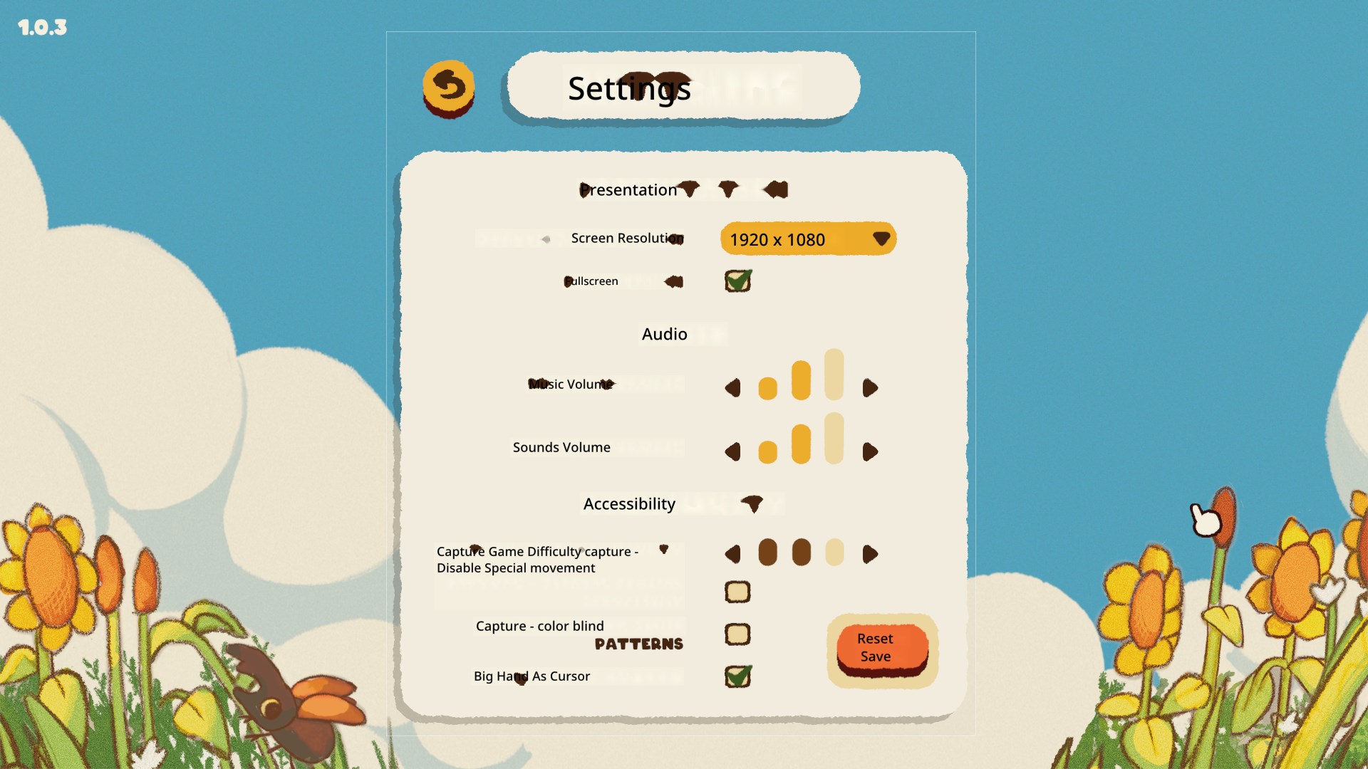
Small box area to cover just the text. Does nicely though has some issues

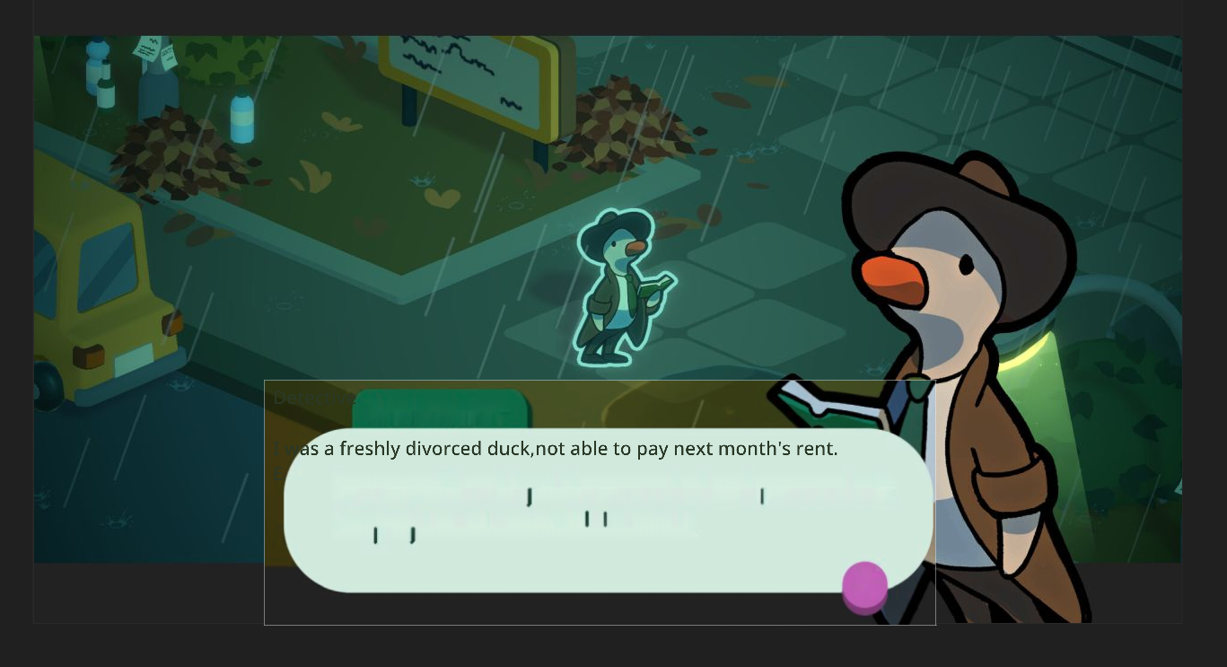
And now with the same large encompassing box. This is where your new technique shines. It’s miles better compared to 0.4.2! It cleanly removes the title and the message box is cleanly preseved

Proposed Next Step

Implement coordinated text placement.

In Dynamic OCR Mode, store the starting position of each paragraph block. This information should be retained and applied during translation output.

Why this matters:

  • Many UI elements (menus, item descriptions, system messages) rely on precise text placement to make sense visually.
  • Translated text may differ in length, but starting position is often consistent and sufficient to maintain structure.
  • Proper alignment avoids overlapping or misaligned text that can make UIs confusing or unreadable.

Suggested Implementation:

  • During Dynamic OCR, record the XY-position of each detected line or block.
  • When rendering the translation, align output based on these stored positions.
  • Optionally allow slight dynamic adjustments if translated text blocks risk overlapping.

This would bring translated UI elements much closer to the original layout and greatly enhance the clarity and usability of real-time game translations. Thank you again for the amazing progress in 0.4.3 🙏

Developer

Glad to see it looks a lot better! Further improvements are planned & will likely be included on the update on Sunday. I also recognize that the image format clearly is wrong (wrong direction of colours).. I'll have to look into this next week.

Thanks a lot for the suggestion, this is something that has been planned & due for a long time, and again (!), when you speak of the devil.. I already have a working solution of this that will be released on Sunday. I'll show you a gif later! Super super exciting stuff. Not far off adding a fullscreen translation mode now.

The gif looks really promising!! And glad to hear you’re already on top of the color correction. Definitely one of those subtle details that will make a big difference. Excited to see how it continues to develop once the features are fully in place. 🙏

Developer

(11 edits)

Tested 0.4.4 and here are the results


The new addition of only having the background replaced where new text is placed is genius.  
 
 
Now, one issue is that the function that decides which background colour to pick sometimes makes.. odd choices.


As we can see here, the UI background element is “Tan” (RGB 241, 236, 220), but it decides that the translation background should be “Light Blue”? (RGB 223, 238, 244).
 

Proposed Workaround : High Contrast mode

While in an ideal scenario, the logic would always pick the most appropriate background color, to improve readability in edge cases without compromising the dynamic system, I suggest adding a toggle in the settings for an optional High Contrast Mode.

Why this matters

  • Does not rely on complex background color detection logic, keeps the overlay readable even when the background detection fails.
  • Provides a safety net for users who prioritize clarity over aesthetic subtlety.
  • A similar solution already exists in the default capture window. This builds upon it with a simple binary threshold and two static styles.
  • Improves accessibility of the app.

Suggested Implementation

  • IF [Detected Background Luminance] is < 50% gray → Overlay shows white text on a black background
  • IF [Detected Background Luminance] is ≥ 50% gray → Overlay shows black text on a white background

To prevent too high of a contrast :
White is RGB 222, 222, 222
Black is RGB 18, 18, 18

This would be a practical compromise between automation and user control, and it gives end-users a way to ensure legibility in any scenario.
Let me know what you think!
🙏

Developer

As I wrote higher up - the color format was wrong in some modes and processes. I've fixed that now afaik, so the colours should no longer flip or look off.  I'll probably release a new beta version today with that and a fully working desktop mode (real-time translation enabled)! :)

I've thought about implementing a high contrast solution too, considering the text colour algorithm isn't perfect. Thank you for the suggestion and implementation idea! ⭐

Ah! My bad, didn’t see the “next week”, I thought 0.4.4 had the fixed colours.

This makes High Contrast mode lower priority, but I still think it would be a: simple, no fuss, and effective solution.

Developer

No worries mate!

0.4.5 is out now with the applied fixes, please give it a try :)

Absolutely agree on the high contrast mode - it is absolutely necessary in some cases.

(1 edit)

Ah ! I have tried 0.4.5 and unfortunately it does not play well with screen capture (both ShareX and Windows Snipping Tool do not display it anymore) so I cannot continue this feature report for now.

But I can confirm in this message that :

  • ✅ The colours behind the translated text are now indeed correct!
  • ❌ The colors of the text itself are however not always correct. (sometimes text is rendered the same colour as the background)
  • ⚠️ Some edges cases happen where, if the text you’re trying to replace has very little padding around it, the background removal overreaches and grabs pixels from another UI element. (It might just be a matter of tightening up the background removal area, but in any case, I will demonstrate this once screen capture is available again)

Since since I cannot demonstrate the issues I’m having, here is the link to the online demo game I use to bug hunt for GameTranslate :

🐛 Kabuto Park Demo on itch.io

Developer

Ah... My bad. I did not think of the implications to streamers/videomakers when I made these changes. I can fix this for Attached mode (as long as you use the WGC screenshot API), but afaik this is impossible to fix for Desktop mode. What I can do is enable so the manual mode is always visible to be captured, but I can't do that for the automatic mode. The first capture would work fine, but after that it would just capture the GameTranslate window and hence everything will just turn into gibberish.

It should however not be a problem at all if you use the internal mode.

Regarding text colour, this is to be expected. The algorithm I created to find the text colour is far from perfect, and I have not made any changes to it for a while. I'm considering different creative ways to make it more reliable.

Yup, the padding problem is very real too. I've attempted to find a better solution, but as of yet I have not found anything much better or performant enough to use. However, I will try to add an alternative algorithm that only blurs the background like you have proposed.

Thank you for the link and continuous testing!

I will try to get a beta version released tomorrow so the windows can be captured again.

Ah, perfect, thanks for the tip. This enabled some testing! 🙏

The internal mode being able to capture the game translate tool is good enough (for me). I don’t think adding it to attached mode is a priority. But if you believe this is important, go ahead. This could indeed be useful if you wish to market to Content Creators.

As for text colour and padding, I’m sure you’ll eventually find a technique that works. 👍

Developer

Hey mate,

High contrast mode has been added in 0.4.6 - thank you for the nudge and suggestion for how to implement it! ⭐⭐

(4 edits)

Test with 0.4.5

Now the background colours are correct! 🙌

 
This has definitely improved a lot since 0.4.3.

You are already aware and we have talked about the font colour and padding still having issues so I won’t repeat them here. But: Progress!

Developer

Thank you mate, I really appreciate all the follow-up testing you're doing. I'm thrilled to see it work a lot better.

(3 edits)

🙌 Yippee !

Test with 0.4.6

❌ Without High Contrast Mode


As we can see here, the issue was that the text color sometimes is incorrectly chosen, making it difficult to read.
 

✅ With High Contrast Mode


And now, High Contrast mode, completely fixes this use case!
 

I still need to do some more in-depth testing that will require more time, but as of now, this is amazing.
Congratulations Godnoken ! 🎉

(5 edits)

Further 0.4.6 testing

❌ Without High Contrast Mode

✅ With High Contrast Mode

And now we are back to the last, arguably the toughest, piece of the puzzle : the background removal algorithm itself.

As we can see in this example, high contrast mode does not address the underlying issue in this scenario (the background removal algorithm grabbing pixels from nearby UI elements, already mentionned in above discussion).
We can even see the High Contrast mode being led into error because the background removal algorithm is rendering a lighter than reality background for the translation of the “E” button prompt.

Developer

Heya mate!

I've got a new text removal algorithm pretty much ready. It is much less destructive & works really really well in all cases apart from extremely thick & large custom fonts ( I think I have a solution for this too..). I'll release it as a beta later today. The only downside is that it is by orders of magnitude slower than the one being used now. Luckily it is only a matter of a few ms of work time even then.

(4 edits)

Testing 0.4.7

I can happily confirm that the original test case has been successfully achieved with flying colours. 🎉  

0.4.7 : Algorithm 1 = PASS ✅

0.4.7 : Algorithm 2 = PASS ✅

  (All pictures were taken with “High Contrast” mode enabled)
  As we can see here, in 0.4.7, both are now satisfactorily passing the original test.

NOTE: There is some minor artifacting with the “E” for example. As the on screen UI is round and GameTranslate applies it’s background removal in a rectangle, but nothing distracting from the translation experience. I suppose this will eventually be ironed out with further improvements to the algorithm.
NOTE 2: The only difference I can see with the 2nd algorithm is that it close, it matches the original text font closelier. 🤷


Godnoken said: […] It is much less destructive & works really really well in all cases apart from extremely thick & large custom fonts

And to this I must concur. I have tried 0.4.7 on another test case and the results were indeed as described..


❌ 0.4.7 with thick and large fonts


Interestingly, it seems to have issues with the letter T more than others. 🤔
 
 
Solid progress nonetheless! We went from a distracting user experience to minor visual glitches. This certainly feels more polished. 👍

Developer

Thank you very very much for all your testing. I'm sorry it has taken me so long to respond.

I'm glad it works much better in some cases!

Regarding note 1;

This will indeed likely be improved, but is finicky business and takes quite a lot of creative solutions to make it work in as many cases as possible at once. Hopefully there will be a way to only have one single algorithm at the end, but at the moment the way to go is definitely to add more algorithms & possible add some user-defined configurations.

Regarding note 2;

Yeah, the difference will be impossible to tell in some cases. Usually easier to see the difference on moving backgrounds or super thick text (let's say BloonsTD type of text)

I think the last issue may have been slightly improved in 0.4.8, but unfortunately it may have caused other destructive problems... and this is why we need user-defined configs...

Thanks mate!