Play game
Frank and Stein Escape's itch.io pageResults
| Criteria | Rank | Score* | Raw Score |
| Visuals | #1 | 4.667 | 4.667 |
| Audio | #4 | 3.708 | 3.708 |
| Overall | #6 | 3.708 | 3.708 |
| Gameplay | #6 | 3.583 | 3.583 |
| Fun Factor | #6 | 3.583 | 3.583 |
| Special Object Implementation | #16 | 3.500 | 3.500 |
| Theme Implementation | #25 | 3.208 | 3.208 |
Ranked from 24 ratings. Score is adjusted from raw score by the median number of ratings per game in the jam.
How is your game related to the Theme and Special Object?
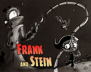
It is an horror game where an enemy pursue you behind you and you use glasses light ability in the dark
Leave a comment
Log in with itch.io to leave a comment.


Comments
The art in this game is incredible and to the standard of a fully fledged non-jam game! amzaing!! the gameplay was fun and smooth and overall its a really impressive game! i think the theme couldve been implemented a bit clearer as the enemy behind me was pretty much left behind straight away ;) but that doesnt change how polished and clever this game is!
WOW! This is a very nice game! Very polished and very smooth. The gameplay feels really good with no bugs and no issues. The swapping mechanic is also nice. The animations and art overall is also very well done. Really cool that you manage to do all of this in a weekend gamejam! Great job!
Thanks for your feedback ^^ I'm glad you liked the game. We plan to add levels and story soon ;)
Very nice visuals and theme implementation is very cool!
Thank you for the nice words :)
The visuals are great, and the face swap mechanic was really well applied, most games just made the platforms invisible, but still walkable, but you made them not interactable at all, which I think makes a nicer use of the mechanic. Great game.
Thank you for you feedback we really apreciate and we're gla you enjoyed the game :)
I love the cartoon artstyle of the characters! Animations and movement felt good. I think the face swap mechanic could be mapped to a single key. The spike hitbox could be a bit more forgiving and the enemy seemed to have very little impact on the gameplay. Other than that, fantastic game!
Hello and thank you for the valuable feedback i appreciate :) !
You're right about the spikes the hitbox is way to big i will change it in the next version of the game, and we need also to change the enemy speed to make him more present in the game beceaus for now it doesn't have a lot impact as you mentionned !
Considering the comments you made about my game I was expecting a very good game, and it met my expectations. I just wish the spike areas in the colliders could have been made a bit smaller to make things easier for the player. Overall, I don’t have anything else to add; it would be a game I’d buy if it were on Steam. :)
I wasn't exepting having creted such expectation and so i'm even more glad to see you consider them met :)
What you have mentionned about spikes is totaly true and i will definitively decrease their collision size so thank you for having putted the light on it and for your valuable feedback !
Great visuals and audio and also nice itch.io page design! The theme implementation could be better than just "there is an enemy behind you" although it works yes. Crazy that you (two?) made that in such a short time. Props!
Many thanks for your feedback i apreciate it :)
For the "behind me" theme , actualy we wanted also to implement in a scenaristic way that i think is finaly not really understandable : you play a character that can turn it's head to switch character and gameplay, so the other playable character is "behind" your head literaly
So for us it made sense, also with this (enemy behind you) that is clasic but works as you sayed
But you pointed a good point i think next time we should think more how to have a more original take on a theme
Really good game! The visuals are amazing as everyone else has already said, i really love the cartoon artstyle on display here, and the lighting was well implemented. The name is clever too.
The gameplay is great as well. The jump feels solid and fluid, and the head swap mechanic is cool as well (Though i think it would have been simpler to have both heads on one button). I especially liked the jump at the end where you had to use both heads to progress. The only thing i found lackluster was that the monster is a bit slow and provides very little threat if you just keep going forward at a reasonable pace.
Thank you so muck for you kind feedback iwe value what you mentionned ! :)
And you are right it would be better to have only one button to switch head instead, we'll consider doing so in the next versions of the game !
Nice platformer, with nice art and mechanics. It was great to make in 3 days, but to be honest, I didn't notice the execution of the theme and the main object.
Thank you for your comment !
Actualy the theme "behind me" , we adapted it like this : you are pursued by a monster behind you and to switch character you have to turn your head beceause the other character is a face behind you head
And for the glasse special object, it is used by the lights emited by Stein who wear glasses
But with what you saied i am thinking that we may be haven't been clear enough to show how our game is adapted to theme and the special object sso thanking to having pointing this out
The visual and sound design are top-notch. The hand drawn style is simply beautiful.
This is something that often gets overlooked, but I absolutly love the game name.
The only real criticism I have is that the controls are a bit funky and the character switch should be one button instead of 2. Also the dialogue box displays A as the switch button for some reason, so I thought the switch happens when you look left/right.
I think other people mentioned this too, but the monster is a bit slow. I had a similar problem in my game, but it can easily be fixed just by making the monster faster when It's far away from the player.
That's all from me and congratulation for making a great game.
Thank you so much for the kind words we really appreciate it :)
About the monster being too slow, the switching character that should be on one input I agree we should change this ! Also i should make more clearer for the dialog box if you understood something else it should be adapted
And you saied that controls are a bit funky and to be honest i really wanna know more about what you mean by "funky control" ? I personally took times to make fluid and engaging character movement so do you mean control in term of inputs (having 2 buttons that could be one) or the character movement ?
Anyway thank you for the answer !
That's mainly what I meant.
The physics are fluid and nice, just the buttons could be remapped in a better way.
I suggest E to switch characters and Q to open doors (at the end).
Ok that make really sense indeed thank you for having cleared this point it helps :) !
No problem.
Simply wow! I loved this, The art was beautiful, the animation, the mechanic. I was honestly disappointed when I finished the game in 2 minutes, I wanted more and I think that proves how good the game was. My only critique would be that I lost the enemy/ monster very early, almost right at the start actually, when you first change to Frank, from that point all I had to worry about was not landing on spikes. (That may be just my playthrough though, I didnt see anyone else mention it in their comments).
Edit: Just played through it again, I guess I was just way too fast from the start on my first playthrough or that the monster is a little slow/ the spawn point is a bit too far back, this time I lured the monster towards me so it stayed close.
Hello, many thanks for having played our game !
I take in account your feedback on the monster being too slow and the shortness of the game ! To be honest, we planned initialy 5 levels and developed other features like ability upgrades, door and level systems, etc
But bug fixes and work to have one fun level instead of several not interesting ones, was the priority
I think we'll implement the other levels with the new mechanics afterwards and adapt the game with the feedbacks !
Anyway, I really appreciated your words :D
I'll keep my eye out for further updates. Its a game I would definitely play again!
Very fun idea of switching faces to see the hidden parts of the level! The theme and object are well implemented. Cute name and pretty graphics :) The before-last jump of the level is a tad hard.
I really appreciate your feedback thank you ! And what you point make sense and seems to be shared by others so I think we'll adapt the last jump in next versions of the game :)
I helped the kids to escape! (=
The most favorite part is when you need to stay on a phycic platfrom and turn on glasses to the that you need to jump above the spikes. ANd then you do it in the dark spamming E to see again! (=
I think you need to have some hints about hidden platforms like ghostly outline. Sometimes you run into a platfor press Q and can not turn to the boy because you are inside a platform already.
Also I think glasses could have a little more horizontal range.
Many thanks for the help you gave to Frank and Stein ... And havin playing our game :)
Your feedback is really interesting, on the hints for hidden plateforms i'm still note sure it is aligned with the game experience we wanna offer (exploration) but can make sense, so we'll need more playtests to validate this hypotesys => But if the hint occurs ONLY when you are on the platforms so yeah it can make sense and I would like to implement it to test it !
And also we'll consider increasing horizontal range but we need playtests to ser me if it doesnt break the game experience we want
Anyway many thanks for those valuable words :D
Amazing game ! The art is really amazing, big props ! I struggled a lot on the second to last jump because you need to be super precise, it would maybe help if there was a checkpoint at the second lamp so that you don't have to replay the entire level if you die just at the end. Also it would have been less confusing if the key to switch between frank and stein was the same.
Other than that, great game !
Many thanks for the kind words and the clear feedback !
That's true that some jumping section can be challenging we may need to adapt this on the future
Also for checkpoints i have to see if it will not make the game too easy and break the game experience we wanna share but maybe by adjusting those hard plateforms moment this will be fine without checkpoints, i have to see this can be a good point !
And yeah good idea to have only one input to switch character we'consider implementing it for next versions of the game :)
I thank you for this relevant feedback :) !