Play game
Sirens: The Cold North's itch.io pageResults
Ranked 53rd with 4 votes
| Criteria | Rank | Votes |
| People's Choice Vote | #53 | 4 |
Judge feedback
Judge feedback is anonymous.
PRESENTATION
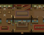
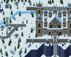
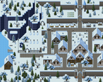
Graphics were a mix of RTP and other asset packs. They fit together well enough. The mapping was pretty good, too, and the areas you could go were well designed. Menu was straight forward RTP fare, no edits, but there was a simple quest hud that showed in the top left corner.
Music was quite well done. It fit the scenes very well and nothing was jarring or seemed out of place.
Sound was used but it was very basic stuff, nothing that really enhanced the atmosphere. Again, nothing was jarring but nothing was stand-out either.
Writing was very good - there were no errors in grammar or spelling as far as I could tell, and the dialogue flowed quite well. Characterisation was done well, even if you didn't get much of it due to a bug cutting off progression. The main characters had their own 'voice' and their banter was light and fun. You could tell they had a connection.
The story itself seems like it might be interesting, however we didn't get too far into it due to the progression-breaking bug. It was perfectly adequate from what we'd seen so far.
GAMEPLAY
Gameplay consisted of battles and walking around interacting with events.The battles were balanced well, but we only saw a few of them so whether it would have remained like this is unknown. There was only one skill available to both characters, which didn't showcase much of the magicite system (spells use up an amount of Magicite items in order to be cast). Otherwise it was typical RPG Maker affair. There were some visual scripts used to show fighter turns and the like but it was nothing that really stood out and used the default of the script visuals.
There was a quest tracker that was activated in the top left corner, keeping a track of what you needed to do. Unfortunately there was a bug about 20 minutes in where you couldn't progress past the quest for talking to the people in the town and the quest tracker disappeared after reporting back.
Slow walking speed made exploration a pain, especially since running was disabled.
ENGAGEMENT
The game characters were fun and there was a lot of promise for the rest of the game being something I might really like, but before it picked up the progression just stopped. The slow walking speed did not help things - plodding along at a slow pace is really only acceptable when you have small maps, and this game didn't. Sure, they weren't huge maps, but they weren't small either - large enough to be a pain to slow walk through.I was also a little miffed that we couldn't go in houses since that would have given us more places to look through, but no go. There was also one NPC who said to interact with stuff because you wouldn't know if they had information or the like but then nothing was interactable. This was annoying and was kind of bad design - your introduction to your story should also introduce the gameplay aspects of your game so that your players know what they can and can't do. This means giving them the chance to interact with things if you have interactions in your game, battling and crafting, etc.
Telling the player that they can interact and then not letting them is beyond frustrating for the player who wants to be rewarded for actually listening to what you're telling them. It was a bit annoying.
At least battles weren't boring but they weren't really interesting either. There was one spell to be used and otherwise you just had to keep attacking over and over. Not exactly riveting stuff.
THEME
The theme of the game seems like it might have been diplomacy and political in nature, however we didn't get to see any of this aside from some discussion by the NPCs of the town wondering about the visit of the king from the south. The fact that the game didn't allow you to progress past a certain point really put the kibosh on seeing where the game would go theme-wise.45/80
Engine
RPG Maker MV
Leave a comment
Log in with itch.io to leave a comment.


Comments
Hey Josiah!
Just downloaded and played your game! Since I found that I don't really like those Pros/Cons lists, I'll just tell you what I liked and what I wished was different. Hope this will be helpful to you!
I liked the intro section, that was a fun way to get to know the characters! They seemed likeable from the get-go (and stayed so throught the game).
Also, I had to laugh as I found the Castle Builders Inc note in the beginning. Nice Easter Egg!
I wished I could walk a bit faster, since the maps, as well-made as they are, are a bit slow to traverse through.
The slimes in the basement were fun to battle, and I liked that magicite was a limited resource. I never could sneak up on the slimes though, because: How can you tell where the back is with a slime? :D
I know, I know, by the direction they were going. Maybe I'm just a mediocre sneaker?
What I found interesting as well is that Ruby seemed so much weaker than Saralyn in battle (except for her magic, obviously), which was a nice story touch and made me want to protect her even more.
I wished however that it wouldn't be possible to miss... just don't really enjoy that mechanic, but I guess that's just a personal taste.
Overall, I liked your light-hearted approach to the story, made it very enjoyable! It's good to play a really traditional RPG from time to time.
Thumbs up!
Awesome! I'm really glad you enjoyed it.
Hahaha! I was wondering when someone would find that Easter Egg. I'm glad you did!
I will be enabling the dash function again in the next update, to let you run as you please!
The back of the enemies will become clearer soon enough with different enemies than slimes. I realize it was hard with them, but it is possible!
I'm glad that you liked that with Ruby being weaker. That was my intention, to make you want to protect her. It's also why I made Saralyn's physical attacks and defence a bit stronger. It kind of gives that feeling that you have to keep an eye on her.
Yeah, I understand not enjoying the missing part of it. That will happen less as you level up, but every good warrior misses a strike sometimes! ;)
If you enjoyed that, there is plenty more to come!
It's good to hear that you plan on upgrading the game! We'll do the same with Quidget.
Let's make our games as good as we possibly can!
Just played this game! The mapping is very well done, I enjoyed it a lot, both the interiors and exteriors. The two different graphic styles was noticeable though (Cel's on the inside, the pixelated stuff on the outside). I also resent you a little bit because you disabled dashing. For the love of god, let us dash!
That said, the story is light and easy to follow which is not a bad thing. The quest tracker is helpful, and I found the quests to be fairly logical and intuitive to navigate through. Combat for the most part was fairly standard fare, but then again I was mostly womping on slimes :)
The ice whisp though... that thing was MEAN! It one-shot killed my characters. It was a huge leap in difficulty compared to the slimes.
At any rate, this was enjoyable! I think it might benefit from additional fine-tuning and balancing, but there ain't a title in the IGMC that that statement doesn't ring true for :) Well done!
That's interesting you mention the graphical styles. They're both a part of the Ancient Dungeons tilesets, so I'm not sure how they don't mesh. Could you elaborate a bit on that? If I get more requests to enable dash, I will hahahaha.
The Ice Whisp is one tough dude. You need to take it out with magic quickly hahaha. If need be, I will lower it's difficultly a little bit.
Thank you so much for the kind review! That means a lot coming from you, given your experience and reputation in the RPG Making realm. I really appreciate that!
It might just be the way Cel did the snow, but the exterior tiles (that is to say, the winter ones) all look very pixelated in comparison to the interior tiles which are smooth (I legit thought these were two different artists' sets, but after research they are not). And you should definitely enable dashing - is there a game-play reason why not to? Otherwise you are taking a quality of life mechanic away from the players for no apparent reason lol. But if you had decent chunks of the game where enabling it would ruin the gameplay, then that is understandable.
Unfortunately, I don't think there is much I can do about the pixelization. :(
Thanks for that! I will definitely reconsider the dashing mechanism. I was just never a fan of the dash function, to be honest. But adding back in won't hurt.
An update was done to fix the glitches in the game that can be found on the main page for it. However, since the submitted version to the contest is meant to be the final version, if you play the updated version, please don't vote based on that. Please vote based on the version here, even though it is a bit broken.
Hello! I think I've found a game ending bug T-T After talking to all of the villagers, I've gone back to Madame Reytok, and she's got caught in an autorun so I'm unable to continue onwards to face the Ice Slime in the graveyard.
There were a few minor bugs I saw too (you might already be aware of), when talking to the fisherman there's some text cut off, and after talking to the girl here, she turns away from me. (At first I thought she was throwing a tantrum since we couldn't build a snowman haha)
But I'll review what I saw so far! As a disclaimer, I don't really play many rpgs and I'm not a fan of turn based battle systems so I'm probably not really your target audience, but here's my two cents anyway!
Can't say I'm a fan of starting games with an exposition of scrolling text. It's not the easiest thing to read (though I had read it from the game page anyway,) but if you asked me to repeat it I think I would have forgotten already. ^^' It's much better to show and tell, and I think it might have been more enjoyable to find these things out by exploration instead. I really enjoyed the little slices of comedy that were hidden away or from talking to npcs.
It was a little disappointing that the castle staff repeated sprites. It works fine for guards wearing helmets (and I did notice that the guards outside were mostly unique) but I think even just a recolour would have been nicer for the castle staff.
Credits at the opening is an odd, and yet cinematic choice. I did feel like I was being set up to go on a grand adventure, however the sprites and certain things like doors shaked whilst the camera scrolled, which was very offputting.
Despite being told by the Siren Guard in the Guild to interact with the books, I didn't find anything to read. This could have just been due to a lack of time though.
As I said, not a fan of turn based battles so you can imagine my dismay having to go on an errand run to kill 10 of them. I appreciate the effort you took to make it different with the Magicite and direction based battle advantages, although it's hard to tell which way slimes are looking! The sound effect from completing the quest is incredibly cheesy. It stands out a lot compared to the grand music you have playing throughout the game.
I also didn't like the quest to talk to npcs either. I felt like I was being forced to explore rather than having a choice, though I supposed it's a good way to ensure world building. Your maps really do give a good sense of a vast kingdom without actually being too vast and boring, so I think you did a really great job there!
Overall, it wouldn't be my first choice of genre to play, but I think an rpg fan is really going to enjoy this! It sounds like you've got a rather grand adventure planned and I really hope that I was wrong about the game breaking bug because it'd be a huge shame if the IGMC wasn't able to access the rest of the story you've created for it! For reference I was 24 mins in just before hitting the bug.
Thank you so much! That was incredibly a helpful review. That game ending bug was something I noticed just after submitting. :( I have fixed those and the text errors today, along with the girl throwing the tantrum hahaha! I will be uploading a fixed version of the game over on the forums, and will update this one as soon as I can.
As for the wall of text at the start, I might try to sprinkle that in throughout the story rather than just have the wall of text if I can think of a way to do it more naturally. Any suggestions?
The repeated sprites was more of a necessity due to time. I will gladly do recolours, or just change a few. Repeating sprites on a main map is, of course, a bit off putting, so I'll change that up as soon as possible, even with a few placeholder graphics for now.
Thanks for the comments on the intro! That was the idea I was going for. I wanted to give the player an idea of the scope of the story I'm telling, even if it doesn't seem that large in the initial start. I got plans. Start small, move large in scope. :)
I'm not sure how to fix the doors shaking, due to it happening with the camera plugin I'm using, unfortunately. I noticed it too.
The interacting with books and whatnot was absolutely due to time. I was going to offer lore and backstory through reading books, and include finding books like "The History of Atlantis, Vol. 1" or something like that.
The quest success sound effect was the default one, and I didn't realize I forgot to change it until after submitting. Thanks for reminding me!
The talk to villagers quest might be reworked on my part. I never liked forced exploration either. Due to lack of time, I didn't have the insides of the buildings finished either, so I'm thinking about how to rework that at the moment.
This is incredibly helpful. Thank you very much for taking the time to play and review what's there! I hope some folks will enjoy the game greatly!