Indie game storeFree gamesFun gamesHorror games
Game developmentAssetsComics
SalesBundles
Jobs
Tags
A jam submission

Harold and The Cursed SwordView game page

Submitted by Rose_Guardian — 20 days, 16 hours before the deadline
Add to collection

Play game

Harold and The Cursed Sword's itch.io page

Results

CriteriaRankScore*Raw Score
Hrld Award for Graphics: Visuals#133.4793.667
Therese Award for Strength: Combat#182.3192.444
Marsha Award for Music: Sound#192.8993.056
Harold Award for Excellence#252.4242.556
Oldhar Award for Literature: Story#291.9502.056
Lucius Award for Laughs: Comedy#321.7391.833

Ranked from 18 ratings. Score is adjusted from raw score by the median number of ratings per game in the jam.

Leave a comment

Log in with itch.io to leave a comment.

Comments

Submitted (1 edit) (+1)

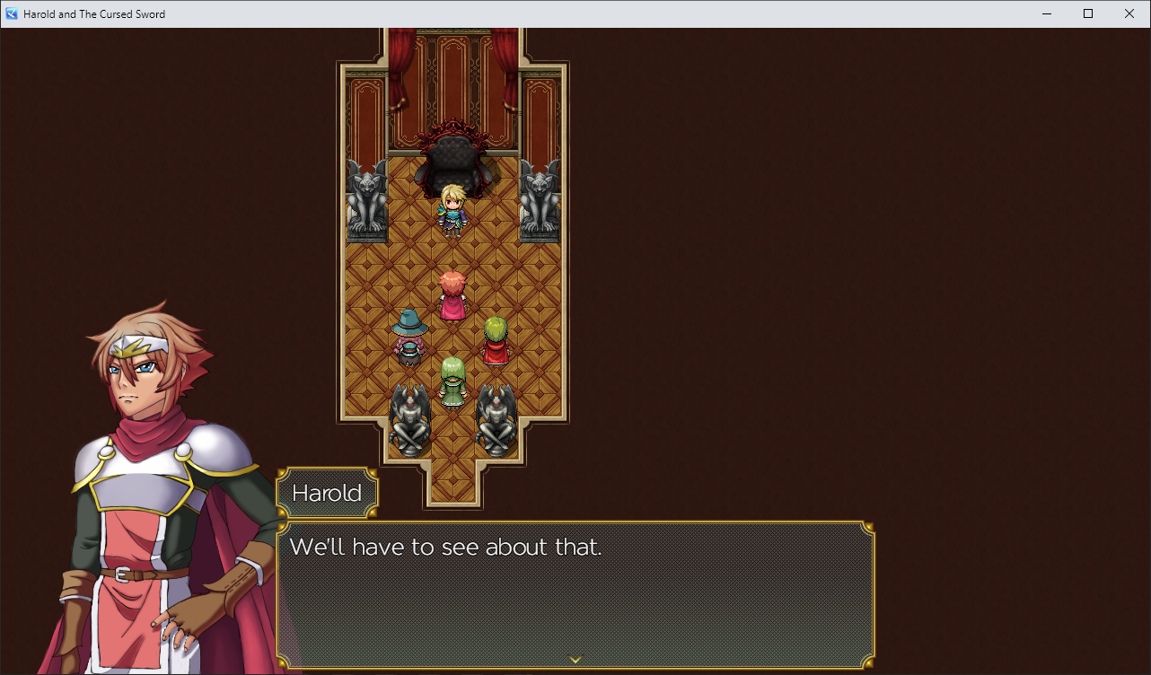
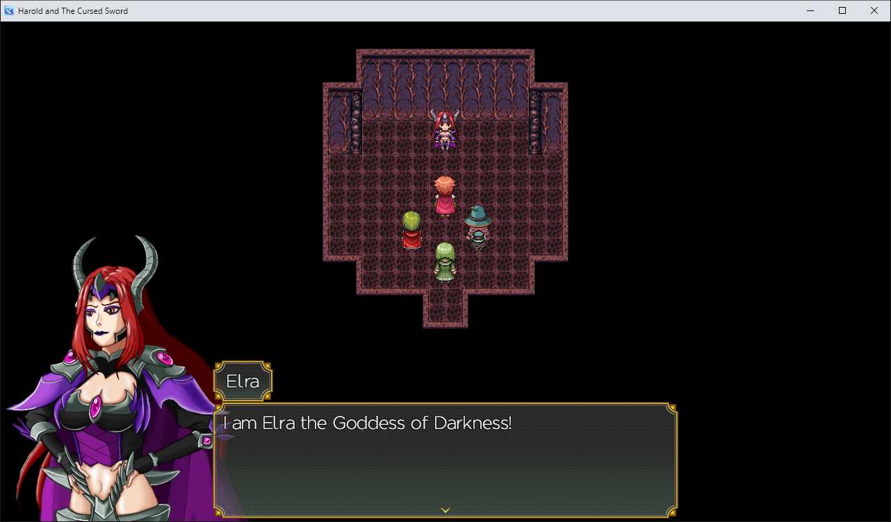
Hell yes, somebody besides me who uses the tall Harold & friends battlers! Nice and short little game with some bitchin’ battle themes. A few things I feel I need to point out, though:

  • That battle UI is aaaaall over the place. While a person’s eyes naturally want to focus on the central area of the screen, the party HUD had me glancing to the upper right, then to the top to view the turn order, then all the way to the lower right to view the actor command window. The choice to use actor-sized enemy battlers also leaves this huge open space that looks overly empty.
  • The battle system itself was a bit too simple for my tastes, as it was pretty much a “spam attack” approach, except each attack was a spell instead. The only variation was “okay now you have enough to use your stronger attack” some party members had.
  • Skill animations felt sluggish, with each having long animations.
  • Item and Escape seemed like unnecessary commands since I don’t think they were ever used. (no items and you can’t escape from any of the battles in the sequence)
  • The skill selection cursor was sometimes a bit hard to see as just a thin line at the bottom of the selected command.

Edit: Oh, and those effeskseer aniamtions the last boss used were pretty damned cool.

Developer

Thank you!

Submitted(+1)

Hey, this was a nice short game. I enjoyed the battle system you used. Battles were easy, but that's completely fine during a jam. Sad there wasn't a tall SV battler for the last enemy, I guess that one doesn't exist (yet)? The custom artwork was a nice touch. The temple map was mapped a little odd. It was very assymetrical, which temples don't usually have. 

Developer

Thank you your feedback. I'll practice mapping temples to make them better.

Submitted(+1)

Hey, you made a battle system that uses TP instead of MP! That's cool!

This is already a much better battle system than others I've seen featured in your games. Please keep refining this, I bet with some more work you'll have a great one!

Here are 3 things to try in your next iteration:

  1. Give each character at least 2 usable skills on the first turn. Currently the only choice on turn 1 for most of the party is "guard," which is kinda boring.
  2. Continuing with that theme of giving the player choices, think about why the player will use one skill and not another. You already have the beginnings of that in this system with each member having at least one heal skill and at least one attack skill. What other skills can you give the characters to make the player choose between one skill and another?
  3. What interesting things can you do with the enemies? Some options include enemies appearing during the battle under certain conditions, multi-phase bosses, and enemies that change their skills when affected by certain states. This is one of the most criminally underused parts of the RM battle system and it easily makes battles more interesting.

As for the rest of the game, I can tell a lot of effort went into the visual presentation. Custom busts, battle UI, window skins, and beautiful maps and particle effects make this look like something more than an average RPG Maker game.

I do have some nitpicks:

  • Healing Flame needs a description
  • Therese and Lucius' names are misspelled
  • There's one line of dialog I think could be improved: Lucius: You were supposed to let me use my magic to throw him into another dimension. Now that he's dead the world will collapse eventually.
  • Rooms need some sort of visual indicator as to which crystal they need and  which one can be entered first. In its current form it's a lot of guessing.
  • I know Hawk pointed this out earlier, but that carpet in the first room you  go in is set to "damage floor."
  • I think rivetdeth's name is misspelled in the credits

Overall it's a game that's not too hard or too long. I'm excited to see you improve your battle-making skills!

Developer

Thank you KV, and thank you for the suggestions. I'll find away to put those in other games as well.

Submitted

Custom art immediately pops out and great care has been taken into changing the default sfx and music appropiate for the game.

Combat is lacking and overall simple.

There are typos and spelling errors such as 'collasp'.

Since the battles were pretty basic, they needed to balanced if it wasn't the focus. 

Enemies had way too much hp that it was a chore to get through the battles for the story as it took too long to defeat them.

What story there was, was incredibly basic and had no development or context. There was a direction but no feeling overall in it. The goal of returning the sword was over in a brief flash and  no consequences or time to experience anything with it.

Submitted(+1)

I liked the character busts used in the cutscenes and the battle tracks you used for this game. However, the rest of the game felt too stripped down, like Harold having one attack and not having any options other than using the skills assigned to each character. However, I think the story is where the game suffered the most. It lacked context and lacked any sort of impact.

My suggestions of how the events could have played out: Harold and his friends enter the dungeon where the goddess was, and state how Demon King has affected their home or world. Then go through the dungeon and face the Goddess of Darkness. Then they get the sword and face the Demon King. Then when the King is killed you could have Harold take over Harold and he becomes the new demon king or when they try to return it the sword disallows Harold to leave so they have to destroy the sword to free Harold.

Developer

You're right I should've done that. Thank you.

(+1)

Overall a decent job. If I have any suggestions I would suggest lowering HP in the fights some, like by 50% or so. They went on a little too long I felt like, especially with the current patterns and skills available. Other than that, I have no other suggestions for this one.

Developer

Thank you bg!

Submitted(+1)

The game play was OK for a very short jam, but I felt the walking till you find a key could have been jazzed up a little better. Maybe a mini fight before you get each treasure. Something small and fast, but something to raise the stakes ever so slightly. Something other than going from room a to b to c....

The combat was too big for the size of the game. I I found my self becoming weary of doing the same attacks over and over again and feeling like they weren't progressing things.  Smaller, more meaningful fights would be better. 

It had quips, but they felt like they were tossed in as character clichés than real humor.

I turned the music off completely. I thought the choices were OK, though.

The art was very nice! I wish you would have flipped it the other way so the characters were looking towards the text. The reason RM games have them looking to the left and not the right is because originally in Japan the characters are placed on the right side of the screen and thus look in. Next game it will very much help if you flip your art!

There was a goal, but it didn't feel like a story.

Also a side note, I wish your rooms were bigger, there was a lot of void and not a lot of mapping, but that's a personal preference of mine.


Not bad for a quick Jam game.

Developer(+1)

Thank you! My friend actually drew the characters for this one. I am glad you liked her art.

HostSubmitted(+1)

That artwork really jumped out! Combat was pretty straightforward and easy. Didn't feel like many choices to be had overall. I'm also glad I didn't have to wander around too much. 

With some extra time doing a bit more for the puzzle room would have been nice. A careful read through to remove typos and extra spaces would have been a nice touch as well. I think your music choices are typically pretty jamming in your jam games.

 I liked the little punch line at the end of your story. In the future, I hope to see some variety and innovation in combat, maybe some unique skills and mechanics, basic action sequencing perhaps?

Developer

Thank you!