Play game
Shell Shock's itch.io pageResults
| Criteria | Rank | Score* | Raw Score |
| Originality | #2122 | 3.056 | 3.909 |
| Presentation | #2270 | 2.914 | 3.727 |
| Overall | #3193 | 2.487 | 3.182 |
| Fun | #4260 | 1.990 | 2.545 |
Ranked from 11 ratings. Score is adjusted from raw score by the median number of ratings per game in the jam.
How does your game fit the theme?
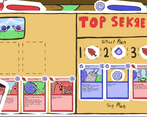
Players don't choose the cards they play, instead they swap out the enemies cards to try and make them lose.
Did your team create the art for this game during the 48 hour time slot?
Yes
We created all art during the game jam
Did your team create the audio for this game during the 48 hour time slot?
Yes
We created all audio during the game jam
Leave a comment
Log in with itch.io to leave a comment.


Comments
As someone who's absolutely atrocious at card games, this is surprisingly easy to understand, and fun too! My only real complaint is the "Escargot" sticker in the bottom left, it doesn't seem to do anything and gets in the way of one of the cards. I think that it would have been nice if the leftmost card goes over it when you hover your mouse in it, but that's about it. Otherwise, good stuff.
this was pretty creative and the artwork is cute :D
I wish the game communicated more about how to play. Great art and presentation, lots of little polish in there. The flavor text for the cards was kinda pixelated for me, maybe its a size issue? Regardless, the game has potential, possibly lots of potential if it was just more clear how to play. I somehow....won? maybe? the first match, stopped playing after getting to the third. Also I wasn't sure what the outlines of the two card slots were for (on the left).
Oh my lord, the art is amazing. This is awesome for a 48-hour project!! I really love the idea behind it, trying to sabotage the opponent. The rollover and zoom-in features in the UI were a little tricky and I was never able to grasp exactly what to do. I agree with other commenters about how a tutorial would have made it much better.
What an amazing concept though! Good job!
Really gorgeous art, and nice idea! My feedback is about the same as what ErikTheBerik said.
In addition, I think you used the AudioStreamPlayer2D node for the music and SFX, but in my opinion the AudioStreamPlayer would be better. For headphone users, the 2D node makes sound come only from the left side speaker, which is a bit annoying :)
It was hard to figure out how does this game work but you get much fun after understanding it.
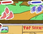
I don't get it. On the right side are the enemys cards? But it doesn't fit with the "snails plan" above, even before I mess around with it... Or am I completely dumb? help :c
Great artwork indeed, cute and funny. Would be nice if it show what card is being used during the combat. Good job!
The game looks gorgeous! GUI animations and art in general is great! It would be great if there was some tutorial tho (maybe I missed it) and it would be nice if the gameplay had as much feedback as the GUI does. Great job :)