Play game
Chroma Bounce's itch.io pageResults
| Criteria | Rank | Score* | Raw Score |
| Story | #232 | 2.733 | 2.733 |
| Aesthetics | #247 | 3.533 | 3.533 |
| Mechanics | #250 | 3.267 | 3.267 |
| Sound | #285 | 2.933 | 2.933 |
| Fun | #332 | 3.133 | 3.133 |
| Theme | #402 | 3.000 | 3.000 |
| Music | #414 | 2.733 | 2.733 |
Ranked from 15 ratings. Score is adjusted from raw score by the median number of ratings per game in the jam.
How many people worked on this game total?
2 (music from my cousin, everything else done by me :D )
Did you use any existing assets? If so, list them below.
Sounds from freesound, some shaders etc, free fonts; I think besides that everything was handmade
Leave a comment
Log in with itch.io to leave a comment.


Comments
In under the wire, but nice entry! Love the color scheme ;)
Wait wdym "in under the wire"
Btw you managed to rate at the very last minute lol thank u!^^
I meant that I got my play in just before ratings closed lol!
Alright hahh, I thought Im very good with English but I have actually never heard this kind of phrasal verb lol
Very great concept.I really loved your idea.Great job!
Thank u!^^
Very good and challenging. I liked it but didn't get the delay to work. It would get back to 10 (btw seconds? minutes?) no matter what value I gave it. Nice work representing the HIGH and LOW of logic! :-D
Thank you a lot!^^
Very weird that the delay doesnt seem to work for other people, it has been working when I tested (and yeah its in seconds, I should've made it more clear)
Okay, Ive tested it and it seems like this is happening only on the web version of the game
Maybe I just broke something because the web version is a little bit newer than the downloadable build, and its not just the delay that does it but also precise angle setup which is allowed in Level 8, where you can for example do 45.4° ; so it does seem like something with parsing the float values is incorrect
It's really a cool concept, but hard to figure out what you're supposed to be doing. Got stuck in the second level.
Oof okay I thought I wanted it to be like an "open puzzle" up to players to experiment and figure out, since there are a lot of possible ways to solve a level, but I guess Level 2 was kinda too complex for the beginning for some players, Ill keep that in mind, Ill try to make everything more understandable in a future update
(If you want a direct tip if you'd like to try it again; you can just angle it correctly to make it bounce around and hit the logic gate dodging the laser, but the default option was to switch the laser's polarity, so thats a 3 step solution, where you just shoot directly at the logic gate after polarity switch)
Thank you a lot nonetheless!^^
The text was hard to read and I just stuck at the second level. Too bad cause it seems like a great polished game. The font for me at least is really terrible.
Wait really in the newest 1.0.1 patch its hard to read? You're lucky you didnt see the first one hahh
I thought this one looked really clean
But thank you nonetheless! I'll look into it later on and either change it or give an option to players
I play at 1080 if that helps you.
Yeah me too, I didnt have time to set it up truly working for every aspect ratio but it does work for 16:9 and especially 1080
Vibrant visuals and elegant mechanics. I can see you've put a lot of effort into this game!
Thank you so much!^^
Oh yeah I did in this span of 8.5 days💀 (I was above 1 day late hah)
Good job. I like the open puzzle concept. I couldn't get the delay function to work right or maybe I didn't understand. The other instructions didn't fire after the set amount of time.
Keep up the good work!
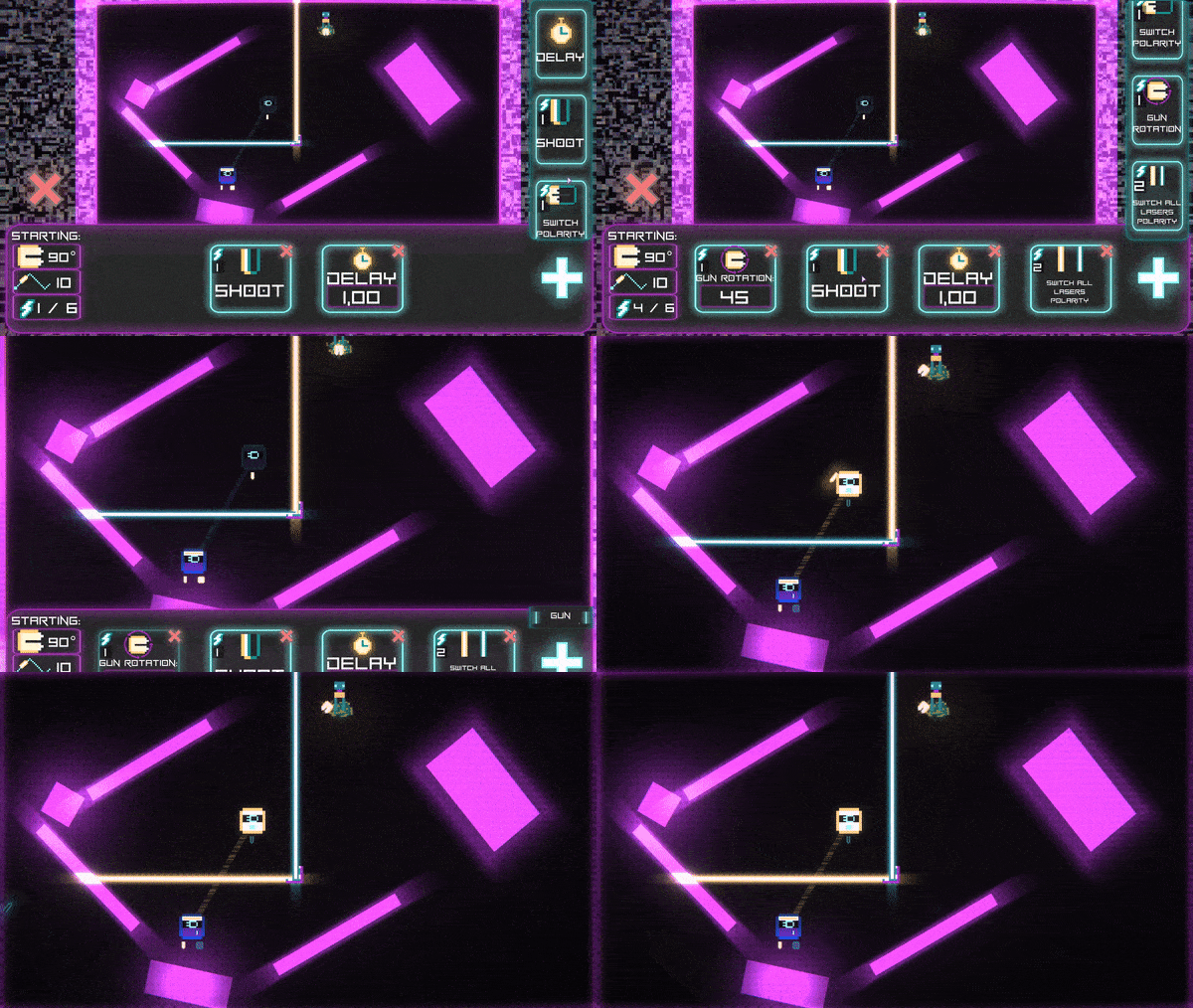
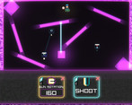
Oh, that is really weird, I have used Delay in the gif shown on the page and I was pretty sure it should work, Ill look into it, maybe something with how I handle the steps in general through Coroutines is somehow off with the previewing angles because thats also "Executing a step" in a way through a Coroutine
Thank you nonetheless!^^
wow there are so many advanced mechanics in this game and the game is well-polished D. would try out mine and rate it according.
Thank you so much!^^
I did rate yours just now, just be mindful that I can be a bit harsh/realistic, but do keep it up buddy!
sure I will put that in mind and thank you for playing and rating the game :D.
Great game amazing job at your first game jam game. maybe instead of typing in the number for adjusting you could use a slider? Just a suggestion but great job on your game.
Thank you so much!^^
Yeah, I just went along with these text fields, but I was thinking of doing a better way like sliders, maybe in a future patch
Really cool concept. The only thing that I would've liked is if you could see the angle that you're shooting at before you actually start. I think a live update for the angle would be really helpful. On a multiple puzzles, I had to restart just because the angle wasn't exactly right
Ok so I will have to point that out in the instruction because it is possible to preview the angle, I have thought about that, its not exactly live, because I did in in a little bit scuffed way but its there, you just "select" the step by clicking on it, after changing the value you like have to click on it again etc
But thank you a lot for the review!^^
Oh gotcha! I tried reading the instructions but it's difficult for me to read I was having a hard time understanding the mechanics so I just went into and figured I'd learn along the way.
I meant the instructions for controls on the website
Did you mean the ingame storyboards/"dialog"? Are they still bad with readability? Ive updated the font after some well pointed complaints
no no it was fine. I have dyslexia
I'm getting this error in web version.
I tried the executable though, very fun and unique game!
:D
I am trying to fix the webversion, this is the first time im exporting to WebGL so Im having some issues
Thank you tho!^^
Cool, but font is not cool.
Ahahhh yeah I get you
I will do my best to change it in a 1.0.1 patch update
Really cool idea, but the text is hard to read
Ah.. yeah I thought about that as well, I will try to find a better font
Pretty cool concept for the game! I think the font is a little bit confusing to read, so in my opinion, it will be better if you use more readable font for the long text and instruction.
Ah.. yeah I thought about that as well, I will try to find a better one