Indie game storeFree gamesFun gamesHorror games
Game developmentAssetsComics
SalesBundles
Jobs
Tags
A jam submission

Dive!View game page

Card Flippy Dungeon Delving
Submitted by Axe (@Midnaut) — 19 hours, 26 minutes before the deadline
Add to collection

Play Experience

Dive!'s itch.io page

Leave a comment

Log in with itch.io to leave a comment.

Comments

Submitted

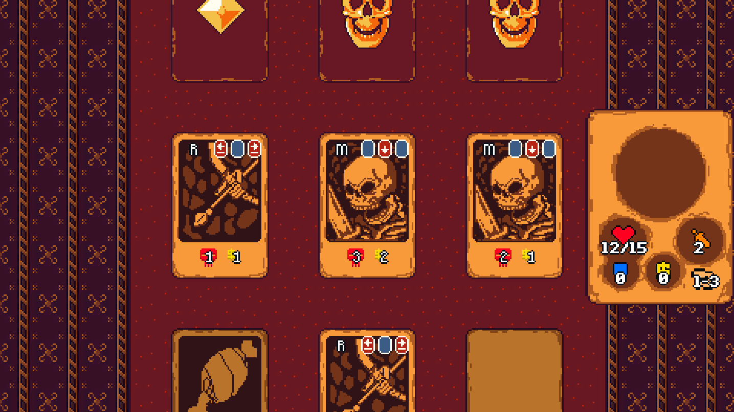
Took me a minute to understand what exactly was dealing damage to me. Might need a bit more of a description as to what the directional arrows mean--but I mean I eventually figured that out, so maybe not?

I figured I was at the bottom of the screen, so I thought the enemies that left the screen on the bottom were doing damage to me for a bit. I agree with Rokas that there should be like a gameboard piece or something that represents the player which advances forward.

It seems like the rows of 3 crossbows (or whatever the side-to-side cards are) are kind of unfair. If you get 3 consecutive rows like that you just continuously take damage without any ability to recover health, relying on RNG to deflect attacks, and eventually die.

But I really like the idea of navigating a dungeon like this, picking your battles and taking best of the worst choices. It's really fun and I've played it quite a bit! I can't wait to see what else you do with this, there's really so much potential here. Keep up the good work!!

Submitted(+1)

Autism:

-no mixels pls
-it would be better to have no sound effects at all than have the ones you do (ecludes music)
-the game is mixelly, but the cards snap to pixels, don't do that, make the movement smooth

Game:
-I'd put the player icon at the bottom of the fought cards, making the illusion that you're actually moving over the carpet (as a bonus you could bump cards and have positional mechanics)
-there's no reason for me to ever not pick the highest food card if multiple exist
-the shop has multiple layers of cards, but you can't see them, this feels arbitrary, since you can see the preview of the next line, either show all cards or incorporate the sequential nature into the design (items in this column cost x less)
-I don't quite follow how the damage dealt is calculated - the skull icon doesn't reduce to 0, but I take 0, other times it does, but I take damage, which I guess shows a UI issue (is it because of my shield, that kinda would make sense)
-there seems to be a bit more strategy this time because of the surrounding enemy damage, good
-possibly show the math precalculated on what happens to your health on hover?
-no idea what "Killed!" means, do you only get the money if killed?
-sword and shield don't seem to have any mechanical difference, since whichever one you buy contributes to the same calculation in this build -- nvm, the difference is pretty important
-money hoarding has no impact on the game

Got up to 7-11. The base is there, all you need is a bunch of content with themed levels, cards etc. Gonna make bank.

Clicking on a gold card would brick the game. Very cool look and feel, maybe add torches on the sides as you go down the dungeons levels. Keep it up.

Submitted

Made it all the way to dungeon 6. I like the simplicity and concept but most of my choices were based on "which would give me the least damage" and not anything related to gold. I feel like slowly introducing a few more mechanics that spice up the choices would be the next step, as well as more/different shop choices. I had fun though, and want to play the next version when it comes out.

(+1)

The furthest I got was Room 10 of Dungeon 3! Once I understood how it worked it was a lot of fun. I really like the art for the enemies. What do the letters on the top left stand for? I didn't seem to encounter any bugs. Great job on this prototype!

Developer (1 edit) (+1)

Hello there. The letters stand for Melee, Ranged and Cleave. I will update the game page thank you for the feedback