Play game
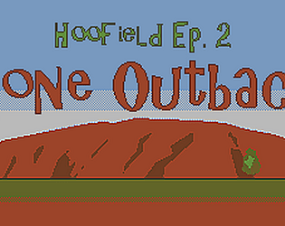
Hoofield ep 2: Gone Outback (AdventureJam demo)'s itch.io pageResults
| Criteria | Rank | Score* | Raw Score |
| Characterization | #15 | 3.462 | 3.462 |
| Overall | #28 | 2.769 | 2.769 |
| Emotional Engagement | #31 | 2.462 | 2.462 |
| Lasting Impression | #32 | 2.615 | 2.615 |
| Atmosphere | #34 | 3.154 | 3.154 |
| Mental Engagement | #45 | 2.154 | 2.154 |
Ranked from 13 ratings. Score is adjusted from raw score by the median number of ratings per game in the jam.
Leave a comment
Log in with itch.io to leave a comment.


Comments
Well done guys, having had a sneak preview when I play tested, I knew what to expect. The story is moving forward well, and I like your graphic style. What's the next move, ep.3 or a merging of 1&2?
Thanks polytely, and thanks again for testing! The first step is actually finishing ep 2, though the scope we have for it might be spread out over 2 eps, so ep 3 could be the second half we'd originally envisioned for ep 3. Then we'll look into a merge of 1&2/3, which will also include a clean-up/polish of ep 1. Then we've got ideas for at least one more ep after that. But first we gotta get started with working on this ep again, the jam was rough timing for myself and I haven't been able to work on it since, but do want to get back into it. Maybe/hopefully next month or so. :)
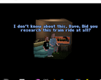
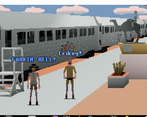
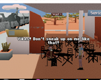
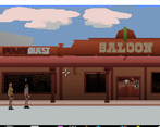
You should post some screenshots of your games to engage people to play them. The graphics are cool and there is no reason to hide them. Nice world, nice graphics, interesting story. I played the first episode before as recommended, everything makes sense.
You're right, we should indeed put some screenshots on the Itch.io pages. I'll try to get around to that!
Wooow, really nice submission, thanks!!
Thank you for playing and enjoying it!
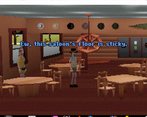
Excellent graphics. Poor sound design: sometimes no music at all, sometimes very quiet uninteresting music, no sound effects or voices. The font is difficult to read. Personally I find point and click gameplay to be almost always bad, but maybe that's just me
Thanks for the honest feedback. Volume was meant to be softened for those rooms, but it’s difficult to get right without a lot of testing by different user audio. The theme is actually composed by Donavan Jonk to give our opening a Crocodile Dundee feel. His western music in the saloon also fit perfectly with the quirky puzzles we intended. Unfortunately, we had limited time to participate and execute our project as intended.
Nice settings and dialogues .-) - I'll be back to try the post-jam full version once it's ready
A little short. But the game was made on a whim,
This kind of art must be pretty hard I like games like that.
Thanks. The art was a main focus. It’s actually not a hard workflow using Blender and most of the animations for the character assets were created for the previous game with tweaking. We hope to do more with it post jam.
Oh my gosh, is that the ACTUAL font from those old games? Because it looks exactly like it with the colored text and everything! I liked the redonkulous accents and the metahumor. Pity it's so short in its current version.
We're using the default PowerQuest engine's text font, which indeed very much resembles and evocates the font from 90s VGA adventure games! Glad to hear you liked it! We had a lot more planned and designed, but sadly ran out of time to implement it all... So we hope to be able to continue work on it and finish it post-jam. :)
Very immersive, I really felt like I was there! :P Also, at one point I got stuck. XD
Looking forward to post-jam if you do any more! I'll have to come visit and get some Belgian fries sometime.
Thanks, Dave! Did you get stuck, or STUCK? ;) Hoping we'll get around to finishing it post-jam!