you have a very strong initial concept that could be made more understandable through some writing and ux adjustments.
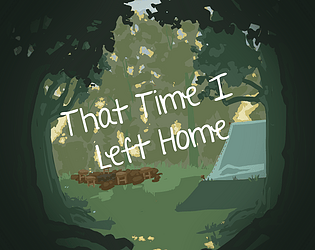
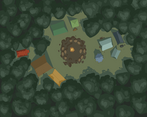
i enjoyed the art and overall theme, and like the concept of a before/after story, finding things in the aftermath. also the 'look around' effect while mousing around is very pleasant. most of the sound and ambience were well-fitting, and from a theming perspective everything was nice and consistent.
the weakest areas are in ux and the 'meat' of the story. the key theme of any adventure game is 'curiosity' and exploring or clicking something, especially when you specifically ask for it to be clicked should always yield something: wit, exposition, characterization. true you did a lot of basic scene setting, but it was mostly very dry. best example of violating this is clicking on the one tent 'you shouldn't'. then don't ask me to, or be more creative in how you admonish a player. 'someone pushes you out, how dare you!' same effect, but now you're giving story and consequence.
you were going for a suspense story, and that makes characterization even more important. the changes of the 'before and after' should have weight and consequence and give understanding into how characters would react to a monster suddenly appearing. how are they now behaving differently in response to something like this?
on the ux side, i'll echo the other comments about the dialog sound. however, the interaction and progression needed more baking. most interactions didn't need two actions, especially since it was very linear and there really wasn't much dependency on which order you interacted with anything. having to left click and right click was confusing, especially when there often wasn't even more dialog. there was no key difference between 'talking to people' and 'looking around' so just make it one shared interaction. i can sort of feel you making do with the system you were using, but even within that figuring out how to streamline that is a core element of game design.
also, for the 'keep the fire alive game', i'd say the requirements were too tight. basically burning all but one plank with a sliver to spare. think of ways to make it more engaging and give a little more margin for success.
a very good effort, and a nice start to a promising concept.


Leave a comment
Log in with itch.io to leave a comment.