Play game
Globberation's itch.io pageResults
| Criteria | Rank | Score* | Raw Score |
| Originality | #34 | 4.467 | 4.467 |
| Overall | #127 | 3.822 | 3.822 |
| Presentation | #181 | 3.933 | 3.933 |
| Gameplay | #307 | 3.067 | 3.067 |
Ranked from 15 ratings. Score is adjusted from raw score by the median number of ratings per game in the jam.
What do you like about your game?
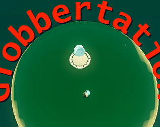
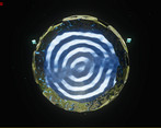
I really like the concept and execution of the shader to make this
Leave a comment
Log in with itch.io to leave a comment.


Comments
good ambient music, love the cool shaders, trippy world exploration, I may have fallen off of the world into the abyss :) oh well
Wait, you found a gap to go through? I placed one spot intentionally but I would be surprised if that is where you fell off as its on the other side of the ocean around a mountain that isn't easily visible.
Hi, just checked out your game. First run: I walk a bit and find a river, "Should I follow the flow (reference to my game if you checked it out), or should I cross it?", "nah let's cross it". I walk for like 10 minutes and find nothing. I came back here to find some clues or something and you mentioned in a comment about a ship on a river. Bruh. Second Run: I find again the river and try to follow the flow, spoiler, I found nothing again :(((. The game's idea is crazy and well executed in term of visuals and shaders. The only problem is that is too dispersive, it's really difficult to not get lost, and I agree with a dude saying that it feels like playing minecraft with 2 render distance. You really just need to add some type of clues to the player, as the overall idea and atmosphere is really unique, you should adjust those things and try developing it further in the future, it has a lot of potential!
Good luck with it, I still enjoyed a lot walking around in this world, really stunning <3333
i love how the menus transitions are absolutely overkill.
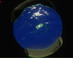
the globe distortion is well done and look great but it does make your game suffer from an issue i would call "playing minecraft with 2 render distance", you have no idea where you are because you cant see your environment. its very easy to get lost as the map is WAAAAAAY too big to be navigated properly, i tried to go through the desert and walked for literal minutes without a change, lost myself again by walking for minutes on the border between sand and grass and realised at the 3rd playthrough that there was water close to spawn because i missed it twice due to the limited view distance. that globe effect is definitively cool but you gotta be aware it has strong downsides and work around it
edit: i discovered on my 4th attempt that there was a portal close to spawn....
...also i swear the music has og fortnite vibes??? huh???
kinda curious where the lava biome is tho
Thanks for the feedback. And yeah the navigation ended up harder than I intended. I wanted it to be disorienting and hard to navigate, but it’s basically impossible if you didn’t build it. If you want to check out the lava area, go south west from spawn. In the desert you should find some speckles of rock leading you toward a big mountain with a sand path up it.
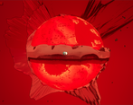
there is also a boat to go along the river. You go north north west from spawn to find a mud path up over a mountain, then follow the sand to the river.
the music was free to use music I found on mixkit. Wish I could say I wrote it but I ran out of time.
this is phenomenal work thank you
The legend!? Thanks for trying it, and glad you enjoyed!
Really unique view of a world, very well done! The style is definitely unique, not seen anything like that before...
I did wish there was more to do though, and I did get lost - so perhaps having clues and helpers to the gem would've really helped on this.
Great job though, looks really unique!
Thanks for the feedback. Yeah I had to cut stuff like enemies at the end as I couldn't get them working, and while I like the confusing nature of trying to navigate the world, even I get lost too easily and I made the thing. I want to make a more complete game out of this, which would probably have some kind of diegetic way to indicate where to go. Did you find the boat though? no one has mentioned it and so I'm curious if anyone tried it haha
This game looks so cool! It looks like some sort of fish-eye lens type of shader was used, really cool! The music was nice, the visuals are awesome, but I think the biggest issue is that I found one gem, and then spent 15 minutes walking and found nothing, aside from the world's edge, where I wasn't respawned, but I think that I just somehow went too far. Overall, this game looks really cool, but there isn't really much more than walking around, and me getting lost. However, I saw the health bar after walking around for a bit and realised that it wasn't being used. But, in reality, this game feels more like a relaxing game, so it would be cool to see what would happen if this game was updated!
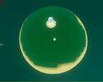
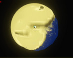
thanks! And it’s actually projecting the world onto a sphere that is much too small for it. Does kinda have a fish eye effect haha! And yeah I wanted the navigation to be the challenge. You can get lost easily. The health bar was something I forgot to disable before exporting. I had enemies and bosses planned but couldn’t get them working in time so scrapped them.
Yeah, I saw that in another of the comments about the enemies, would have been cool to see! Interesting that it's just a sphere projection. thanks for the response!
This game is pure state of mind! The music stayed in my head for a long time, while I was wondering how you made the globe effect. I would really like to check the Godot project because, in spite the controls are quite simple, the world builds up as it reveals itself. It is a base mechanic that could be used for a greater exploration game. It resembles The Outer Wilds in a smaller scale.
What was you intention with the health bar? At the beginning I was tense thinking that there would be enemies, but got relaxed and felt it very enjoyable when it was all about walking. Seeing the mountains raise in the horizon is quite an epic view!
Thanks so much! And yeah, honestly the health bar was a mistake. I had planned on adding bosses and enemies, but when it came down to the wire, I didn't have time to fix the errors they were having so I scrapped them and forgot to remove the health bar
And the stuff coming over the horizons is one of my favorite things! Super happy with how that looks!