Love the visuals and the control feels very responsive
zeestar
Creator of
Recent community posts
Submitted late and it was still broken!
I wanted to incorporate deceit into my game to get at the theme of "not everything being what it seems," so I devised a simple matching game where you want to move opposite colors next to each other and execute the match, assuming the displayed colors of your opponent's pieces are the pieces' actual colors. This is how it became a competitive game. Destroying all of an opponent's pieces in this way, or destroying enough that you can strike an empty space five times is a victory. Each player gets two moves/fires per turn.
This was my first time incorporating 3D graphics into a game so this was a lot of fun! They're a lot typing but a lot easier for prototyping than sprite-based games it seems...
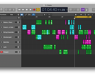
I liked the first half a lot more than the second... Something about the melodic line that comes in half way through, it worked very nicely for the build, and it had an ethereality to it, but I think maybe the first part gave me more of a slow, meditative game and the latter injected more anxiety. I really liked it!
I liked how you had a platform-sort of theme driving your creation. And of course it was my favorite platform you had to choose :D Very simple, which is a good thing for a game soundtrack in a lot of cases. It seemed a bit tense for a "peaceful" environmental exploration though. Might have been the tempo...


