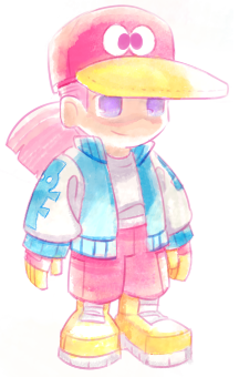
yes, that would be so cool to see! <3 sorry for the late reply.
Wiivil
Creator of
Recent community posts
thanks dude this really helps me understand how things work. I'll optimize them when I get the chance.
if you don't mind me asking some basic questions on spritesheets: do the rows get affected if objects are of different sizes horizontally? and does alignment matter a lot? no problem if you'd prefer I ask the boards instead haha.
stunning render work. nothing is overdone and its all filled with the perfect amount of beautiful details!
perhaps insect parts like multiple chitin-covered arms, beetle elytra and wings, or a tail made of centipede that coils around the body? my bad if these are already options. bugs have really neat textures that work well with fantasy cybernetics, I think.
very respectful and well-drawn. the old tv effect and closed-caption style of the text is very evocative of the moment. you're so right about the news moving at lightning speed now too. I actually didn't hear about it until I got called home from school, that had to have been at least 30 minutes after it happened.
I didn't really use reference, but I did tap into the Feeling I got from thinking about old game art from the gamecube and gba era. I got my start drawing by copying those lil game guides that came with boxes. So nostalgic!
In more technical and less old-man-sentimentality terms, I would study what concept art you can find from that era: this art below matches the style most closely but I pulled a lot from A Wonderful Life (not the remake) as well.
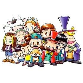
then throw in some of the down to earth chunkiness and watercolors from the gameboy color era sugimori art. I guess that's not really that technical, but that's just how my brain formulates style.

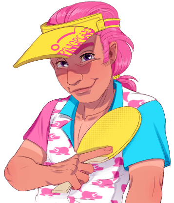
also: use a pink outline, soft yet saturated colors, white highlights, and a watercolor tool :) a basic understanding of clothing folds can also really help in both this style and pretty much anything you draw, though that goes for most of the art "basics," which you can never practice too much of. (I am overdue for practice myself lol) hope that helps! :D
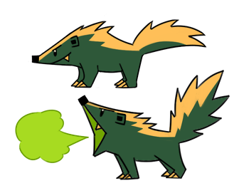
very nice detail work and enemy design! the second and last rows are the type of creatures I would want to catch.
when working with pixels, its best to avoid using tweening imo. it works with these because the images are big and you don't really see the pixels when they're zoomed out, but that sort of defeats the purpose of pixels. rotation is okay, but it still does crunchify the image. also, with pixel art, less is more. when moving from normal digital art to pixels a common mistake, and one that i still struggle personally with is making the canvas too big. even 100x100 takes up most of the height on a gameboy advance screen, which still impresses me.
all of this advice is only relevant for if you want to emulate retro stuff though. hope it helps!
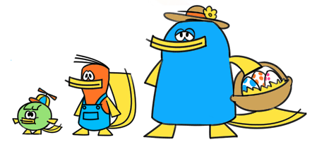
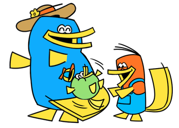
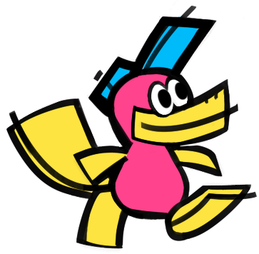
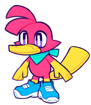
thank you! paddle came out of thinking what i would like out of a game if i could actually program, which would focus around rolling eggs to a goal. (shout out to billy hatcher) platypuses lay eggs, so I thought it would be a natural fit. he could also use his tail to smack the egg up high.
I liked the design so much I thought I'd rework it a bunch of times to illustrate my style flexibility, because i need some examples for commission work. I'm just kind of having fun with the design right now and seeing where it takes me. :) I might make an asset pack if i can learn to animate well enough. (it would be in pixel art though lol)
howdy fellow gamers. I'm new to itch.io and game development, but I'm very experienced in character design and slightly experienced in animation. My favorite thing is trying different art styles. I'm gonna some experimentation in here, I'm trying to basically improve in animation and possibly catch some interest without posting on big social media sites, because I hate them lol!
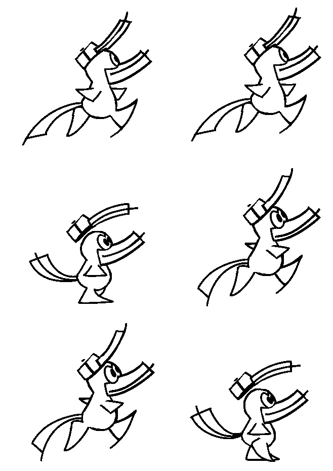
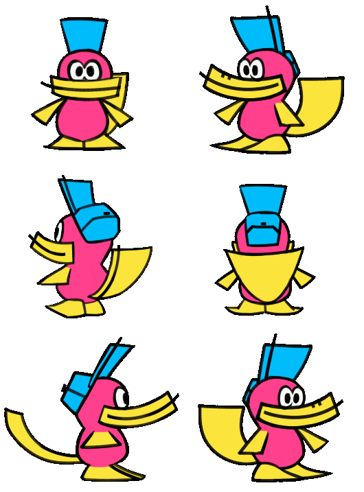
this fella is Paddle the Platypus, and here is a simple 4 frame walk cycle which I am still working on, as well as a turnaround. Advice welcome!
Anyone have any suggestions for animation software that is easily integrated into games? the setup I'm using right now is fucking monke level primitive and a complete pain to use and preview things 🦧


