doing a little project to show my stylistic range: re-interpreting the same design concept a bunch of times. this is what I have so far. :)
paddle flavors: gameboy platformer, sanicesque, sports game rival, harvest moon
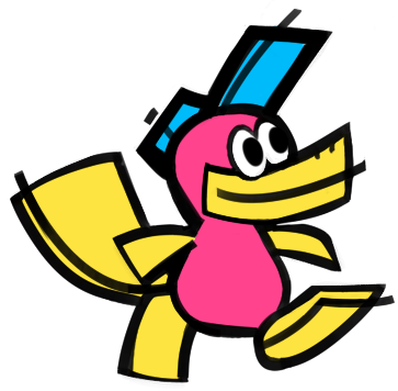
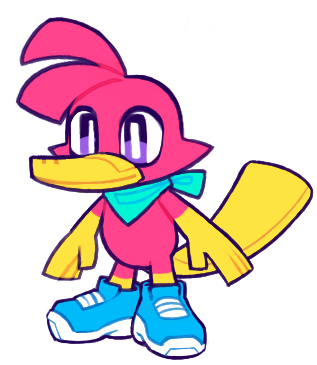
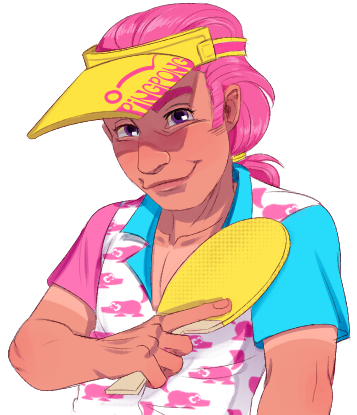
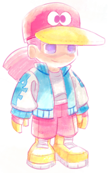
I didn't really use reference, but I did tap into the Feeling I got from thinking about old game art from the gamecube and gba era. I got my start drawing by copying those lil game guides that came with boxes. So nostalgic!
In more technical and less old-man-sentimentality terms, I would study what concept art you can find from that era: this art below matches the style most closely but I pulled a lot from A Wonderful Life (not the remake) as well.
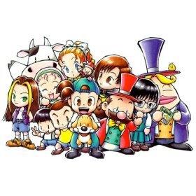
then throw in some of the down to earth chunkiness and watercolors from the gameboy color era sugimori art. I guess that's not really that technical, but that's just how my brain formulates style.

also: use a pink outline, soft yet saturated colors, white highlights, and a watercolor tool :) a basic understanding of clothing folds can also really help in both this style and pretty much anything you draw, though that goes for most of the art "basics," which you can never practice too much of. (I am overdue for practice myself lol) hope that helps! :D
Hey, thanks for the details!
I'm a sucker for that era of nostalgia, despite not even being alive back then as an early 2000's kid growing up with the DS. I think practicing this will help me nail some concept art for may game over here: https://wasabiiii.itch.io/grass-elemental-demo-demo
The gameboy Sugimori style is what I'm going for, I've already experimented with it in the aesthetic for my game. I'm not the best digital artist, but I think I can get somewhere close if I try!