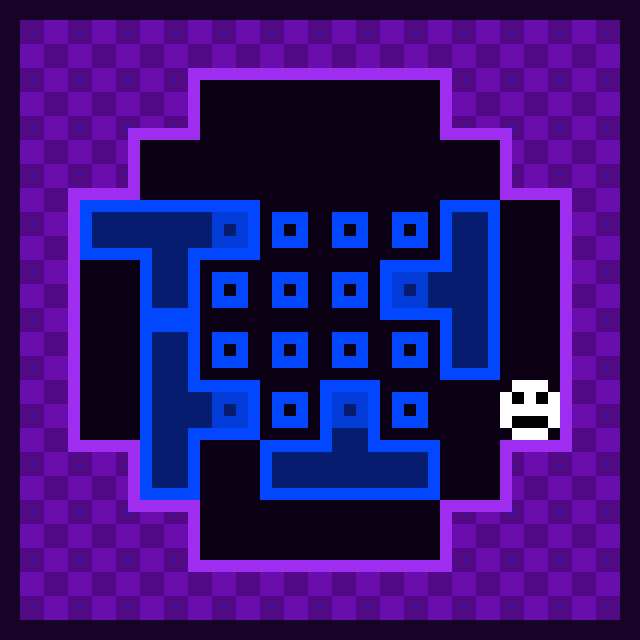
the final level is cheesed through usage of replacing the t-block with a line block
putting a block into a small hole can be a bit tight.
fun puzzle game. couldve been a bit longer
Undone Flame
Creator of
Recent community posts
neat game, however the starting position of the piece being random and the quick restarting can be easily used for an advantageous position. (this is a reverse of chess960)
quirks of chess not present here:
there is no pawn promotion which makes sense as you want to keep as many pawns as possible
also no double step which means you cannot preform en peasant
if you manage to get a state that can castle, you simply cannot, makes sense as kings are less valued and the random starting position.
i enjoyed this (definitely didn't spam r to get good start).
while the concept of control the player with the floor is pretty neat, i have a few nitpicks that are mostly what i believe are just me.
the off screen indicator can initially seem like a go to next room button if someone didn't read the tutorial
the area that first requires the usage of turning has some unnecessary saw blades
its interesting to know that only the first jump of the final area utilizes the mechanic of running being overridden by something without running
turning could've been utilized more
the pause menu doesn't pause and is therefore just a menu
the paint tiles don't have a right edge which is understandable as if both edges had an outline the tiling would a bit muddy
pretty good game
the game is just core concept is literately a large fetch quest web.
but the fact you can colour tiles is great but i would've like the ability to paint beneath the tiles.
the most threatening object are the boxes that change the colour chosen and the most threatening colour box is the underground blue box which when you fail to dodge forces you to the tower.
i would've like the ability to colour boxes and tree trunks.
ladders feel like ground rather than for lack of a better word ladders and that it doesn't let you go down.
the UI design gives a sense of progress.
also the NPCs have a higher sprite than players.
i wonder what co-op will be? :thinking:
speed and transition effects are great additions.
the indication for "SOMETHINGS GONNA LAND HERE" is amazing.
the start game animation and end really make the game feel circular.
though i complain that going of a platform significantly slow down speed and in level 3(chess) two "jumps" are consecutively preforms.
the chess area seams to be absent of "WARNING!"
the kitchen (on my first attempt) felt a bit long.
by the way where is Rho Apple and Tau Banana?
its scary but more in the (i don't want that to happen to me) in this and the TV static progressing further and further along side the would-be cheerful ukulele. the driving mechanic is pretty hard to get used to and even at the last time i still don't think that i got decent control over it along with situations that are strange. the red character showing up more and more as the game goes on. and segments that feel repeated mid-day. it all despite the graphics has a uniting theme.
its scary but more in the (i don't want that to happen to me) in this and the TV static progressing further and further along side the would-be cheerful ukulele. the driving mechanic is pretty hard to get used to and even at the last time i still don't think that i got decent control over it along with situations that are strange. the red character showing up more and more as the game goes on. and segments that feel repeated mid-day. it all despite the graphics has a uniting theme.
wait did i write the same thing twice?
i love how if i can squat then it has a big eye, how Abby looks like an arrow (implying better vertical mobility) Tabby looks more buoyant, and Zappy looks like you could stand on it
there are a few moments to praise the restart function as sometimes it appears like soft lock.
i would've liked text to indicate how to play rather than include it in the last page of the how to play
if you fall off a ledge rather than jump off of it then the player still has all their jumps (my guess is that the boolean for 'Grounded' is only turned off when the player jumps, and not when the player fails to detect ground) leading to a pseudo-coyote jump and Zappy being able to stop midair (unless swapped to another player)
funny how will you snail music is included with what i believe to be the WOWIE jam pack.
i am absolutely thankful for save functionality.
some maps after all 4 towers only provide 10/15 materials thus progress locking me.
Tower: Stage when you spawn on it forces slows the player to a halt.
layering issues.
music loops way too early but sounds great.
in mountain peak at the far left the void is present.
the purple enemies don't even do damage.
the game (at least for a jam game) is extremely large and ambitious.
the Tower: Conservatory is bit too powerful.
i like the "sticker-like" outlines.
the map preview is nice.
i kind of wished that each boss had more stages
there exists a bug where if you die and break all the boxes the game considers it a win
purples actions are confusing but it turns out it just dashes to the opposite side of the
optimization of the stars attacks that connect with blocks is a fun semi challenge
i feel as if the game should have more levels (whether a new boss or extending the bosses level count or even just each star interacting)
funny how the player largely resembles a chess bishop along with the games project (bottom right on webgl) is chess.
the quick rounds make it hard for me to show a large review but the games simplicity counters that.
the characters being able to swing their pick axe in any direction (for me at least) reminds me of an SNES game that is both 2 player and lets the players place and remove tiles.
i do slightly question why '/' is player 2's jump button as that means jumping for quick access requires stretching the pinky/thumb uncomfortably.
i do wonder why plain soil gives some points.
music is great cant say much about that. the sprite art works well with the simplicity.
ill summarize
level 1: introduction to concept
level 2: introduce the the three players interacting
level 3:pretty cool challenge
level 4:the darkness makes it so it feels like the end as all movement just pushes you back(or at least appears to) but since all levels end at the bottom left corner its a "hold right to win level"
level 5:"YOU WANNA SEE HOW FAST I AM" -yellow "the mentally insane" box
id think that a sense of moving forward whether tension or curiosity should be applied at level 4
i would like usage of a larger room so that you cant just go directly to the red cube but would have to use a path from blue to green to red, alternatively, you could've used darkness to prevent character swapping. i don't know conditional swapping is something one my mind here
i like the text boxes each player uses.
i like the dual weapon flow and the fact that the enemies move more realistically (something like: move to a random point relative to the player) managed to get to the game crashing point at wave 3
the two weapon type work like "the one you want to use but cant very often" and "the one you dont want to use but it can be used for longer"
I'm not sure if there is supposed to be a boss due to wave 2-4 crash
and i didn't witness the player change/didn't notice (stated in how does this fit the theme)
(levels ill split by the large doors)
since my skill issue cant pass level 4(second time inside the tower) ill write about everything prior to that
level 1 and 2 are very well done with an introduction to the game play and mechanic
level 3 meanwhile asks "complete a tight jumping gauntlet then hope you fit into the next segment which is easier then the gauntlet.
level 4 (the parts that i can get to) is extremely intense despite the music. where a gauntlet but with clone... then there's a what i believe to be a recovery path which pretty much impossible to land on consistently
3 & 4 have a "one go" mentality and the game could benefit from checkpoints, otherwise it feels like a long seemingly unsupported bridge where the goal isn't exactly obvious other than
sometimes you can do the unintentional game play feature of ledge climbing and stated with other reviews "wall jumps".
the character is a bit slippery
the mechanic isn't anything new (Super Mario Galaxy 2 and Celeste have this mechanic) but its welcome. the pixel art is nice.
the spikes in their design say to me "yeah you can walk through me, just don't land on me" and the hit box is a bit larger than sight reading would do.
i like the music transitions
the tanks moving away from actual mines is nice unless the marked mine is not a mine (how do they know?)
the face of the smiley is unsettling and i love it.
phase 1 is very faithful to the classic minesweeper but with a z-dimensional coat of paint(tip: phase 2 only happens after the 5th clearing)
phase 2 for me makes me extremely focused to the smiley (the smiley alone can used to the advantage of removing rather than marking mines)
phase 3 can just be utterly frantic with BOTH things that remove your progress and things that change what the goal would be.
flag marker my beloved
fun game

(during the run multiple tiles got a question mark yet only the smileys hit changed anything)
bug where gun ALWAYS shoots to the left. i like the conversations when two amogus and i quote from one of them"👍💬 👎👍 ❓👎💬"(or was it"☝️💬 👎☝️ ❓👎💬")are near each other and the animation for LAZER'd.on my own display (not widescreen) the icons to show that an amogus has been either not found, found, dead. or rescued. gets cut in half.
the music is tension inducing, and adds to the timer.the loading screen is great.the amogus get stuck probably due to (a follows b follows c).
the overall theming (aside from "your not alone") is Tension.
and finally...
GETOUTOFMYHEAD
the progression of the enemies is great until wave 4 when the enemies have the equivalent of a shotgun.
i like it when the robots upgrade, they get a different sprite. balancing issues FEEL like the second robot from the top is extremely powerful and the cost is easily pass via the beacons. i feel as if leveling should increase price by even the slightest and/or preform a more visible function. the fifth robot from the top... i don't know it just doesn't feel as powerful. the shield isn't exactly obvious for me
the sprites are great and it could benefit from some bgm
ill state that placing tiles feels less like a task the magic player is doing and more of a no character.
i do like that some parts require the player to enable the other player to get some blocks and then.
the parts all sum to
- get the magic player to be able to get tiles
- use tiles
the enemy variety is hard to say: the enemies don't seem to have varying speeds nor hit boxes
the lasers are very well done.
i do love a good puzzle script game and the wall outlines are nice but the differing timmys only appear later. the timmys are cool in how they are setup with:
- normal, what would go wrong.
- weak, cant budge a block.
- sticky, makes movement with the boxes force at least 1 side to have a box.
- fast, SLOW DOWN TIMMY #55.
- inverse, i liked the mechanic of causing black holes.
the maze type puzzles ask which direction is valid. the mutation station has unique quirks like that it cant change two timmys in consectutive steps.
*clears voice*
roses are red,
violets are blue,
getoutofmyheadgetoutofmyhead

the distortion for the player is cool but bleeds into new runs, and the pits are more threatening then the main gimmick, the background effects are nice. i would've liked a indication of how many bad souls that you can tank are left (a health bar of sorts). finally the bad souls and/or hearts can just spawn on top of you.
the radar item only seems a seems plot based, and only provides a visual and audio effect
I'm not sure if there is more content as after eliminating all of the enemies within the subspace area but after entering the second portal there isn't anything i couldn't see as a valid pathway and it doesn't exclaim itself as an end.
i don't know why lowering the browser window size, increases performance, but it works(my guess relates to pixels).the weapon upgrades are nice with the slow single shot, fast but weak barrage, and shotgun.
the unlock for the barrage weapon's placement is nicely done as it makes the player ask the simple question of "how do i get there" and sure enough a platform with a long delay between point a to point b is present.
the enemies require a moving in battle as their fire rate, is for a fitting term, alien.
being a prototype it doesn't need to be perfect but ill highlight a few issues and bugs:
- moving the mouse occasional causes it to drift
- buildings occasionally fall through
- enemies stop spawning after the enemy counter reached higher than it should
i do like how it feels in movement like coyote jumps and the ability to jump over the walls and stay there.
the potato with a gun (the potato with a gun) is a game where there is a potato with a gun and it is the result of the potato with a gun committing crimes that only a potato with a gun would do.
a lot of the game feels solid and the potato with a gun's enemy the cement brick with a gun is absolute perfect antagonist and the boss BIG LARGE SUBSTANTIAL OF CONSIDERABLE SIZE cement "blockhead" brick was beautiful.
the name, story, characters, all feels like a meme submission ands that alright.
the controls and camera are great, collision however sends bullets and you through each and every parallel world out of sheer spite, and the enemies are bit "ill defeat you with clones of myself", and i wish there would have been a very cobbled together boss containing CPU destroying amounts of cement bricks because... ...idk.
over all a "potato with a gun/10"
if i had to complain about somethings :
- the art feels a tad cobbled and a bit inconsistant.
- it is weird that like-colours do damage to each other but at least the way of this is consistent(i.e guns of the players have differing colours from themselves).
- the dash is nice but, it in the easy difficulty, it makes getting to the far corner so your buddy can pick them off very trivial.
- i was a confused for a bit on how to start a new game after winning the easy difficulty as the "thanks for playing" doesn't quite say that its a valid target.
Otherwise i do like the asymmetrical style and friendly fire. the enemies are bare but it covers what one needs to worry about: the quick ones can make more threatening if the bundle up in higher rounds, the slow ones force you to move.
Pretty Cool usage of those assets, albeit a few oddities ranging from seeing the V O I D as one of the edges isn't long enough and that health doesn't exactly work, and lastly jumping while running into an enemy is like a trampoline with bounciness toned to extreme values. i do like the last levels usage of triggers despite the fact its fictionally identical to that of three targets, it makes that singular target more final in a way.
This game reminds me of a Gameboy-like puzzle-script game with a tad of modifications for 8x8 graphics.
The mechanic is a bit hard to control with a two step process before you can move the softer walls.
Most of the levels boil down to "move through diagonal walls." and probably could've used some asymmetrical quirks between both characters either in the levels or the objects.
overall a neat concept.
don't worry, as the jam is less of a competition and more of a fun little "can you get a functional game with a set limit of time". if last place is a valid fear, it won't affect the fact that YOU made a game within the time limit. the odds of last place overall are slim to almost none and even if you get that... there is no loss in getting last if anything, its only a learning experience.
in summary:
- the jam is only meant for fun.
- don't worry about getting last
- failure is only a learning experience.


