Oh, cool, thank you! I did play it just now (sorry it wasn't before the deadline), and I quite liked it. I thought the gates not opening in the last level was a bug at first until I realized that you had to get exactly the number on the gate. I quite like that aspect, having to not only get all the stamps but get them in a certain order/combo. Very nicely done!
tustin2121
Creator of
Recent community posts
Brilliant! Once I figured out how all the dice work, it was quite fun stacking together effects and working out how best to buff myself and take down the enemies. And the style is amazing as well, very Persona-5-everything-angled-radically, and I love it. I also quite enjoyed how you could roll over everything to get more detail about it. Couple small things if you're going forward with this:
- The energy mechanic should be pointed out, at least highlighting the energy that will be used with the roll of a die. I thought the game was bugged at first when clicking the die wasn't doing anything, and for a good couple minutes I was trying to figure out why I could or couldn't roll particular die. At the very least the descriptions should say how much energy each die uses (even if the D20 is the only one to use more than 1).
- The hover details on the final fight go off the top of the screen since the HP bar is so high up. And it wasn't always obvious when effects would be ending (at least once I saw it say an effect was "for 0 turns").
- It's interesting how the dice actually roll around and drop on the table to determine what happens, but it seemed to me that the number you could barely see at the top was the number being chosen? If we had a better angle on the dice, or maybe highlighting the side that is being selected before the die vanishes, it would be nicer.
- Sometimes the die would seem to take quite a while settle, so I appreciate that there seemed to be a timeout for how long it would take to roll. I was afraid the game was going to softlock when the die slowed way down like that, but it never happened. The die also seemed to spin insanely fast a lot, which seems not quite realistic to match the realistic rolling.
Anyway, loved it all, the art style, the music, the tone, it's all great!
The unfolded die preview actually made the game very accessible, and thus much more stand out from other games with the same concept. The 007 theme was excellent as well: loved all the punny level titles (they should stay on the screen a little longer, imo) and I enjoyed how the 1's face was the suave die's single eye. Brilliant!
Loved the idea. The controls are a bit finicky though: clicking doesn't select what to pick up from the massive pile next to the machine, you just always pick up the closest thing, even if you're standing on top of it and can't see it. Then when you hold it, it's above your head and gets placed down where it "hovers" above your head, making it easy to lose items in the wall. I also think accidentally killed a patient by giving them the wrong organ because of this?
Also, not sure what happened at the end: I was slamming the button minigame and was suddenly thrown back to the start screen out of nowhere; I presume I lost somehow and clicked through that dialog? No idea or indication of when losing might have been a thing? Either way, it was fun.
Love the strategy element of it, once I understood how this was supposed to work. I thought at first I was fighting against a dozen and a half dice! It would also be nice if there was some method of knowing what sides were on the other sides of the dice, so I might be able to plan better; I ended up just doing a lot of prospective movement and then being unable to back out once I realized it wasn't good.
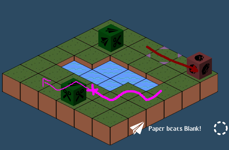
Also, I seem to have run into a game-breaking bug: That poison die was about to do a run around me, but I managed to get rid of it (accidentally) by being next to a blank, but then the game soft-locked, so maybe it wasn't prepared for it to stop moving so soon or something? Or maybe stop moving at the same time as the other die? Here's a screenshot of when it would no longer respond to clicks (but the cursor indicator was still moving around with my cursor, and I could still 'select' dice for the side but couldn't do anything with them):
- The movement feels terrible: there seems to be a randomly long lag to stopping the character moving in a given direction. I would let go of a button and it could stop after like half a second or stop after another three seconds of movement. This meant it never felt like I was actually in control of the character, and also meant I was sliding around the pickups a lot.
- When you run out of dice, there's nothing you can do anymore besides wait for the enemies to slowly eat your health. Or quit, I guess.
- Not sure what the strategic value of the dice's random damage is if you don't know what the health of the enemies are; I ended up just firing the dice like normal but usually ineffective bullets.
- I would have preferred if the 'next die to be fired' was next to the character I was controlling; it being way down in the bottom corner where my eyes never really went meant I was never cognizant of what I was about to fire. But then the previous point made that moot anyway.
Apologies that this is overly negative...
I also screwed up on this front, using music because I can't do music myself. But also I didn't see the rule about needing to only show four colors on screen at once. So I guess I should remove my submission as well. *sigh*
Here's mine: https://tustin2121.itch.io/my-saturday-grounded
Thanks for hosting this jam. The ink for the story this inspired out of me is long, multi-threaded, sprawled across over a dozen files, and most critically not finished in the slightest, so unfortunately I won't be able to submit it in time. (I thought it'd be short enough to finish in 72 hours.) But I'd like to thank you for inspiring it nonetheless. Hopefully it'll be done in time to submit to one of the other concurrent jams with a longer time frame.
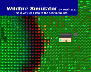
They are, for each cell, every timestep:
- Dissipate Heat (average the heat of surrounding cells and the air "above" the cell)
- Spread Fire (based on if surrounding cells are burning)
- Spark or Smother Fire (based on heat and moisture)
- Light Fire (if player is clicking this cell)
- Spray Water (if player is clicking this or neighboring cell)
- Collect Rainwater (if raining)
- Dry Excess Moisture (natural water evaporation)
- Dry Air (vaporizing water in high heat)
- Burn Fuel (if burning, consume fuel and add heat)
I'm sorry, I wanted to like this game, but the gesture recognizer just got in the way of everything. I couldn't even get out of the first room before I gave up.
It's an interesting idea, that needs a good gesture recognizer, and the ability to just draw on the whole screen instead of the too-small box in the bottom corner. It might also help if there was any feedback whatsoever (Insert symbol for "You must stand near the chest to open it; I'm not going to autowalk you over there, player" here).
I'd suggest, since I can only input one gesture at a time anyway, that the recognizer could display the input I put in immediately after I let up instead of waiting until I submit; that way I can confirm it recognized my squiggles as the input I wanted before I submit it, so I don't mess up the command combo and have to struggle with the interact gesture again. And/Or allow most verbs to interact with the current noun (ie, the thing I'm already standing in front of and have to stand in front of to do anything with anyway).
Thanks for the feedback. Did you get out of bounds near the fourth level, or in one of the transition tunnels? I was specifically making the wall collision thick in the puzzle rooms themselves to avoid potential out of bounds stuff, but I got lazy with the last one and the tunnels since it was getting close to the deadline.
EDIT: Never mind, I had my brother play it, and he managed to get out of bounds via landing on an attachment plate at an acute angle. And I saw first-hand how bad the bouncing around can be if you do something wrong. This is why playtesting is a thing...
Thanks for playing. Yes, the first room is intended to be solvable simply by running off the platform. It introduces the concept of there being no gravity when you leave the metal floor area, instead of being able jumping around on platforms. (The first room is actually specially coded for this solution, because normally you don't auto-attach to metal floors if you're moving parallel to them.)
Hey, it's a 2D version of my submission! :P
My main feedback is to either make an option for no screen rotation, or to make the screen rotation a lot snappier. The tail off of the camera's roll did not not agree with my stomach much. I did like how the blue guy's face indicated when we were flying free.
Thanks for the feedback. Perhaps I should have introduced wall sliding earlier, because it is the intended way to help you recover. Basically holding shift will prevent bouncing off the wall and let you slide along it, and you can kick off in the direction you're facing once you've reoriented yourself in a useful direction. The mechanic is introduced in the 4th room, but I realize that that 3rd room is long and has no attachment plates along it if you fluff the first jump.
Thanks for the feedback. I had thought of putting an indication on-screen, like a little person silhouette or something, which shows if you're walking, floating, or sliding against the wall, but unfortunately I didn't get much time to polish the interface before the deadline. Generally if you hold the shift button before hitting a wall, you will "wall slide" (that is, lose all momentum that isn't parallel to the wall) when you reach the wall; in addition, kicking off from the wall requires a wall behind you, and it's not obvious why sometimes a kick off doesn't work (your feet can't reach the wall when you kick).


