Indie game storeFree gamesFun gamesHorror games
Game developmentAssetsComics
SalesBundles
Jobs
Tags

Sanguine Vow Games

60
Posts
3
Followers
A member registered Jun 06, 2023 · View creator page →

Creator of

Recent community posts

Thanks for playing!


Cheers on the compliment for the graphics, even if they don't look very gameboy-ish. The resolution was set in accordance with the rules as I understood them, you can see my discussions with others on this note below,

Enjoyed this very much. The experience felt very authentic to the gameboy, music was excellent and I think the gameplay did a great job of teaching good habits (not over relying on full boost, learning to use the curve of gravity from planets) through game design. 

It was unclear to me on the page whether the inversion or change in color palettes that would happen from time to time was a bug. Whether it is intentional or not I would say my only area to suggest improvement would be to remove that. None of the others I saw looked as good as the original if it is intentional, and if it is a bug it was a distracting one. This is  a very minor nitpick on a very good game. :)

Pinball wizard! Glad you had a fun and chill time. Thanks for playing :)

Thank you. Pokémon pinball was a game with a lot of nostalgia for me, so that was the main inspiration to try something like this. 

I appreciate you letting me know about the visual bug, if I do a post-game jam refinement of this project I will now be on the lookout to fix that. Thank you for the comments and for playing :)

Glad you found it fun. 

Getting the ball to work properly on the ramps was, gameplay wise, the most time intensive challenge of making this game. I agree that I didn't nail that part. 

You can see below my conversation with dwhiffing who also had concerns about the game size. To summarize, it is 160x144 natively in engine and scaled to be 8 times larger, which was in line with the rules as I understood them. Since the sprites have no issue going "in between" pixels the result is that the game ends up feeling like its resolution is 1280x1152, which is something I will keep in mind for next year. 

Having the game able to be re-sized or only scaled this large if the player wants to might have helped but didn't have time to implement that. 

Thank you, I'm happy with how it came out for the most part :)

You're right on that the background could be better. The original idea was to have a scrolling starfield but I settled for a static parallax to save time. 

Thanks for checking it out :)

Great looking game, I will echo the other comments on here saying how excellent the hyperspace jump is. Music is also excellent. Making water your commodity and also your fuel is a great use of dual purpose design and reminds me of having to make similar hard decisions in FTL. 

I did find the beginning quite difficult to eke out any progress. I would also suggest a goal for further refining the game would be to reduce friction and increase speed in menu-ing. Since a player is going to be going through the same loop of 

-go to planet

-purchase stuff

-go to new planet

-sell stuff

Making the menus fast and easy to navigate should be the highest priority. Having to, say, sell 7 units of water means going through 9 different text boxes with associated confirmations, which really adds up when its the main gameplay loop. 

I think the physics are well tuned, and I could see some very cool courses being designed around the idea of using the gravity of planets to put spin or curve the shot of the ball.

I will echo the thoughts that a better sense of geography, and knowing the full layout of the course looks like would help a lot. I know there is a freeaim mode but I might be tempted to have the arrow on as a default and have it toggle on or off with a button press. 

I also think having the camera pan across the course from the flag back to the player at the start might be good to help the player get a sense of what obstacles they need to avoid / where they need to go. 

Classic gameboy color palette, solid idea and the feel of the physics and controls were all good. :)

Big number go brrr.....

I will echo the thoughts of the others below that the controls could use a bit more fine tuning / more stuff to do which would help your milk production.

As is, its a nice little relaxing cookie clicker with  a pleasant soundtrack and cute spritework. 

(1 edit)

A decent mix of FTL and pokemon which suits the gameboy theme. I really liked the music and I think the idea of a project like this has potential. The strategic depth of rpgs is a smart way to make an interesting game on limited hardware.  I also like the look of the graphics. The dithering used for shading looks very crisp and authentic. 

The menu controls all feel good, and when I was navigating around the map (using a keyboard) my inputs always made sense. I was able to navigate the information well. 

A few quality of life things: 

I might have an "auto turn end" feature if there are no valid actions to be taken by the player, even if you allow some folks to toggle it off if they don't like it. It got a bit tedious double checking everything to see whether I should end my turn.

I was disappointed on my first shop to have bought a ship and then found out that it didn't have any weapons, nor did the shop have any weapons to buy, so the ship just kind of sat there in my fleet not doing anything. Having a default, even non-damaging ability for each ship might raise the floor of how many interesting decisions the player has to make each turn.

(1 edit)

Exactly what I figured happened. Its a game jam, corners have to be cut, I totally understand. For the music that got finished they did a great job! :)

Spooky! I like the analog horror / jumpscare images in the background. 

I also agree that its awkward to move from the mouse for menus to buttons for the game part. 

I like the concept. Make the player choose between two different forms of health, protecting your physical health by taking the penalty to your sanity. However the connection is not super clear (it took me dying about a half dozen times before I sort of figured it out) and I think rather than a static number, some kind of bar that fills up (like a heat based gun in an FPS) might be a better way to communicate the same idea visually. I didn't ever really have a good sense of how well I was riding the line of going insane. The number seemed to have only a very loose connection to how close I was to going crazy. 

The music is an absolute BOP! Like legitimately I would love if you put a download link to just the music on the page. 

Love the pastel bubblegum look, unique, vibrant and the gameplay reads well. 

I might suggest toning down the difficulty, especially at the start. Maybe enemy ships get less health, or the player hitbox is smaller or something...I did have to replay just the first few enemies to the point of annoyance. 

Also, while I'm sure it would be a challenge to have the bullets have sfx that wouldn't get grating seeing as how constant they are, it did seem odd that the bullets were all silent and the explosions made noise.

Lastly, I did run into a bug where the music would just stop looping. It started back up upon death. Not sure what caused it. 

I will echo what others have said. Often I would either have sprites spawn on top of me or come in offscreen before I react and destroy me. Upon taking a hit, I would be either teleported to a different part of the map, or perhaps all the objects on screen would be reset, but either way it was quite disorienting. 

I also agree that there is some strange blurring going on graphically. 

On the plus side, the game has a lot of personality and snark. Kind of reminds me of Crazy Taxi from back in the day. 

Very authentic to the gameboy experience. The spritework fits in right at home. 

I too am impressed at the size of game you were able to get together in the course of the jam. 

Small note: it does feel weird that the village / common areas don't have music, but the music, when present, sounds exactly like what would come out of a gameboy's speakers

Excellent entry. I played it all the way to the end for the well balanced puzzles and chill vibes. 

The small touches of sfx are a small detail that was really well done and added a lot to how polished the game feels. 

I would have loved a small thing after the final level noting the end of the game, as I kind of wandered between menus for a few seconds to confirm there was nothing else to do which resulted in a small anticlimax, but that is very nitpicky. 

I agree with folks that say an "undo" node button would be welcome. I'm also impressed by the implementation of having the constellation links always go where I wanted to, and never attach to a star accidentally. I don't know why but it seemed like something that could be buggy if improperly implemented but I didn't notice a single issue. 

I too had a frantic dash to try to get a web version runnable which was ultimately fruitless, so I know how that feels. 

Sorry that it affected your windows build as well. :(

So many submissions are incredibly nostalgic, that is for sure. Thanks for playing :)

I see! Then I definitely misunderstood the requirements, I thought as long as the viewport was 160 by 144 with 4 colors that was all I had to concern myself with. 

To your point, I'll try to keep that in mind for next year and see what I can do with the proper constraints. 

No offence taken, thanks for clarifying. :)

Very kind of you to say! Thanks for playing :)

Thank you! I did a lot of tweaking to try to get game feel right, I'm glad I got at least in the right ballpark :)

4 colors is a huge challenge to get ui elements to read to the player. 

I will say that all the in-game sprites look very appealing and I had no trouble finding my way around or differentiating between different elements in the game world, which is also a huge challenge with a small screen and 4 colors. UI nitpicks aside its definitely one of the nicer looking submissions I've played. :)

Yeah the sound kind of comes in hard off the jump, doesn't it? 

Thanks for taking the time to play it and I'm glad it was enjoyed :)

Glad you enjoyed it, thanks for giving it a shot!

Thank you for taking the time to check it out :)

Oh definitely, I did a bunch of research on how gameboy graphics are rendered and nothing about how the individual sprites work in my game is compatible. Since it wasn't in the requirements for the jam I didn't ever even consider trying to accomplish that. Your game is FAR more authentic than mine. 

All good! My game has bugs I didn't have time to iron out as well :)

Definitely, I didn't even finish my first few game jams so I know how that goes. 

Like I say, very good music and I'm always in favor of any game where the protagonist is a shark.  :)

It is natively 160x144 in engine and visually scaled 8x bigger for modern monitors, so 1280 x 1152  :)

The right flipper button, so D. I will add a note on the page, thank you for pointing that out. 

(1 edit)

I see below from other commenters that the inertia on the player character is divisive. I also didn't really care for it. 

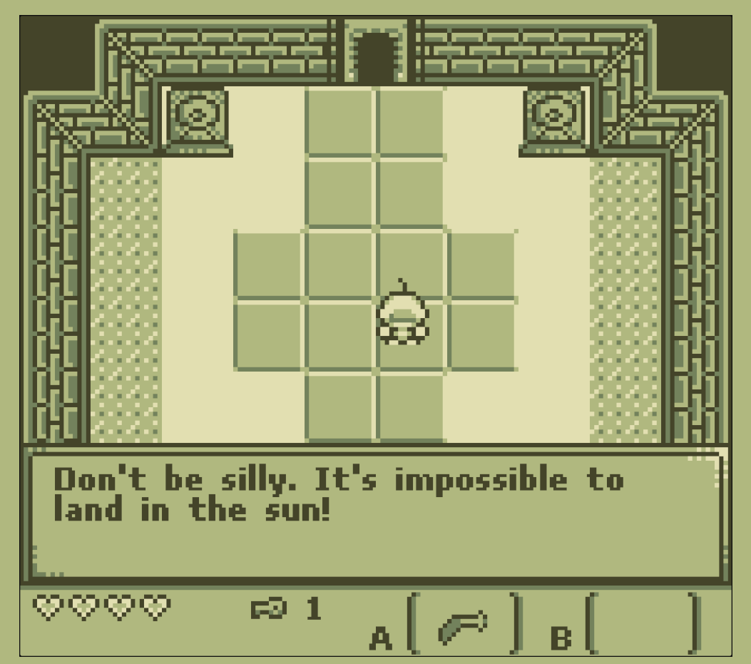
Very evocative of the game boy Legend of Zeldas, super nostalgic to play. Lots of "gameboy soul" here for sure, other than the font used for text. Changing that to something more pixel gameboy-ish would help a lot to make it more cohesive, as it is it kind of sticks out because the rest of it does such a good job being authentic. 

I think I found a bug. I went from the "secret station" to the bottom center planet and shortly after landing had this text at the bottom of the screen and couldn't get rid of it. 


I liked the puzzles which rely upon boomeranging the projectile backwards to curve your shots. One thing I noticed is in areas where the scrolling stopped, if there is collision at the top of the screen then the boomerang hits it and is destroyed, whereas if there is no object past the edge of the screen the boomerang comes back. But from the player's perspective, both look the same especially on your first time through a level, and so it makes it feel inconsistent whether the boomerang will bounce off the back of the screen or not. 

Also, I'm not sure if its meant to look like the boomerang is spinning when its coming back, but it looks like visually there are just two boomerangs, slightly offset, as they return to you. Could be a visual glitch. 

Thank you for taking the time to play and review it!

Definitely. Far more important that people feel like they see what a game has to offer, especially when a game has as much to offer as yours does :)

Fun colors and visuals, lots of charm and humor. Major points for the inventive use of the theme to have space as a finite resource. 

The main fun of the game was in reading the blurbs that go into the newspaper. Picking them felt quite arbitrary. Even after reading the tutorial I was unsure why the numbers would change the way they did. 

Good catchy music, the controls feel good and its snappy and responsive to move around. 

I did have some issues navigating around the inventory screen. Using my arrow keys the cursor never seemed to go where I want it, and I don't think I was able to pick up any loot. I think I closed the chests without looting anything which made them disappear? Not sure. 

I also ran into a bug in the cave just inside the southern road on the left. I walked next to the slime, the "COMBAT" banner went up and then I was soft-locked. No controls did anything. On a reload and second play I was able to fight things perfectly well in the other caves. 

https://sanguinevow.itch.io/spacefarer-pinball

Happy to play and give a rating to anybody who leaves a comment :)

Great music and theme. Major points just for the title alone. 

I found the gameplay a bit frustrating. When you jump, you lose sight of the floor and so are only guessing on where you should come down, whether it is on an enemy or not. 

Also it may be just a glitch on my end, but often I would be in midair and then the camera would fling backward and my character would disappear. I think I was taking mid-air damage but it was very difficult to tell. 

Very fun and a method of doing a platformer I've not seen before. I did have a few moments of "ah ha" of how to use momentum as the gravity shifts.

I think to really pull off the precise platformer that this seems to want to be, some more polish on the jumping mechanics (adding some coyote time especially) would be helpful. Also the camera would often not keep up with the level design and so I would find, especially near the end of level 1 where it got to be the biggest issue, that only about 20% of the screen was showing me the area I needed to see to do the rest of the level, with the rest all irrelevant space behind me. Perhaps a set of fixed cameras that go from section to section, or a camera which leads to show what is coming up better would help. As is, I had a lot of "throw yourself blindly forward and see what happens". 

One of my favorite submissions I've come across. 

-Lots of charm and humor, I went through this with a big smile on my face. 

-Gameplay is the fun kind of frustrating, which is well justified by the game's theme.

-Lots of different ideas have been mined out of the central premise (each level feels distinct)

-The little jingles at the start and end of each level are a lovely little touch. 


A few very minor nitpicks. 

- The third level is harder than the level on either side of it. May need re-arranging. 

-The font is kind of hard to read, and for the in-between level text that can be an issue. 

- There is no incentive to play well once your tip hits zero. Perhaps introducing a failure state if you go too deep in the red, or having to pay for late / damaged arrival could continue to keep the player honest.