
Hey! Thank you! I would love to add italics, and even did some tests in Aseprite. That said, with 13 variants right now this would be a massive undertaking, so I don't make any promise :)
A member registered May 09, 2018 · View creator page →
Creator of
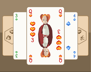
A trick taking game for two players with only 18 cards
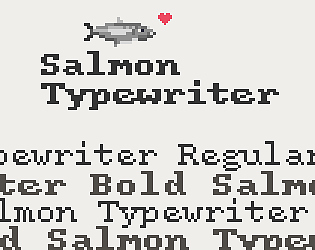
An antiquated typewriter pixel font
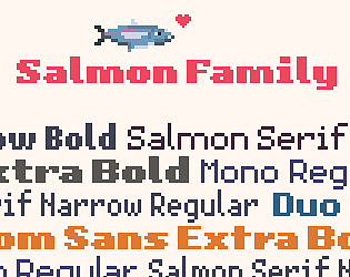
A versatile family of high-quality pixel fonts


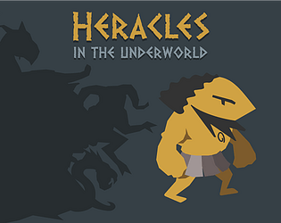
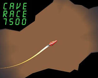
Heracles goes deep into the Underworld to capture the Hellhound Cerberus
Strategy
Play in browser
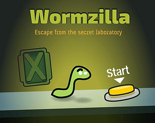
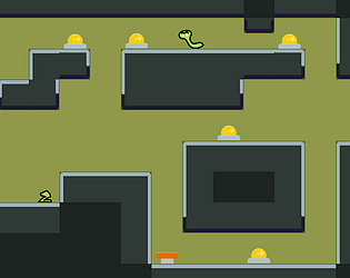
Help little Wormy escape the mad scientist's lab through 6 levels in this short puzzle platformer
Puzzle
Play in browser
Recent community posts
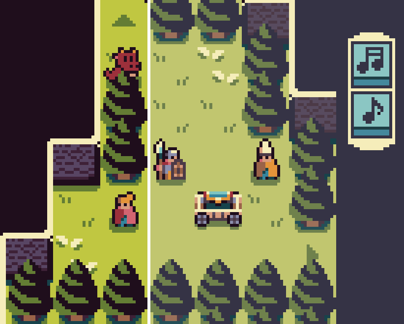
Yes the dark outline works very well. What I had i n mind was keeping very dark/black and saturated colors only for characters and actionnable items, and "muted" tones for environment. Here's a quick n'dirty mockup. Not sure it would work for the whole game though, it is a very different look, and I probably went too far to illustrate here, especially for the grass :D

itch.io Community » General » Release Announcements · Created a new topic Salmon Typewriter, a free pixel font
Salmon Typewriter is a typeface that aims to give the feel of text typed on those old, quirky typewriters. If your project includes old letters, vintage administrative paperwork, hard-boiled style narratives, it can help achieve the right atmosphere.
More screenshots on the page: Salmon Typewriter
It is tricky. In the kerning table we could escape it like "\ " (backslash space) but that would be hard to read.
Or perhaps "\s"? As in regex it "matches whitespace".
Another way would be to use a double character, something legible like "!!"
I'm not sure it would be practical in glyph images, that would probably require some color coding, like "red indicates width".
Is there a way to specify kerning for a character before a space?
The reason I ask is I am making a duospaced font, so I can't use the monospace option. For characters that don't cover the whole tile, it is a problem because for example in Pixelfont the dot character is 3 pixel wide (single pixel centered in a 5px tile) instead of 5:
The trick it to add 2px between the dot and the next character. It works fine, expect I found no way to specify "increase kerning by 2px between a dot and a space". So with most ponctuation followed by a space, kerning is narrower than expected: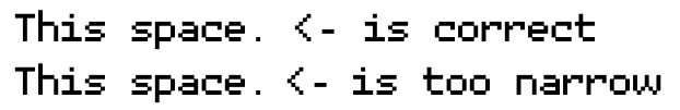
(top line is with monospace option, bottom one is my attempt at duospace)