
Presentation: Text and visuals scale independently. You're supposed to set the text to something that's comfortable to read, then adjust the frame so that the board is comfortable to handle. I have a few ideas for how to prompt the player to do that and like. Maybe have letterboxing by default.
Tutorial:
It's good to have someone say they're stuck. The tutorial has been a problem for a long time. I've had a few playtesters who got it, so I thought it wasn't a problem anymore. But they were mostly people who have tried earlier versions of the game. And someone who's developing a grid-based tactics game of his own.
I have a few simple ideas to make it better.
- Disable health regeneration for the enemy (or maybe everyone) in the first section of the tutorial. Less to think about.
- Separate out the explanation of reaction attacks from the explanation of stats, so it can be a bit more thorough without overwhelming the player. Explain that next turn or when a reaction attack triggers.
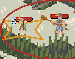
I think the main thing you're stuck on is how to make reaction attacks on the enemy and prevent them from healing.
To do this, you need to understand
- The red and orange areas are called threats. (you can hover the character to get white marks on the exact spaces their threat covers)
- Reaction attacks trigger on enemies in the character's threat, when they do something specific. The reaction attack's text says what it triggers from.
- Reaction attacks have to spend a reaction (orange lower-case r) from the character's health bar to trigger. [Brace!] also spends the reaction, so if you brace every turn, you won't deal damage.
- The enemy will heal quickly at the start of their turn, unless they start within your threat. So after you've dealt the first blow, you need to stick close to them.