Can't compile for mac without a mac.
OlivierGuillaume
Creator of
Recent community posts
The gameplay is original, fun and intuitive, although a bit repetitive. The puzzles seems random, with very simple ones near the end (I had one with only 2 basic ingredients). The progression curve could have been better with handmade puzzles IMO (and, maybe, by progressively adding mecanics).
Other than that, the game is very well polished. Great job!
Hello and thanks for your feedback.
Light based mecanics were supposed to be the unique feature of the game. However it proved not that fun and I was short on time to implement and polish what I planned: ennemies and towers that act differently depending on the light, upgradable lanterns etc. So only the basic lantern was included in the game.
The randomized upgrades are another thing that is not in most other tower defense games.
Hello, your games are very impressive. I would be glad to team up with you for this jam.
My discord profile: https://discord.com/users/542807530926243840
Hello
I have experience with game jams. My previous entries are on itch, you can look at my profile. I am looking to join a team.
I'm good at:
- Gameplay programming
- Stylized technical art (shaders, SFX...)
- Procedural generation
- Puzzle game design and level design
I can also do :
- Simple vector art
- Basic 3D models (no humanoids/animals)
Ideally I would like to use this jam to test the shaders I'm currently working on for a bigger project. It's stylized cartoon-ish 3D using a palette texture to control precisely the lighting. Here is a test scene I made with it:
I have been thinking for a while about a card based RPG, and I would like to use this jam to implement it but I'm not sure it fits the one page rule.
The core rules (what the players and DM would need to read beforehand) would fit in a single page. The game would also feature several decks of cards for the races, skills, items, wounds etc. To create new characters the players draw a few races and skill card then select the ones they want.
Does this idea fits the rules of the jam?
Hello,
I am a somewhat experimented Unity dev.
I don't want to spend a lot of time on this jam, though. So I don't want to be a "main" dev.
But I like experimenting with "technical art" like shaders, particle systems, procedural animations, procedural meshes etc.
So I am available to join any serious team as a technical artist (team with a least a dev and an artist).
Things I can do: cutom shaders, custom post processing effects, particle systems, animated textures, randomized texture, custom skyboxes, simple procedural animations...
Examples:
Scene with several custom shaders: outlines, fog, skybox, cellshading, terrain
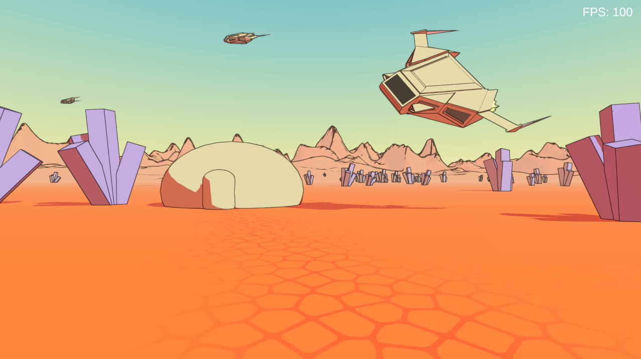
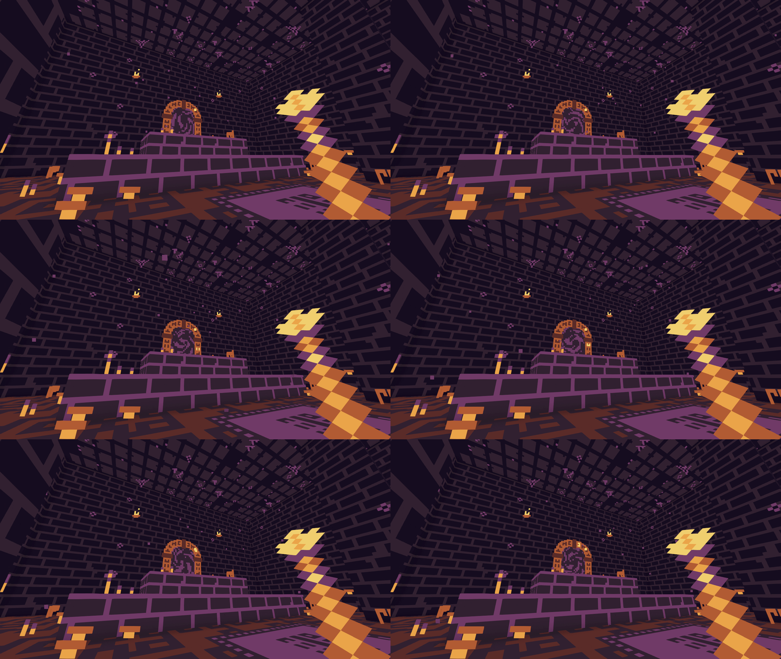
A scene made during my last jam with an animated texture, randomized wall/floor/ceiling texture, randomized cosmetic elements (spider webs, mushrooms, flowers, grasses...):
Very ambitious game, but overscoped as a one week jam entry. There is a lot of potential here but most of the systems seems to be halfway implemented and doesn't work. IMO it could have been a great entry if you focused more on the core gameplay loop and less on the extras.
The graphics, atmosphere and humour of the game are great. The stealing mecanic is already fun thanks to the humorous comments and the fact that you can steal everything. It would have been great with additional tension if the gard AI was working.
Also:
- Don't port your unity 3D games on webgl, performances are terrible and it's basically unplayable (unless you optimize it a lot).
- The guard material is missing (it's pink)
The mecanic is genius. I would require a better tutorialization, though, as I didn't undestand it at first, and had to read the game page. But it make interesting puzzle, is very original and fits the theme perfectly.
The art is great, one of the best looking among the games I rated. And the most complex by far. But it has readability issues, especialy the doors that are not visible enough. Also the chromatic aberation effect, while cool looking, hurts the readibility and is a bit headhache inducing after a while. Maybe tune it down.
This game has a very good polish in all its aspects (graphics, audio, ui...).
The projector and switches puzzles were balanced, not too easy, not too hard. The safe puzzle was a bit too obvious. It would not be a problem if I was not the last puzzle before the end. But it is and it felt a bit anticlimactic.
Also I found the key in the switches puzzle room before solving it. It should be locked.
The game lenght is perferct for a game jam.
The atmosphere of the game was a bit confusing. The theme and the music suggest an horror game but the house seems very ordinary. It could use one or two weird props to set the mood a bit better.
Bugs and glitches:
- I had a very weird bug on the projector puzzle. I was entering the right combination but only the first color was working (orange), but the second one (blue) failed. I spent something like 15 minutes on it but it wasn't working. I watched Ategon's video, he was doing the same thing as I was doing. I restarted the game, still doesn't work. I restarted again, and it worked! I did exactly the same thing than in the first 2 tries I have no idea why it wasn't working.
- I got stuck between the window and the safe, but I was able to jiggle myself out of there eventually
- The shadows are glitchy (jagged edges)
Thanks you for your feedback!
Is the "stutter" the small slow down just before the doors?
I didn't noticed it before and I have no idea what's causing it, I will investigate.
[EDIT] Fixed. It was the CharacterController colliding with the ceiling despite not touching it. I'll release this fix in the post jam update.
For a jam the old input system does the job well. Just use GetAxis for movement, it's easier to use and has better compatibility (works with gamepad and non qwerty keyboards).
The new input system is probably better for big projects with complex inputs and with support to a lot of different devices. It's easier to customize and can deal with more complex inputs than just pressing and releasing keys. But it's also a bit more complex to use so it's not necessarily better for a small game.
I beat the mind test. It was nice. The riddles difficulty is well balanced. I think the one about the father is wrong, though. The ansmer should be "me" unless I am wrong.
I wasn't able to pass through the first room of the strengh test even after many tries. The camera angle make it very hard to see what's happening and the jump controls felt a bit weird (a "coyote time" would helps).
The graphics are nice. Maybe adding a pixelated texture to the walls/floor would have made them fit better with the character.
The polish of this game is incredible. Sound design and animations are very well made and make the game feels great. The art is very cute. IMO the only polish-related thing that is not perfect is the music that doesn't really fits the exploration theme.
The gameplay is simple yet addictive. At some point it become a bit too click intensive for me, then I found the "x2 resources when exploring" bonus and I got basically infinite resources and explored everything.
The sokoban + portal mecanic works extremely well. It's intuitive and deep which is what make puzzle mecanics great. And I don't think I ever seen it before (and I played sokoban inspired games a lot).
The level design was very good too, although the difficulty curve was a bit rough and some medium difficulty levels were needed between the very easy ones and the relatively hard ones (it's not an issue for people who are used to sokoban inspired games, but in the general public a lot of players will abandon).
The art and audio are good too.
One if the best games I rated.
Beside the difficulty tweeking, IMO the only things that need to be improved are QoL:
* an undo last move button
* a reminder to tell wich door correspond to wich key because it's easy to confuse them.
* arrow keys support, gamepad support, non-qwerty keyboards support
* a skip dialog button
You should submit this game to coolmathgames after you fix the QoL and difficulty curve. It's the kind of game they like and you will earn some money (I sold a sokoban inspired game to them in the past).
I love the art style! (I made a game with billboard characters too).
The ambiance was great thanks to the music and the fog. The combat animation, trail and sound feels good, but the lack of feedback make it hard to understand what is happening. And the camera control felt weird and slow.
Some Unity related stuff:
- With the old input system, use the GetAxis method instead of GetKey for WASD, because GetAxis supports different keyboard layouts. Or use the new input system with default configuration.
- Use "Cursor.lockState = CursorLockMode.Locked" or "Cursor.lockState = CursorLockMode.Confined" to prevent the cursor to go outside the game view (second screen).
The idea is good and the cosy atmosphere is nice.
The controls felt needlessly overcomplicated. WASD movement is fine, mouse movement is fine, but mixing the two doesn't work well. Same think for the pollen collection, why clicking twice (flower then pollen) when it could be done without clicking at all?
Otherwise the game was enjoyable yet a bit repetitive.
It looks like you didn't had much time for this jam so it's hard to judge.
The art style is ok. IMO it just needs a better lighting (just changing the main and ambiant lights colors could be enough) and something to hide the unity's default skybox like a ceiling or a random skybox from the asset store.
The gameplay needs more work but it was a good idea. I rated other games with a similar premise and some of them were very good!
Also there is a problem in the web version. The screen is cropped. The healthbar is hidden and the doors are not entierely visible. The windows version does works, though.
I'm a regular of r/DestroyMyGame so if you want to be really honest you can.
https://itch.io/jam/brackeys-11/rate/2534995
(I already know about the procedural generation bugs)
1 and 3. This jam requires you to have 20+ rates. Itch.io algoritm also penalize games that have less rates than the median (but it probably doesn't matter because of the 20 rates cap of this jam).
2. This jam only allows game breaking bug fixes.
4. By default the "submissions" page is random, so just rating games doesn't help you getting more rates. There is a "sorting by karma" option that sort according to number or rates and feedbacks posted, but idk how many people are using it as it is a bit hidden. I think the best way to get rates is to write feedbacks and hope that the dev rates you back.
The idea is very original. I think the windows related mecanics have a lot of potentiel. But they felt a bit underexploited in this game. For example rooms with no doors on some of their sides so the windows need to be moved to access it, or an unkillable monster that travel from window to window and can only be killed by closing the window they are currently in.
The combat gameplay was simple but effective, and had a lot of weapon diversity and bonuses, which is really good for a jam. The only real problem is the fact that aiming is controled by the mouse and the game stops everytime I clicked outside the windows (which happened a lot).
Graphics and audio are both great, especially as you didn't used any premade assets.
I will rate your game.
Here is mine: https://olivierguillaume.itch.io/goblins-and-fireballs


