I don’t see why you wouldn’t !
Obigre Fichtredonc
Creator of
Recent community posts
The Linux build available here on itch doesn’t want to start on my laptop. When running it through Lutris to get the logs, here is what you get :
Started initial process 6503 from gamemoderun ./fuglthegame
Start monitoring process.
./fuglthegame: error while loading shared libraries: libGLEW.so.2.1: cannot open shared object file: No such file or directory
Monitored process exited.
Initial process has exited (return code: 32512)
All processes have quit
Exit with return code 32512
…which points out to a file that the executable should find, but doesn’t. Problem is, the file IS there so i don’t know what really is the problem. This seems to be a similar problem to other users on the Steam Deck (see here a Steam topic on that matter).
I will try to run it through the Proton accessibility tool, but i’d be much better for the native build to run :p
Salut, L’issue tracker renvoie sur itch, j’imagine qu’il vaut mieux poster bug et suggestions ici dans ce cas ?
- Très souvent le jeu se soft-lock quand je veux démarrer une nouvelle partie: il m’affiche un écran blanc sans boutons, parfois un écran noir, et je suis obligé de redémarrer l’appli complètement.
- Les différentes upgrades de combo ne se superposent pas, mais s’ente-annulent (la dernière choisie est toujours préférée). c’est peut-être voulu mais ce n’est pas ce à quoi on s’attend en tant que joueur.
- si j’ai bien compris, l’upgrade qui détruit les dernières briques n’est efficace qu’à partir du 2e niveau, le niveau ne donne aps de bonus. c’est normal ?
- je suis daltonien et je trouve le mode daltonien très décevant ! je suis sûr qu’on peut trouver un moyen d’inclure/adapter les mécaniques pour les rendre accessibles. combien de couleurs existe-t-il en tout dans le jeu ? si il n’y en a que 4 ou 5, ce serait très facile de les sélectionner de telle sorte à ce qu’elles soient toutes visible par tous les daltoniens (en se basant sur la luminosité des couleur, pas leur gamma). autre exemple: en associant chaque couleur à un motif ou forme différente (carreaux, rayures, points, bords carrés, crénelés, en vaguelettes…).
- quand le jeu se termine (toutes les vies perdues, dernier niveau fini) l’écran se fige sans plus d’informations. j’ai découvert assez tard qu’il fallait appuyer sur le score en haut à gauche pour voir ce qu’il s’était passé et relancer une partie. pensez à mieux communiquer ce qui se passe dans le jeu !
- ce serait pas mal d’inclure un petit manuel de jeu dans le jeu lui-même, pour ne pas êtr trop perdu
- permettre la traduction du jeu via une plateforme de crowdsourcing comme weblate pour augmenter sa visibilité :)
Thanks a whole lot for answering.
-
Hmm, would you consider using a custom-made tool like is being used for SnappyMail and Tarock Palcka ? That would greatly help: you wouldn’t miss any string, will always have the original on the same screen as your own, and produces readly available translation files.
-
As i said: the easiest way to support any type of colourblindness would be to have every colour have a different light value compared to the others. An easy way to check the contrast between all your colours (and put yourself into the shoes of a VERY colourblind person) is to turn screenshots of your game into levels of grey (or as is commonly said, black & white). Then, tweak the colours of your game so that each and every one of them look different when looked in black and white.
-
Good to know 👍 definitely not top-priority thing !
Anyway i’m looking forward to further updates ! Thank you for your time :)
Hello !
I downloaded Translines from Flathub and had a blast with it ! Congratulations on making this game. This message here is because i have questions and suggestions related to it, but couldn’t send a message to your adress @centrum.cz… my own adress @free.fr was refused. Strange ! Anyway, my suggestions and questions :
- How do you translate the game ? there already is a french translation that i use but it’s only partial.
- What are the controls exactly ? i was trying to find a way to zoom in and out of the game, also trying to remove stations of a specific colour, and i sometimes had a very hard time. Maybe you should add a controls page that show how to control the game.
- I am colourblind and was not always able to differentiate between the red and green lines. If the green line was lighter than red but stll darker than yellow, that would help a whole lot !
- Have you ever considered porting the game to Android ? it would translate really well i think and you’d have tons of potential new players.
Thanks a lot for this game. Greetings from France, have a nice day !
No, not impolite at all, don't worry.
I wouldn't say i only played 30 minutes, i think i played for an hour or so. Or maybe it just *felt* longer, idk. But i didn't get neither the jump or run power-ups as you thought, yeah. See, i might be the one being impolite for not having played so much of your game !
I can understand building your game so that evey upgrade feels deserved and empowering, but i still think the movement without these two upgrades i'm supposed to get later is too hard to master, too tight. At least for me. What made me let quit the game on my first playthrough was when i was getting the pieces of Heart after having climbed down from the vines in the sky, not so long after getting that ability. The level-design made it look like i had to get all the heart pieces, which led me into what seemed like 20 more minutes of play without those jump and run power-ups i was expecting impatiently. I didn't want to get through another 20 minutes of slow progression through small gauntlets.
Don't get me wrong, having no jump in a platformer is very interesteing and i can see you tried (successfully) to provide interesting situations without the ability to jump. But that jump is such a basic ability nowadays, i felt so incapacitated comapred to other games, and the narrative didn't provide any hint as to when or even *if* i would even get that ability... all of that tried my luck a bit too far that evening. And i can see a good portion of others get impatient too.
Maybe if i had some other active ability to compensate for that... the climbing ability was a good idea ! but not really creative, as you can only climb on pre-set vines...
ok ok i'm getting too far.
I'll stop writing my thoughts now because clearly i haven't gone too far into the game for now. I did want to give it another go, play through another session to see where i could get too and if i could find more enjoyment in the following levels. So I'll get back to you when i have more time with your game ;)
Heyo, i just tried this game on the computer i told you. It works very well ! It slows down in bigger areas but that's entirely my computer's fault.
This is a work of love and it shows. Everything is very intentional and from the very second you start the game, you know what you're getting into. I've got a Windows XP 2000 indie game vibe. Both in a good, and in a bad way.
The games created back then were from passionate developers doing their thing in their own corner and sharing their work with the world when they wanted to. That's waht you're doing too. I can see myself spending some time in this world you crafted, vibing to the fantastic music -it is fantastic!- and letting my eyes wander onto your lovingly crafted sprites. Keep doing your thing, you're doing it wonderfully! All in all, my short experience so far was that of an "hommage" to an area of older platformers which were more demanding of the player's time and skills.
One thing i didn't think would be of so much importance to me is the difficulty: your game is challenging, in many places even frustrating. The controls, ennemy and platform placement don't allow for much maneuvering and if you don't jump on that bird at its very peak altitude, you won't get further and fall to your death, instantly punished. This wouldn't be such a problem if, say, the screen was a little more zoomed in and i could see the pixels i am supposed to be bouncing off of, or if i could recover easily in the earlier levels. I don't mind a little challenge, but i felt most of the platforming was tedious precision jumping that made me squint at the screen, rather than enjoy the challenges i was put through. The jump/bounce/falling curve is really odd to me as i was expecting it to carry the momentum from going left to right but it seems to stop and slowly accelerate when you press the direction key, which makes most of the jumps unnatural, to me at least.
The way Bobo is controlled in your game -unfortunately, for me- is very "dated". The characters isn't very reactive, moves slowly, and jumps awkwardly. Combined with unforgiving platforming, it makes for tedious challenges that require discipline and precision, and that is not easy to enjoy for its own sake. In a way, this forces you to be fully focused onto the game, because you don't instantly get how to master Bobo right away.
Now, i think i'm trying to be critical of the mechanics of your game, but this is not what really matters here i feel, is it? I like your game, and i like that you're making it. I can enjoy the world you built and appreciate the time you put into it. In the end, i just don't think this is a game for me.
Official statement from co-host Avis ;)

Join us on the Discord ! we're very much unproductive gamejam-wise but we all know we'll be working on this on the last month of 2029 sooooooo. https://discord.gg/PM5kRC3
Hihello,
I came to discuss a particular issue regarding the side menu UI on game pages, but i realize there's a lot more to talk about.
I've been part of the Decade Jam community since it's begining (almost 3 years now) and many of our submissions happen to be part of multiple other jams on top of ours, which tends to greatly lengthen the size of that side menu.
Here is my feedback on the matter, and suggestions to improve it.
- It needlessly clutters the page.
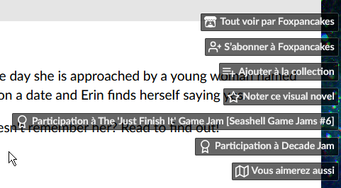

This menu can't be hidden or relocated unless you have full access to the CSS page editor (which so little of us have since it's on demand...). So any lambda creator is going to have to deal with a permanent hovering menu above their game, whether they want their game to be evaluated or not, whether they want to show off the jams they participated in or not. Depending on the game's page presentation, it can even hide some text behind the buttons.
- It draws your attention away from the pages content.
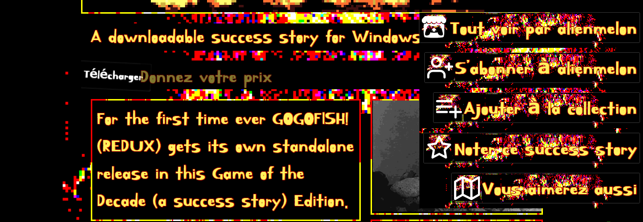
The example here is quite extreme because it's taken from among alienmelon's games (which pages are notably, let's say, colourful) but it speaks to see in how many of their game pages this menu is either hidden, manually tucked to the side as to not bother us, or paradoxically thrown in face (like the above screenshot shows).
Some creators try really hard to create a beautiful landing page for their game, coherent with their game's universe and presentation. This uneditable and intrusive menu prevents from providing a coherent and easy to navigate game page. - In some cases, it actively deteriorate the gaming experience.
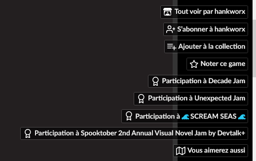
In the above example, the game is playable directly in the browser, and the side menu text is layered above the game window... missclicks are plenty, and sometimes lead the player to lose their progress by being redirected to another page. This shouldn't happen.
Are there any solutions ?
YES.
- By default, either prevent a game page's text to ever reach behind the buttons, or prevent the buttons size to ever reach the game page content. At least it won't superimpose over other content on the page. Take notes from bandcamp's side menu for example:
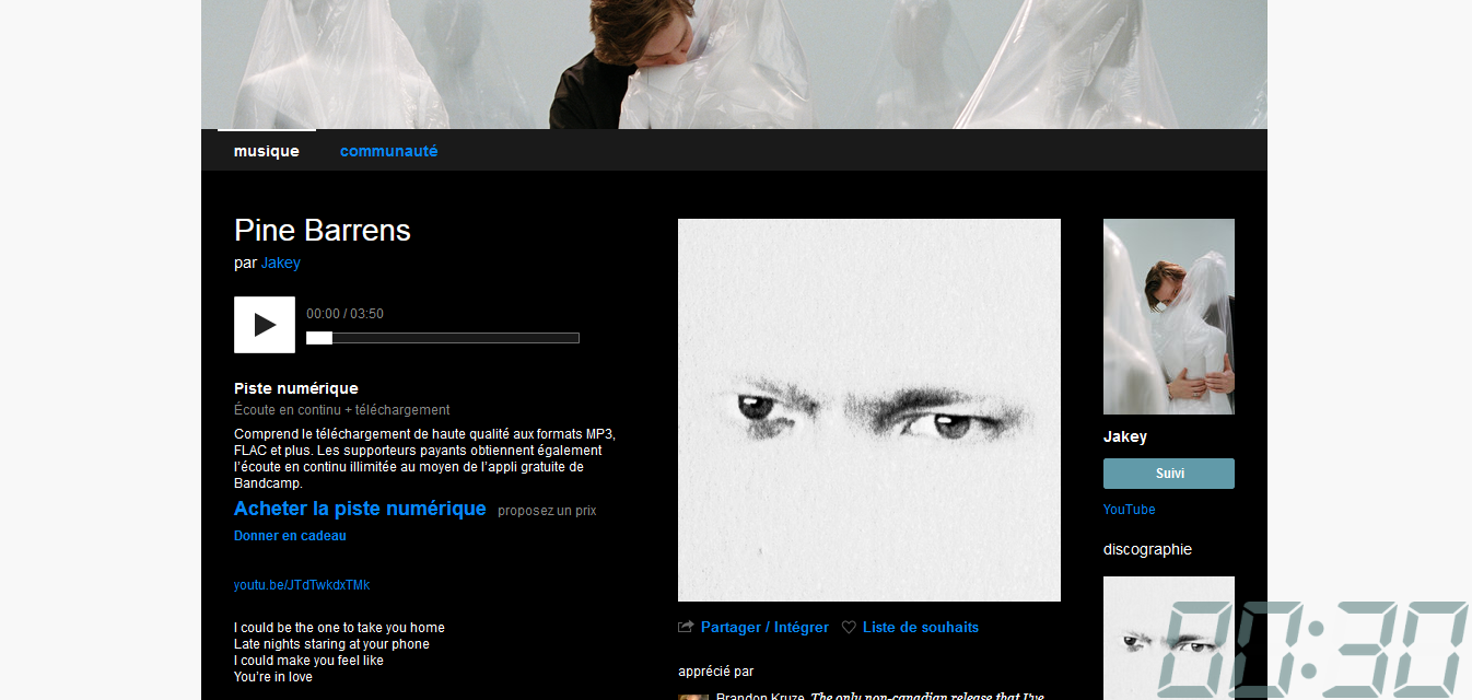
It's got a button for subscribing to the artist, a quick access to the last items in their discography.... But it's neatly tucked into its own box that never ever gets over the rest of the content. - Allow creators to entirely hide this menu, or some of its buttons.
- Relocate the options in the side menu as fixed buttons, somewhere in the body of the page: at the end of the game's description, before or after the download button, after the title, or in the top bar even... there are lots of places in which these button would be more welcomed.
- If you were to keep the side menu scrolling with the page, please provide less intrusive buttons by reducing the amont of text, making them easily customizable, and grouping all jam submission buttons into one that list all jam entered in a pop-up menu like it does for when reviewing the game or adding to a collection.
Here's a mock-up: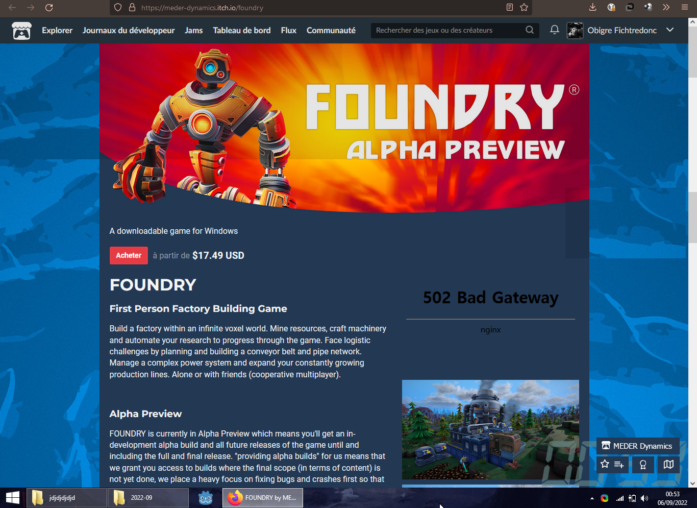
Again but this time with 60% transparency: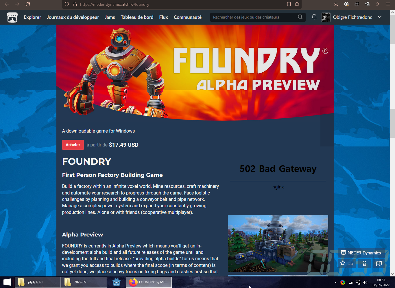
Here, see ? in the bottom right corner ? Yeah, it doesn't jump right to the reader's eyes, but that's exactly the point. Don't worry, once they start scrolling they'll see this collection of boxes doesn't move, and their attention will naturally be drawn to it. This page i took as an example is for a popular game, but its looks are that of many other pages on itch.io, and this change in the UI would give a much better vibe by default to a great many game pages i think.
These were my thoughts on this side-menu buttons. I hope this insight was helpful and that you'll consider the options i gave you.
J'ai enfin pris le temps de faire cette démo. Le jeu est simple à la compréhension, clair comme il faut, mais je crois que la démo ne permet pas de se faire un avis sur les mécaniques du jeu. Comme il semble que tu t'inspires des livres-dont-vous-êtes-le-héros, l'équilibrage fera beaucoup dans l'appréciation de l'histoire et de la progression. D'ailleurs, j'ai gardé mes bottes et j'ai tué un mort-vivant, j'espère ça me donne droit à un bonus dans la version complète :p
La présentation en tous les cas est irréprochable pour un prototype!
Très bon document, clair et concis ! Des conseils de base pour tous ceux qui ne savent pas comment s'y prendre, c'est très bien.
Perso j'ai rien appris de neuf, je crois que je connais assez bien les bases :p j'aimerais pouvoir trouver (ou proposer si ça existe pas) quelque chose de plus exhaustif un jour qui puisse proposer des tournures de phrases-type neutres pour remplacer les tournures classiques genrées. Pour économiser du temps à l'écriture !
Works wonders in my browser! but the .exe doesn't work on my computer: it is made for 64bit architectures, and mine is only 32bit.
I didn't understand that the left card always makes you go left, and the right card only makes you go right. Maybe you should clarify that.
The action is a lot more readable compared to the last version thanks to the icons above the characters and the lowered speed at which they attack. But because the icons for your last action only appear the next turn, i would think at first that the icons were representing the action that i'd be performing this next turn ! Maybe only show the icons WHEN the characters move and WHEN the action is performed, but make them disapear after that. Like for example, make the shield glow around the character when it moves and make it disapear after that.
Also, if you put yourself against the wall and continue choosing the card that goes towards that wall, the AI can have somehow has a hard time attacking you sometimes, and will stay in place, neither going backwards or onwards.
I didn't understand why sometimes i'd go through the enemy without hitting them. I had either a wild boar attack or a simple attack on, and they didn't have a shield on, so why didn't they get hurt ?
Heyo,
Mitch seems to forget which page i was browsing if i decide to switch to the desktop or another app. Especially sad when i'm browsing the 37th page of an obscure jam which i dont remember the name of.
Even more strange is that today i reopened Mitch to browse some more, i changed focus to another app, and vhen i came back tw Mitch it didn't remember the page i was just browsing, but instead brought me back to a page i was browsing *yesterday*. How is that possible 😵
Thanks for the work you've already done on Mitch ! and thanks for your time


