
Hihello,
I came to discuss a particular issue regarding the side menu UI on game pages, but i realize there's a lot more to talk about.
I've been part of the Decade Jam community since it's begining (almost 3 years now) and many of our submissions happen to be part of multiple other jams on top of ours, which tends to greatly lengthen the size of that side menu.
Here is my feedback on the matter, and suggestions to improve it.
- It needlessly clutters the page.
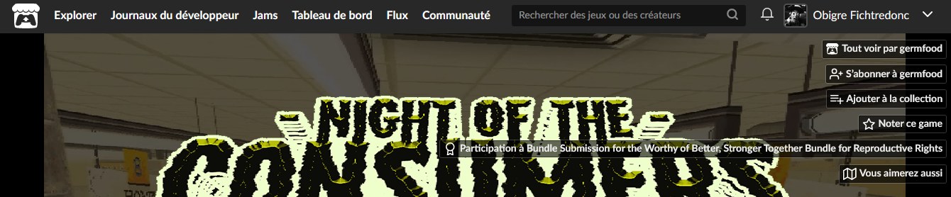
This menu can't be hidden or relocated unless you have full access to the CSS page editor (which so little of us have since it's on demand...). So any lambda creator is going to have to deal with a permanent hovering menu above their game, whether they want their game to be evaluated or not, whether they want to show off the jams they participated in or not. Depending on the game's page presentation, it can even hide some text behind the buttons.
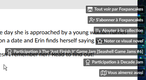
- It draws your attention away from the pages content.
The example here is quite extreme because it's taken from among alienmelon's games (which pages are notably, let's say, colourful) but it speaks to see in how many of their game pages this menu is either hidden, manually tucked to the side as to not bother us, or paradoxically thrown in face (like the above screenshot shows).
Some creators try really hard to create a beautiful landing page for their game, coherent with their game's universe and presentation. This uneditable and intrusive menu prevents from providing a coherent and easy to navigate game page. - In some cases, it actively deteriorate the gaming experience.
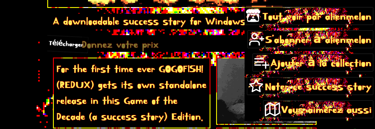
In the above example, the game is playable directly in the browser, and the side menu text is layered above the game window... missclicks are plenty, and sometimes lead the player to lose their progress by being redirected to another page. This shouldn't happen.
Are there any solutions ?
YES.
- By default, either prevent a game page's text to ever reach behind the buttons, or prevent the buttons size to ever reach the game page content. At least it won't superimpose over other content on the page. Take notes from bandcamp's side menu for example:
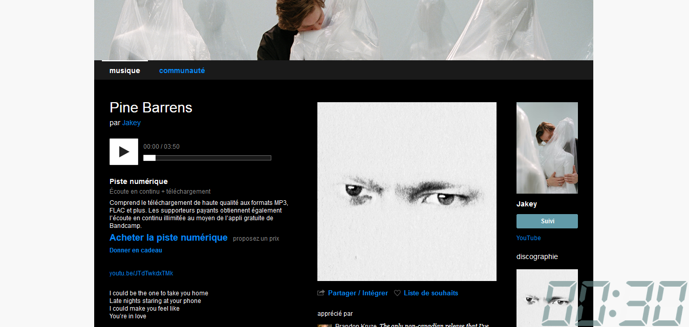
It's got a button for subscribing to the artist, a quick access to the last items in their discography.... But it's neatly tucked into its own box that never ever gets over the rest of the content. - Allow creators to entirely hide this menu, or some of its buttons.
- Relocate the options in the side menu as fixed buttons, somewhere in the body of the page: at the end of the game's description, before or after the download button, after the title, or in the top bar even... there are lots of places in which these button would be more welcomed.
- If you were to keep the side menu scrolling with the page, please provide less intrusive buttons by reducing the amont of text, making them easily customizable, and grouping all jam submission buttons into one that list all jam entered in a pop-up menu like it does for when reviewing the game or adding to a collection.
Here's a mock-up: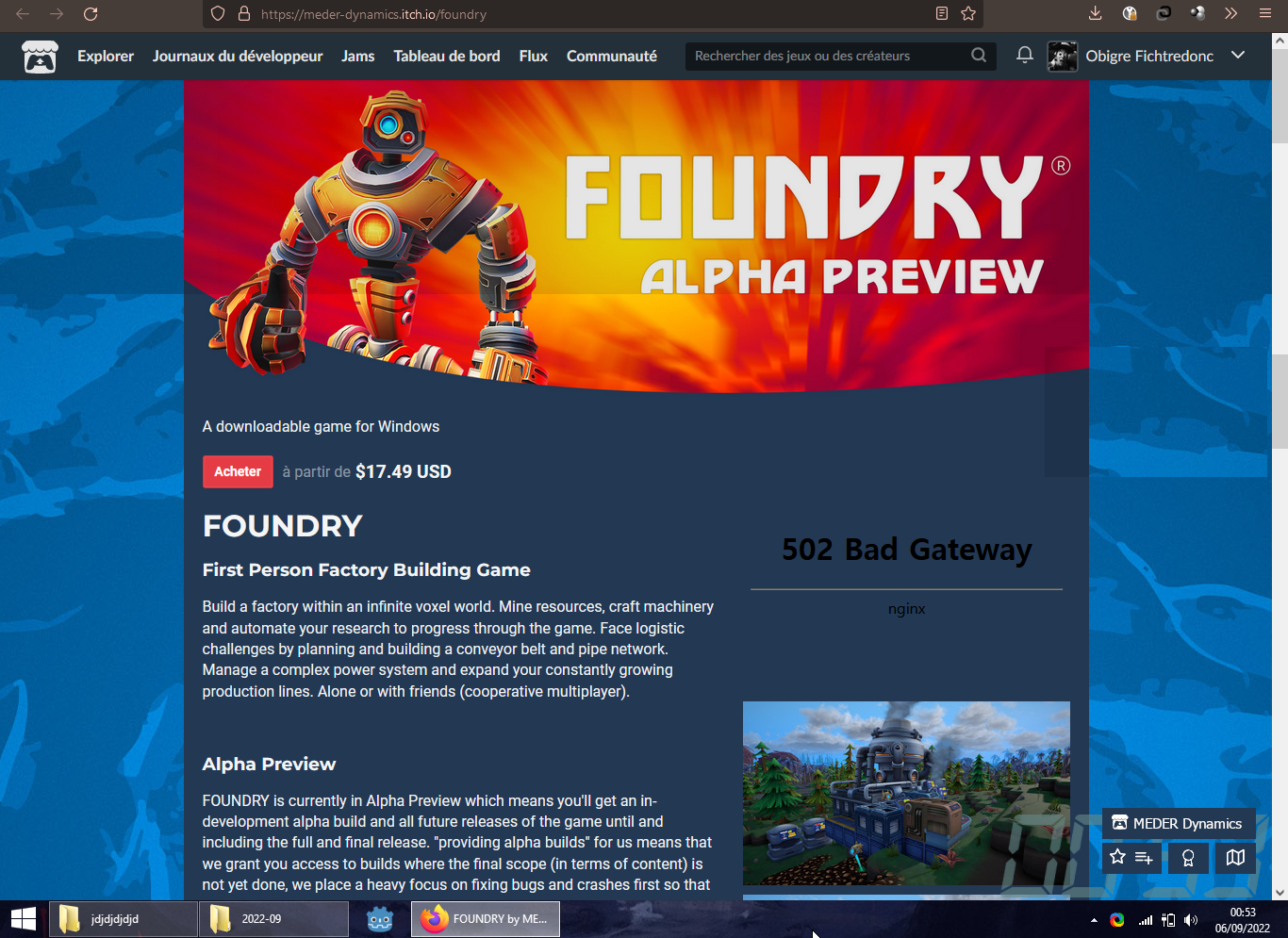
Again but this time with 60% transparency:
Here, see ? in the bottom right corner ? Yeah, it doesn't jump right to the reader's eyes, but that's exactly the point. Don't worry, once they start scrolling they'll see this collection of boxes doesn't move, and their attention will naturally be drawn to it. This page i took as an example is for a popular game, but its looks are that of many other pages on itch.io, and this change in the UI would give a much better vibe by default to a great many game pages i think.
These were my thoughts on this side-menu buttons. I hope this insight was helpful and that you'll consider the options i gave you.