
That I can't tell ya.
A member registered Nov 02, 2024 · View creator page →
Creator of

Play in browser
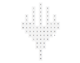
Mediocre Magic: the Gathering themed word searches to do on the clock
Play in browser

A 100-word TTRPG about fighting sticks
A 100-word card game about proximal classifications
A 100-word dueling improv game about on-the-fly "poetry"
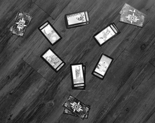
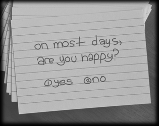
A 100-word deduction game about swapping seats at the royal table

A 100-word board game about descriptive elements
A short rhythm game of unfolding tension
Rhythm
Play in browser

A 100-word game of mindless navigation


A 100-word card game about ordering objects

Five 100-word games for Yankee Notion cards
i been down too long…
Puzzle
A 100-word party game about halfways communication
A 100-word board game about thievery

(PDF VERSION) A collection of my first 50 games, all at your fingertips.

A 100-word improv game about... well, there's a lot of nuance to it, no?
A 100-word tabletop game about making the devil have a terrible commute
A 100-word card game about sums, rows, and river flow
A 100-word tabletop game about creating a city
A 100-word party game about spies in cars
A 100-word party game about bad diagnoses
A 100-word tabletop game about designing a language
A 100-word card game about fast matches
A 100-word improv game about fixing inconsistencies


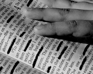
A 100-word hand game about strategy, or something
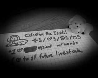
A 100-word tabletop game about creating creatures

A 100-word game about heart rates

A 100-word game about disease and sensation
A 100-word game about building your evil base
A 100-word party game about making analogies

A 100-word game about binary categories
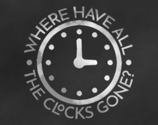
A 100-word game about creatively telling the time
A 100-word game about back-and-forth conversation

A 100-word card game about the best and the worst
A 100-word game in preparation of goodbye

A 100-word solo game about controlling your body
A 100-word tabletop game about squaritory


A 100-word improv game about everything happening at once
A 100-word improv game about changing language

A 100-word game about rearranging words
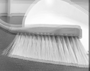
A 100-word fast-paced game about sweeping in your favor

A 100-word improv game about subtle social clues
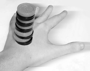
A 100-word tournament game about balancing objects

A 100-word tournament game about kicking ass by chewing bubblegum

A 100-word pseudo-RPG about (before) the final battle
A 100-word card game about competitive divination

A 100-word series of road trip spotting games
A 100-word improv game about casting spells on other players

A 100-word party game about being a page
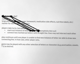
A 100-word game about connecting letters

A 100-word improv game about finding your manners
A 100-word longform game about routines
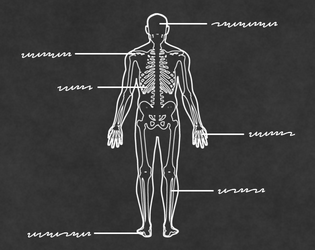
A 100-word game about your personal anatomy
A 100-word party game about surveying
A 100-word TCG-esque game about battling trinkets
A 100-word party game about finding a match
A 100-word party game about "not" losing at trivia
A 100-word tabletop game about pseudointrospection
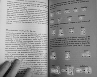
A 100-word tabletop game about creating symbols

A 100-word party game about tall tales
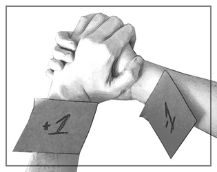
A 100-word hand game about intimacy

A 100-word hand game about reactions and fists
A 100-word party metagame about being sneaky
A 100-word tabletop game about categorization
A 100-word cooperative card game about scavenging and survival

A 100-word card game for a (mutilated) standard deck
Recent community posts
I've kept playing through the game, it's remarkably fun. I'm also surprised how many fish variants you got in here--circular arenas, bouncing bullets, HUGE bullets. Swarm encounters helped the pacing of the game, and kept things interesting after seeing all an area had to offer. I'm terrible at aiming, so the early game was rough, but Fang and Green Bag help alleviate my troubles. I was going to say I was tired of rods until I got to the Dish. That's a good Dish.
Couple minor notes: the "magenta" tag on the Glass Horseshoe and Shotgun Shells doesn't work, the rods in Rod Fields have layering issues with the shadows, Coffee Beans just say 'Speed' (I laughed even if it wasn't a joke)
I don't know if that easter egg was worth the effort, but it did get a smile out of me.
I eventually did have to take off some upgrades because I started to break things. The bullets got so big, we went into seconds-per-frame territory.