Every part of this game feels very smooth, from the transition of the jets as well as models exploding. And the level design felt fresh for each point. One thing I would say to add in after is some more detailed player and AI models but I assume that they were kept fairly simple to fit the art style.
Matt Hargitay (UP2028285)
Creator of
Recent community posts
One of the things that stood out for me was how nice the menu looked and acted. With highlights and sound when you clicked. I also really enjoyed the style of the levels and each one felt unique. One thing I was not a fan of though is the camera zooming when you jump, but apart from that its a great game.
I really like the concept you implemented of having a mix of 2D. However I would probably still make any of the 3D object more cartoony just so they don't stand out from the 2D art. However I liked the amount of animation that you added for both the player and the goblins. And having the dragon fire blast as a way of attacking was fun. Another thing I would try and fix though is some of the images have are low res and it might be a case that you have to mess around with unity to get it clearer.
The graphics for this game are very aesthetically pleasing. I also like some of the animations that you added for the character. And of course the sound effects. However there is a little bit of a delay between the sound effects and I feel that the background wall shouldn't need to move with the player.
I really like some of the animations you added such as the extended metal arm when you punch. The Controllers feel fairly smooth and easy to use. Also the boss entrance was really cool. A few things I would say to to improve is some of the jumping mechanics as you can run into walls and hover as well as when you jump you fall straight down.
Some cool looking graphics made it feel like an arcade game. And the music fit the theme aswell. Only thing I would say it to add multiple items such as the points per click so that the first item only doubles the clicks and so on. Besides that though I spent a fair amount of time trying to get my material count to 1mill so good job on getting me hooked!
The game feels fairly smooth to play. I really like the fact that there were multiple objects as colliders. The Playstyle is definitely a unique spin on the one button rule. A few things to add though is the fact that the main player is a bit default and it would be cool if there was a player model. Also in some areas of the trees I was able to clip through somehow. But IGN 5/5
Having the player follow the mouse was an awesome idea and the delay between the two was really well executed. Additionally the music and sound effects made it a lot more immersive I felt like I was back playing arcade games. The only things I would add would be to make it so that when the player catches up with the cursor it doesn't bug out. Next I would change the alien spawn so that the aliens image can be fully seen by the player as it has a tendency to hang off a little bit. But apart from this its a really fun game and I could see myself playing for hours.
Overall a well made game. The menu screen is a nice addition as well as hitting any of the grass resets your game. And having the car move up and down was cool. I would say though that some of the green needs to be cleaned up a bit as there are small green lines along the screen. If you want a slightly cleaner look I would consider trying to use tile mapping for your levels instead. It makes it easier to edit and you can easily move things out of the way if it becomes a problem.
Simple but enjoyable. Having the frog not move and the objects move to you was a nice little idea. I think most people would agree that the sound effects and music were on point. As well as this the art style blended together really well. One thing I would add though is if the player hits one of the balls it resets the scene and additionally maybe a score in the corner.
You nailed to gravity mechanics for the pig. Additionally I like the animation of the moving clouds in the background. And being reset when hitting the ground is a nice feature aswell. The only issues with the game are that If I hit the side of an obstacle I stick to the side of it. You might have to mess around with surfaces in unity to see if that fixes the problem. Also when this happens the score keeps increasing when I'm not moving.
I liked the animation for the character while moving aswell as the ending cutscene which seemed pretty unique and I haven't seen a project do this yet. The background and colliders was also a nice edition with the water being animated and the background images changing overtime. As an addition though I would maybe make it so the ground is a little bit less blocky and fits with the aesthetic of the game. A very well made game overall though.
This game is really fun but frustrated the heck out of me. Overall was very well made. The music fit the comical nature of the game and resetting after hitting the grass was a nice feature. The only other thing I would add is a few more levels but as we only had 5 days having just the single level is fine.
I'm taking this game over 8 ball pool :). A very clean and fun game. The moving platforms definitely add some complexity to the game and having the golf hole slightly sloped makes gameplay smoother when coming to the end of each round. One thing I would add though is some sort of power meter for when you are holding down the button just to gauge far the ball will go. Overall though a great game!
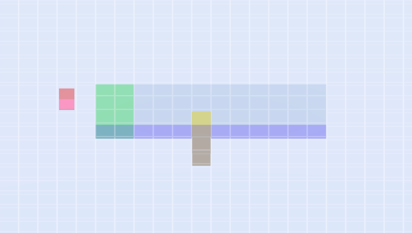 A pretty amazing game for the time we had to complete this. The idea of flipping between planes was very innovative and being able to make several functions out of a single button was a neat idea. And having audio queues for holding down the mouse definitely made it easy to use. The only thing I would say to change is to make it so that once the first block finishes that it isn't able to go over the larger cube. Ill attach the image of what I mean. Overall though 10/10


