Very cool game! Self-contained and challenging.
The first half of my gameplay went to understand the puzzle pieces, then the second to actually find a valid solution. First intuition was to look for something with bm9vbg== , but I couldn't think of anything that wouldn't mess up in other ways. Finally, beat it with: ZG9taW5v
lrdazrl
Creator of
Recent community posts
The life system sounds like to be really interesting. I didn't understand how it worked but feels like quite a cool idea now that you explain it.
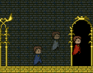
About special power: is it possible to proceed in the game without killing the enemies? I thought that in order to proceed I was supposed to kill (/turn to friends) all the enemies coming from the red door. Was the solution something different? I agree that having the power be limited in use fits well in a horror game as long as the player can also proceed without it. In that situation (without knowing what I should be doing) I thought I had to fight the enemies and the power-up seemed like the only way to do it.
Thanks, for the hint! I greatly enjoyed the part that came after it. More comments:
- In my opinion realizing that you can jump through the water should already be rewarded. Requiring the player to also press down doesn't seem to add anything to that puzzle but might make players (for example me) quit thinking that jumping into the lake was not the solution. And they would then miss the funniest moments of the game!
- I really liked how the ending just kept continuing. It was on the spot for the feeling of this game. The only difficulty might be knowing when to end the game as I'm not even sure what kind of ending would be satisfying. I would always just want to find a way to escape to a new secret screen
- I quit at the "last challenge" after the first checkpoint where there were 5 spikes in a group and you somehow had to get through them. This was frustratingly difficult. I would have wanted to continue but I'm unable. A precision challenge like this doesn't really feel like part of the main experience of your game. At least for me, it didn't feel very fitting. (Unless there is some clever secret how to pass that puzzle with some OOB tricks but I cannot think of any)
- The moment of the character should stop when they die. It feels disorienting that they teleport to the checkpoint and automatically continue moving forward after death. Especially if there is spikes next to the checkpoint I might die&restart multiple times consecutively before I have time to stop pressing the move buttonare
I tried it again and this time the movement felt better. I don't remember how the lights were before but at least I managed to find my way back to the big room quite fast this time so the new version might have helped. This time I almost got to the yellow goal door but then the twist happened. It was a cool and scary moment, well done! However, after that, I had no idea where to continue and was killed.
A couple of new comments:
- There is something off how the movement works. It felt weird. I think it's because it does not work the same as normally when using WASD + mouse to move. Here both the mouse and A+D controlled the turning. I would have expected maybe A+D moving sidewise but not starting to walk in a circle.
- I managed to somehow get inside the wall and wandered there a while before I found a way out. It didn't seem like being part of the game?
- Being able to use the power very rarely, I feel like there is nothing I can do most of the time. This might be a design intention as the game is a horror game. However, from player perspective, I'm starting to feel like I'm just standing aside waiting for my powers to charge most of the time
- Another point that I noticed playing the game again. The second time the scariness is clearly less there as I know what to expect. This means that dying and restarting the game actually feels like making less scary. I have know idea how this could be fixed without removing the threat, just pointing it out as a player experience.
- Lastly, it's not clear to me when the enemies manage to hit me and when they miss. Do I have health? Can I take couple of hits before dying? Or are the enemies just bad at aiming
Hi! Played your game through and here are some notes based on my experience:
- Music was a great choice! Sounds good and feels like fitting the game well.
- Game concept was simple and understandable. Not necessarily unique as I've seen similar ideas before, but a solid implementation of the concept nevertheless.
- The game was fun to play and mostly had good level of difficulty but at point there was a part that was extremely difficult which I didn't quite enjoy (The problem was that I always ended up jumping on the orange things at the roof)
- Graphics were mostly clear in their meaning, even thought the style was different for some elements. Overall I feel they were reasonable for a game jam scope. Only things that were unclear in art were 1) in one level there was some red teleporter that spawned me to another room. However it looked exactly like a normal red platform. 2) tho contrast between a red/blue platform being on or off could have been a lot clearer as now I wasn't always sure which were on and which off
- I didn't understand how the game connects to the theme. Would you like to elaborate that?
Overall, the game was enjoyable experience even if not fully polished. The scope worked well in a jam game. If there is something spesific you would like to ask of a player, feel free to ask and I'll try to provide you my opinions. I would also like to welcome you to try my jam as well at some point if you feel like and would appreciate any feedback you might have about it.
Hi! I just played your game and it was very interesting! It's probably my favorite game of this jam I've played so far. Here are some further comments:
- The main premise was creative and a good interpretation of the theme in my opinion. The idea was simple but it worked really well and created some cool puzzles.
- I think the graphic style might hinder you from getting a lot of plays as it is not what a stereotypically high-quality game looks like. However, to me, this minimalist style worked really well and maybe even helped by making everything visually super clear. As a special mention, however, those glitchy 101010-floor were a nice touch
- The puzzles were overall interesting. I especially liked the first one, which really captured this mechanic quite well as the player needed to go out of the screen both vertically and horizontally to pass the obstacle. I agree with others though about that the log should be fully solid as all the other trees are fully solid as well
- The second puzzle in which the player needs to pass the vertical red line was not very clear to me and I had to look at the comments to figure it out after trying for a long without any progress. The problem in that puzzle in my opinion is that the player either remembers the previous interaction and immediately can do it or they don't and they will never be able to solve it because it cannot be solved by thinking only. There is no progress to be made or no amount of thinking that would allow the player to get through. And they cannot even backtrack to see the example case again. The worst thing was to me that I remembered the interaction and tried to tap my way through the bar but I used the right button instead of the down as that was the way the character was supposed to be going.
- From the area, after that, I tried to jump everywhere to find a secret location but there was no secret to be found (at least to me) even after jumping everywhere I could think of, which was a bit sad
- The puzzle in which the player jumps off from the cliff and must get through the red line in the lake was quite straightforward to realize but really painful to execute because of the spike.
- The win screen puzzle was a really fun twist. Although even getting out of there I didn't find the secret it was promising me.
- It would have been cool if as a secret I could have jumped through the start point lake to fall through the bottom of the screen to a secret area but that didn't seem to be possible either
- The checkpoint system worked well. There was enough of them and the simple sound effect combined with the flag "litting" up was already very rewarding.
Overall, I enjoyed playing the game and would have happily played a little longer if there were more content. However, already like this, it was very appropriately scoped for a game jam game. If there is something specific you would like to get feedback from, feel free to ask and I can give my opinion from the player's perspective. I would also be happy to hear your thoughts on my team's jam game if you happen to have a chance to test it at any point.
I tried your game and it was a really cool experience that fit the theme really well in my opinion. Here is some further comments of the game I collected while playing:
- Excellent pitch for the concept on the itch.io page. It really got me interested.
- Instructions on how to play were also very clear and implemented nicely inside the game itself
- The game view in the Ithc.io page looks kind of weird when the game only fills part of the whole area
- Very clear concept and solid execution! I feel this is like game jam game should be like. Strongly executing simple but novel ideas.
- The only downside is that I felt the game soon became repetitive, with the same words repeating and only this one activity without a change.
- A very direct but extremely creative way to interpret the theme.
- The gameplay worked well without any issues.
- I especially enjoyed that Play and Play again were also words that you had to cut to interact with them
- One thing that I didn't question at the start but I started wondering afterward is, why the player needs to click through all the letters of the word when the answer can only be to remove the first letter, remove the last letter or don't remove. Isn't having the option to cut the word from the middle a bit weird considering that it should never be correct?
- As a non-native English speaker, the game had an extra layer of difficulty
If you have something specific you would like to ask from a player, feel free to ask me and I'll be happy to share my opinion on it. Additionally, if you have an interest and a chance to try our jam game, I would also be extremely happy if you would leave some notes about what you liked or disliked about it.
Oh, interesting! I didn't realize you could use drones as a platform. What would happen in a situation if the player killed all the drones though? Would it still be possible to get onto the platform?
I was wondering whether the doors being slow was a design choice. It makes sense like that as well. It discourages running away and instead encourages fighting against the enemies.
About the theme, I understood the part that you are infiltrating this enemy building so you should not be there. But if there was some other layers to it I might have missed those. What I meant by the mechanics not supporting the theme was that playing the game I didn't feel like I was not supposed to be there. Instead, I felt that as a player I SHOULD actually keep moving forward and continue further.
Hi! Just played your game though and thought to leave some comments on my experience in case you enjoy hearing experiences from your players:
- It was hard to read the red text on black background in the itch.io page
- Dramatic intro! It drawed me into the horror atmosphere immediately
- The horror was there: the dark corridors and weird noises in the background really helped build a scary atmosphere. When the first monster started running towards me, I was scared. Also, having the cooldown for the ability being long, meant that most of the time, the character was potentially vulnerable to attacks.
- Mouse sensitivity was quite high, so it was difficult to move the camera precisely
- The character felt like moving really slowly. I would have enjoyed a bit faster pace.
- I was quickly lost and didn't know where to go to proceed in the game. Especially, with the character being so slow to move, it started to get frustrating to just wander around without finding anything
- At first, the room with multiple enemies wandering around felt epically threatening. However, after the enemies watched me for the first time, they started to become less scared. They didn't seem to actually do anything even if they caught me
- I died running into a pit of some sort and had to restart. It took so long for me to get to that point in the game that I didn't feel like doing it all again and therefore quit playing. Maybe you would benefit from a checkpoint system?
- The graphics and the atmosphere were nice!
- I liked how you had put an explanation of the rules inside the game at the beginning!
Overall, your game had clearly the potential to create some scary situations and I can see how the Teddy bear doesn't really belong in this scenery.
If you have anything specific in mind that you would like to get feedback for, I'm happy to share my opinion on it, if you just ask. I would also be interested in hearing your thoughts on my jam project if you at any point happen to test that one.
Hi! Just played your game though and thought to leave some comments on my experience in case you enjoy hearing your players experiences:
- Nice subversion of expectations at the very beginning! I was so ready to start playing a race game, and then suddenly... POOF.... the race track disappears and I'm reading dialogue in someone's bedroom. I don't remember being this surprised playing a jam game before.
- Overall, I liked the idea of combining narrative parts with the gameplay of a race game. It felt like that alternating these two different kinds of game play, neither did not get boring. If it had been just reading dialogue or just driving all the time, it might have not been as interesting to play.
- In the story part it would have been nice if the background would have changed as the location changes. It was a bit confusing to have the bedroom background while reading about events happening at a car race
- I really enjoyed the music in the story section.
- At the car race, all the other cars crashed together and I was left racing alone which felt a bit weird as there was no one to compete against
- There were no instructions for controls in the game which would have been helpful. (Maybe image or text shown at the screen before starting the race would have been nice). However I managed to figure out the controls by guessing after all the other cars had exploded.
- The dialogue system was had some slight issues: 1) the images of the characters inhumanly tall compared to their width, 2) the image was not changed when the character player was speaking to changed, 3) the player character was called the "Player" which felt odd compared to the other characters who had names. Was there a reason why you decided that the protagonist shouldn't have a name?, 4) sometimes the speaker was "None". In that case maybe completely removing the box for the speaker name would have been reasonable.
- The racing part of the game was quite easy, I didn't really feel like the other cars could even possibly beat me in any of the races I played. Maybe making the competition more difficult could increase the excitement a player gets from winning a match.
- I would have liked the car to be faster to turn as now changing directions was super slow. Also, maybe all the cars could have driven faster. After all, it is supposed to be a racing game, and going fast is part of that.
- Towards the end of the game I started to grow tired of reading long dialogue. It might have been that I was tired when playing or then you might consider making the story sections more compact.
- However, there were some comedically surprising moments in the story that almost made me laugh. At the end after the protagonist has won the race, Kenna is being suddenly nice which completely threw me off. But the funny part was that, that was not even the twist but you manage to make anther twist out of that first twist! That was somehow a really funny moment.
Overall, I liked the concept of combining two very different genres like racing games and stories. It was an interpretation of the theme that I wouldn't have thought of myself.
If there is something else you would like to ask from a player of your game, I'm happy to answer for a specific question you might have. Otherwise, if you happen to try our jam game at some point, please consider letting us know what you think of it.
Hi! Just tried your gave and decided to leave here some of my thoughts:
- Clear instructions at the itch.io page. The premise was clear and quick to understand. It was also good to have the key controls written there (though I completely forgot the dash ability and never used it)
- The title of the game was quite informative of what the game was. The animations on the title screen made it look interesting: simple but elegant with no redundant elements.
- The visual style was consistent and understandable: everything looked like what they were, and there was no trouble understanding the rooms. I especially liked the atmospheric storytelling part of the cameras being there. The style holds well together with how the game was "promoted" as "retroguns".
- One big problem that I had was that there was no feedback on enemies or the player getting injured. I didn't even notice the character taking damage during the first attempt. Also, I thought the enemies weren't actually enemies at first, because when I tried to shoot at them, nothing seemed to happen. I would have needed some sound/visual cues that they were hit. Same for the player character.
- Another challenge for me playing the game was that the movement and turning happened way too fast for me to keep up, which made controlling the character quite difficult
- The sound effects that existed in the game were nice. Especially shooting and reloading
- For the weapon, I didn't notice a way to check how much ammo I have left, which I would've liked to see. Maybe the weapon's blue energy could deplete on each shot so the player would always see how much ammo they have left, just looking at the side of the gun
- The shooting was nice. I would have even wanted to shoot some non-enemy objects and was a bit sad that I couldn't destroy boxes or security cameras with my gun. That would have been cool
- The first time I died without knowing I was taking damage. The second time I got stuck inside the wall, (maybe, not sure. It happened right after the room with the robots and there was maybe an elevator as well). The third time I got put through the part with an elevator but then got soon stuck in a room that had a platform high up one of the corners but only one door (from where I came?) How should I have proceeded from their
- When running away from the enemies the doors sometimes seemed to stand in my way before they opened. This created situations where I wasn't able to escape as the robots kept chasing me.
- Regarding the theme: the theme is included in the narrative of the game. The gameplay doesn't necessarily reflect this though
It was nice to try it even if I didn't get it until the end. If you're interested in getting feedback on certain specific parts of the game, feel free to ask and I would be happy to provide my personal opinions of it. And if you would end up trying my game, it would be really cool to hear what you thought of that.
Thank you for the comment and sorry for getting back so late!
I went through our sound assets folder and managed to find the original soundtracks from Pixabay with the help of Google.
In the main menu there is three tracks playing over each other:
https://pixabay.com/sound-effects/ambient-wave-48-tribute-17243/
https://pixabay.com/sound-effects/glitch-sound-static-noise-30279/
https://pixabay.com/sound-effects/static-w-lightning-tickles-78098/
I believe the first track might be what you were interested in.
The idea was exactly to change the pace of the game and provide variation. The level was also intended to build tension for the narrative structere as that is the penultimate level and the last one in which the characters are still trapped inside the building before their escape.
Throughly searching the level was actually something we had not thought the players would be doing in the level. Thank you for pointing out your experiences. If we will ever continue the project, I'll take these comments into account.
Thanks for taking interest in the game. I hope you enjoyed the other levels!
Thanks for the comment!
Can I ask whether you played with a friend or alone? The game was designed to be played co-operatively by two players and the difficulty is adjusted accordingly. However, I know that many also play this game as a solo version in which case the fourth level can be quite difficult because of the time pressure and platforming elements.
Hi, and thanks for the feedback! We are planning on continuing to work with the game and all comments are really useful for improving the game experience.
It would actually be extra helpful if you would be able to describe which of the levels felt more difficult than others and if you know why. Do you remember what level they were or what elements there was in the level that made it harder than others?
Hi, and thanks for your comment!
I've also heard of those kind of games but never actually played any of them, so I don't really know how they were like. But what you described "simple" and "warm sprited" was exactly what I was trying to achieve with this game. The competition element between the teams was actually just an extra element, attempting to motivate certain groups of people who really enjoy competetivenes in games. Originally, I actually intended it to be fully cooperative game with only 1 team. But in the late phases of the design I suddendly had the idea of multiple cooperational teams playing the game at the same time (and then possible trying to compete with the other teams).
Some comments:
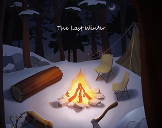
Visuals: The game looks really nice and and sprites are detailed. Especially I like the trees and that there is variations in them. The colors fit really well to winter atmosphere. Also, the red color makes it easy to distinguish interactable elements from the background. Only graphic related thing that would need an improvement in my opinion is the pier, which I did not even see at first because it just blend into the sea graphics.
Music: The music is lovely! The main song fits well to adventure style game but I especially enjoy the sudden change to more threatening music part in the forrest. I really wish the music wouldn't stop each time a dialogue is started or room changed but I assume that is a problem of the Bitsy editor and couldn't be easily overcome.
Gameplay: The gameplay is quite simple and the game is very short. The game presents the challenges well (e.g. you cannot cross the sea, you cannot get trough forrest, ...) but in the end there is a limited number of things the player can do and all the problems can be solved quite easily by talking with / collecting everything red. If the game intends to focus fully on the narrative, then it might be appropriate that the obstacles are not difficult to overcome. Although you could consider adding some (more difficult) puzzles or narrative choices to the game to vary the gameplay and increase the importance of the player. Currently, the player can experience the story of the game but does not really affect what is happening.
Theme: No Code Low Code theme is clearly well followed using Bitsy as the engine. Additional theme Winter is incorporated to the graphics but on a mechanic level I feel that the game could have been more focused on the theme. I didn't really feel the game to be about winter because all of the actions the player (or the character) is doing is not really related to winter spesifically.
Overall the game was a short feel-good adventure game with nice graphics and lovely soundtrack.
Consider checking out my project & giving some feedback if you have time:
https://lrdazrl.itch.io/the-last-winter
If your game is just an html file you could easily set it up playable online on itch.io. I've noticed you usually get more players having the game availabe without downloading anything.
On Edit Game page where you have the html file uploaded, just select the checkbox This file be played in the browser and everything should work fine.
Is okay to use columns or other ways to layout the content so that it fits in one page?
I think the F.A.Q. tries answer to this question with the line "For example, Tunnel Goons (by Nate Treme) is over two smaller pages, and most 24XX games (by Jason Tocci) are across three half-pages, but you’d be hard pressed to argue that philosophically they aren’t a one-page RPG, especially if they can be printed on a single sheet." but I have troubles understanding whether the statement means that it is okay or that it's not. I'm not sure whether my confusion arises from my my non-native English level or if the sentence just is not written so clearly. In any case, I would highly appreciate if someone could clarify to me how this rule should be interpreted.
Hi! I worked in a two person team but I did not realize that we both had to be marked as admin/contributors in itch.io. They did not have an account previously so they created a new account now and I added them as admins/contributors to the game. Is it possible to still get the prize course for them too? Would they need to get their own link for the Google Forms from you or could I just share the same link you sent to my email to them?
Thank you for organizing this jam. Hopefully you will be able to help.
Hi! I found your game from https://itch.io/jam/gamedevtv-jam-2022/topic/2148162/feedback-for-everyone-windo.... I have tested and rated the game and here's my feedback about it:
- The graphics look really great overall! Although as just a small comment: it can be seen that at least some of the graphics are from different sources/authors. For example the fence at the beginning area looks out of place because it's so pixelated compared to the rest of the enviroment.
- Background music and environmental audio effects are great and building really relaxing atmosphere.
- I did not notice the controls being explained anywhere. If the controls are not explained in the game itself, you should probably at least explain them in the game description on its itch.io page. Luckily, I still managed find running button. Also, it helped that you used intuitive control scheme.
- The slight zoom effect when running looks good and is used well to create illusion of more speed.
- Some suggestions about collecting the orbs. As the main gameplay is around finding the orbs, there could be more highlight in the event of successfully finding and collecting an orb. You already have a fitting sound effect which is great but you could also consider adding a visual effect for it to make it even more rewarding to collect orbs. It might also be helpful for the player if the game would have an UI showing the number of collected orbs and total number of orbs so the player would know how well they are doing. I could not keep count anymore after reaching 4 or 5, so at least if would have helped me!
- Some of the objects in the game world seemed to have unmatching proportions. When inside the shed every object seem to be super large compared to the player character. They eye level of the character is below the top of a table for example which would not make sense unless the character is meant to be a child(?). Also, the shed itself seems to be almost the same size as the 2 floor nearby.
- The game world is impressively large for a jam game! Of course this also made it bit difficult to search for the orbs. Luckily the orb placement was pretty good as the orbs usually were found in a places that looked visually interesting, drawing the player to visit them
- Still I did not find all of them. When I ended playing I think I had found 5 or 6 of the orbs (at least the one in the house, in the shed, in the second shed, on top of the hill and somewhere around the trees on the other side of the fence). I thought I had already been in all places but apparently not. Where the last ones would have been? Is the something that happens when the player collects the last orb?
- As you have probably already figured based on the comments by others, the blue orb on top of the stone is very confusing. If I had not already read that I don't need to collect it I would have certainty thought that it must be collected. One "rule" that I believe is generally followed in game/usability design is: things that look the same, work the same way in the game. Because I have seen other colorful orbs in the game and those were collectables I as a player would assume that all the other colorful orbs share this same function that they are meant to be collected. Following this idea, if you would want to make it clear for the player that the thing floating above the stone is not to be collected it should probably look different from the collectable items.
- This game is not really my genre and not something that I would usually play on my free time. To me the gameplay is too simple but I want to emphasize that this is really subjective matter. I still find the visual/audio scenery you have here as very impressive for a game jam entry. And there is probably people out there who really enjoy that kind of experiences more than I.
Overall: you have managed to build a really good atmosphere here. This games probably works the best for those who enjoy walking simulators or other slow-paced games that are more about the emotional experiences than complex or action based gameplay.
Thanks for playing and thanks for the feedback!
The middle platform in 3 puzzle is something that a lot of players have commented about. Again we see that it is not enough that the developer tests their own game. One should always have outsiders to the test the game as early as possible to prevent these kind of unnecessarily difficult section.
About the last level: that is actually the current ending for the game. The character dies in the pit and the screen goes black. I can really see how that might look like the game crashing though. It was not necessarily the best design choice I have made... I probably should have just kept the game more abstract and not try to include narrative when I clearly did not have time to do it well enough.
Thanks for playing and commenting! I'm glad you enjoyed the puzzles.
The first level should have probably been shorter to better work as a tutorial, you are right. About the copies: the characters should spawn with 1 second intervals. If it was slower than that, then it might have been just WebGL being too slow.
Thanks for playing and thanks for the feedback! Really good to hear you enjoyed it.
I very well understand your comment about the music. It would have been nice to have longer track or even multiple different songs but I had to also do programming + level design which were higher priority. That's what I managed to do with the time I used for the background music. I'm just glad that there is at least some music! But if I were to continue working with the game later, music would obviously be one thing that needs more content.
The game only has 4 actual levels. That's the amount of level I had time to design and test. The fifth area was meant for "narrative" closure of the game: the death of the character which is represented by the screen going black. So that's how the game currently ends but I can see why people would be confused about it. I think someone else also commented earlier that they thought it to be a crash.
That's a really good compliment. I'm happy you liked it!
If you don't mind an extra question: was there anything about the game that could be improved in your opinion. Did you encounter bugs, was certain part of the game too boring/difficult or was there something you would have liked to have more of? If I would ask you to name 1 or 2 most important things to improve if I were to continue development of this game, what would those be?
Thank you for your feedback!
I actually had more action based speedrunning game concept about the game but then I went with puzzles in the end because that's easier for me to design.
About jumping and collisions: there has been also other comments so I have now fixed most jumping related issues that with some help from Vendolis. The problem that you had with platforms moving differently during different attempts is also a known bug but it happens relatively infrequently that it is really difficult to debug. My best guess so far is that it would be related to frame rate inconsistencies.
Your last point is also something that has been repeated by others too. Rewind mechanic is interesting solution idea but I fear that it does not fit the narrative or theme. Maybe if I would just change the theme to time travelling that could really work as a mechanic. I will have to remember this suggestion. Maybe I will make a speedrunning time travel game somewhere in the future.
Thanks for you detailed feedback! It's nice to hear that at least someone enjoyed ghosts as many have commented that waiting for the ghosts was not very fun. About your other points:
Yes, the current levels are relatively "easy", meaning that they do not necessarily need more than one ghost. The player might still get killed accidently so I wanted to have the levels scale easier if necessary with the help of the second ghost. Having only one ghost could have made many levels difficult for most players. I believe you found some of the shortcuts in the levels: the normal solution for level 2 needs 1 ghost and level 3 needs all 3 ghosts. But as the game is also a platformer I wanted to give a possibility to "cheat" the puzzles with accurate platforming so if I'm correctly guessing what you did to solve those levels, they were left there intentionally (even though the trick in puzzle 2 was just an accident at first).
There has been also other comments about jumping so I have now fixed most jumping related issues that with some help from Vendolis.
Your suggestion for the ending would have been cool. I had similar idea at one point but then I decided against because I was worried that having the game both go black and end the music could be seen as a glitch. If I would improve the game I would want to make the ending more dramatic: maybe having the music cut at first and then after a while proceed to an ending screen or main menu with a melancholic version of the main theme playing. If I were to make a full game out of this there would probably be even an cutscene at the end.
Were you distracted by the platforms above the pit perhaps? Did you think that you would have to somehow get on top of them? Some others have commented that those platforms were confusing because player cannot jump on top of them so they are not useful for the level. Those were actually added when I was thinking about adding collectables to the game. I did not have time for it in the end so now those platforms might feel out of place and maybe even confusing.


