Made a discord for the game: https://discord.gg/RNmpruu4
Loressa
Creator of
Recent community posts
Anyone who playtests this game will be listed in the credits forever - all you have to do is answer a few questions!
Different rounds of playtesting will each have their own group they are listed in. This is the first round!
For bug reports, please visit the subforum: https://itch.io/t/6141365/bug-reports
-----
Please answer the following questions:
- Which genres of game do you like?
- What are your favorite games?
- What are your favorite novels?
- Which class did you pick and why?
- Which unique need option did you pick (eg neurodivergent, blind) and why?
- What was your favorite scene and why?
- What was your least favorite scene and why?
- How did you feel while playing this game?
- How did you feel after playing this game?
- How should we list you in the credits?
Notes from gameplay:
- Nice main menu. Clean fonts, nice text shadow, love the scrolling background!
- Music is chill and calming
- Interesting concept of putting the instructions on a bulletin board! It's a bit tricky to read all the text and walk just the right way to get it in frame
- The top down view is really awesome! Reminds me kinda of sim city + a kid's toy car mat, gives a very nostalgic vibe
- Oh my, why are so many guns being shot?
- The lighting is gorgeous, I love how the shadows move as the day goes on
- Well done adding sound effects to each event, though the crime one might be a bit loud
- Had to restart the game because I forgot the controls
- Hmm maybe the day should pause when the upgrade menu is opened?
- Oops, I have negative money (upgrades don't seem to check for if I can afford them)
- Uh oh, pressing tab while the upgrade shop is open leaves you trapped, have to press e again to gain mouse functionality to leave the shop
Interesting concept. I really loved the lighting in particular, so pretty!
Notes from gameplay:
- Fun music! Makes me excited to dive in and splash around
- Wonderful writing on the dialogue. You capture the voice well and I can hear a kiwi accent as I read it!
- Maybe give the "intro" guide a fun name so they feel like a proper character
- If you expand this out, consider integrating the instruction into gameplay, so the player gets right to the action
- Click confirmation for next dialogue line would be nice for slower readers, as well as an option to click to make all dialogue appear for faster readers
- Art style looks good so far, I love how bright the dive suit is
- Hehe the jump animation on land is very fun
- The walk animation is WONDERFUL, I love the waddling with the bulky fins!
- The dive (C) is very subtle and feels more like "swim downwards" versus diving
- Fun art style - I'm impressed at how much of a world you managed to create in our short time frame!
- The environmental details get blurry at the further edges of the screen, intentional? I'm guessing it may be intended to reflect the distortion of goggles, since I also notice a reflection of my character. If so, impressive and clever detail, but the execution could be tightened up as the blurriness is a bit fiddly on the eyes
- Nice detail having the icon for when I'm in range to interact with the fish
- I love the educational details and Māori words for the fish
- Might be easier to read the text if the character bobs in place during a fish scan, the moving flippers are a bit distracting
- Looks like macrons are missing from words? Might have been stripped by unity, I know engines can be weird about special characters
- Again, great job with all the research and educational facts. I love how the fish models reflect how the fish look in real life, and I love learning all these facts. It's like a trip to the aquarium!
- A sprint button would be nice, there's a lot of ocean to swim through!
- I love the little worldbuilding detail about voting through an app on a ministry plan
- Ah, looks like I can't interact with a fish school again after I've catalogued it. I think that's the right design choice, but perhaps give a bit of feedback for the player to make that clear, eg "You've already scanned this school!" or something
- Lol, I am enjoying the dialogue so much. The intro guy definitely needs a name because you've made him such a fun character!
This was a great effort, and I'm impressed at the giant free-roam level your team built in such a short time! I live in Australia and it was fun to see some of the fish I know, like hoki. The art was vibrant, the music was fun and the dialog was great. Great educational details and heaps of personality. Awesome job!
Notes from gameplay:
- The bird sounds are very well done. My cats are going wild :P
- Nice addition of including an icon for the game for my taskbar! Such a little detail which really enhances polish
- The splash screen is nice. It's simple, but the font choices and the button shape prime me for something artsy, heartfelt and handmade
- The scribble behind the play button when clicked is a great detail
- Oh, what a fun concept, just clicking to have the world unfold. Maybe consider alternative button controls if you expand out this design to make longer content like this, as holding down a mouse button can strain the hand
- The art style is beautiful!
- I love how the text panels hang in the air. The sense of depth is awesome!
- I wonder if it might feel a bit better visually if the text boxes veer outwards as the player walks past them, instead of obscuring the screen, if that makes sense? Like make it feel like we're walking past the text, not through it
- Oh no, I'm worried about Sam :(
- The forest fading away into just bits and pieces and then white was effectively done
- Click through comic reveal, also well done.
- OH NO, now I'm REALLY WORRIED about Sam!
- Great job hooking us emotionally so quickly!
- The zoom in clickable panel being in the top right is a little confusing as far as story flow goes
- Why do the other hedgehogs seem happy?
- I clicked on the bracelet and clicked through the panes and a hedgehog left and now Jodie has said sam! but can't figure out how to advance
- Alt tabbed to come type this and the game restarted to the main menu
- Tried a second playthrough and got stuck in the same spot
Absolutely beautiful art and what a creative concept with the opening sequence. I would love to see a game focusing around gameplay like the starting forest scene! Nice work and very creative!
Notes from gameplay:
- Splash screen is simple but effective. I like the slight texture in the background blue
- Ooh the slide down from the title screen into the gameplay is an awesome effect!
- Art style is super pretty!
- Good detail to include the white outlines on interactable objects
- The white outline is a bit less noticeable on the seed packets because the windows behind them have a lot of white and grey
- The slight animation on the growing plants is a nice extra touch!
- Can't seem to get the fertilizer to work? I'm dragging it over each plant but nothing appears to be changing
- Same with watering can. Do I need to fill it?
- Good feedback by making an item green when we hover over it, but it seems to stop turning green after we drag it. Need to click somewhere else before the hover effect happens again
- Ok, well maybe my plants don't need water? Ending day
- Again, I love the art sliding up/down as a transition. Very slick!
- Ah, ok, now my plants are telling me they need stuff
- Still can't figure out how to use the fertilizer or watering can :(
- Cycling through days. Great art distinction to show my plants are dying!
What beautiful art and polished UI! Some audio and enhanced gameplay would help improve this. Feels like you have a good start to something cozy!
Notes from gameplay:
- Nice main menu. The art is simple but evocative, the music is upbeat but also chill, the text is easy to read. I really like how the yellow edge of the sawblade matches the font color
- Nice job including a guide. The handdrawn sketches work well here
- The music here is much more frenetic! I like the emphasis on drums. That feels like "wood music"
- The art is very pretty and a clever use of a small number of assets. The consistent art style creates lovely cohesion. I love the little animation detail of the trees swaying back and forth!
- The tasks we need wood for are kind and community-focused (build a school, build a tiny house)
- Gameplay reminds me a bit of a bubble popper. This could be a great casual mobile game!
- There don't seem to be any consequences to clearcutting the entire forest. I went full "bad guys from Fern Gully" and it just meant I could sit afk and have orders filled. Some more tension around overharvesting would be nice
- After a point, you run out of blades and kinda just sit there waiting for a matching order so you can keep playing
- Music doesn't seem to loop? It's stopped playing Edit: it somehow got muted
- The physics of the bouncing blade coupled with the sound effects of the saw + trees being cut are very effective, good feedback to doing a game action
Fun little idea and I definitely think you should play with this and consider expanding it out. This is a type of game I could see myself casually playing while waiting for a bus. There's definitely room for some more complexity, different seasons, different maps. I'm really impressed by the physics of the blade. That's excellent work to have achieved in our short time frame. Art and sound are fun, overall well done!
Notes from gameplay:
- Beautiful main menu! The art is bold and vibrant and immediately makes me think of nature and green spaces
- Nice hover effect on selections, nice click sounds as confirmation when clicking
- Oh, this is a very cool hub for the minigames! For future expansion, you could add clickable elements to the items on the desk
- Nice detail with the flashing screen to direct me where to go to start gameplay
- Music is fun and engaging
- The banana peel blends into the grass quite a bit. Maybe consider a bright outline around interactive elements like that
- Looks like this is in portugese! Different localizations will be great for future expansion
- The physics on the trash is fun, I totally just sat dragging stuff around for a bit :P
- Got 100 points from sorting, hit continue, but no new trash seems to spawn?
- Visiting the lake now! Again, the art is so lovely!
- The text box styling is nicely done. The font is easy to read, the color contrast is sharp and the little details like the green squares in the corners make this look very polished!
- Noooooo, birdie, don't eat the trash!!!! :( Not really sure how this game works, going to need to type the text into a translator
- Same as with recycling, game doesn't let me play again when finished, returning to main menu and back doesn't fix it, going to have to restart the game
- Hmm, restart didn't fix it, can't seem to replay game #2 :(
- Onto the community garden
- The tools flyout is nicely designed
- I like how we learn WHY we plow, eg to mix oxygen in
- Unsure HOW to plow, click/double-click/dragging the tool doesn't seem to do anything
- Ahhh I see there's a slight change in the soil texture. The lines could be more visually distinct. Also hovering over a plot with the tool again reverts progress
- Fertilizer has a nice active effect to show it's being used
- Seed planting is very visually effective
- Looks like I can replay the minigames because it's day 2
- The swan minigame is a bit counter-intuitive, as the red items DON'T go in the red bin. The bins themselves are cut off so I can't see the sorting types
- It looks like the swan eats items if my drag brings it over the swan
- Didn't get a chance to feed the swan, the results screen pops up
- Returned to garden on day 2 but all my crops are gone :(
- Unclear what to click to start game 4
- Not sure what this minigame is about. the i button is helpful, but unsure what I'm doing or why
- How do I add something to the second and third boxes? Everything I click just goes into the first box
- Somehow I was able to click around a bunch and got a modified option displaying in the 4th box, all the other boxes are still empty
- Got a few more results showing in the 4th box. They are all stacking atop each other, the results aren't clearing out from the box
- Oops game ended on me and sent me back to the main camera feed. looks like day 3 hit
- Still can't replay the recycling game
- Backing out of recycling sent me back to arts and crafts, not camera feed
What an impressive result in the timeframe we had! The art and sound make this immediately engaging and I love how we learned some basics about recycling and gardening. I hope you expand this out! It would be cool to see interactions with others in the community.
Notes from gameplay:
- Install is taking FOREVER...
- Oof, need visual c++ redistributable as well...
- Pretty splash page!
- Flowers are pretty
- Nice use of similar low poly graphics across the game, creates a cohesive image
- These NPCs are wild, one grew a giant tree!
- Reload takes quite a long time
- How do I grow a treeeeeeee
- Aha, tree grenade!
- Movement feels fluid
- Lighting is awesome, I love how the trees cast shadows!
- Aww, I'm out of treenades :(
- I fund a random gun on the ground? I rewilded it and now it's a green gun!
- Ran out of ammo. Ran around until the F button prompt showed up, but not sure why it did, doesn't seem like there was anything on the ground
Interesting take on the jam theme. I liked the humor in the text!
Notes from gameplay:
- Art is polished and effective. Nicely cohesive use of pixels
- Including some tutorial instructions is great :)
- Movement animation is great! I like his little green poof behind him
- Nice jump sound effect
- I don't seem to be losing lives when I die. Edit: when I got the level where I got the genetics vial, I started losing lives
- Cool idea to have players plant different things for various effects!
- The smoke sometimes will do damage after the lily is planted, but perhaps that's an intentional timing puzzle
Wonderful art and well done platformer design. I unfortunately am not very good at using the arrow keys for movement, so I couldn't get very far, but I'm not your target audience for a game like this. I imagine there are many gamers who would find the movement easy! Impressive effort for such a short time frame!
Notes from gameplay:
- Splash screen is subtle but already doing narrative work. Looks like it's about Māori or Polynesian culture?
- The handwritten font and choice of lowercase makes me feel like this might be a cozy story
- Love the text outline and shadow on the title
- Music is restrained and emotional
- Character art is beautiful!!!
- Love the different facial expressions
- I like that you toss us right into the action and we can figure out the story through context
- Ahh, they are cousins. Thought they might be sisters at first
- Some lovely lines of writing in the descriptions of emotion/action.
- Lol @ Aira's line after Piri rambles about his kid, nice little punch of humor
- Well done creating different "voices" for each character. Kiri in particular stands out
- The mayor's building music is great, it feels "formal"
- What an interesting world this is. The gradual trickle of information creates an intriguing mystery. Why are they isolated from everyone else???
- OMG, that is NOT what I imagined the wise woman would be
- The resource need behind waking her up is a great comment on things like tech and AI being resource hogs
- "forces seeking endless growth" :( Yeah :(
- Very interesting take on venerating ancestors, by letting them live on through the wise woman
- The scarcity is a crucial aspect of wisdom line is stellar!
- Hmm, very interesting overall message. You bring up some excellent points about how the internet fuels animosity but is isolation truly the answer? A few more scenes around town could be a good way to really sell the community as the right answer.
Wonderful story game! The art is beautiful, the writing is snappy, and the sound is great. Awesome job!
Notes from gameplay:
- Art style is adorable! Feels cozy and welcoming just from the splash screen. Awesome title image as well!
- The music stopped very quickly, is that intentional? All I hear is chatter now
- Back button on credits popup doesn't work, had to reload
- Great work including a tutorial
- Hehe, I love the sound effect for the back button
- The button styling looks crisp and professional, nice work!
- Font is clean and legible
- Clever use of blah blah voice effects to make the characters feel voice acted
- Oh, thank goodness that the soup ingredients list all the likes/dislikes. I was like oh boy, I won't be able to remember this...
- Hmm, I think whatever I make is going to upset someone :(
- Caro's my favorite simply because she eats everything! :P
- I love how everyone helps each other out at the end!
- Great character design. I like how inclusive it is!
What a sweet game! I love the idea of a community where everyone helps each other out in the ways they can :) Great work!
Notes from gameplay:
- The background art is cute. It's simple but effective. I love how the sky changes based on time of day. Nice work with the lighting!
- Hmm, what is this timer in the right? It's going up quite rapidly
- Would be nice is building selector showed what I've selected. I clicked several times before realizing I was ready to build
- Looks like I can put multiple buildings on the same plot. The evil skyscraper took over my park! :P
- Hmm, somehow my camera ended up underground. There appears to be a skyscraper lurking down in these depths!
- Ok, starting over since I got stuck underground lol
- Hmm, the library is a book store?
- Oops underground again. I think it's from walking around
- I like how you can add green roofs and solar panels to the skyscrapers!
- Hmm the clock in top right started over?
- I escaped from underground! I'm flying into the sky now!
- Actually this perspective is more helpful for building
- Ah, it was camera tilt that sent me underground
- Ah, I guess the clock is time of day, duh, silly me
- The shadows from the sunrise look AWESOME
- I like the art for the park, the low poly matches the background mountains well
- Planted almost all plots with parks. It looks like it doesn't get as hot!
- Oh, nevermind, up to 90. Not sure what the thermometer does.
Nice work! I was particularly impressed with the lighting!
Notes from gameplay:
- Gameplay is deceptively simple - with a single control (the spacebar), timing becomes REALLY important
- Background is very pretty!
- Nice job adding sound assets for key gathering
- Oh no, the end of level choice between forest and industry happened when I was in midair, so I fell to my death after deciding lol
- Game over text is teensy tiny. Try again, just says try.
- Hmm, I selected forest twice but it says I'm industry-heavy!
- I really like how the music speeds up to reflect your choices!
- The procedurally generated levels is very ambitious!
- Seems no matter what I pick, I end up with industry
- I like how the background got more grim as there was more industry, nice use of the game world to illustrate the consequences of our choices
Great effort, especially considering how little time we had! I can't believe you were able to do procedural generation in the time frame!
Notes from gameplay:
- Nice name, clever use of capitalization to convey multiple meanings!
- Hmm, music doesn't appear to be playing
- Great tutorial popup. The ding sound is a great indicator there's something important I need to look at and requiring an OK button means I can't accidentally dismiss it. Smart design
- Why is the water level critical if it's raining? :P
- Nice effects with the rain and lightning!
- I wish i could use drag and hold for planting trees, like I can with gathering wood
- Text cuts off the last line on the tutorial popup starting with "farming give food and wood"
- Hehe the baby trees look like wild horseradish in Stardew Valley
- Oh, music kicked in!
- Oh noooo, the lake is vanishing!
- Hmm, are the round farms from not gathering the resources in time? How do I make them grow again? Edit: Ah, I have to click them again to grow more? Edit2: Ah, the farm option has to be selected
- I like seeing all the little people wandering around, that's a very cool extra detail. It makes this feel much more alive!
- Oh no, we all died of thirst :(
- Maybe code a way to skip the tutorial on a replay?
- Oof another water crisis
- Hmm, I'm told I'm supposed to plant trees to fix the water crisis, but planting them costs water!
- Everyone died again :(
Nice work! I really liked the cohesive art style and your excellent staged tutorial.
Notes from gameplay:
- Main page music is nice - ambient and not too distracting
- Font is a little tricky to read
- The art style is smart - quick assets for a jam, but polished enough to feel like a proper style. The use of colors in the text and UI really enhance this to create overall visual cohesion
- Nice work including a tutorial!
- Main music is fun!
- The hover effect and sound is a great detail (for play/menu buttons)
- Oh, it automatically starts! I lost the first round because I was making notes here, lol. Time for a restart!
- Oops used up all my energy too quickly! What tricky decisions these are. I wish I had a bit more time for decision making, heh
- The clicky typing sound the computer makes is a fun sound effect
- Good audio feedback with yes/no sounds
- The speed of decay feels quite punishing, especially if I want to check individual people's simulated results
- Hmm, I seem to have broken the game. Just kept clicking yes and now it no longer decays, nor does clicking yes/no change column values
- Replicated the lock. It seems like all values need to be fairly high (or maybe that's just a result of a good roll of policies giving me enough time/clicks for it to happen, locked at 82/88/99/90)
- Tested with all no and it didn't lock, so suspecting it has something to do with high values
- Oh nevermind, it means I won. For some reason I was thinking it had to be 100!
Fun concept. It definitely demonstrated the difficulty of balancing the needs of a group and how perfect agreement isn't possible.
Notes from gameplay:
- Ability to change font is nice, the default is hard to read
- Nice range of settings options!
- Music is fun and boppy
- Whoa, wall of text. This would be a lot better if it was fed to the player in sections
- Music stops when text intro comes up
- Nice worldbuilding with the instadrone
- lol @ cactus
- Intro text is well written, funny and sets the scene well for gameplay
- Text on the left sidebar is getting cut off (maybe because I have the 2nd font choice?)
- Clicking on tiles to dig and plant feels very slick and satisfying. Excellent use of changing graphics and giving auditory feedback to actions.
- The pixel art is very well done. You convey a lot of details in a just a few pixels!
- I'm enjoying meeting the community! I like how you show vs tell, eg kia ora and abuela indicate different cultural backgrounds without flat out explaining it
- A bit confused by the gameplay itself. It looks like the lettuce is grown on day 4? Do I pick it? I clicked on it, but nothing seemed to change in my UI, although it vanished from the garden
- Love learning about new types of plants through the zine, great educational inclusion
- How do I not have enough plants for worms?! The entire garden is planted (maybe it's not counting the grown lettuce?)
- Oh, Sabbah brought worms the next day without me doing anything
- Ooh, I love the little butterflies around the grown plants. I forget what those are called (some sort of labeling in the UI would be helpful)
- lol @ the old grumpy man who actually just wants the garden to be better
- No more story :(
- Surprise story! The ending is very sweet and I love how the community came together to stick it to the corporation
- Aww, the tree blooming is a lovely touch and it's the most beautiful art in the game!
- Pigeon consulting, eh?
- Love the call to action at the end about community gardens
This was a lovely little narrative piece. The gameplay feels more like a relaxing way to progress though the story. I really wish the text had been easier to read - the story is wonderful, but SO hard to read :( A bit of polish there would definitely improve the game! Overall, great work and inspiring. I want to go make a community garden now!
Notes from gameplay:
- Itch page is gorgeous! Lovely layout and formatting. I love the description about zai pits - I'm already excited to see these in action in game
- Art style is very cute!
- Hmm, wonder why one tile has smoke (?) or clouds or something over it? Clicking on it gives negative feedback, am I supposed to direct water to that tile?
- Music is peaceful and pretty
- Confused by gameplay
- just tried spam clicking everything at first to see what would happen, game over from that, time for a restart
- Ok, clicked a path to the smoky tile and got plants to grow!
- Oh, I guess I won?
- I like the little summaries after each level, feels like oral mythology and community legend
- The poem is a nice touch!
- Ok, so gameplay is to basically get stuff growing on the smoky tile
- What does the fist icon symbolize?
- Level 3, looks like we have blocker tiles I have to go around?
- Oh, I guess the fist symbolizes how many choices I have? Perhaps this is tuned too generously, I didn't even notice this mechanic at first until I looked up at the top, doesn't feel hard to make it to the smoke tiles
- Getting all the tiles green feels very satisfying!
- Oh, the game exited to main menu before I was finished reading the little text blurb, I guess that's game over? Yeah, continue just returns to the same level
Awesome concept and I love the text blurbs and poetry to help tell the story of the land's renewal. The concept the game is based on is a really cool ecological idea and it was fun to see it actualized in a game! Everything is very cohesive, just needs some tuning to make it more challenging. I would totally play a version of this on my phone, feels like a great game I could pop in to solve a level of while waiting for the bus.
Notes from gameplay:
- I like that you emphasize how a sustainable future is something we need to build together
- Music is chill
- Graphics are all cohesive. You picked a cute art style and the characters + world + assets match well. I think the UI could be improved a bit to match this style even better. It's currently functional UI, but not the prettiest font or box styling
- text is being clipped in some tile descriptions, eg fossil energy cuts off the final line with the g and y of energy not fully displaying
- Clean air standards, line about paper straw - almost feels like you're making a joke about how mandated standards don't work?
- Nice hover effect when choosing policies
- Can't seem to upgrade anything? Always greyed out
- Oops, we all died
- Is there any way to REMOVE the fossil fuels? I don't like having to chew up all the nature :(
- I wish I could upgrade green energy vs fossil fuels
- Seems like no matter what I pick, we all die from pollution eventually. Bleak!
Notes from gameplay:
- Interesting concept. I've never heard of an audio ttrpg, but it instantly speaks to the accessibility aspect of this jam. This seems like an awesome game concept for blind gamers in particular!
- Needing an external app is an extra hurdle for gameplay
- The art design is stark and effective, it's a nice detail to have included to break up the text rules
- Excellent use of formatting to help lay out rules. Bold, headings, italics all serve their roles well
- I love the examples for the creature questions - the word choices here are informative, descriptive AND spark creativity (rhizomatic! plastic waste! phase-jumping!). You've crammed in world building and creative prompting really well in just a few words
- The gameplay itself is easy to figure out. This sounds like a rather fun little game to play with a group, and it seems like it would be easy to pick up quickly!
This is a cool and innovative ttrpg concept! I think the biggest downside might be needing an external app, but for the right player group, I can see this being a beloved, repeated game.
Notes from gameplay:
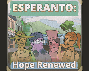
- Loved the backstory given on the itch page. Great thoughts about hopeful future changes!
- Loading page:
- immediately loving the crayon art. It feels handmade, nostalgic, reminds me of childhood.
- The font at the bottom matches the art well, maybe consider using that same font for the continue button?
- The slight animation + shadow on the text is very effective, the page feels dynamic
- Intro message: this sounds cool, what is the Mooi Amsterdam committee?
- Green on button hover is a nice detail
- Button click sound is nice
- Consider putting the english translation in parentheses for choice of space
- AH! This is like Flower!!!! https://en.wikipedia.org/wiki/Flower_(video_game) - I ADORED this game back in the day, so I immediately "got" your game as soon as gameplay started
- The music is wonderful, it's more about ambient sound and little moments where that sound blooms, which feels quite appropriate paired with the gameplay
- The art is very effective, I love all the organic curls and twining, and how it builds on itself the more things grow
- Only just realized (after like 5 mins) that holding down a mouse button changes growth
- Are all of these plants depicted native to the Netherlands? What's the yellow cluster, that one in particular seems to be an interesting choice as it doesn't look like a typical flower depiction so it feels like a specifically chosen plant in particular!
- I left this on as a screensaver for a bit, it was very calming and pleasant :) The way the levels loop around made it easy to just relax and casually play this in between writing notes and doing chores
- What engine was used for this?
- The movement feels very organic which resonates well with the jam themes. Even when trying to control the plants, steering isn't precise. That feels appropriate for a game about spreading plant growth!
Overall, I found this delightful and a great use of time within our tight constraints. The art style is simple but very cohesive and effective, the music is sparse but haunting, and the overall result is absolutely beautiful! Awesome work!
Choice of Games (basically one of the big audiences for interactive fiction) writes in their code documentation that much fewer people replay games than writers imagine. This is not to say that replay is bad, just don't bank players understanding your game on the replay value unless you've focused on that (eg time agent: https://alyshkalia.itch.io/youre-a-time-agent )
This is a great concept!
I think the actual countdown is slightly problematic as it encourages readers to skim your prose, which loses the emotional impact of gathering up your life. It also means people on screen readers will lose before the screen reader has finished reading. Same with slow readers.
Have you considered tying each choice to the countdown, instead? Eg quickly reading the letters could cost 10 seconds while moving rooms could take 5. This would allow you to expand this out by adjusting the time remaining, potential choices and the cost of each one.
Great project, very cool core idea!


